CSS Grid and flexbox are two CSS layout modules with different implementation techniques and usages. Flexbox is primarily designed to avail space distribution between the items in an interface and stable alignment capabilities. On the contrary, CSS Grid excels in dividing a page into key zones or defining the size, position, and layer relationship between the parts of HTML rudimentary control. Because of the existing similarities, the question of better efficiency between these two has become quite prominent among web development circles because of the emerging approach to interactive web designs.
Hence, this article will shed some light on an overall comparison of how flexbox differs from CSS Grid and how the application changes as per the need.
Bringing Together CSS Grid & Flexbox
The introduction of CSS Grid and flexbox replaced age-old hacks to create page layouts, positions of items, and alignment of components. Both of the modules have many similarities as they both are display modules. They started with the same target of defining the visual placement of elements with a different approach. Both of them pave the way for calculating the display measurements. They implement justification and alignment similarly, except that flexbox uses common properties for all items while CSS Grid avails individual properties for each item.
Although the roles they intend to play are similar, the best occasions to use each layout model in a website are different based on their approaches and characteristics. There are situations where either one can be used, and there are those where one becomes more suitable than the other. Although the use cases depend on the developer, it calls for a discussion of the differences between the two. There are things Grid is better at doing and things where none can compete with flexbox. Moreover, they can be used together, where grid items can be flex containers, and flex items can be used as grid containers.
Some jobs can be done better using Grid. Some specific ones are:
- Making whole page layouts considering the layout performance reasons
- Making literal grids
Requires fewer media query interventions with powerful functionality like auto layout, minmax(), repeat(), and auto-fill.
But, these alone do not make the Grid better than the flexbox. Let’s put the different approaches of the two forward, and hopefully, it’ll help you understand the display modules and their applications a bit better and make your task easier for you.
Dimension in CSS Grid & Flexbox
“Flexbox is essentially for laying out items in a single dimension – in a row OR a column. Grid is for the layout of items in two dimensions – rows AND columns.”
Rachel Andrew
The primary difference between flexbox and CSS Grid is that flexbox is one-dimensional. Flexbox lays out items along either the horizontal or vertical axis, where you are to decide if you want a row-based or a column-based layout.
Flexbox allows the elements to wrap, which results in columns and rows of flex. There’s no way to directly decide or informatively control the exact position of the elements as they merely push the elements along a single axis.
On the other hand, CSS Grid can be considered two-dimensional as it allows the freedom to declare the sizing of both rows and columns and then explicitly place things into them.
Base in CSS Grid & Flexbox
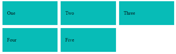
In a flexbox layout, the size of a cell or the flex items is defined inside the flex item itself, while the size of a cell in a grid layout is defined inside the grid container.
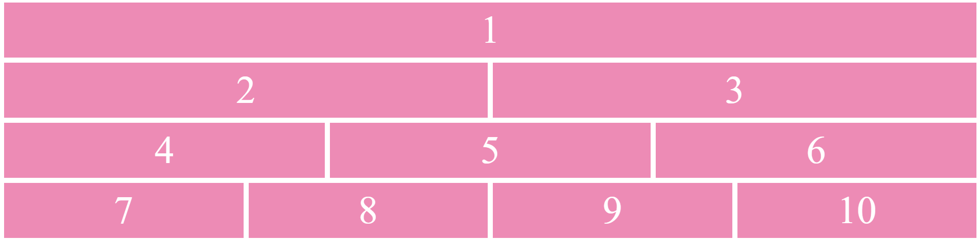
See the example below to understand how the sizing is done for flex items and grid cells. The example shows two different ways to build the same layout for better understanding:
CSS for flexbox
CSS for Grid
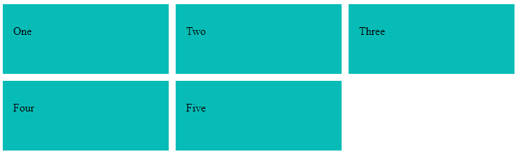
Gap
Gaps are spaces between content tracks that can be created directly using CSS Grid. It allows you to create a gutter between grid-items using grid-column-gap without much ado. Regarding the grid sizing, gaps act as regular grid tracks, although nothing can be placed into the gap. Also, the row-gap and the column-gap are not the only things that cause tracks to space out. Margins, padding, or the use of the space distribution properties in box alignment can contribute to the visible gap.
See the example below for how grid avails gap between the cells:
CSS for flex
CSS for grid
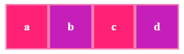
As you know, flex doesn’t have the gap property. So you need to take a twisted route to add gaps between items (as shown above). You need to use padding and nested containers, or you have to increase the width of the flex-container while using the justify-content property to spread the flex-items.
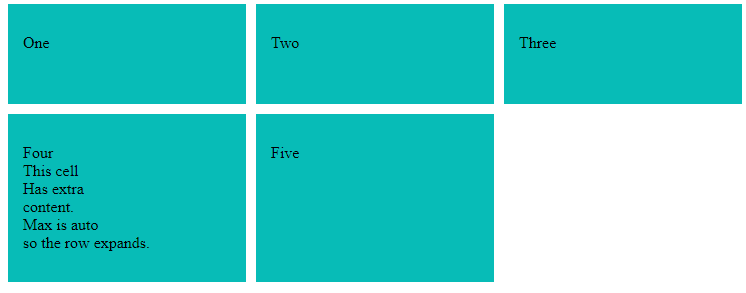
Wrap
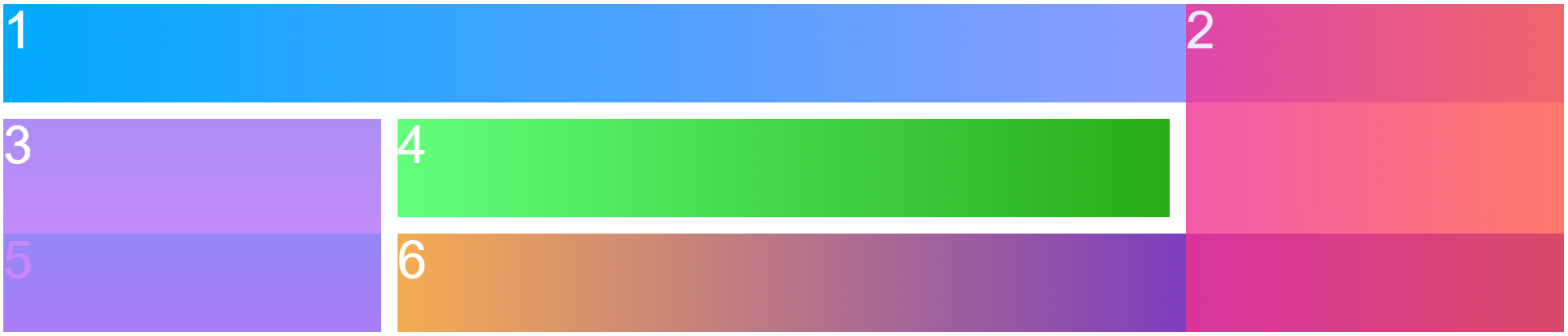
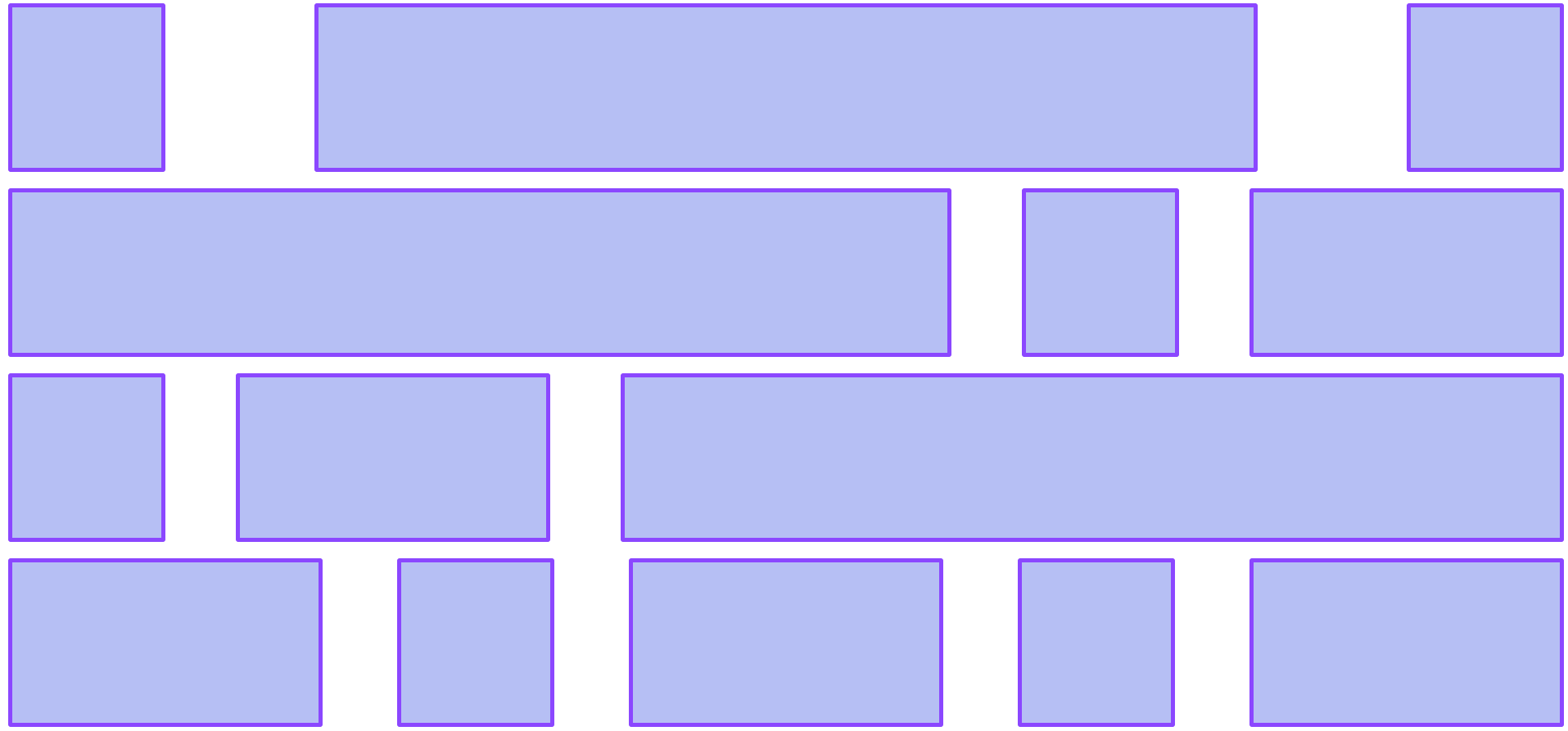
If the total width of items inside the container is greater than the container’s width, both the layout modules have the option to wrap the items in a new row. The beauty of flexbox and Grid lies in the ability to stretch and squeeze. But each module does it differently. For instance, flex-wrap is used to wrap items into multiple lines, considering each line a container. When flex items are wrapped and pushed in a new row, the layout algorithm treats them as a part of a different flex container, and the pushed items lose their context. So the cells do not get to have the exact sizes as all the others. Look at the examples given below:


From the example above, you can see the different outcomes for distinctive values. If you set the value of flex-wrap to wrap, the items will be allocated the same space. Also, any item that goes beyond the row will be set in a new row. If the value is set to nowrap, the items will not be wrapped into the same rows; instead, they’ll be hidden and not be shown within the flex container. Moreover, if you set the value to wrap-reverse, the items will be allocated in a reversed continuity.
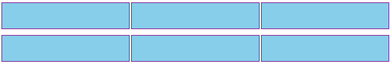
On the contrary, Grid achieves this using a combination of min-max and auto-fill functions inside the grid-template-columns property. But in Grid, the cells retain the same size as all other cells in the Grid.
When there’s extra space available, the input element will grow twice compared to other input elements. In this case, flexbox outperforms Grid. So for this type of single-dimensional layout, flexbox is well-suited.
This is how CSS Grid works while wrapping items:
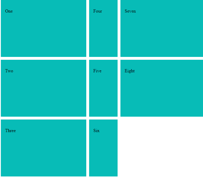
From the examples above, it is clear that you can use CSS Grid to distribute the items around any or both of the axes. The outputs will vary depending on the values you set.
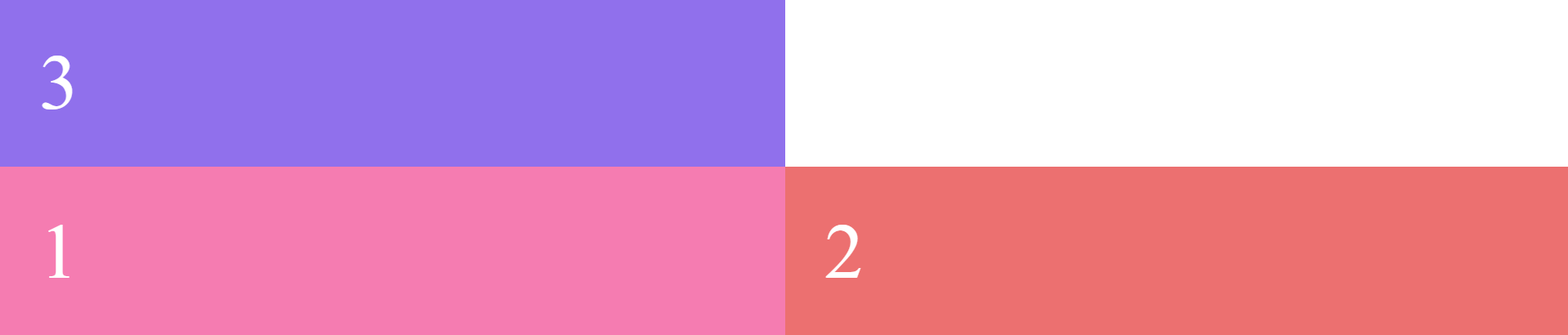
Overlapping
For items to be overlapped in the flexbox, you need to look at traditional stuff like negative margins and transforms or absolute positioning to break out of the flex behavior. But, Grid is better at doing it. With Grid, you can place items on overlapping grid lines or even right within the same grid cells.
Margin
Flexbox has a feature to push everything as far as you can. It allows putting margin-right: auto on an element, and if there’s enough space available, that element will push everything as far as it can. This is a unique flexbox feature that is not available in Grid.
Space Employment
The way a flex item is sized gets complicated in some cases since it is defined with a combination of width, min-width, max-width, flex-basis, flex-grow, flex-shrink, white space, and other properties. For this purpose, Grid has interesting space-occupying features like fractional units and the ability for content to break grids, even though you’re the one to set up grid lines and place the items within them to drop right into the place.
Nesting in CSS Grid & Flexbox
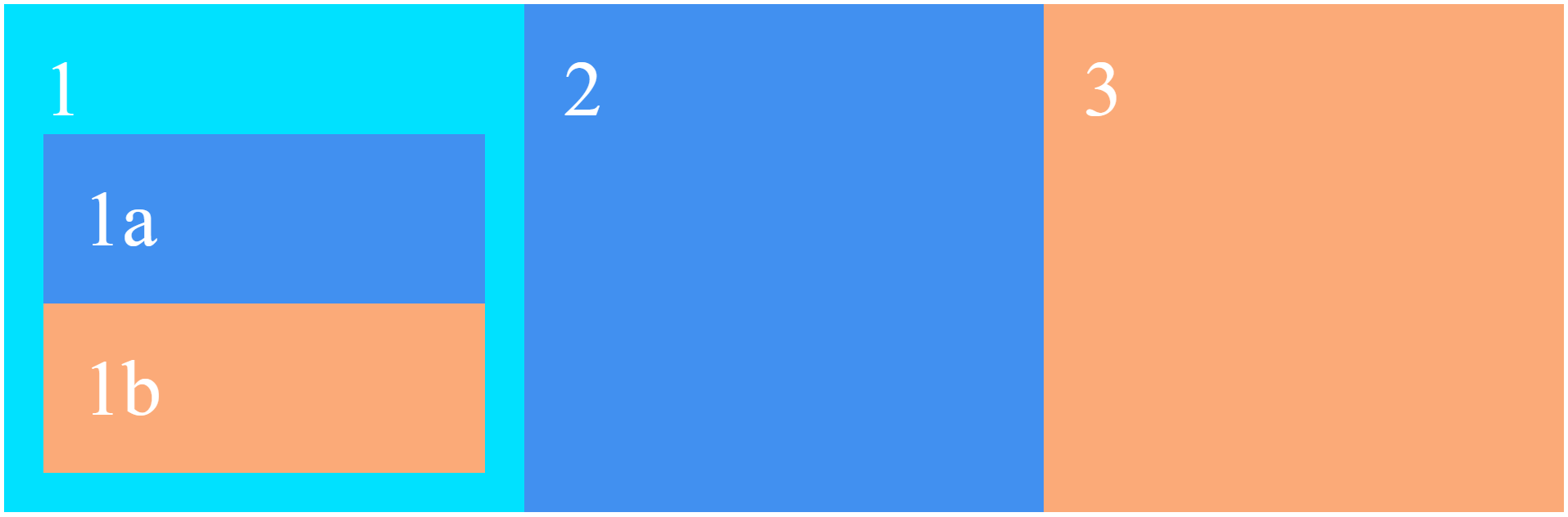
While using CSS Grid, only the direct children become grid items when the display of a grid container is set to grid. They can be placed on the grid created, and the children will display them in normal flow. You can ‘nest’ grids by turning a grid item into a grid container. Since these grids are independent of the parent grid and each other, they do not take their track sizing from the parent grid. This makes it challenging to line nested grid items up with the primary grid.
But, if you set the value subgrid on grid-template-columns, grid-template-rows or both, the nested grid uses the tracks defined on the parent. In this case, gaps are inherited or overridden with a different gap value. Also, line names can be passed from the parent into the subgrid, and the subgrid can also declare its own line names.
Subgrid
CSS Grid (level 2 layout specification) has a predefined subgrid value for the display property, which is still under the experimental stage. This unique value is a nested grid with display: grid.
Adding this value to a grid container turns the direct children into grid items. The items can then be placed in the grid created. The children are displayed in normal flow.
Setting the value subgrid on grid-template-columns, grid-template-rows or both, Grid uses the tracks defined on the parent instead of creating a new track listing the nested grid uses. For example, using grid-template-columns: subgrid, while the nested grid spans three column tracks of the parent, the nested grid will have three column tracks of the same size as the parent grid. In this case-
- Gaps are inherited but can also be overridden with a different gap value.
- Line names can be passed from the parent to the children, and the subgrid can also declare its own line names.
In short, the content of the subgrid affects the sizing of the parent grid while allowing content to align across both axes.
You can use the value subgrid on the grid columns, grid rows, or on both dimensions, as in the instance below:
You can make things like this using flexbox as well, although the procedure gets hefty and messy as the process depends on many media to show the expected output. You’ll need to add display: flex on a parent, creating independent children who will not inherit any parent properties. Moreover, to define their characteristics, you’ll need to define newer parent items each time you need to style any of the children. This results in a long repetitive process of adding more properties to each item.
Inheritance of Values in CSS Grid & Flexbox
In CSS Grid, your nested grid will not inherit the values from its parent grid. This enables changing the parent grid without accidentally affecting the nested grid. Also, you can override the children with a different value. Line names can be passed down from the parents to the children, and the subgrid can declare their own names.
On the contrary, while using the flexbox, the children will be independent and not carry the parents’ characteristics. Newer parent items must be defined before you have to style any children.
Focus on Content Placement: CSS Grid
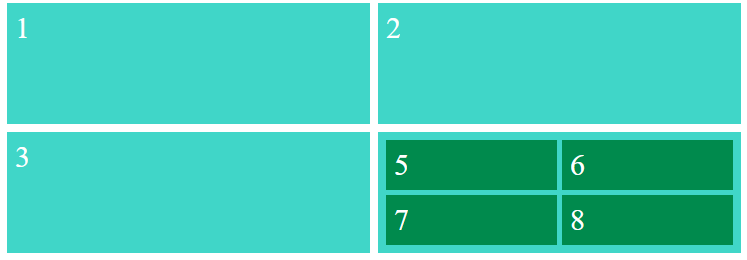
According to the W3 school, CSS Grid allows users to precisely position and size the elements on their application into the grid areas. CSS Grid focuses on precise content placement where each item is a grid cell, lined up along both vertical and horizontal axes. Hence, CSS Grid is the module to control the positioning of items within a layout.
On the other hand, it’s tough to predict the behavior at certain viewports, which can create amazing results. Though you can set the widths and heights of flex items, it can hinder the process by being less flexible.
Creating Unusual Layouts
CSS Grid has properties like grid-template-rows and grid-template-columns and utilities like fraction units to let you calculate everything precisely. Also, it’s possible to create responsive layouts without using media queries. Grid makes creating unusual layouts like broken, asymmetrical or overlapping simpler and effortless. Moreover, by adding a simple Grid technique, you can make the grid cells wrap and adapt to any viewport size.
Despite the layout being wrapped based on the available space, it’s not content-aware like flexbox, as the contents inside the items do not flexibly stretch out.
Focus on Content Flow: Flexbox
Unlike Grid, flexbox focuses on content flow rather than focusing on content placement. Content flow is the natural arrangement and positioning of elements within a container based on their inherent properties and relationships. In flexbox context, it refers to the way in which elements within a flex container are laid out along a single axis while maintaining their relative sizes and proportions. The content of the item determines the widths or heights of flex items. Flex items grow and shrink according to their inner content and the available space.
Flexbox enables you to allocate space and align items flexibly. You can make fix-width flex items by using the width or flex-basis properties. But, doing that results in the loss of flexbox’s content awareness. Since flexbox treats each row independently, different rows align flex items differently based on the number of texts inside.
Deciding Content Behaviors
Flexbox allows you to decide the way your content should behave when there’s too much or not enough space on the screen. Flexbox sizing makes creating layouts fully adaptable to the screen possible. Using the flex-grow and flex-shrink properties, you can achieve a completely fluid layout that optimizes the allocation of flex items at every viewport size without relying on layouts and orientations or media queries to support them.
CSS Grid & flexbox: Example
There are many use case examples for both CSS Grid and flexbox on the web. We have chosen two examples of grid creation for a simple comparison between the two use cases.
CSS Grid & flexbox: Use cases
Though the targets are the same as CSS Grid and flexbox, they are different from each other in their implementation process. In some cases, CSS Grid can not compare to flexbox; in others, Grid remains the best. The different use cases are pointed out below:
- Small Design: Flexbox is ideal if you’re working with a small layout to implement with fewer rows and columns.
- Align Items: When you need to align items, all you have to do is create a container using display: flex and define the flex-direction of your need and get what you want in minutes.
- Content-first Design: If you’re to create a website with a low idea of how your content will look, or if you just want to fit everything in a layout, flexbox will be the perfect one to work with.
To be true, you’ll be able to create almost all layouts you want with flexbox and get similar results as Grid. But to create a better CSS approach to have more maintainable applications in the long term, it’s better to use CSS Grid as it allows for creating a more concise layout. The exemplary implementations of CSS Grid are listed below:
- Complex Design: When you have a more complicated design to implement, it’s better to use CSS Grid. Its two-dimensional layout system helps you create more complex and maintainable web pages.
- Gap between Block Items: Grid has a more accessible gap property that isn’t available in flexbox. This property allows you to define the gap between the rows and columns without having to use the margin property that causes issues if you’re working with many breakpoints.
- Overlapping Elements: As mentioned before, Grid is better at overlapping elements. You can do it easily with grid-row and grid-column properties, while flexbox still needs to use some hacks like margins, transforms or absolute positioning to do so.
- Layout-First Design: If you have a designed layout structure, it’ll be easier to use CSS Grid as its two-dimensional layout system makes positioning items easier.
Choosing one to use between flexbox and CSS Grid can be perplexing as you have to know every nook and cranny of them. It’s helpful to learn the use cases first to get the best result. Learning the use cases best aids your decision and gets you an anxiety-free development all the way through. You can also check the official documents for more information and implications to make the best decision regarding any use. We cordially hope this post will walk you along the way and get you the best of web design.


