A landing page’s main reason for existing is to convince a visitor to do something. Whether it’s to guide them towards the top end of a sales funnel by signing up for a newsletter or to start a transaction process that will convert them into a customer, a landing page demands action. How it goes about doing this involves a combination of tactics. Some of them can be super obvious, like text telling visitors exactly what you want them to do. Other strategies are more subtle, and they involve graphic design techniques used to draw attention to elements that prompt a particular behavior.
In this post, we’re going to look at five landing page design techniques proven to be successful in getting visitors to do what you want them to do.
1. Keep It Simple
Any content on your landing page that doesn’t make a material contribution to the landing page’s purpose is a clutter and will detract from the page’s primary goal: conversion. Obviously, there are exceptions, like navigation elements, but these aside, every graphical or informational element must urge the user towards a particular goal.
Lyft is an excellent example of how negative space draws the user’s attention to a very strong call to action. Aside from limited copy explaining what the service offers, the page is populated exclusively by interaction elements, prompting a user response.
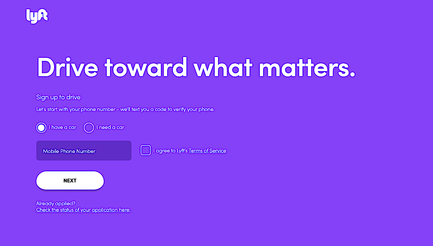
Source: lyft.com
What Lyft did really well in this instance is to also supply additional information below the scroll-line. Finding out more about the company and its services is possible, but only after being presented with a full-screen of visual elements focused purely on prompting the user to supply their mobile number.
Another company that does this very well is Ultimate Meal Plans. The entire section above the fold is focused solely on a short and comprehensible core message. The section also includes a clear call-to-action button and a prominently placed refund guarantee.
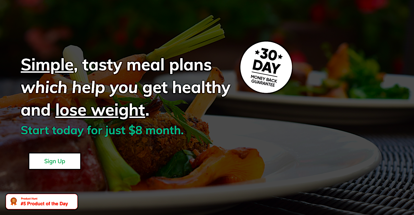
Source: ultimatemealplans.com
2. Make the Call to Action Obvious
Whether you’re harvesting email addresses or prompting users to place an item in their shopping cart, the button enabling the conversion must stand out from the rest of the page’s content. Your range of products may look awesome and engaging, but if users aren’t presented with a clear and highly visible CTA, you’re severely limiting your chances of inspiring conversions.
Product website BestSpy offers a great example of how to effectively ensure that visitors to their product page see these elements frequently, yet unobtrusively.
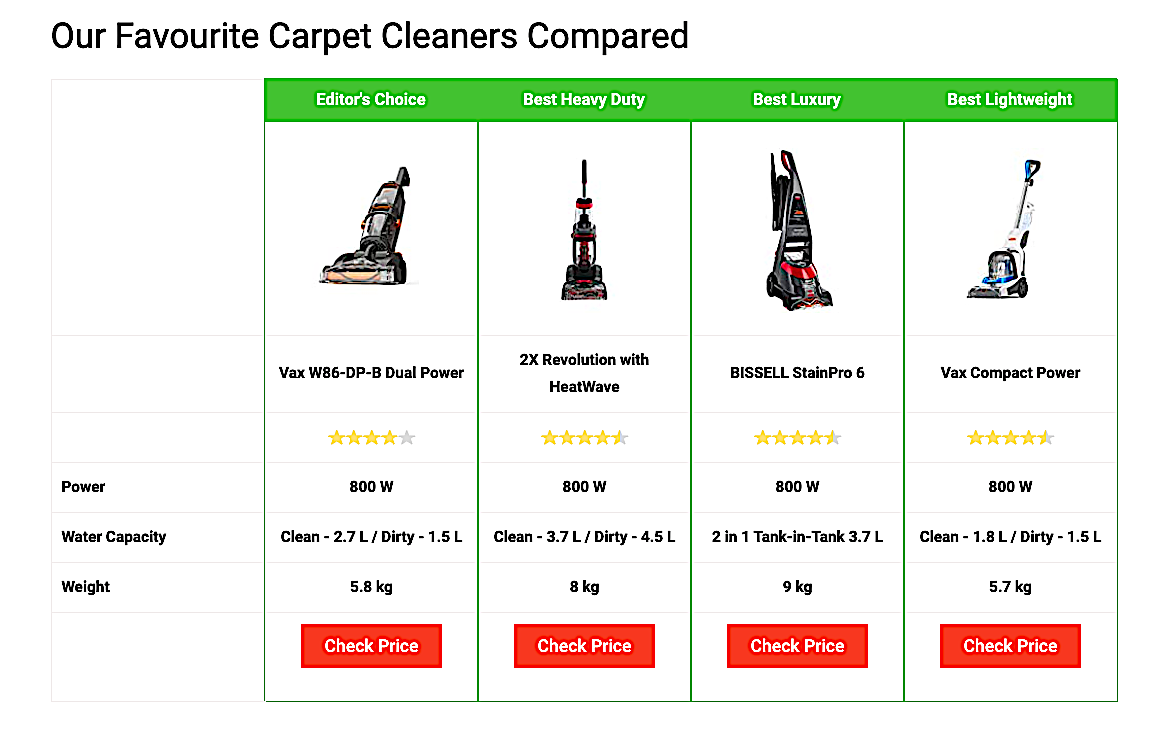
Source: bestspy.co.uk
Their review of carpet cleaners shows a summary of their selection of the top products, each with a subtly enticing, and highly visible call to action labeled: “Check Price.”
If the user wants more information on each of the products in their comprehensive review, these calls to action are repeated using the exact same format. As they interact with more information on the site, the red button (a color that’s used nowhere else on the page) is an instant reminder that they can move along the sales funnel in a way that doesn’t pressure them into making an instant purchase.
The psychology behind these calls to action is the topic of much research and debate, and finding the ideal label (“Check Price” vs. “Buy Now”) is largely dependent on understanding your target market, as well as quite a bit of A/B testing.
3. Provide Credible Social Proof
Using your landing page to show evidence that other customers are satisfied with your product or service is an excellent, proven method of boosting conversion rates. A staggering 87% of online shoppers kick off their shopping journeys by reading reviews. Even more importantly, more than 90% of shoppers trust customer reviews over traditional advertising.
It’s easy to see why building trust in your brand is essential when it comes to prompting a purchase — especially when you’re dealing with first-time customers. Fortunately, there are several effective ways of using social proof to boost conversions. Here are two of our favorites:
Content Snare adds excellent value to their customer feedback in a highly visible, attractive UI element that maps testimonials to three of their product’s unique selling points. Testimonials are given additional credence by showing not only the respondent’s photo and name, but also their company and role within it.
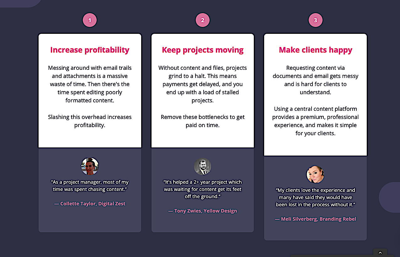
Source: contentsnare.com
TrustPulse goes the extra mile by showing purchases as they happen in real-time. This builds enormous credibility since visitors to this landing page know that these testimonials and reviews aren’t outdated or recycled.
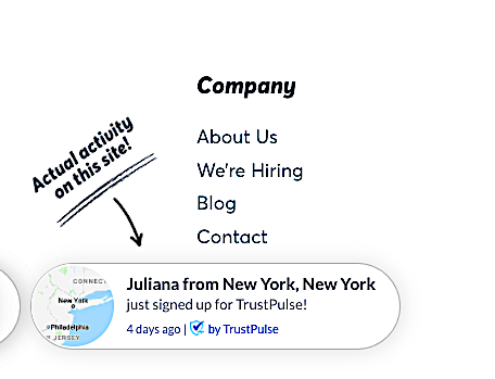
Source: trustpulse.com
4. Create Urgency
Using the Scarcity Principle, you are able to effectively (and ethically) manipulate the emotions driving an impulse buy. Not only that, but you’re also reducing the chances of your visitor “shopping around” and being snatched away by sites that do offer discounts and special offers.
Fear of missing out (FOMO) isn’t just some glib term that people use when justifying their questionable life choices. There’s solid business logic behind this concept — something that can be easily and effectively leveraged to boost conversions.
The folks over at Udemy have become experts at applying this strategy to their course landing pages by clearly showing the former price, the current, limited-time price, as well as the number of days left to make use of the deal. By placing this element right above a very prominent call to action, visitors to the page immediately create a visual link between the special offer and the button they need to click to activate it.
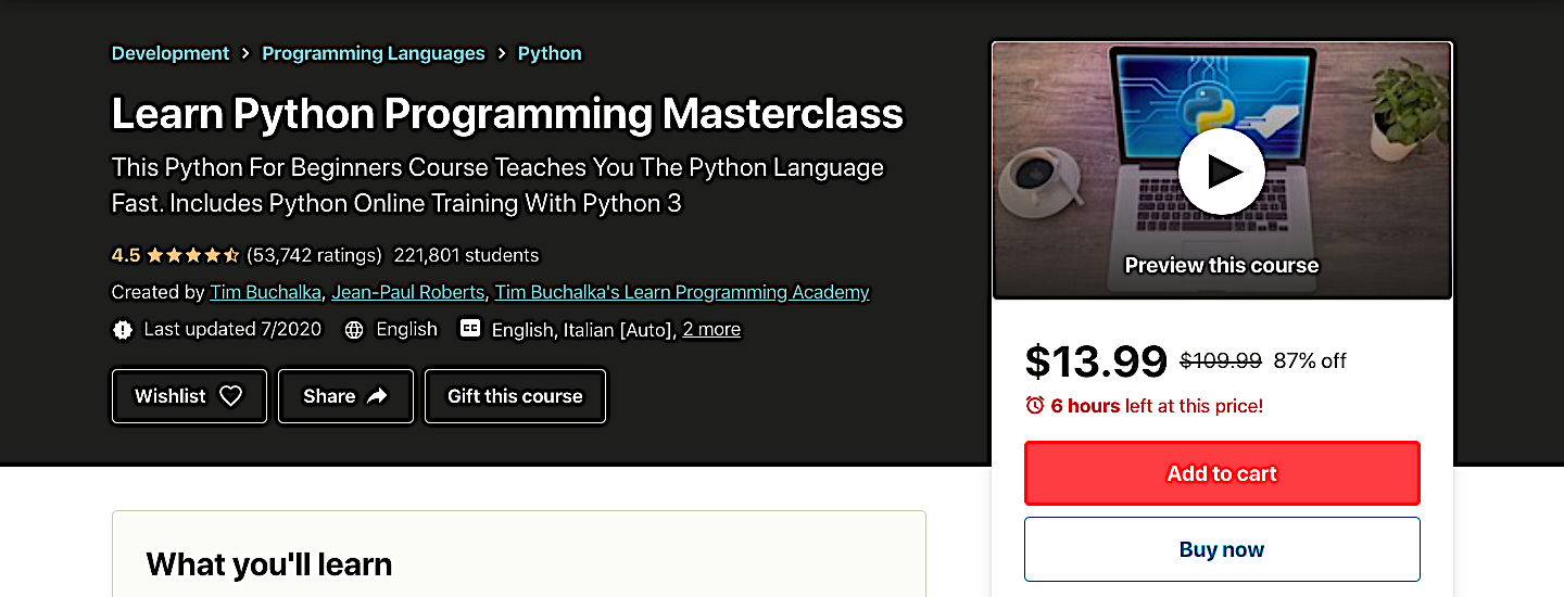
Source: udemy.com
Interestingly, limited-time exclusive offers can be used to not only boost sales, but also to build email subscriber lists. Light In the Box kills both birds with one stone by making a special offer for visitors who supply their email address.
Source: lightinthebox.com
5. Embrace Customer-Centric Messaging
Your landing page is the ideal space where you can instantly convey your product’s unique selling points to first-time visitors. One of the most effective approaches to doing this is to put yourself in your customer’s shoes when creating its content.
Ask yourself the question: “What is it that my customer wants to know about my product?” rather than “How can I create the best possible perception of my brand?” Typically, you have about 15 seconds to convey this message to your visitor, and if you’re not using this time wisely, you’re risking a high bounce rate.
ExiteBee’s Smart Exit Adds product is a terrific example of how to maximize landing page real estate to convey the product’s value propositions by using fast, attractive animations that focus on what’s important: the customer’s needs.
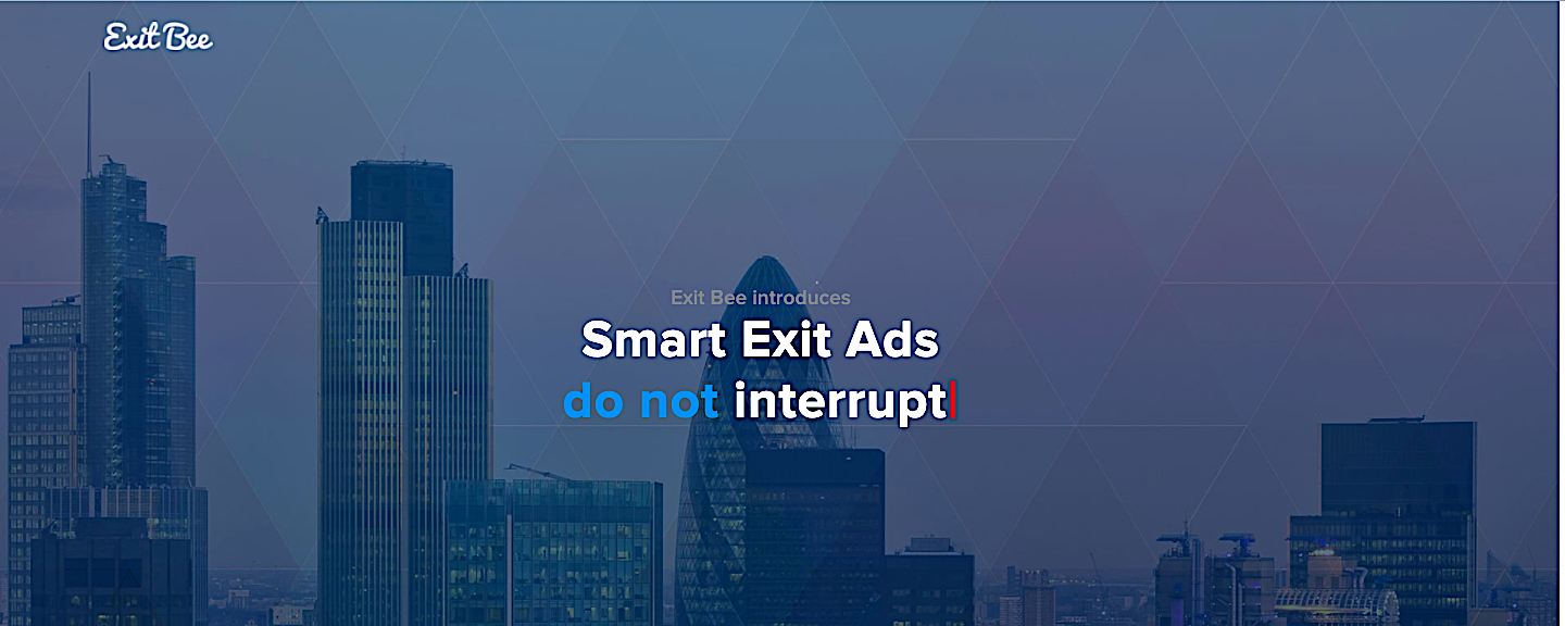
Source: exitbee.com
Closing Word
Your landing pages are a critical tool for boosting conversions and growing your business. They’re worth investing all that time and effort, so make sure to follow our tips and be ready for a lot of testing and tweaking.