Since the rise of the mobile browsing, web developers and webmasters were always in the process to offer mobile-friendly websites. Because of the advancement in handheld devices, people use mobile phones and tablets for their daily needs. Even in many aspects desktops are being replaced by those lightweight and easy-to-carry devices. Since a large number of people browse the internet from mobile phones, it becomes essential to keep your site readily available for them, with the complete interface as big resolution.
Bootstrap 4
Bootstrap is the most popular front-end framework, made for the users of all skill levels. A tech-geek or a rookie developer, everyone can use it for their mobile-ready website making. Bootstrap 4, the newest release of Bootstrap web framework, has come with a lot of facilities so that users can perform their task with more ease and efficiency.
Bootstrap 4 Features
Here are the new Bootstrap 4 features. Continue reading to know more about what the latest version offers.
Faster CSS Preprocessor With Sass
Saas is a bigger and more popular community than LESS. Bootstrap has been using LESS until the new release. Now it’s faster than ever along with a robust styling tool. The number of Sass developers is growing for the program’s easier functionality and better usability.
Flexbox for Malleable Layouts
Flexbox (also known as flexible box) generally works to provide supple layouts. It also splits the space in particular container without caring the actual size of it. The container, based on the flex layout, is capable of altering the height or weight of items, by giving no command.
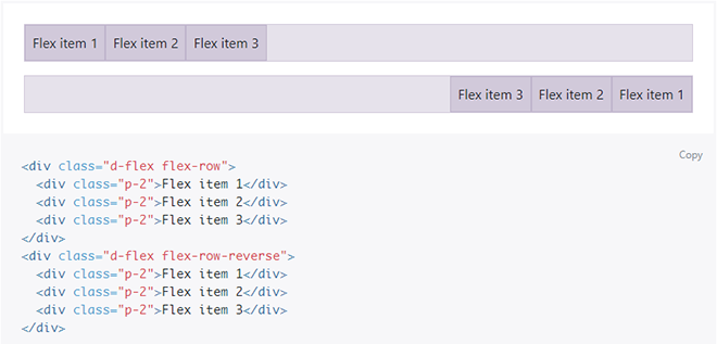
You’ll make everything on your site based on flexbox if you’re working with Bootstrap 4. As flexbox accommodates every single website on all kind of devices, you have nothing to worry regarding mobile responsiveness. Put it simply, with cleaner code; any layout is possible to form.
Improved Grid Tier for More Adjustment
When you’re building a site, your target users may come from any device. Hence, it’s crucial to make the site scalable on different viewports. From the beginning, Bootstrap ensures maximum visibility of a website across the available device; people use for different purposes.
The new Bootstrap comes with improved and advancement grid system. Previously there were 4 grid systems to the Bootstrap 3. Now the default class .col- for the screens less smaller than 576px. The newly added prefix is .col-xl- that accommodates 1200px or bigger screens.
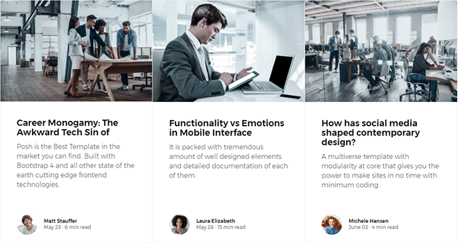
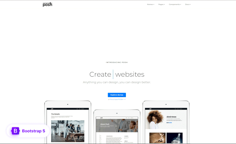
Cards: A Novel Component
Bootstrap 4 introduces a new component named as Cards. It’s an expandable and container for contents with several flexible options. You’ll find options for headers, footers, background colors, and strong display choices. Some old components as panels, wells, and thumbnails are no more in the new version. Cards replace the all of them.
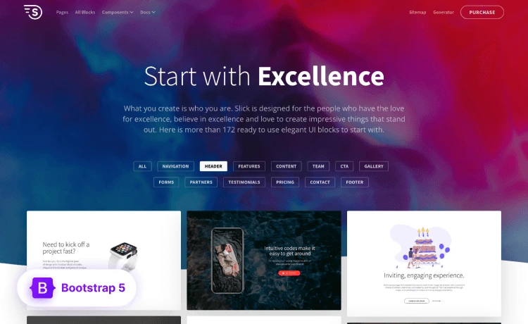
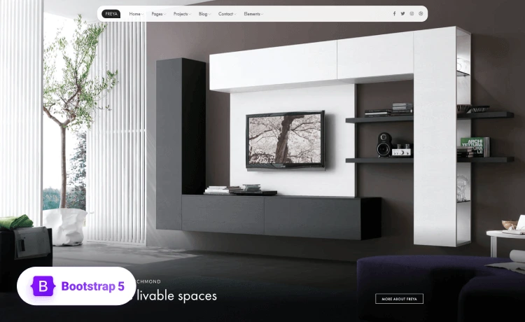
The image of the cards below was taken from Posh – digital agency. Check this beautiful Bootstrap 4 template now.
More Customization In A New Way
Replacing the old styling options Bootstrap 4 brings them in a different way. The previous styles for grid classes, shadows, gradients and others no more exist in the new version. Instead of these establishments, there are Sass variables to do the same job. By updating a variable one can have the default transition or see no changes on other elements, as well.
Drops The Support for IE8 and IE9
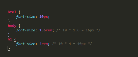
One of the smartest steps of Bootstrap 4 is dropping the support for IE8, IE9 and other older version of browsers. Also, it will use REMs and EMs to make the typography more readable for responsive websites. Since they moved from pixels, web developers now can implement responsive elements for smooth visibility and wonderful experience. If you need support for IE8 or IE9 or other older browser versions, use Bootstrap 3.
All JS Plugins Updated
By rewriting all JavaScript plugins in ES6, Bootstrap 4 is well-prepared to take benefits from latest JS improvements. There are other specifications available like option type checking, teardown methods and more. Altogether, you will find this amazing framework more efficient than it was before. With the up-to-date features of JavaScript, the new Bootstrap 4 runs faster.
Improved Tooltips, Popovers, and Dropdowns
In the new version, Bootstrap 4 uses tooltips and popovers with the help of Popper.js, a popular JavaScript library. You can now keep an element next to another element where both are perfectly positioned and on the same page. However, Bootstrap 4 websites will place tooltips and popovers smoothly and automatically.
New Reboot Component
Bootstrap used normalize.css for CSS reset, previously. The new Reboot module doesn’t use it anymore. They didn’t discard it totally rather adding some own rules inside it. After taking the normalize.css, they changed it and added some things so that one can use it relevantly. Because of this change, the Reboot includes all generic styles in an SCSS file which is easy to use. Take a look to see how it works.
Documentation: Enhanced and Redesigned
They rewrote it and redesigned it. The docs are now easier to read with new useful plugins and code snippets. There’s also a new search form to look out what you need inside the document. As the documentation is well-designed and well-informed, users won’t stumble upon working with the new Bootstrap 4.
New Tools and More
Previously, Bootstrap writes build tools in Grunt although it’s not same anymore. They changed the technology and now replaced Grunt with NPM that help to simplify the development process. As a result, you find world’s best frontend framework with a better and enhanced experience for the users.
Updated Utility Classes for Spacing
In Bootstrap 3, you’ve used several utility classes for different purposes. Now there are more classes in Bootstrap 4 for making your work easy and fast. With these new utility classes, web developers can make a change on spacing functions: paddings and margins.
Bootstrap 3 vs 4
| Component | Bootstrap 3 | Bootstrap 4 |
|---|---|---|
| Source CSS | LESS | Saas |
| Primary CSS Unit | PX | REM |
| Global Font Size | 14px | 16px |
| Default Fonts | Helvetica Neue, Helvetica, Arial, sans-serif | Native font stack (user’s system fonts), with a fallback to Helvetica Neue, Arial, and sans-serif |
| Grid Tiers | 4 tier grid system (xs, sm, md, lg) | 5 tier grid system (xs, sm, md, lg, xl). |
Here you are
Get Bootstrap 4 here. If you have applied the tool in your sites then you’ll understand the difference easily. Even if you’re a first-time user, you can use the framework for better and for awesome mobile-conscious sites. After all, Bootstrap 4 features are for more efficiency and quicker jobs. Furthermore, get a Bootstrap 4 template and start building the website for all the devices available in the world.


