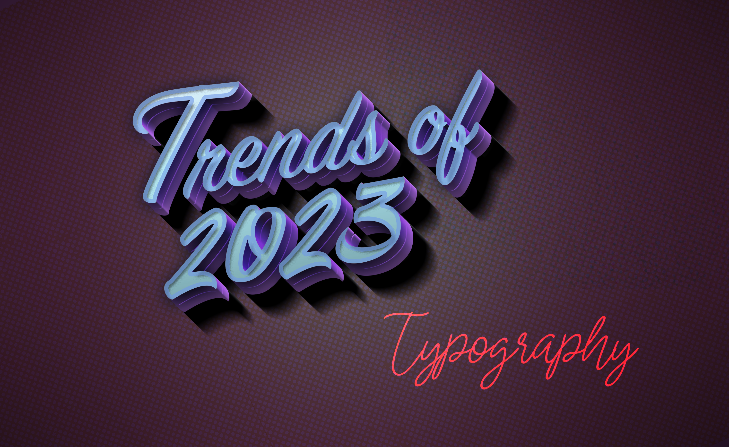
From brand identity to conveying a message virtually, typography plays a crucial role in how you tell a tale. It’s much about ‘how’ you say it now, rather than what you want to say. As for branding, typography communicates the value, tone, and personality as well as through other stylistic materials like layouts, color schemes, illustrations, and styles. This is why, designers and developers should be acquainted with the ongoing typography trends, and we here aim to ease that up for you.
As we are talking about the typography trends of the year 2023, we tried to cover almost all rising typography trends, while also referencing a versatile collection of typeface families so that you can understand the ongoing web design styles in compare to the past ones thoroughly and accordingly.
Vibrancy in Visual Forms
This trend in typography pairs different types of fonts in versatile, powerful ways. There are different approaches to incorporating this into your style. Let’s see some unique uses of this trend:
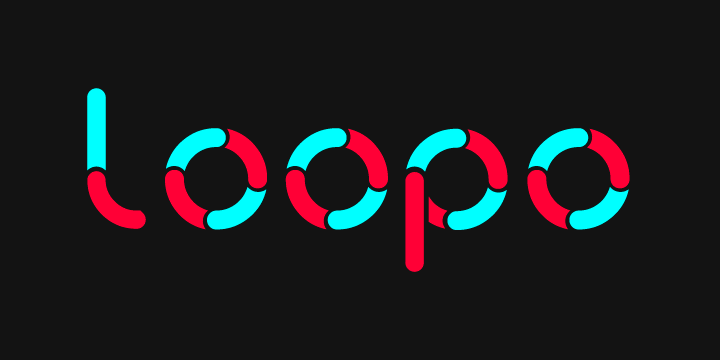
Loopy
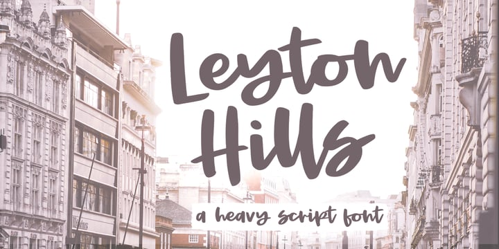
These typefaces are often used to give static designs a sense of organic movement and a human touch. If mixed with exciting colors, the bouncing fonts express assurance of change and progress since they look like they are in motion.
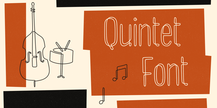
Quintet by Lauren Ashpole
Loopo Stencil by Little Fonts
Leyton Hills by Rachel White Art
Subtle
This typography trend offers a unique pairing style, unlike the conventional font pairings in layouts. This trend can set the brand’s tone of voice, as this pairing offers a more private feel. Subtle pairing offers endless possible pairings that can help you find the perfect tone for your brand.
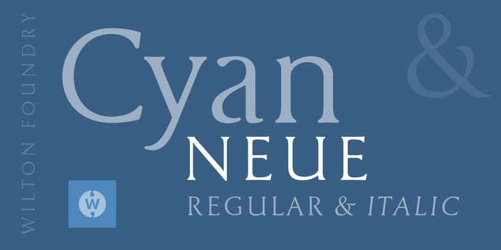
Cyan Neue by Wilton Foundry
DT Paper Type by Dragon Tongue Foundry
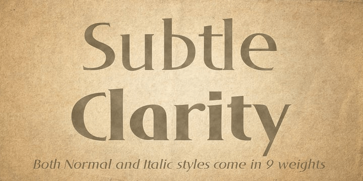
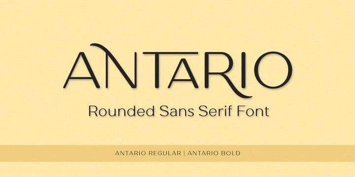
Antario by Locomotype
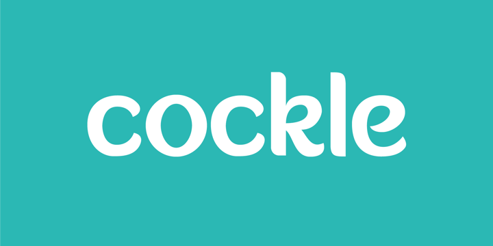
Cockle by Joy Studio
Subtle Sci-Fi
As technology becomes crucial in our everyday lives, sci-fi is encroaching into every design aspect, from style to typefaces. Designers are opting for new approaches to incorporate sci-fi aesthetics into typefaces. This trend emerged from merging natural components with scientific futurism and making it natural.
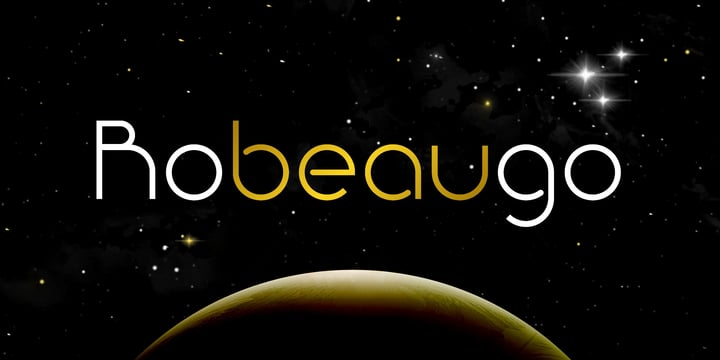
Robeaugo by Stephan Kamperman
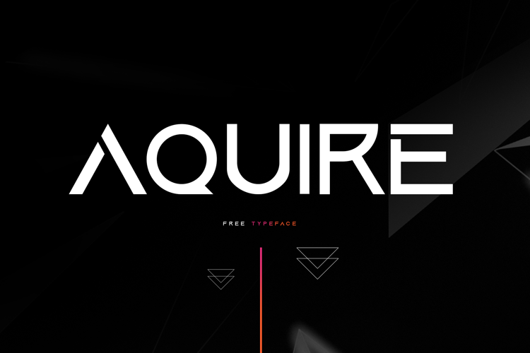
Aquire Font by Sesohq
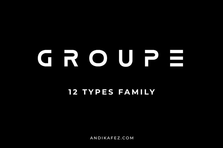
GROUPE Font by andikafez
Getting Wild with Good Olds!
This is an evolution of another pre-existing typography trend. The typefaces blend art & science structures, shifting shapes by quarter or half circles. Although grids are the main showpiece here, the grids are cut precisely with sophistication.
80s Editorial
These typefaces are inspired by the early 1980s’ prominent and familiar typefaces which were wildly used in different print media. These typefaces are still widely used with unique twitches incorporated into them.
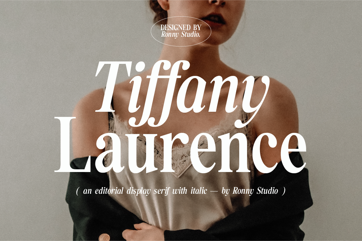
Tiffany Laurence Font by Ronny Studio
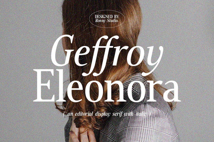
Geffroy Eleonora Font by Ronny Studio
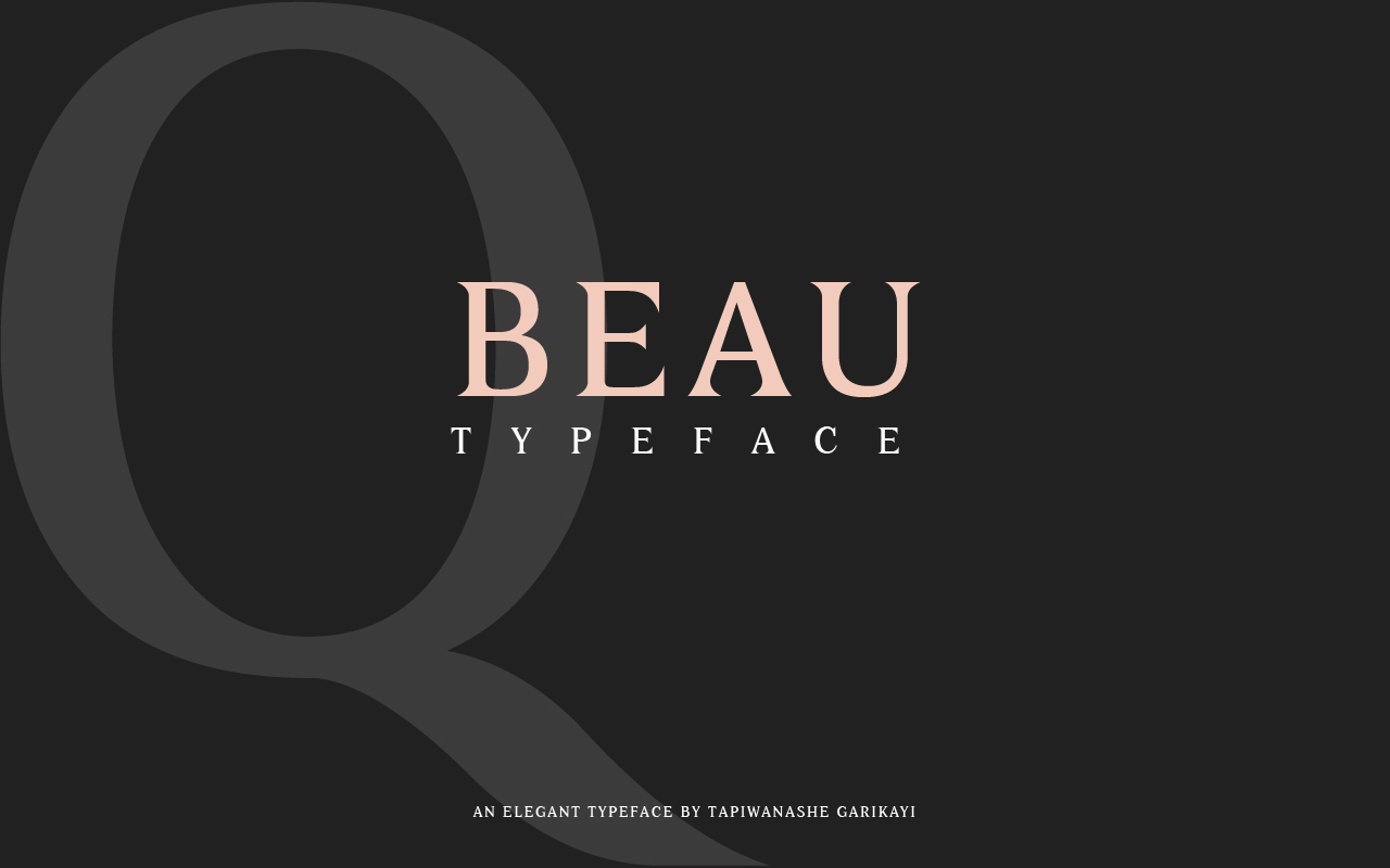
Beau Font by sebgarrydesign
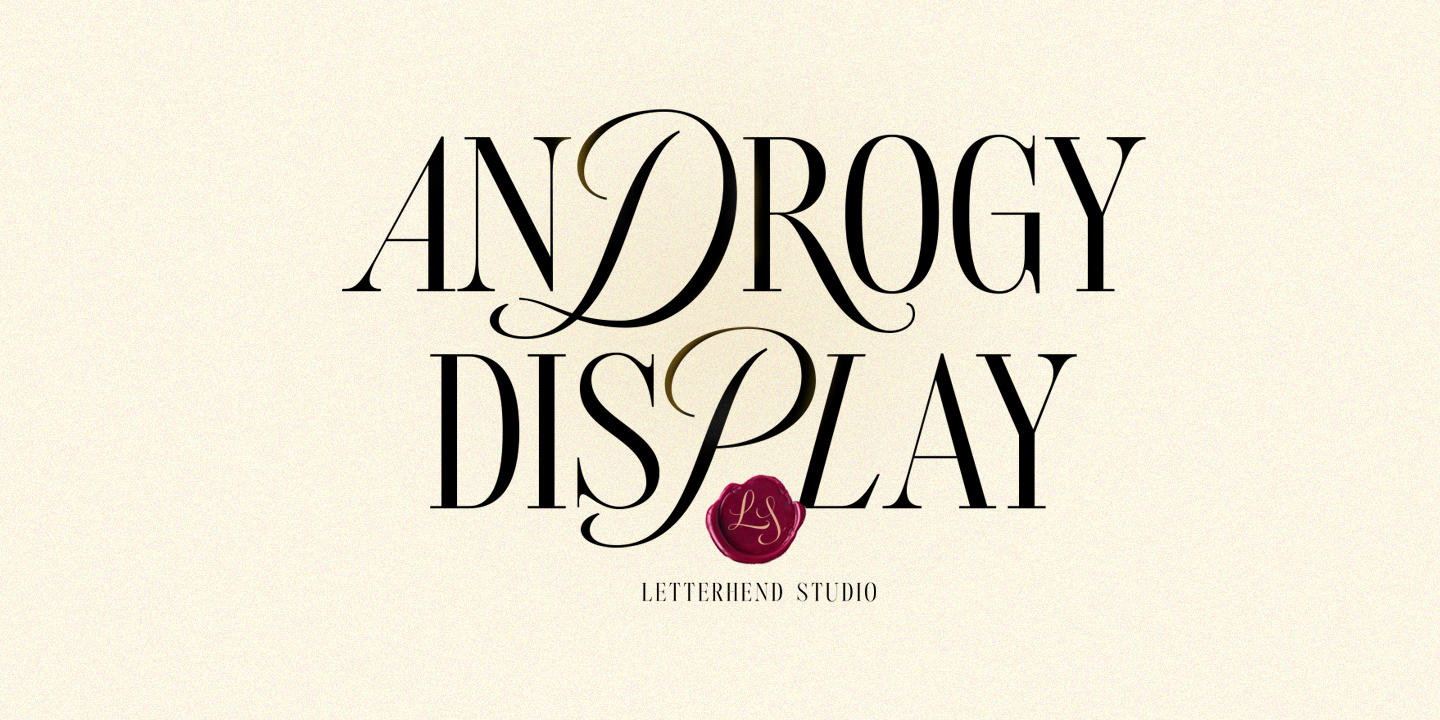
Androgy Font by Letterhend Studio
Retro Condensed
Retro condensed typefaces originated as designers opted to accommodate as much text on a page while making the fonts narrower and condenser. These fonts always highlight the attention to clean geometric shapes. This year, these fonts favor the typestyles from the 50s to the mid-80s while being paired with modern sci-fi aesthetics.
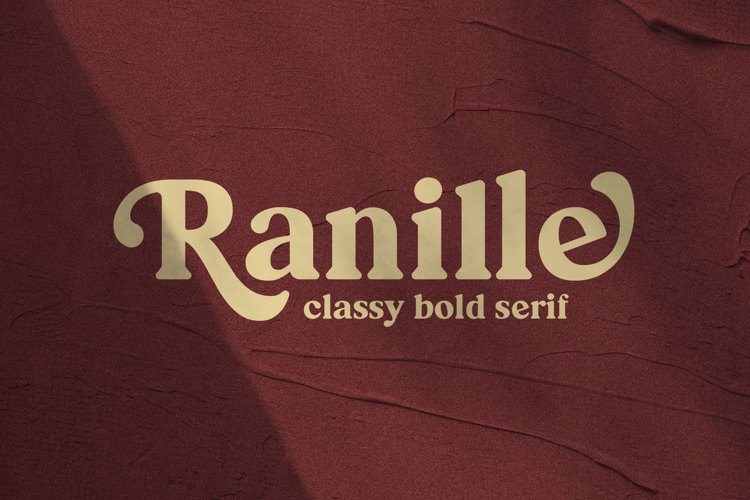
Ranille Font by Arterfak
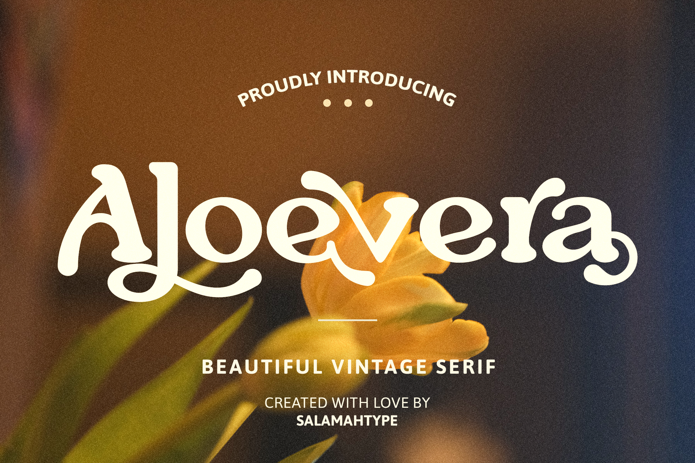
Aloevera Font by salamahtype
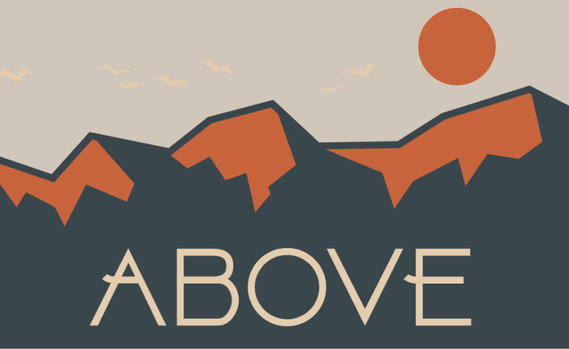
Above Font by Herofonts
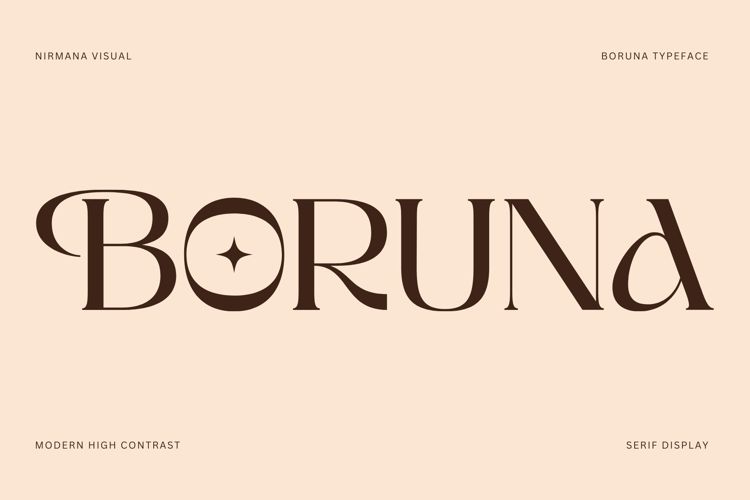
Boruna Font by Nirmana Visual
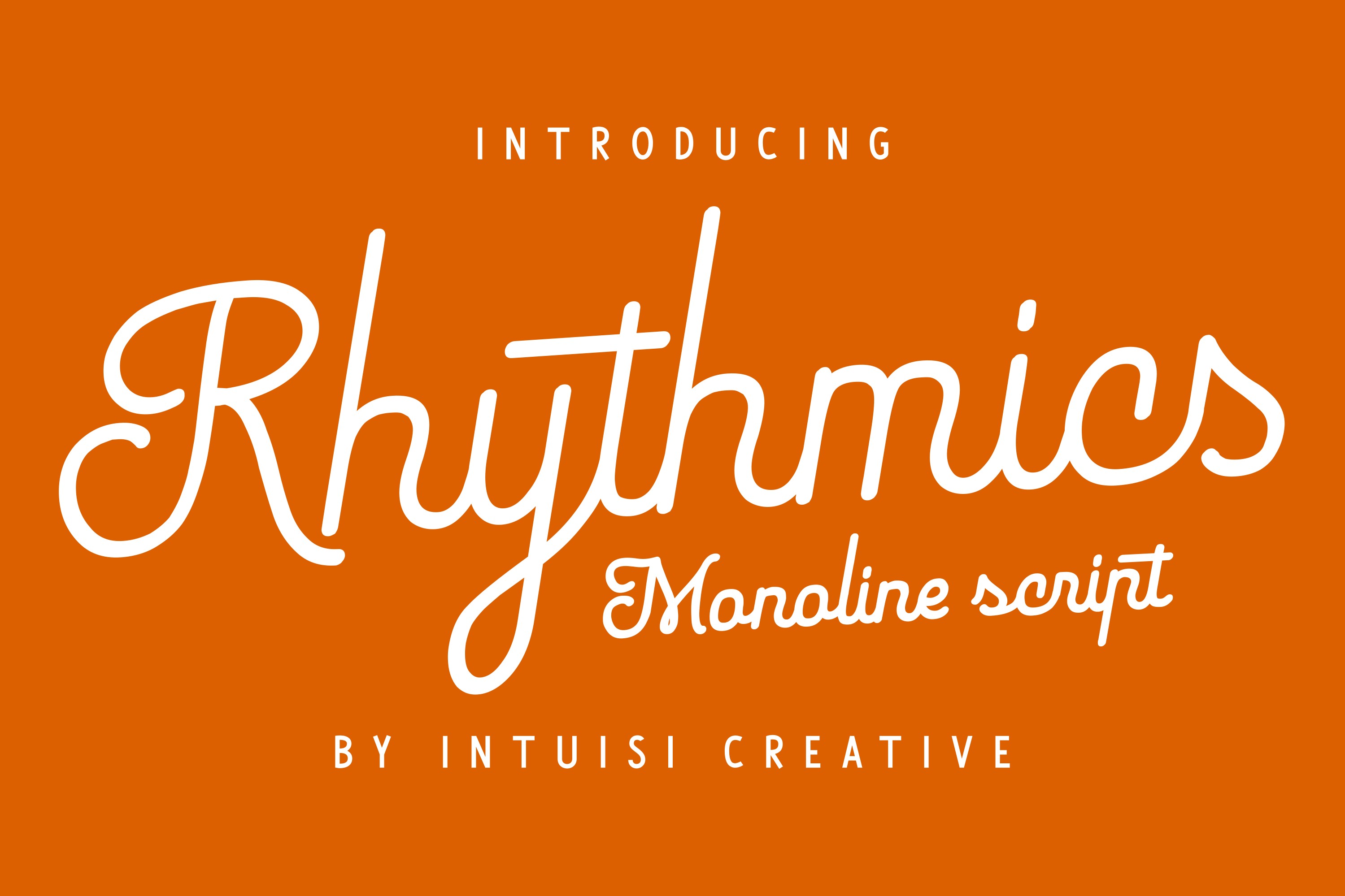
Rhythmics Font by Intuisi Creative
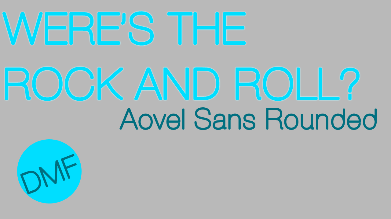
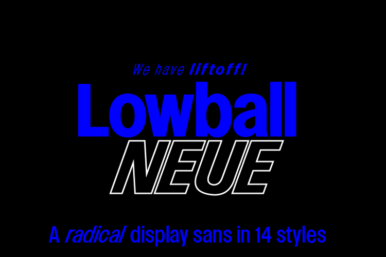
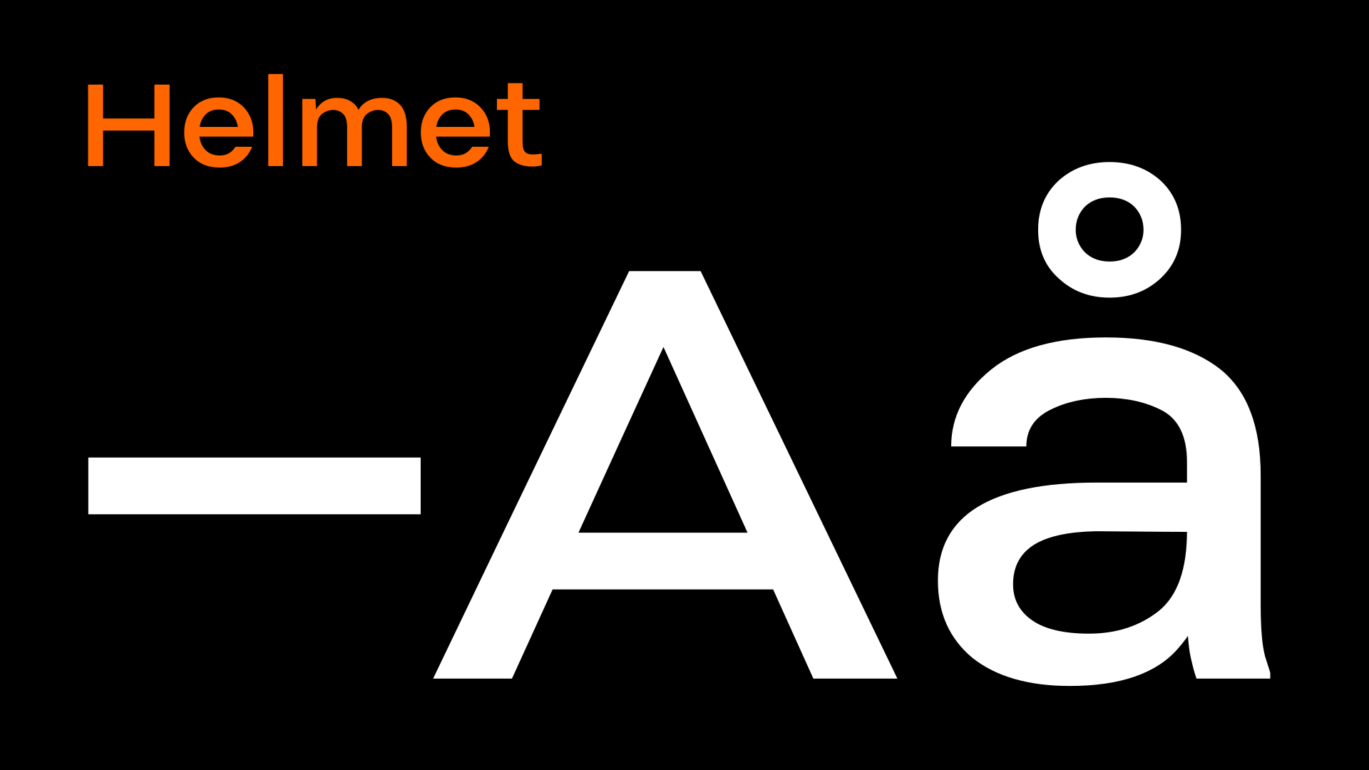
Classic Modernism
Classic Modern fonts are mostly from the serif font family, which primarily originated from the Swiss graphic designs of the late 60s. This font family adds versatility to otherwise classic designs. Subtle tweaks and twitches to them can help you incorporate them better into your design.
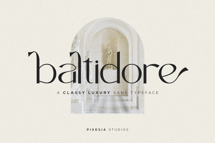
Baltidore Font by Pixesia Studio
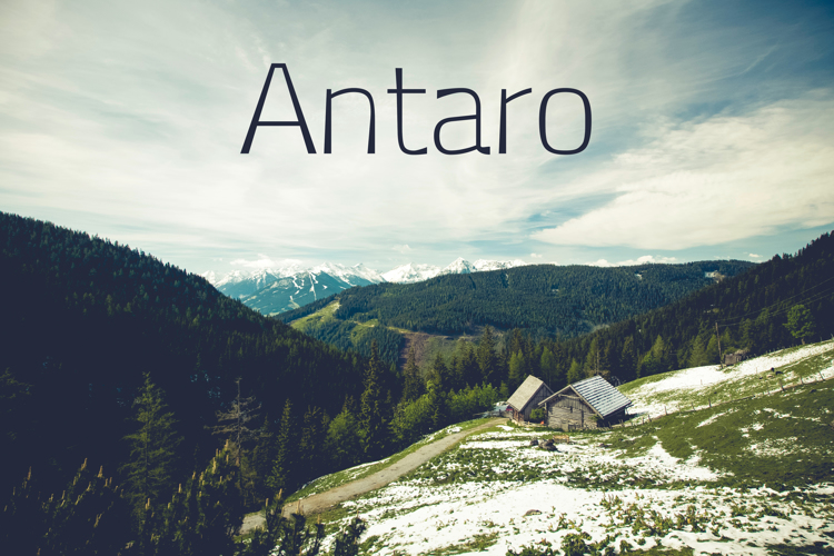
Antaro Font by Eldamar Studio
Aovel Sans Rounded Font by Álvaro Thomáz
Lowball Neue Font by Quinn Davis Type
Helmet Font by carlenlund
Looking Sharp
This trend is about curving fonts into perspective with shadows and outlines. The fonts are often tilted or skewed. This style is a blend of explosive colors and fonts. This trend offers a comic-book vibe with electrified and dramatic vibes and is bold, loud, and fun to incorporate into a design.
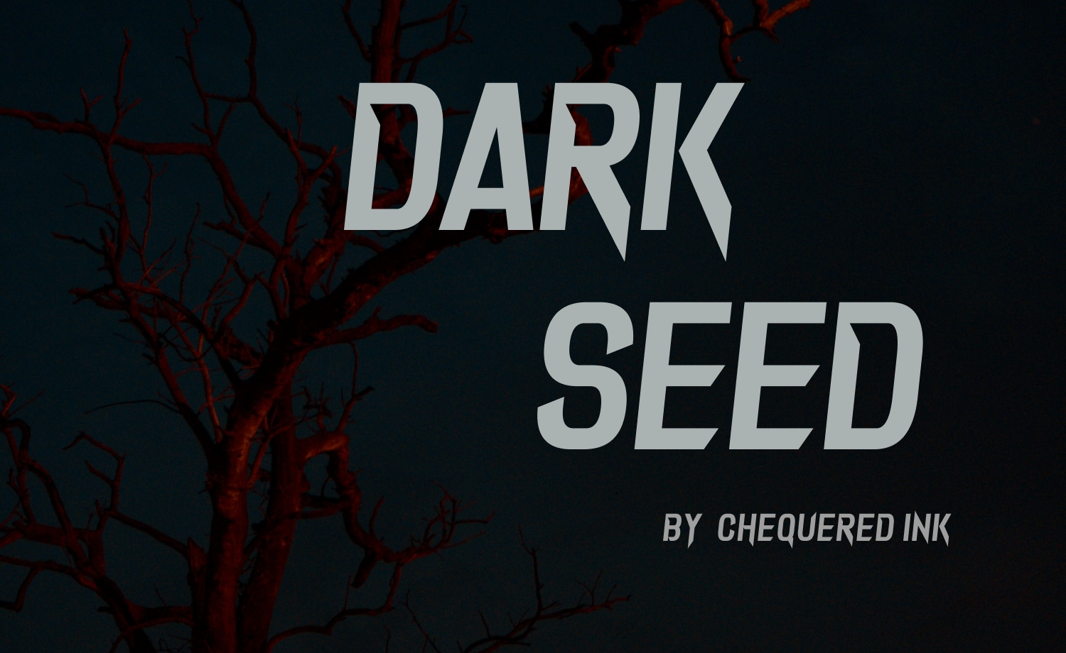
Mall Goth Fonts
Mall-goth is a reversion of the post-goth subculture. The resurgence is rooted in a commercialized subculture, and designers are now drawing the inspiration to incorporate and create unique typefaces. Smoky forms and sharp edges paired with black or dark backgrounds.
Dark Seed Font by Chequered Ink
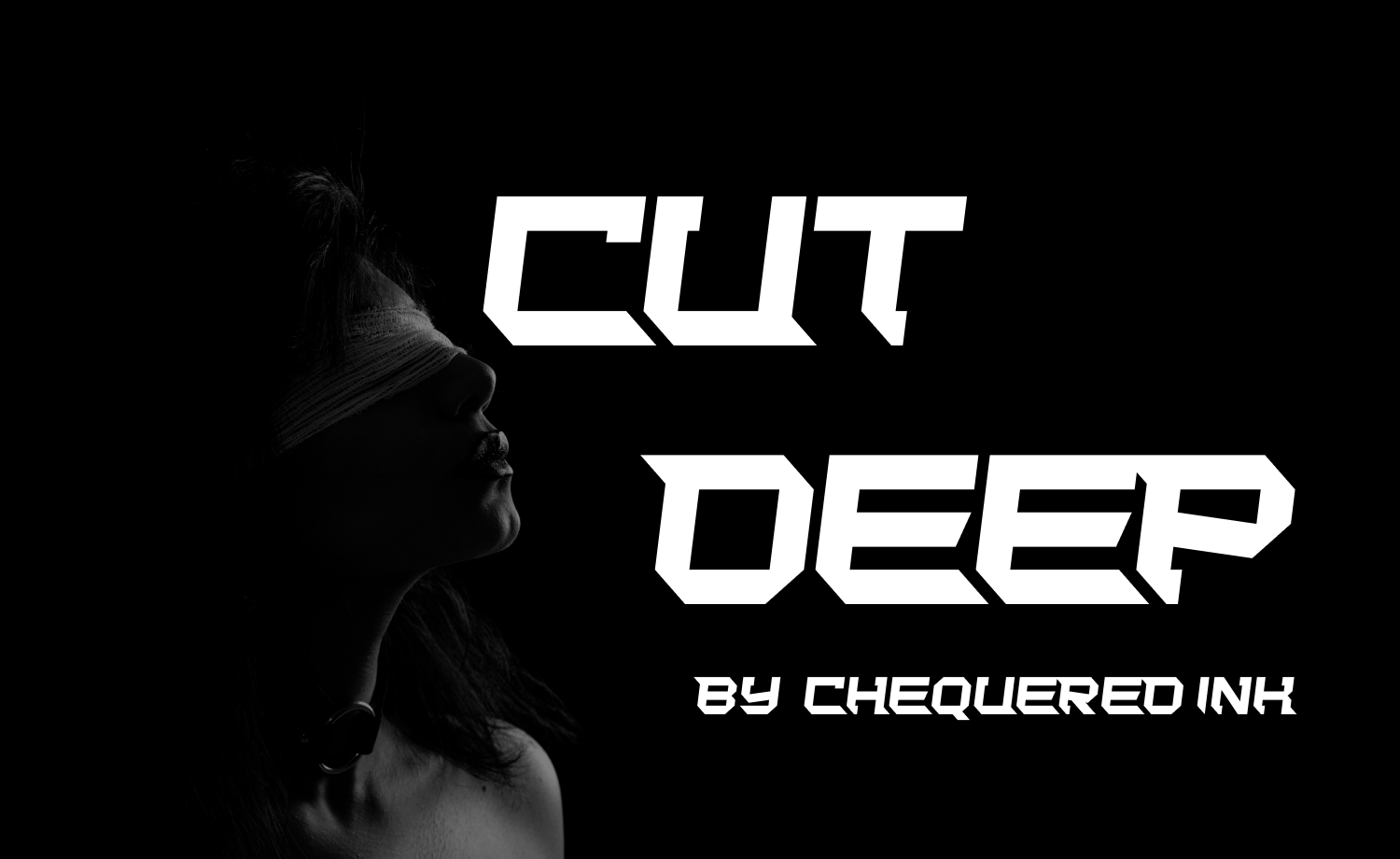
Cut Deep Font by Chequered Ink
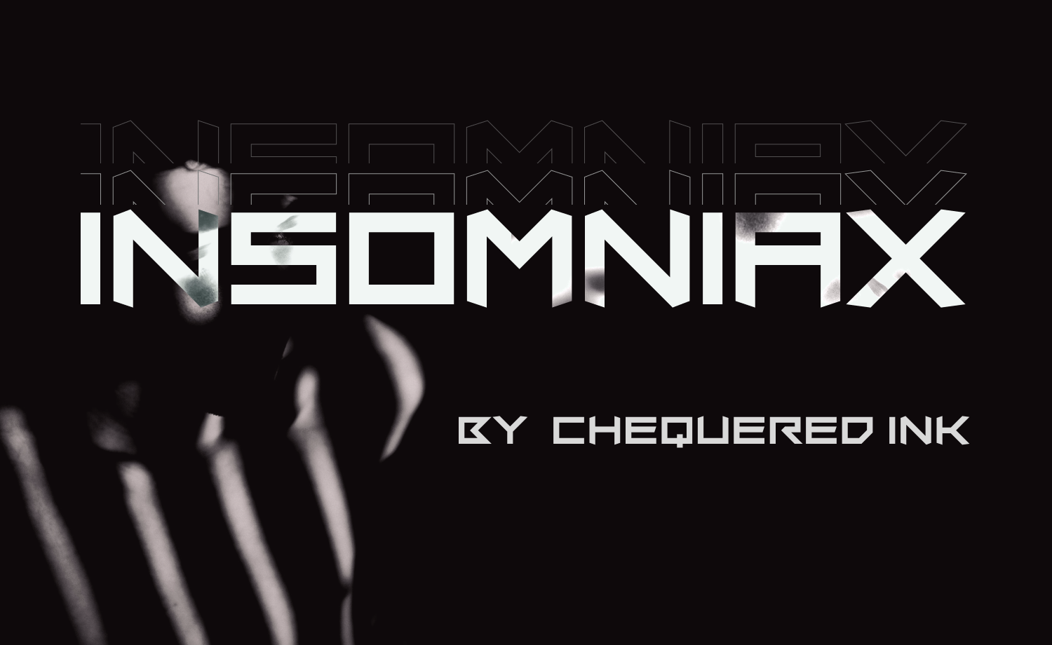
Insomniax Font by Chequered Ink
Calligraphic Mix
As discussed in the previous blog, people are now getting back to scrapbook aesthetics. This led people to rethink calligraphy and designers to add twists to their designs with calligraphy lettering. These letters are mostly seen on fashion or lifestyle websites, though they’re becoming more popular nowadays.
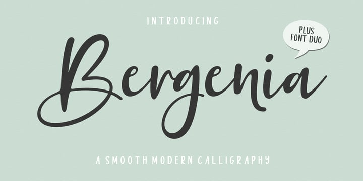
Bergenia Script Font Duo by Zane Studio
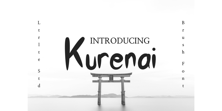
Kurenai by Letterlite Studio
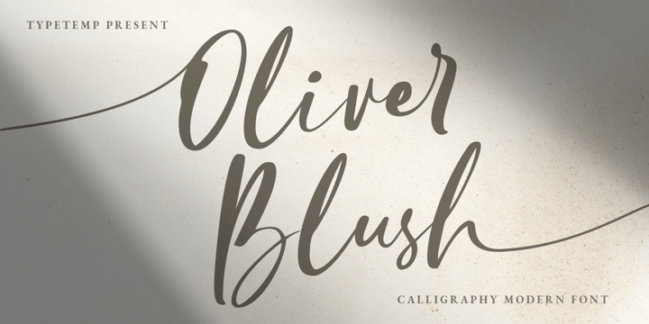
Oliver Blush by Typetemp Studio
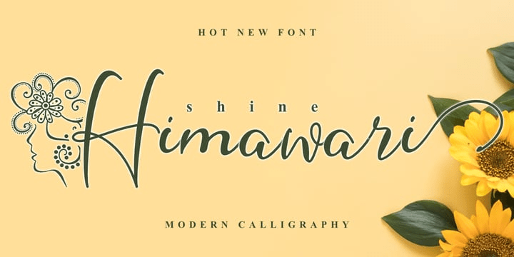
Shine Himawari by Andrey Font Design
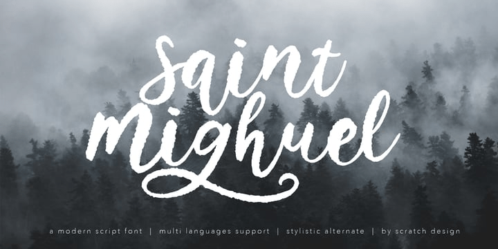
Saint Mighuel by Scratch Design
Take A Moment of Peace
This typography trend is simple, centered, and often black and white. Though this underlying trend never goes away completely, it remains notable due to its contrast to the unapologetic exuberance of mix-ups and superhero fonts. These typefaces do not overpower the branding and maintain sophistication when paired with calm and natural color palettes to appreciate the materials.
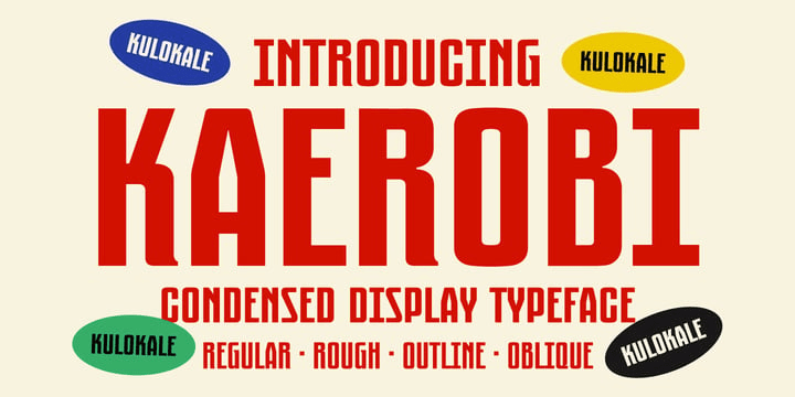
Mid-Century Modern
Mid-century modern typeface style is defined by clean, straight lines, natural tones and defined structures. Inspired by the 50s fashion and style statements, this typeface style creates a stylish middle ground between highly organized and structured geometry and engaging design decisions.
Neutraface Slab Text by House Industries

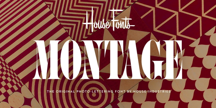
Montage by House Industries
MGT Vallery Hills by Magetype

Kaerobi by Kulokale
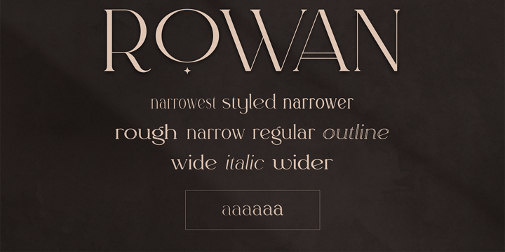
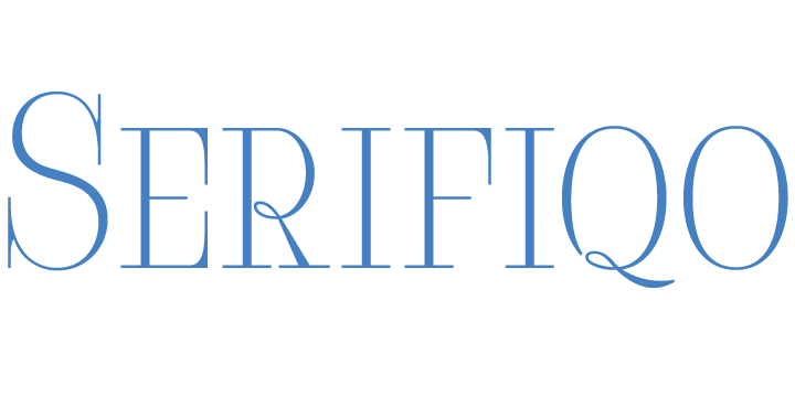
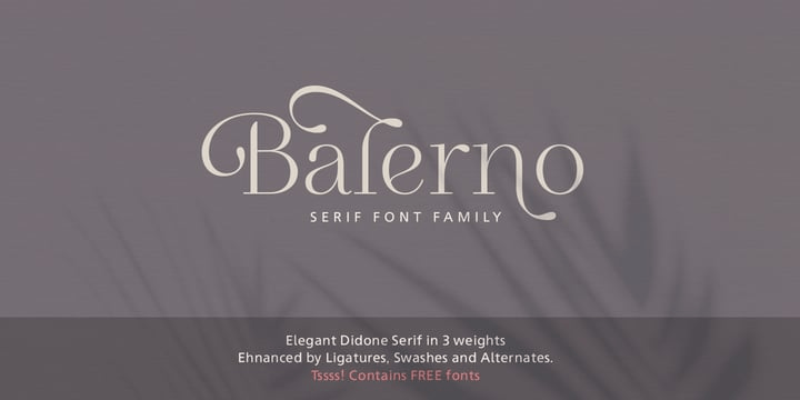
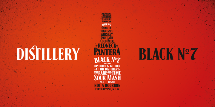
Vintage Narrow Serifs
Though mostly seen in fashion websites and magazines, vintage narrow serif fonts are getting more and more common with a more sophisticated look. This font family is used to recreate a sense of familiarity through various mediums.
Rowan by VP Creative Shop
Serifiqo 4F by 4th february
Balerno Serif by My Creative Land
Black No.7 by Typocalypse
Making the Cut!
This typography trend is about cutting down on the exaggerated feeling of sharpness by removing the pieces. Some variations of them involve cropping them to add a third dimension, sometimes to convey an animated feel.
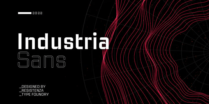
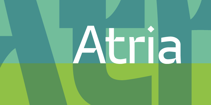
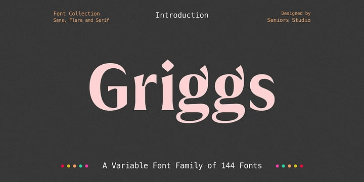
Ink Traps
Adding unconventional details to prevailing sans serifs is what this trend is about. This influences the design approach by making the fonts act as ornamental elements rather than the functional elements they used to be.
Industria Sans by Resistenza
Atria by AVP
Griggs by Seniors Studio
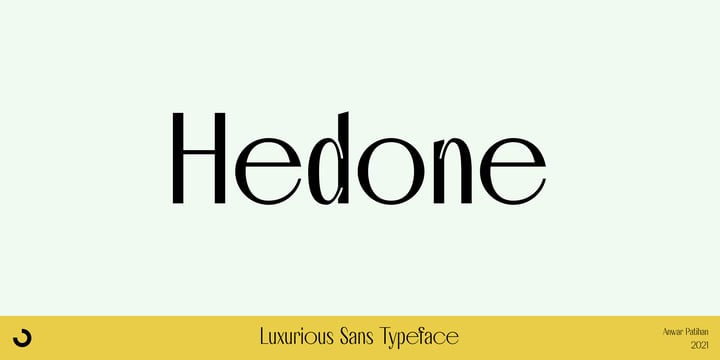
Hedone by Jehoo Creative
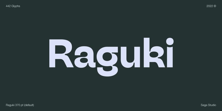
Raguki by Saga Studio
Hypertension
This trend is unique to this year. These fonts have a sharp point of interest. Though they often appear flat, they create visual tension and a focal point in the design. These fonts consist of diagonals, adding dynamic energy to the design. The hypertension typeface trend looks rather tech-y and organized while also maintaining spontaneity and uniqueness.
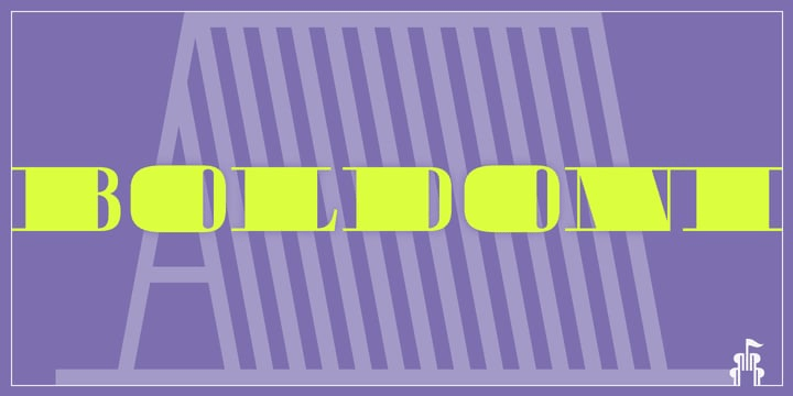
Boldoni by Forte Type
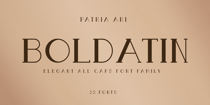
Boldatin by Patria Ari
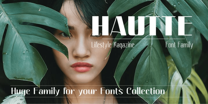
Hautte by Anomali Creative
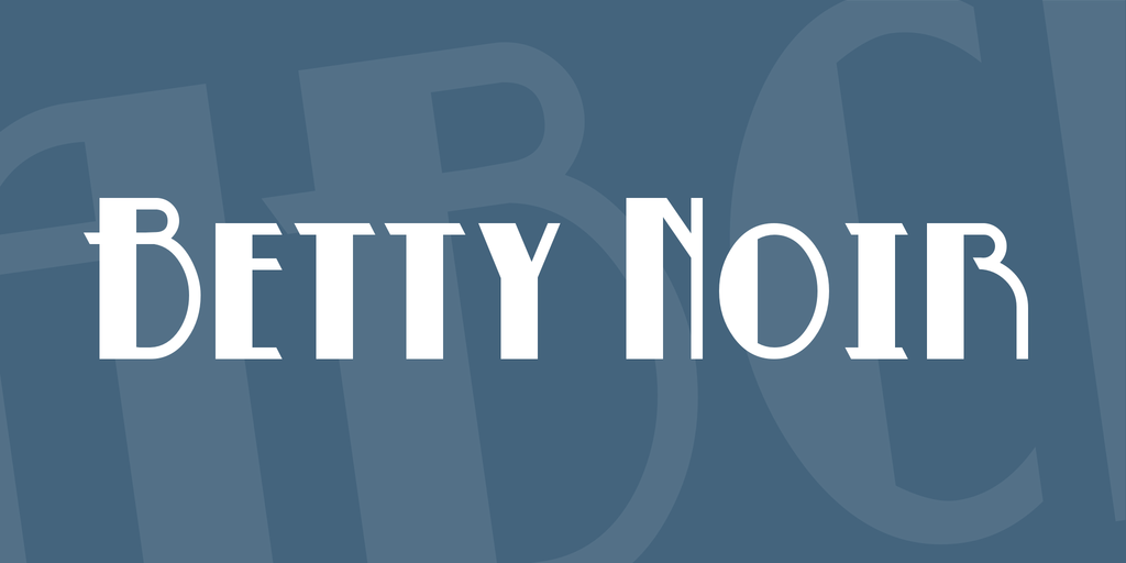
Betty Noir Font by Blambot Comic Fonts
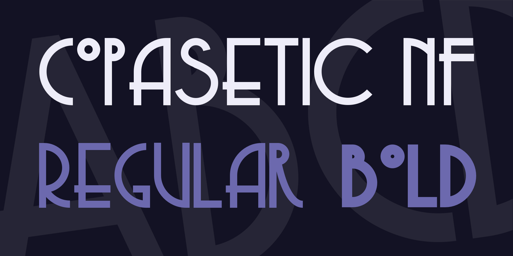
Copasetic NF Font Family by Nick Curtis
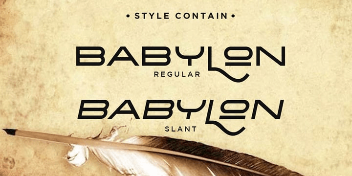
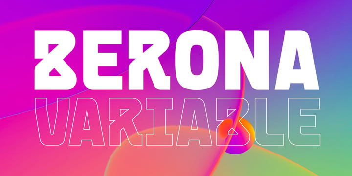
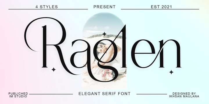
Goofy Sans Serifs
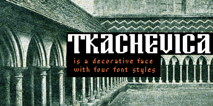
These serif fonts are visually cleaner than most, as they’re useful to balance the simplicity and clean lines of a design and help with the display style with their characterful nature. These fonts are perfect for casual and informal designs as they add a cartoon-like twist to the design.
Tkachevica by Tkachev
Babylon by Haksen
Berona by Alex Camacho Studio
Raglen by IM Studio
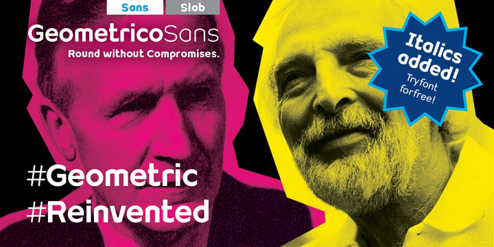
Geometric Sans Serif Fonts
Sans-serifs are highly functional fonts and designers often try to tweak the typefaces to create unique layouts and maintain visual appeal. These fonts establish the tone of clear communication and speak to the desire to access site contents thoroughly.
Geometrico Sans™ by FSdesign-Salmina
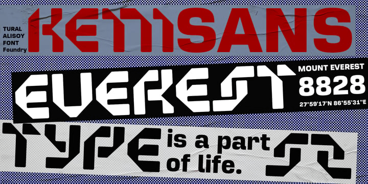
TA Kenisans by Tural Alisoy
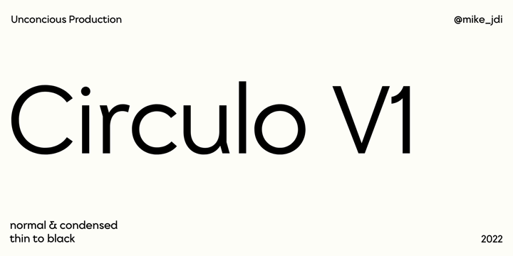
Circulo V1 by MMD Fonts
Karacho by alphabeet.at
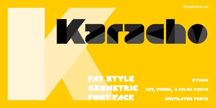
Karacho
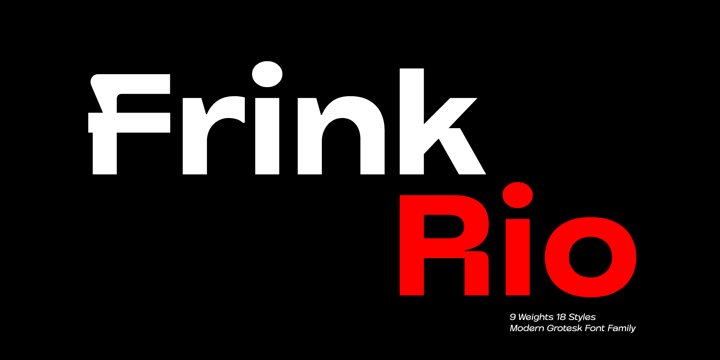
Frink Rio by Brenners Template
Adding Moments of Interest
This trend blends nostalgia with our latent love for digital tools and gadgets. Sometimes these are created by adding moments of interest, meticulously adding pixels for texture and playfulness. This trend emerged from the earliest digital experiences.
Art Deco revival
This is a font family that is instantly recognizable due to its unique visual appeal. These fonts are made by combining elongated letters and vertical decorative line details with geometric rounded shapes. Designers are now tweaking these otherwise general sans-serifs with their unique contemporary spin on them through digital media.
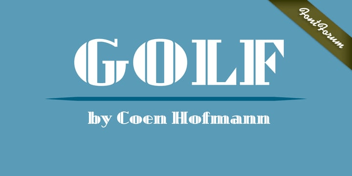
Golf™ by FontForum
Artisinal by Stiggy & Sands

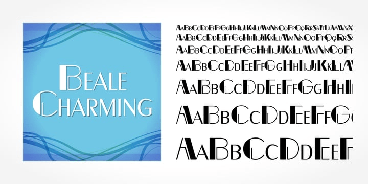
Beale Charming by SoftMaker
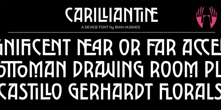
Carilliantine by Device
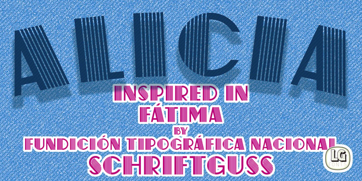
ALICIA LGf by LGF Fonts
Make it Move & Catch the Eyes!
Variable fonts and morphing fonts are around nowadays since they convey a moving and animated feel to the design. Types and letter forms are designed in static images to enforce the “caught in motion” feel. These fonts open up a new window to the near AR-VR future in the three-dimensional world.
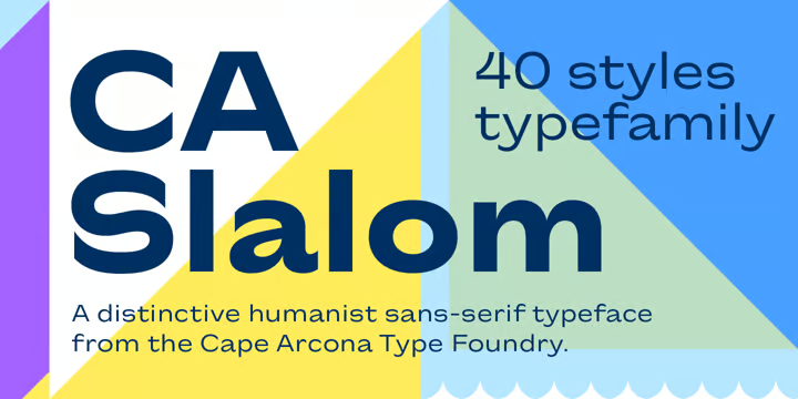
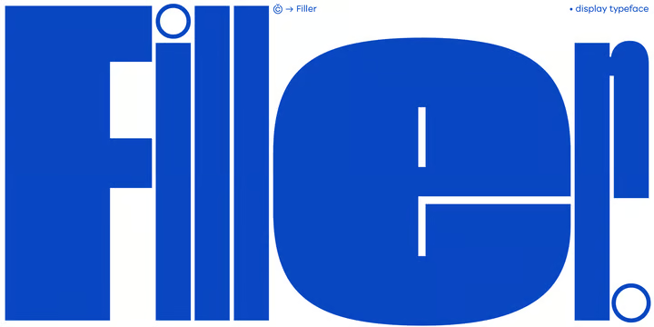
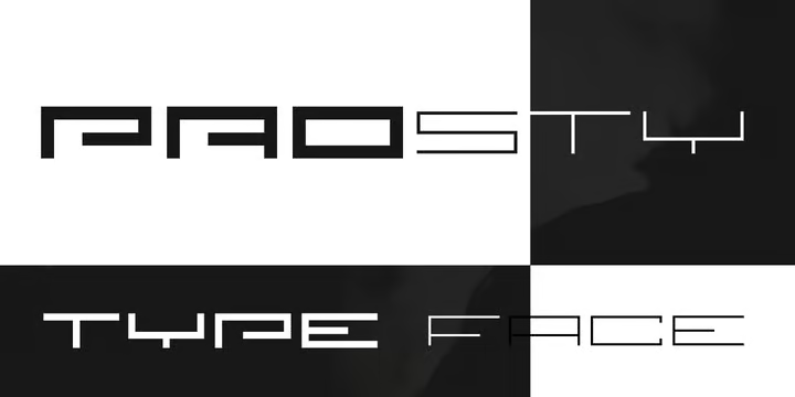
Extended
This font family is used to showcase powerful, confident, stable, and luxurious uses of type. Their distinct shapes and proportions give a sense of movement and speed. Often, they evoke the idea of circularity. This typeface stands out among most others across all platforms and applications.
CA Slalom Extended by Cape Arcona Type Foundry
Filler by CarnokyType
Prosty by Fontsphere
Augmented with Typography
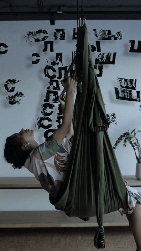
As typography unfiltered every aspect of web life, it should as well be interesting. This is a year of augmented and virtual reality and so designers now animate typefaces. This has opened a unique way toward interactive design as typefaces involve the audience better.
Augmented Reality & Motion Typography by Alex Slobzheninov
СЛЫШ PODCAST FESTIVAL IDENTS by Multiple Owners
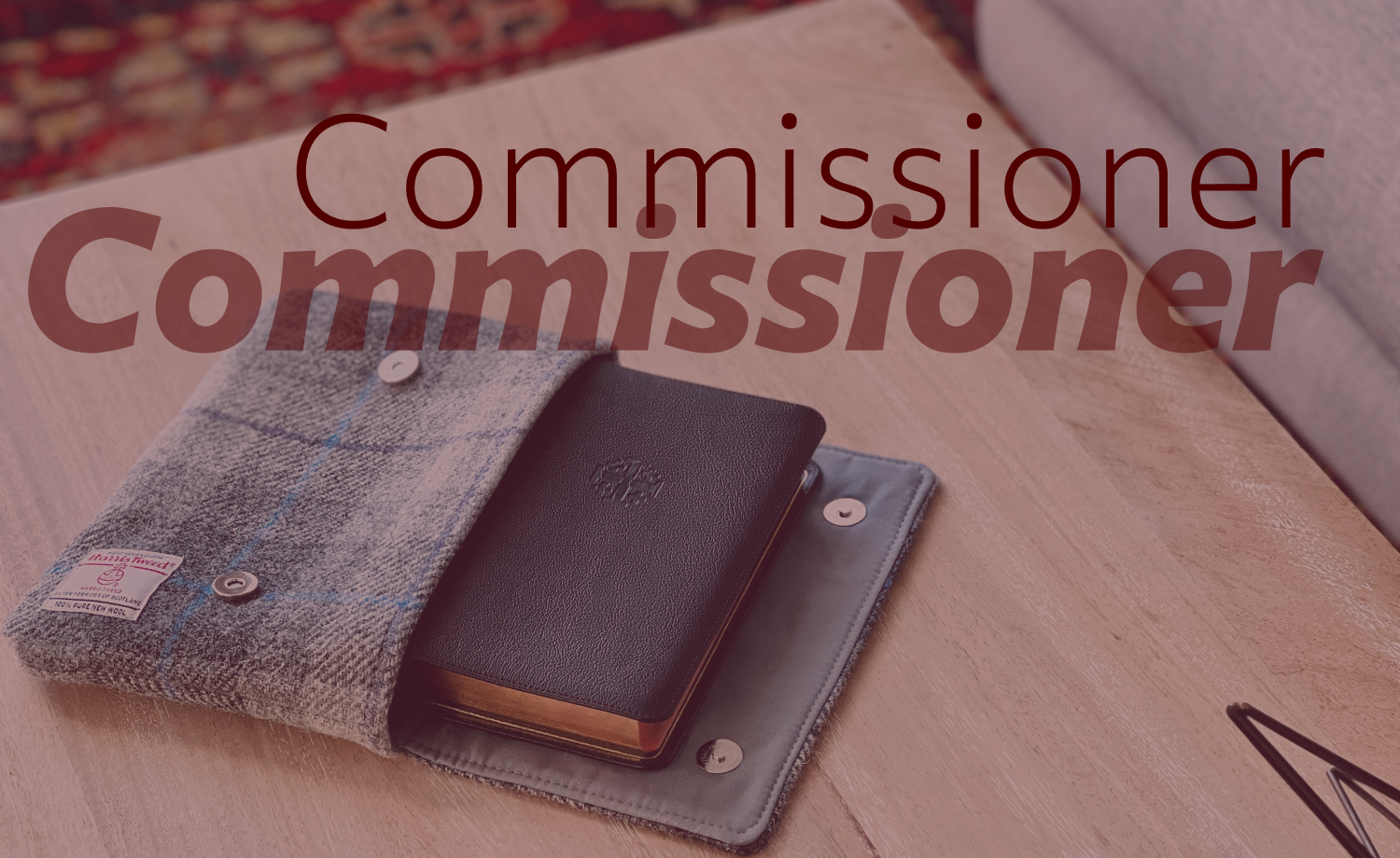
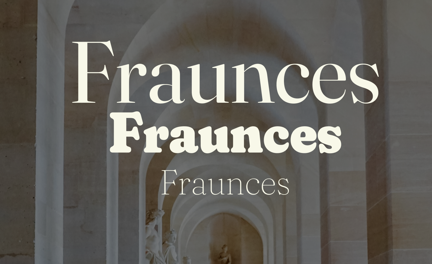
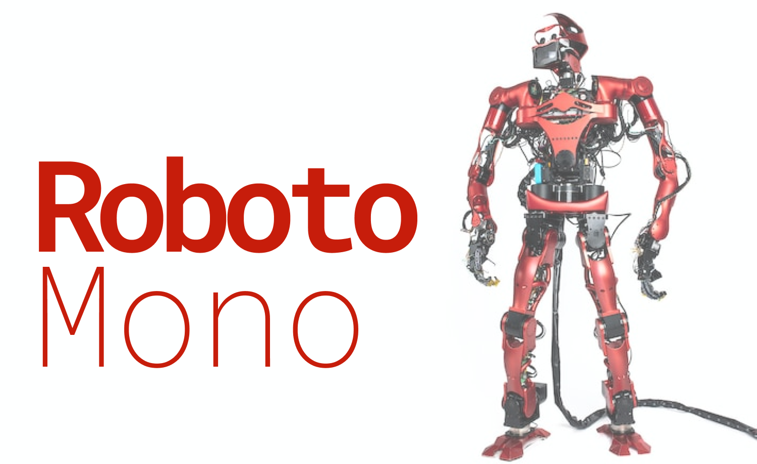
Custom & Variable Fonts
Custom and variable typefaces are on trend with the rise of augmented reality and virtual reality. Typefaces are customized to be more inclusive and accessible to all the different people visiting the site.
Commissioner by Kostas Bartsokas
Fraunces by Undercase Type, Phaedra Charles, Flavia Zimbardi
Roboto Mono by Christian Robertson
Mash & Blend!
This typography trend incorporates varieties of elements with typefaces, such as icons, illustrations,
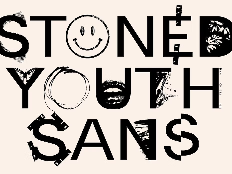
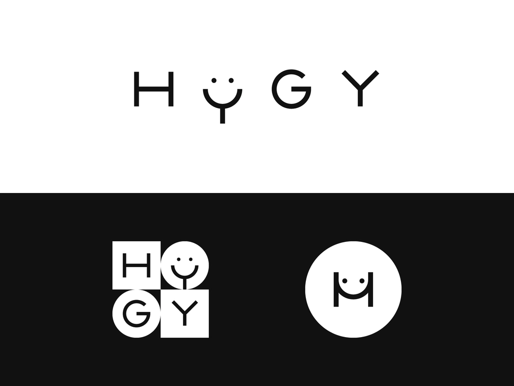
Iconographic Mashups
With the rise of technology and digital creative media, designers are now integrating icons, doodles, and abstract shapes into letters to create unique typefaces. These fonts reject uniformity to favor a rather chaotic collage style.
Iconography by New Tropical Design Studio
Teach Me How to Hygy by Blankenship
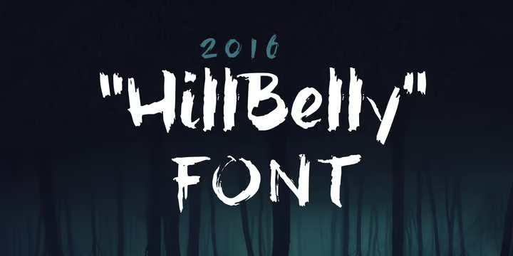
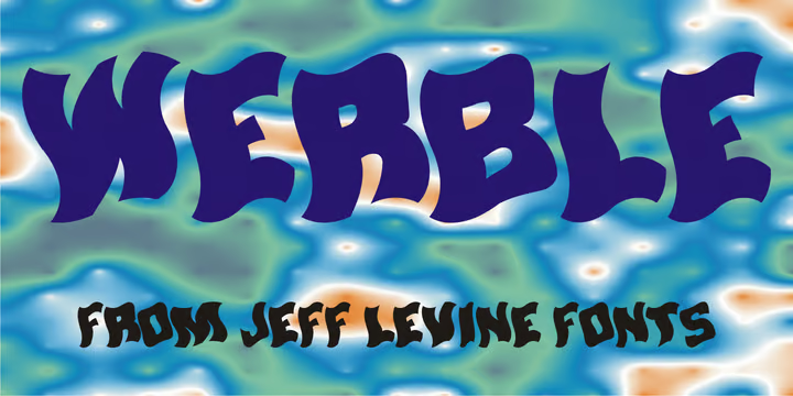
Distorted Fonts
These typefaces are obscured or overlaid imageries containing wrapped letter forms that are unconventional to look at. These typefaces work as visual metaphors and are most useful while designing interactive components.
hillBelly by JOEBOB graphics
Werble JNL by Jeff Levine
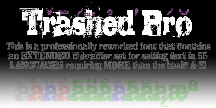
Trashed Pro by CheapProFonts
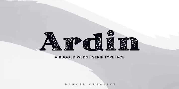
Ardin by Parker Creative
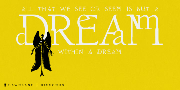
Dissonus by Dawnland
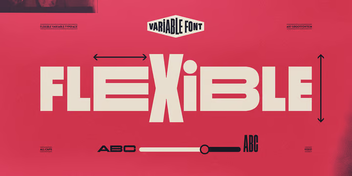
Flexible Fonts
While accessibility is crucial for web content, flexible and illustrative fonts are also becoming a necessity. These fonts give out a flowy and animated feel to the contents and are available in multiple weights. These typefaces can be incorporated to give an animated feel to the contents.
Flexible by Art Grootfontein
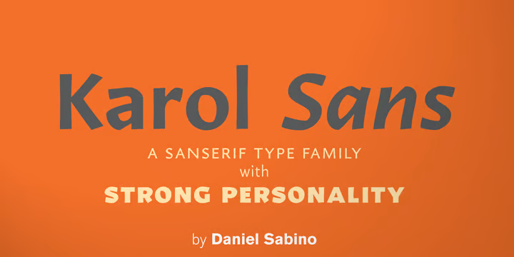
Karol™ Sans by Type-Ø-Tones
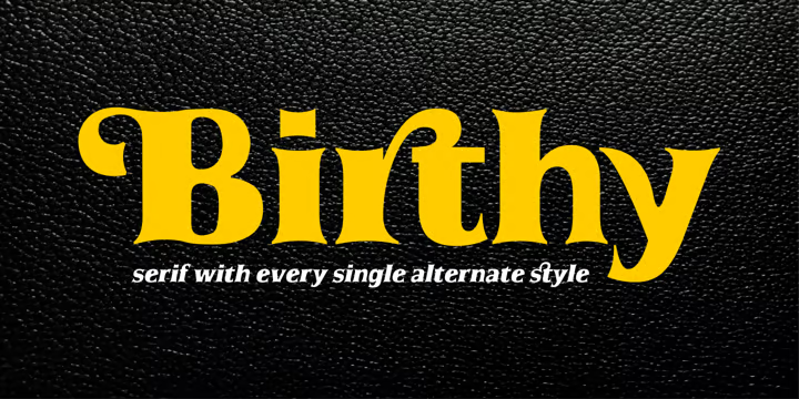
Birthy by ZetDesign
The more Liquid it is, the Better
A new, yet widely accepted and incorporated typography trend is using liquified fonts. Liquified fonts are typefaces that include realistic and abstract elements while appearing fluid with an undefined shape. This style incorporates sci-fi vibes to express escapism as an imperfect yet aesthetically appealing visual.
Liquid Chrome
Liquid Chrome originated from incorporating renewed optimism through 3D textures and shapes. The trend is characterized by mashups of realism and abstractionism by 3D rendering and formless fluidity.
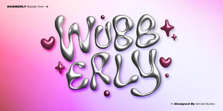
Wubberly by Set Sail Studios
Solvent by PintassilgoPrints
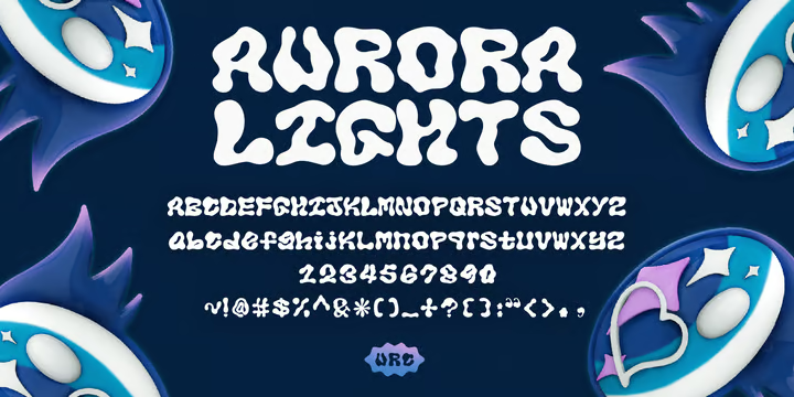
Aurora Lights by Lazy Holiday Studio
Psychedelic Minimalist
This style of typeface is used to offer a distinctive aesthetic that can make your design project stand out among the crowd. It’s the complete mash of warped and altered aesthetics suitable for different applications.
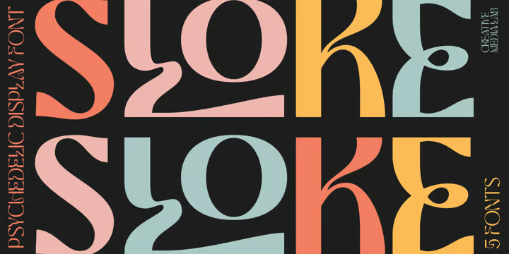
Sloke by Creativemedialab
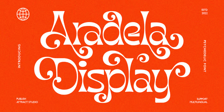
Aradela Display by Attract Studio
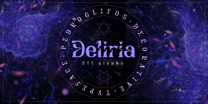
Deliria by Pedroglifos
The Co-creation Era
As artificial intelligence is becoming a familiar name in today’s world, we see a lot of ways to get immersed in tech. The co-creation era is showing the uniqueness of the typeface world in designing rather interactive fonts and icons, creating unique typography trends. The idea is to connect the audience visually with an aesthetic touch.
AI Painting
AI-designed letters can be a new way of font design and development. Technologies like Midjourney can help bring out all the latent possibilities regarding typefaces. We can see a bunch of collaged look of the usual, regular letters.
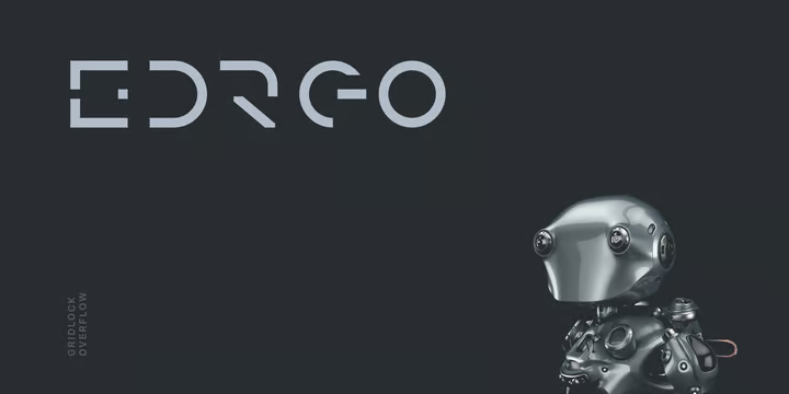
Edrgo by Baqoos
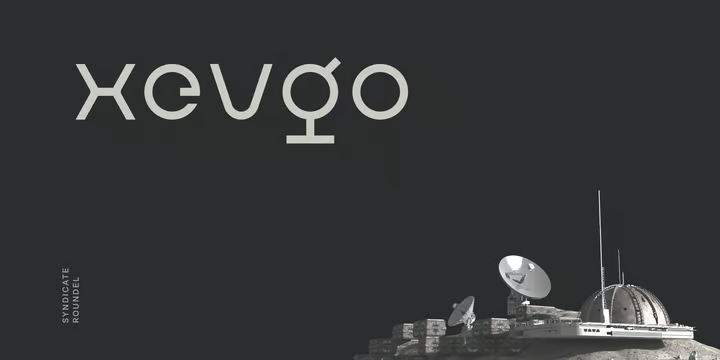
Xevgo by Baqoos
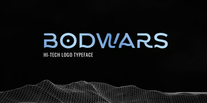
Bodwars by Sarid Ezra
As we wrap up the discussion of typography trends, we expect that you’ve got needed inspiration about choosing typefaces from this collection. Check our series of blogs to get inspiration about pairing these typefaces with artistic and trending color schemes and with trendy illustration styles and flourish your creativity!
Enjoy!