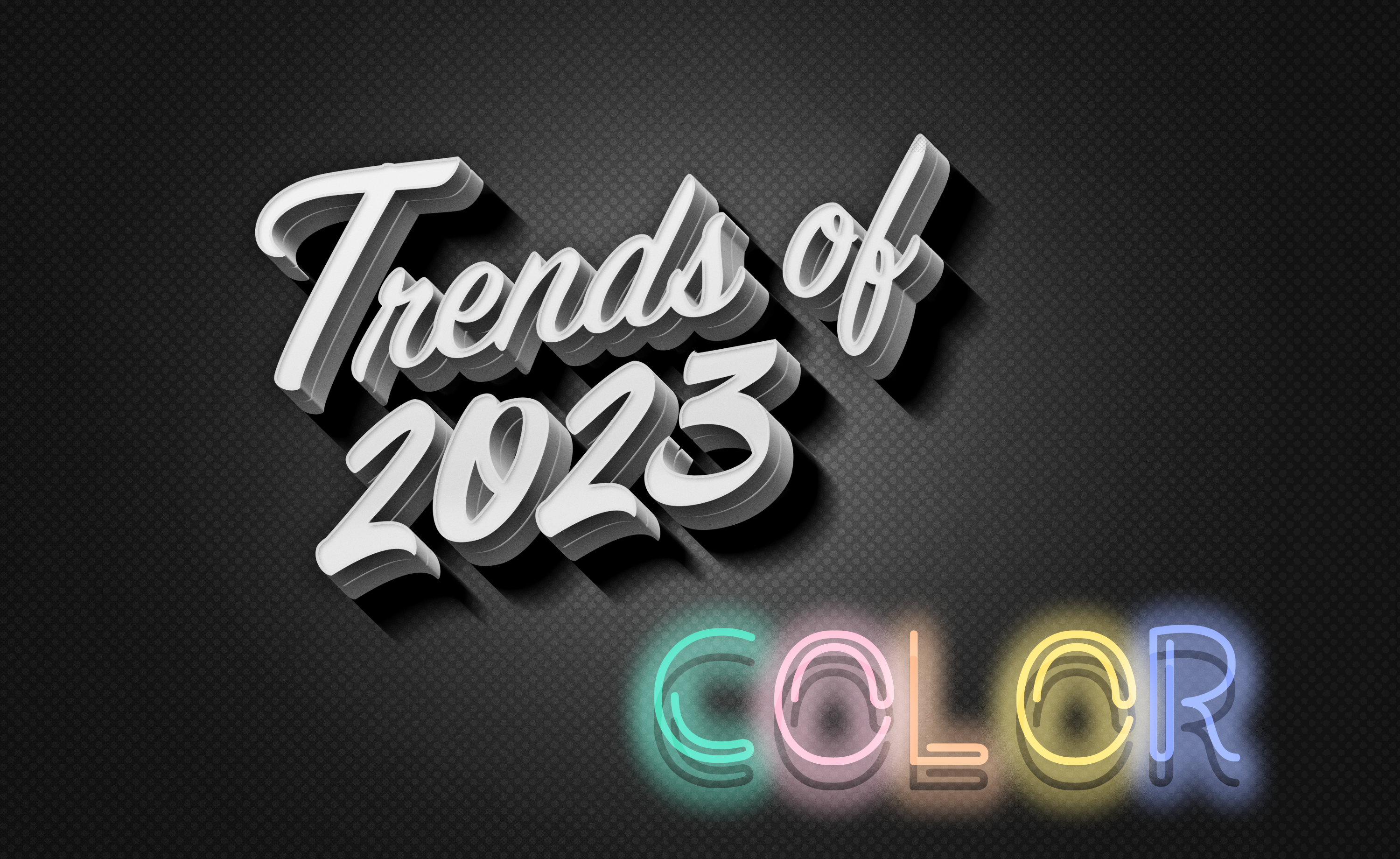
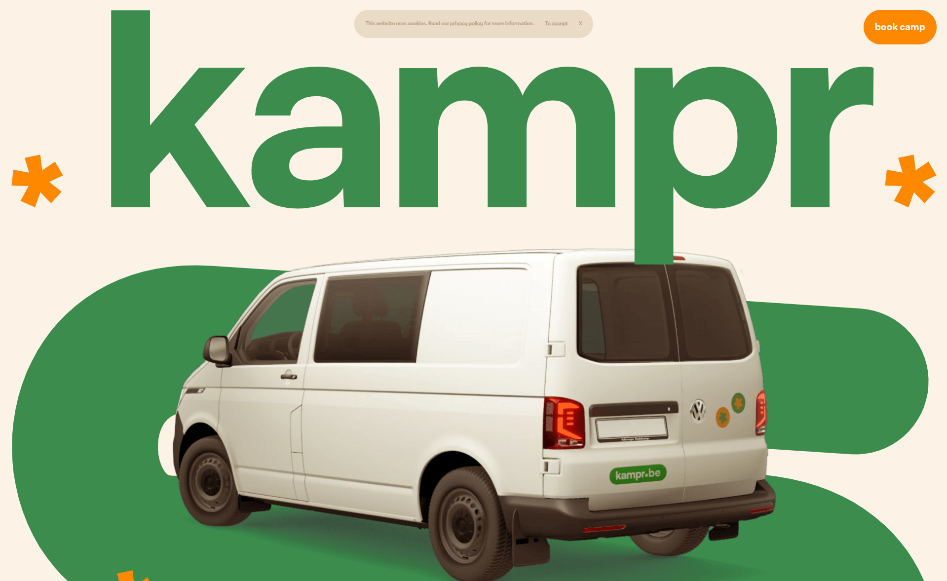
Web designers choose website color schemes to create a brand identity and associate a color with a particular brand. Hence, color is one of the basics of web design. As mentioned in the previous blog, 2023 is going through a massive trial and error phase with web design that involves everything. This happened with website color scheme trends as well.
“Color! What a deep and mysterious language, the language of dreams.”
–Paul Gauguin
Designers help define the purpose and set the tone for everything we do by reading the pulse of culture. Since each color is assigned a specific meaning and evokes specific emotions, it’s way more crucial to choose the right color scheme. You can do more than expected by choosing the right palette for your site and strengthening your online presence.
Fashion-Inspired Color Schemes
Web powerhouses set trends for everything we do, from dressing to driving, and anything that falls in between. This allowed the fashion industry to set some of this year’s trendy web color schemes. These color schemes are usually used on fashion websites, portfolio websites, eCommerce websites, etc. Let’s see the fashion-inspired color schemes that will influence this year below:
Blending Vibrance with Bright Colors
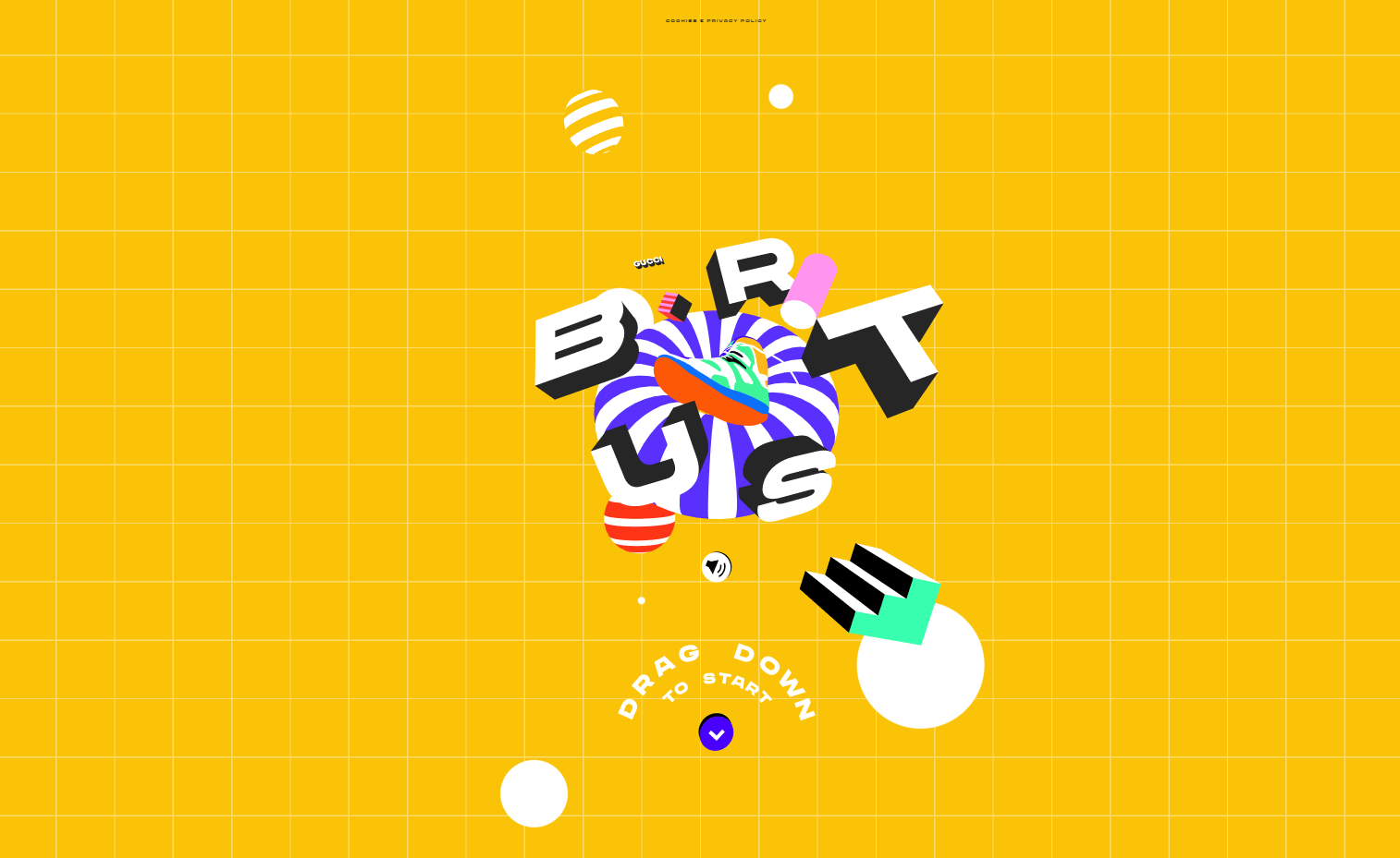
As we live in a rather hazy time and period, we’re seeing a strong bias towards warm colors nowadays. The rich and deep colors enhance the versatility of any website while also making it rather eye-catching. Designers use bright and vibrant colors to add a statement to the design, to offer confident hues that push the traditional edge to allow experiencing truly exceptional color.
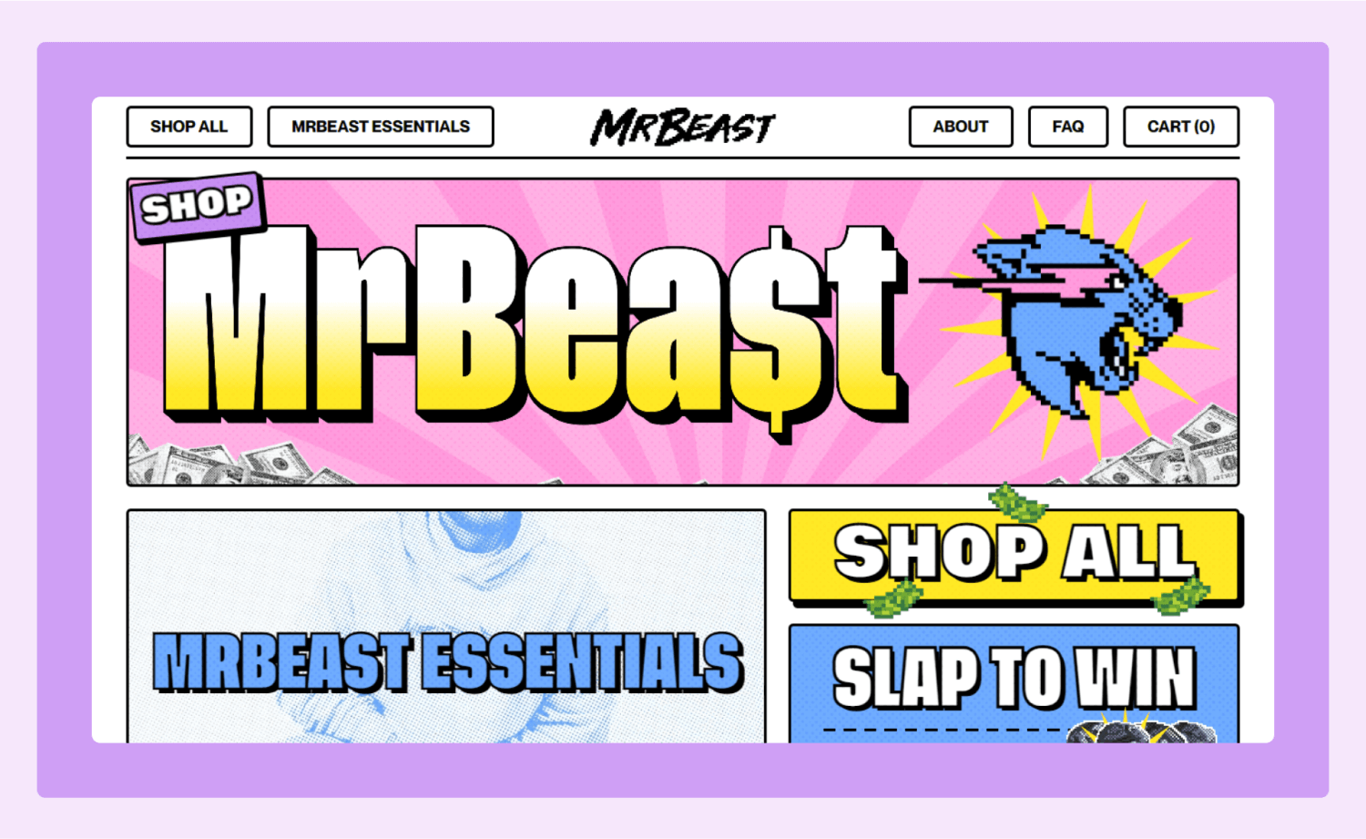
Being Bold, Seeing Red
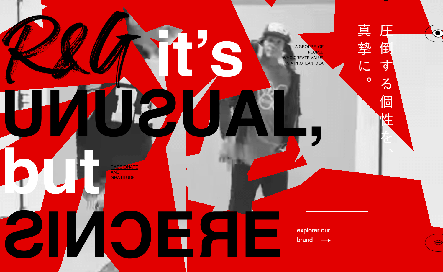
Red conveys a bold statement. Designers use red as an accent color, as a bold background color, or to stand out among the crowd with a particular statement. As a historically impactful color, the color Red gets the blood flowing and emotions running high. It makes the visitors feel intense and identify with your brand. Hence, a bold tone of red can be a vivid choice of statement.
Bringing Summer on Beach
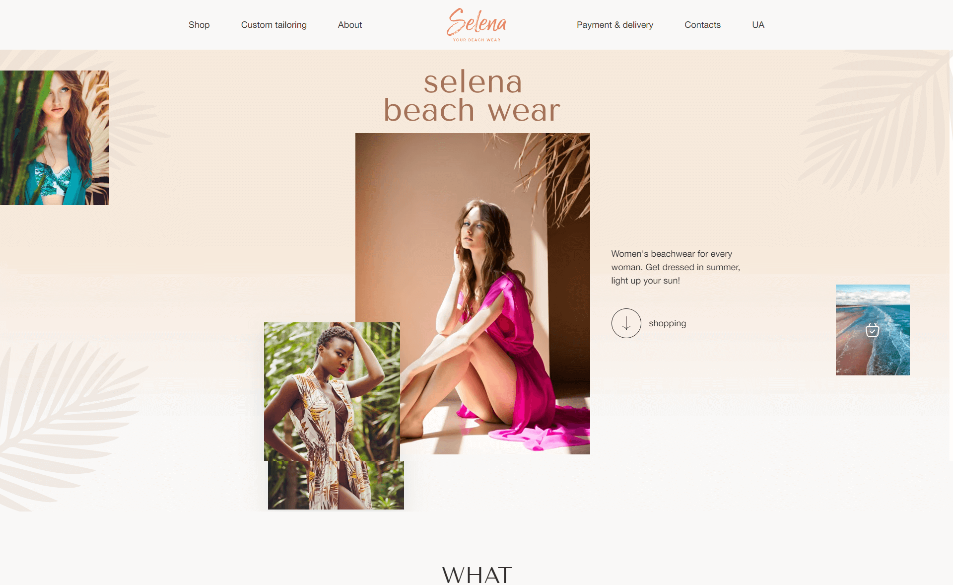
This color scheme is another fashion-inspired palette created from a campaign by Diesel that turned up beach-side motifs. This is a trend that was introduced as the world needed to break free from the pandemic-stricken lifestyle. The style combines beachside aesthetics with similar images and fonts. The aim is to provide a beach-like feel with shades like Coloro’s Lapis Lazuli Blue, Pantone’s Blazing Sun, and Dulux’s Golden Sands.
Reminiscing Comfort Zone
Consumers seek peace and comfort and desire to reconnect with what they lived through. With that in mind, designers experiment with familiar color schemes from the past to invoke a sense of nostalgia and have fueled the trend of embracing old-school motifs celebrating nostalgia. The colors reminiscing comfort zones are:
Neutral Shades, Bold Colors
Using calm, earthy color palettes that create and convey nostalgia with the orientation has set this trend. Often, nature inspires these colors, such as harvest golds, avocado greens, mustard yellows, and so on. These colors beautifully create a feeling of comfort and joy, familiarity, and make your site more approachable to visitors.
Blurring Out Gender
Millennial kitsch is a color trend that was set from the inspirations of the late 1990s to the mid-2000s. This trend combines a playful aesthetic with bright and cheery colors. The colors embody optimism and power and enhance your chances of connecting better with your audience. With its challenging and troubled relationship with femininity, audiences often loathed the color Pink. Nowadays, everyone wants a “gender blur” in every design prospect. There’s a chance for this pinkish tint to be associated with gender neutrality and creatives are opting for newer design approaches to blend it in.
Adding Rust of Lady Liberty
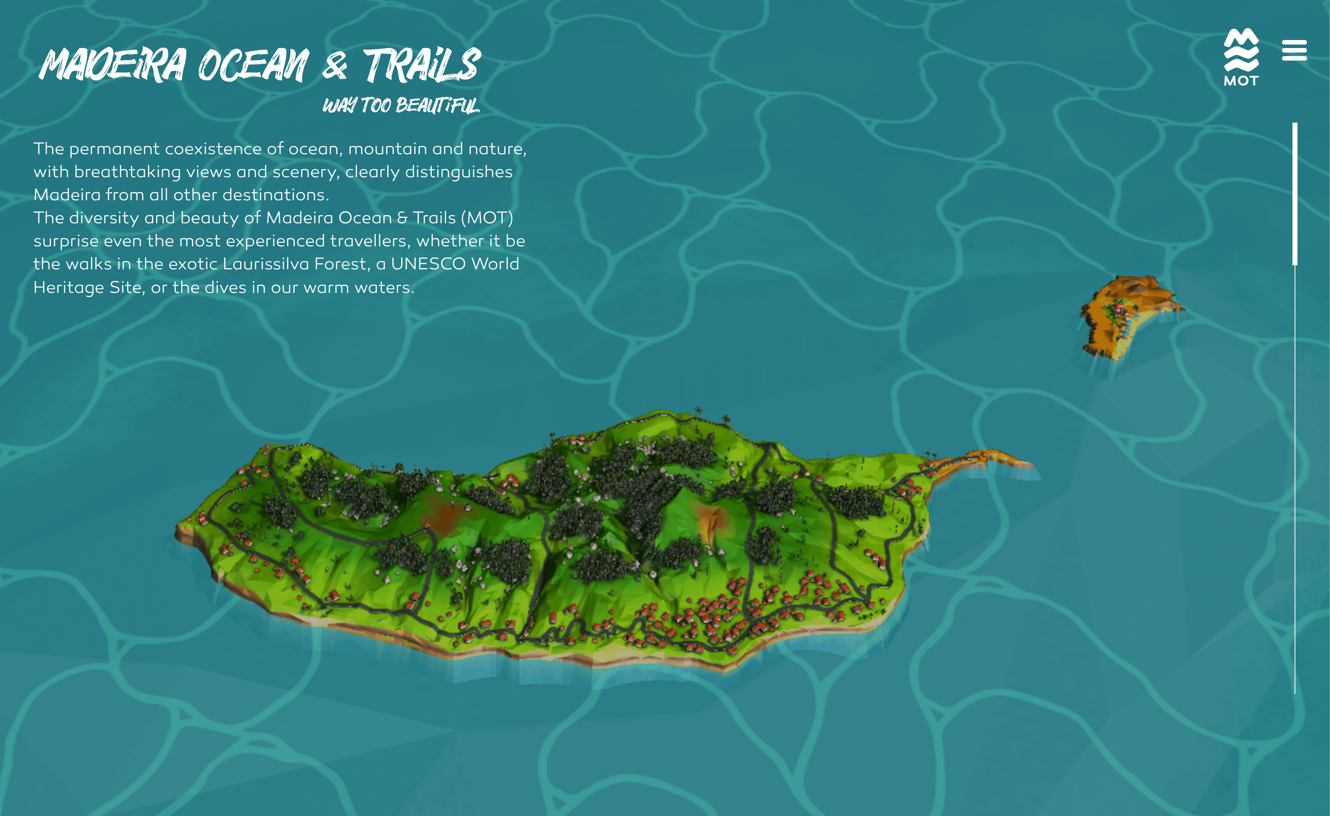
Verdigris is a color of rusted copper and is called the Lady Liberty color because the statue is covered in copper that has rusted and turned greenish-blue. According to WGSN and Coloro, this color is going to be an influential web color in 2023. This color gives an oceanic vibe to the site and page and grabs users’ attention right away. Moreover, verdigris becomes more versatile when used to create abstract backgrounds containing subtly shifting shades.
Desaturating Earth Tones
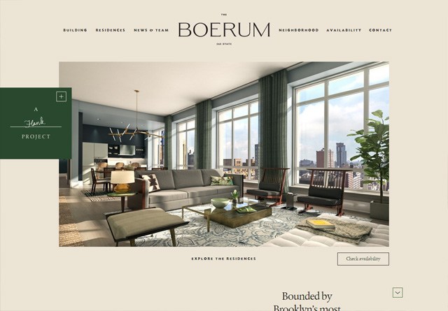
Natural hues inspired undersaturated earth tones. As these colors are visually comforting and help excite the chaos of daily life, they are recognized as calming to the eyes. The visually gentle color palette inspires visitors to slow the pace while bringing sustainability to design. Usually, the colors are neutral, meaning they are muted and flat simulations of natural colors to create a warm, nature-friendly atmosphere.
Dystopian AI-Infused Dark Academia
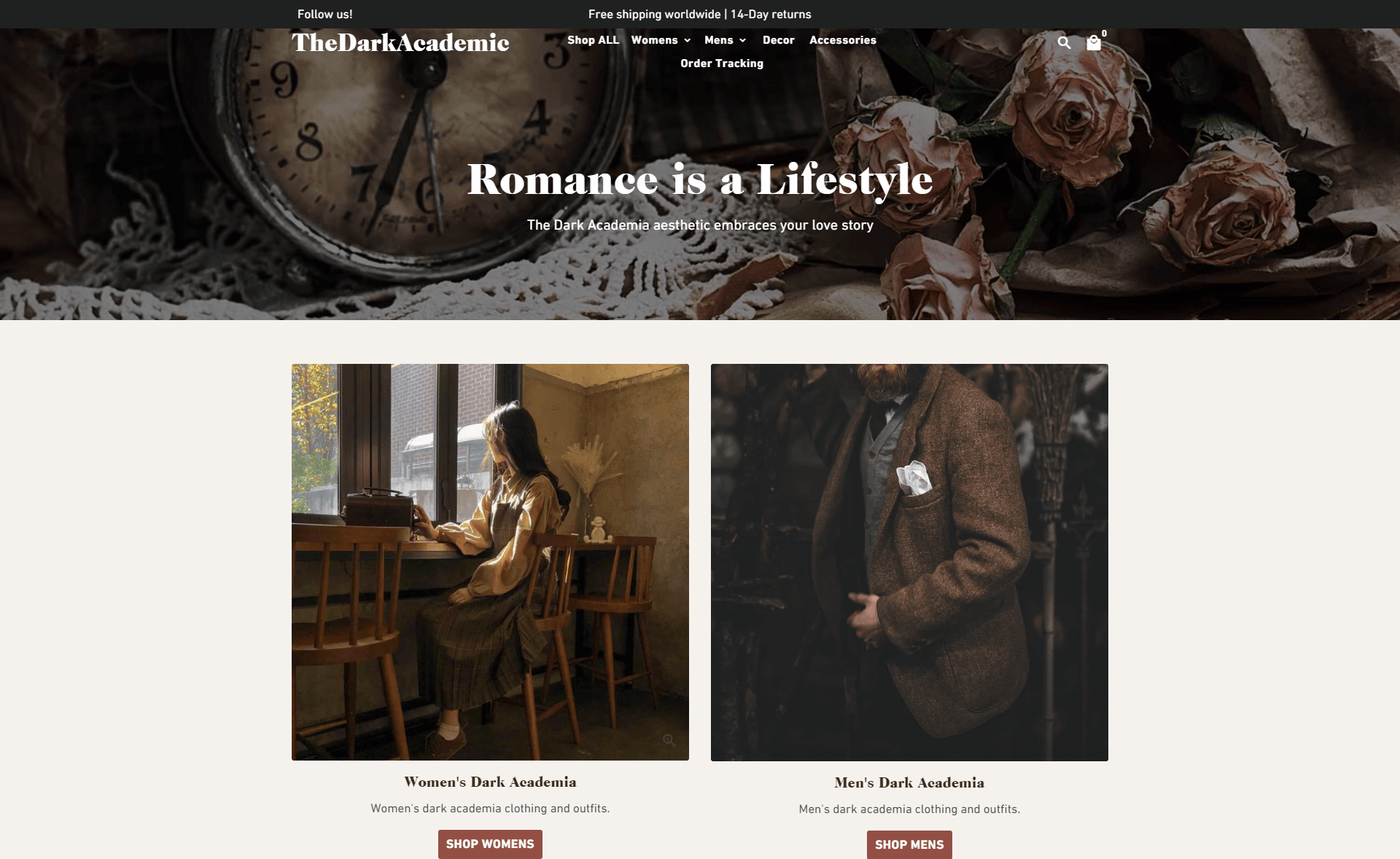
This color trend’s greatest influence is European culture, especially with their use of vanitas motifs. It’s a TikTok subculture with vintage kicks from different elements. The palette consists of black, mahogany brown, forest green, midnight blue, and burgundy, which contrast with olive, lighter gold, and orange colors. This color palette is on trend as it makes any website look classic and helps catch visitors’ eyes instantly.
Eccentric Color Schemes
These color schemes are created through continuous experimentation with styles and tones. As designers associate colors with specific meanings, artists have been trying to understand the influence of colors. This practice has coined some eccentric styles that became major trends in web design. Let’s check the eccentric color palettes that are going to dominate this year:
Playing with Tones and Shades
Playing with different tones and shades of one or two colors, especially the dual-tone effect has become an important trend. By playing with different tones and shades of the same hue you can achieve this effect. You can also use it with different backgrounds, fonts, scripting, or illustrations. Unlike the conventional gradients, this trend tends to change in an unexpected way and creates a more striking effect.
Exploring Freedom
This trend is about encouraging exploration and experimentation with freedom through bright, bold, and colorful shades and combinations. This color scheme incorporates some Brutalist and Memphis characteristics and helps you stand out among the crowd with your work as the interface bustles with Fuschia pink, rich purple, and minty green. You can saturate your design with these colors and bring life to your designs with animations and effects on vivid colors to ooze playful positivity.
Staying Vivid with Monochrome
Monochrome color schemes are trending and numerous websites are incorporating a monochrome color scheme to stand out in the crowd as this year is seeing. This color trend uses a mix of black, white, and gray that creates a modern, but classic outlook. Designers use a touch of one or two bold colors to accentuate the contents on a page and make it memorable without throwing too much color on their faces.
Design Delicates with Pastel Palettes
Pastels are subdued colors with low saturation and the tones are more soothing and soft. Pastel colors work well with neutral colors to represent growth and peace. Designers expect that we’ll see more use of millennial pink, light azure, creamy mint, and whimsy yellow. These colors add a soothing aesthetic and appeal to any design as the antidote to the monotonously used bold colors.
Going Metallic with Silver Chrome
Designers use metallics and silver chrome to add glamour to the design, incorporating silver, gold, copper, bronze, or more subtle metallic tones into the design strategy. Silver chrome is highly reflective, it brightens up the page with its mirror-like effect. Moreover, when blended with 3D, it adds a bold and high-tech feel.
Hurting Eyes with Aesthetics
Testing acid substances have influenced Acid hues as web colors. The more acidic the substance is, the brighter it gets. Visually, these colors hurt the eyes in an aesthetic way, in contrast to the soft aesthetics of the 70s color palettes. These colors catch the eye right away. Hence, if you really want to stand out with your site design, this might be the color palette you should opt for.
Brownie Points!
Pantone’s Viva Magenta Color Scheme
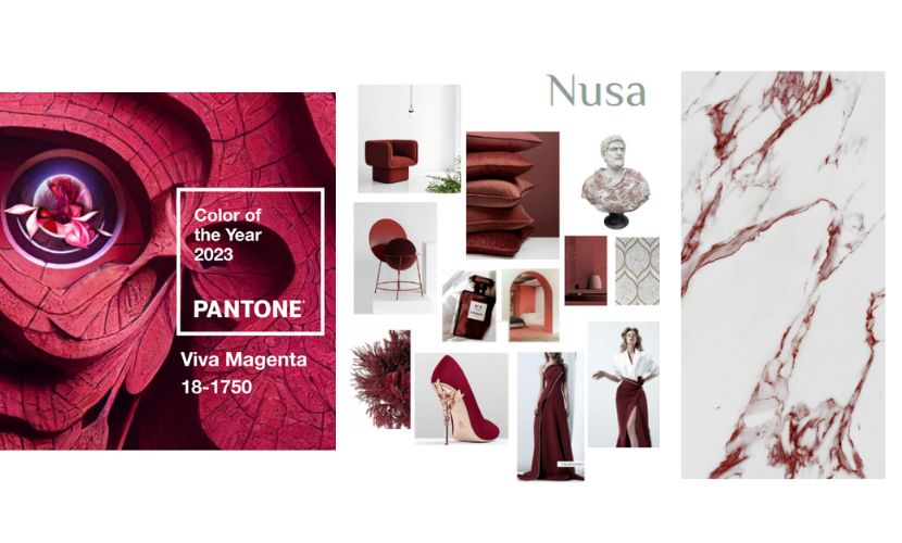
Viva magenta is a fashion-inspired synthetic color made using equal parts of red and blue pigments that result in a bold, vibrant, and lovely hue that adds a pop to any design. Pantone declared it this year’s trendy color due to its association with creativity and high versatility. Moreover, Viva Magenta has a hue that’s highly suitable to create out-worldly and surreal atmospheric feels. This color creates distinct contrast and dissonance in a project. Pairing it with more neutral and muted colors can help create a sense of disjunction and convey a surreal or dreamlike feel within the composition.
As research shows, color increases brand recognition and people decide to like or unlike a brand based on its color scheme first. Colors affect psychology and culture simultaneously. Understanding color is still subjective although it influences our way of thinking through different illustration styles. So choosing the right palette is the least you can do to strengthen your online presence and enhance your growth this year!