The year 2023 is the year to make the impossible possible. The invention of the metaverse and artificial intelligence getting involved in everything makes this year unique in every way. The newer techs provided designers and developers with ways to create and develop extraordinary things including creative approaches to illustration and have made learning about yearly illustration trends and staying updated crucial.
Along with the emergence of augmented and virtual reality, illustration trends changed over time and users are more invested in well-illustrated sites nowadays. Accordingly, with immersive technologies, users are now more prone to get into the content with illustrations. This works as the inspiration behind today’s illustrations.
“…and art wasn’t supposed to look nice; it was supposed to make you feel something.”
Eleanor & Park
The illustration is the earliest form of narrative as it informs and observes, excites and graces, directs, and simulates. Hence, illustration styles are circled and altered over time. At this point, 2023 is seeing a blast of mixed forms of illustrations blended together to create unique illustration styles. Significantly, this year, it’s important to focus on what’s going on in this arena to make better decisions about site content.
Let’s see what this year has got to offer the users in regard to illustrations and make the choices better.
Illustration Trends of 2023 in Brief
This year’s web design trends have seen a lot of fusion in styles, motifs, and forms. There has been a rise in experiments and creatives have taken unique courses in web design and necessarily, web illustrations went through the same process. This has paved newer trends to settle in which can be typically mentioned as:
- Experimenting with Styles
- Experimenting with Forms
- Overplaying Nostalgia
The newer forms of illustration trends are described below in detail to keep you updated:
Experimenting with Styles
Illustrators are now accepting the wide practice of mixing and fusing former styles. It allows them to create unique projects and launch newer art trends. Let’s check how illustrators are experimenting with different art styles to create new illustration trends:
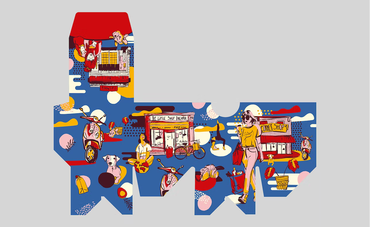
Reimagined Risography
Though developed as a new model of digital duplication in the mid-80s, Risograph became a new, unique tool with a look that could not be achieved through any other medium. This style is defined by bold and vibrant colors with inaccurate and imperfect prints. It pioneered a path for low-cost bulk printing by employing dots and desaturated colors, which produced a grainy look.
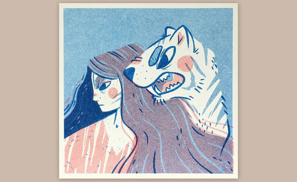
It’s expected that designers and digital artists will use this technique more to create surreal visuals by integrating grainy and noisy textures into minimalistic designs, and it’ll become trendy to mix simplified shapes with grainy textures.
Reasons to Use
Using risograph on websites ensures user attraction as it can be spotted among many others. Moreover, it has a saturated, vibrant color scheme that draws the eye. Furthermore, it opens the door to endless possibilities.
Elements
- Minimalism
- Visual textures that are sometimes inconsistent or uneven
- Bold contrast and vibrant use of colors
- Asymmetry
- Handcrafted feel
- Graininess
- Overlapping objects
Complex Compositions
This illustration trend, as the name suggests, is a mix and overlap of several shapes and objects, where different ideas and concepts are combined to create a single image. These designs are dense but minimal. This style supports the inclusion of distinguished elements without exhausting the viewer.
This style favors landscape orientations, and developers and designers are using it more and more to make projects that stand out. This style is especially fit for blogging, as it’s a very engaging one.
Reasons to Use
This illustration style reinforces the idea of living on a spectrum with multiple stories and keeps the viewer’s eyes moving through every detail. So, this paves a unique way to engage visitors.
Elements
- Distinctive Shapes & Imagery
- Overlapping Shapes
- stylistically minimal Elements
- Detailed & Interactive Images
- Inclusive Designs
Mixed-Media Collage
Mixed-media collage is a growing trend as the line between the physical and virtual worlds becomes blurrier every day. This year, more boundaries will be broken by combining digital designs with real photos.
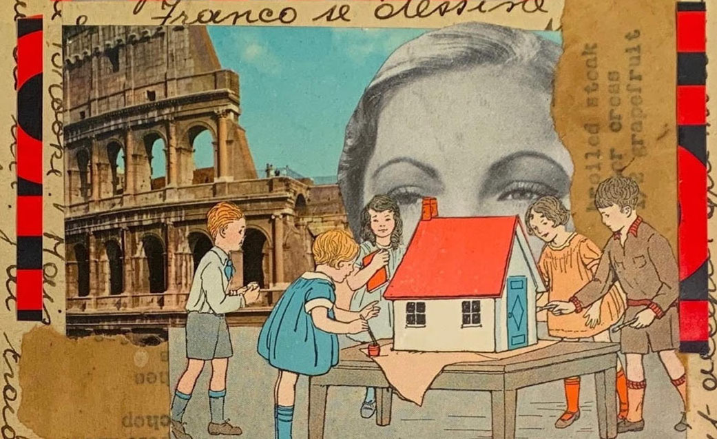
This design showcases the fantasy world everyone wants to find themselves in while leaving some space for the designers to create the vibrance they need to find in this post-pandemic world. Splashes of vibrant colors and grinning cartoons also emphasize the contrast between the dissimilar elements.
Reasons to Use
This trend helps the audience find an interactive place of discovery and wonder and gives your site a distinctive aesthetic outlook with vibrant colors to bring joy and whimsy to the site for better user engagement.
Elements
- digital designs to real photos
- Vibrant colors
- Grinning Cartoons
Folk Botanical
The year 2022 made nature-inspired colors a trend. With the rise of that, this new year paves a nature-inspired trend known as folk botanical or folk floral. This trend combines traditional folk art motifs into botanical illustrations.
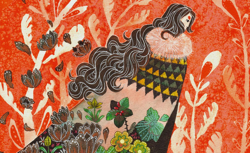
Nature patterns are getting less refined through shaky doodles, rough textures, and out-of-place coloring this year though. This trend tries to redefine familiar nature themes into whimsical drawings while rejecting geometrical precisions imposed by vector art tools. This style gets more vibrant with handmade, shaky imperfections. This effect is used to make illustrations organic in more than one way.
Reasons to Use
This style can be used to add whimsy and rust to their designs. Also, it gives the site a more lively outlook, which makes the site more engaging and audience-attractive.
Elements
- Nature-inspired Elements
- Folk Motifs
- Hand-drawn Elements
- Earthy Color Palettes
- A mix of Organic & Graphic Shapes
Experimental Escapism
Escapism has been around for a while in art practices, and digital artists are embracing the style in their works to provide the audience with a way to escape the daily monotony with a pleasant alternative. This trend started when new technology made it possible to look at ideas that had been around for a long time.
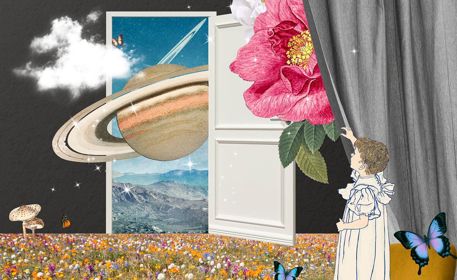
Designers are being inspired by the metaverse and recent interstellar images, resulting in exploratory compositions that give the impression of a window to an outer world and digital psyche.
Reasons to Use
The artistic world is going through a revolution with the emergence of artificial intelligence and is experiencing a newfound vibrancy. This trend is a style that can be used to show a groundbreaking approach to creation.
Elements
- dreamlike backgrounds
- different tones, gradients
- grainy effect
- adventurous landscapes
Classique
Classique is a trend still on the rise that incorporates classic digital media design motifs and blends more than one to get a contemporary outlook. This is a trend that’s set with the use of classic typefaces blended with a meaningful illustration to communicate the message.
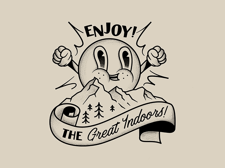
This is a style derived from print media, and now it’s getting popular with designers who are trying to get over the illustration and design styles of the last decade.
Reasons to Use
This style gives the most familiar outlook for people with classic tastes in anything. The impact is making sites more clear and meaningful with the least design effort.
Elements
- Classic typefaces
- Minimal Design
- Print Media Design
- Meaningful Illustration
- Minimalistic Motifs
Experimenting with Techniques
Taking a creative approach of mixing and matching different techniques with different styles, mediums, and themes. This not only results in interesting and engaging art but also strengthens the creativity of an artist. Some illustration trends are derived from this kind of experiment. Let’s see them up close:
Mysticism
The last few years have seen a rise in interest in mystical, other-worldly design trends, which have crept into the graphic design and illustration worlds as well. Though it presents unique challenges at times due to its origin, which is rooted in personal experience, this trend has infiltrated many aspects of visual design with iridescent colors, spiritual symbols and motifs, and ethereal textures and patterns to evoke the feeling of the unknown.
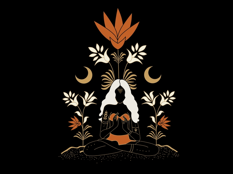
Mystic arts and artistic techniques, like one of mysticism’s themes, aim to achieve the oneness it preaches, incorporating the oneness in experience, transcending limited identity, and re-identifying with everything that there is.
Reasons to Use
Opting for mystic illustrations on your projects will help your clients feel connected to a greater force and show them that you can go deeper to take a creative approach to your works.
Inspirations
- Tantric Buddhism
- Sufi Calligraphies
- Tibetan mandalas
- Aniconic vision
- Materiality
- Cosmic Horror
- Ekphrasis and/or verbal image-making
- Christian images inspired by vernacular spiritual texts
- The abstract beauty of a single letter to meditate on Quranic truths
Acid Graphics
Unlike the connotation it conveys to most, the word ‘acid’ bears a cultural resonance of “mind expansion.” Today’s designer world is now more focused on a newer understanding of “acid graphics” as a new wave of contemporary designs. This new outlook looks at acid graphics as a futuristic take on seemingly naive and nostalgic motifs.
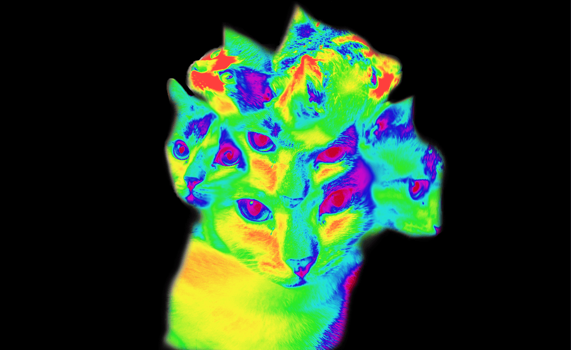
In contrast to the acid aesthetics of the last decade, today’s new style is more spiced with irony and a darker sense of humor. Stylistically, this new exploration is defined by a haze of bright colors, experimental typography, sci-fi futurism; and the odd ’70s throwback, with dystopian-tinged skies and desert scenes, etc.
Reasons to use
Acid graphics is much about vintage techno and rave flyer designs, the propagation being a part of an evolution to break through the rules. This style is described to be trendy with super organic forms and crazy lettering mixed with a heavy metal aesthetic created with lots of rendering and 3D while also making it enough trippy for the audience.
Aesthetics
- Organic Forms & Crazy Letterings
- ‘70s Throwbacks
- Vintage Techno & Rave Flyer Designs
- Maise of Bright Colors
- Dystopian Designs and Scenes
- Sci-fi Futurism
Scrapbook Aesthetics
The early and mid-2000s were the hyped seasons of scrapbooking. It’s a method that helps in storytelling in a very personalized manner. Nevertheless, when it comes to illustration styles, futurism often comes with a desire to reclaim the natural world, impulsing manifesting the scrapbook aesthetic in illustration.
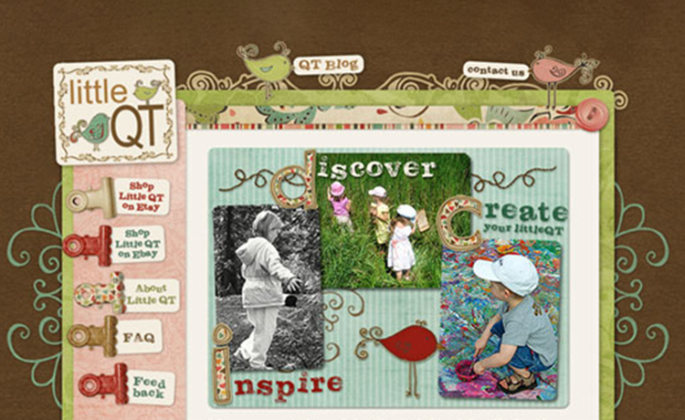
The illustration technique involves doodle drawings. handwritten letterings, sticker graphics, and cut-paste collages to recreate the experience of scrolling through an old-school mag, conveying a sense of intimacy and imperfection. These designs have embraced both the digital and the physical sides as coexisting.
Overplaying Nostalgia
Since the world is recovering from a pandemic and seeking comfort in every arena of their lifestyle, nostalgia is being overplayed especially in illustration. It tunnels a comfort zone through illustrations and creatives are incorporating it all the way.
Let’s see what nostalgia has to offer this year:
Vaporwave
The world appears to grow out of the minimal, organized, and clean illustration styles, just as the early 2020s saw disruption and uncertainty. The early 2020s are characterized by disruption and uncertainty, which paved the way for a more random, diverse, and chaotic style, the vaporwave aesthetic.
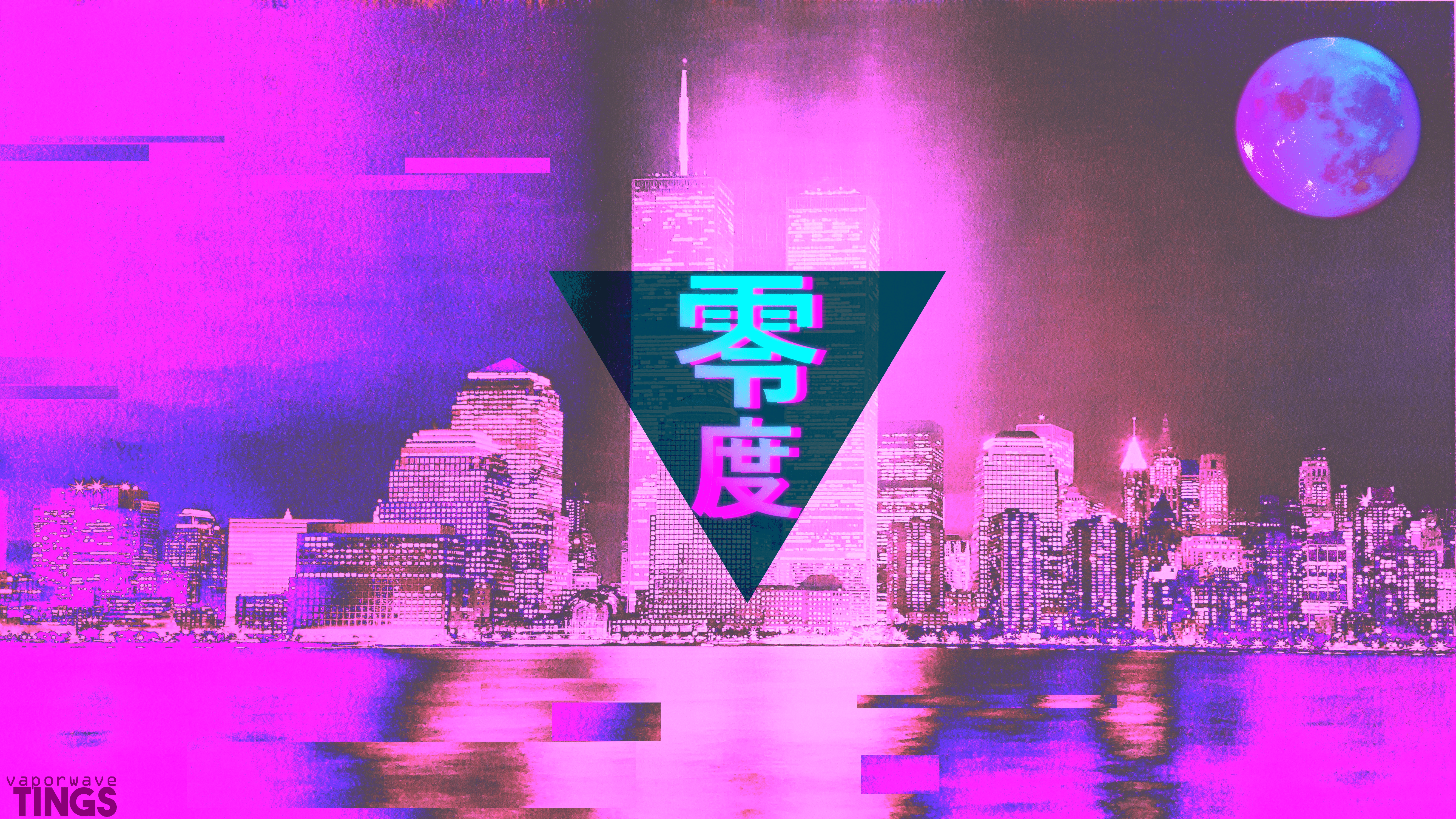
At length, vaporwave blends several neo-vintage elements in a more dynamic style to induce nostalgia while still breathing fresh life into the past. This trend combines retro visual elements from the 80s and 90s and combines these disparate elements with other visual elements to create something unique, vibrant, and exciting.
Reasons to Use
The rise of virtual reality has established this trend in almost all creative media. The virtual elements of a VR world are incorporating more and more vaporwave elements, as this makes the outlook vibrant and catchy.
Elements
- retro visual elements from the 1980s and 1990s
- VHS tapes
- pixellated text
- vintage anime and cartoons
- video glitches
- cyberpunk themes
- broader geometric grids, lines, and shapes
- Greek and Roman busts and panoramas
Retro Cartoon
This illustration style was made with a throwback theme in mind for projects that wanted to capture a certain feeling. This style inspires illustrators to shape their styles around the aesthetics of a past era. Now in 2023, many illustrators are creating a retro style to recreate the nostalgia of drawing with felt-tip markers.
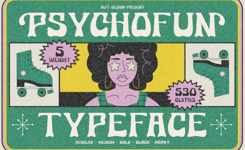
The simplicity of this style makes it a perfect fit for lighthearted projects. Moreover, this style can necessarily uphold ultra-bright and bold colors, bubble fonts, oval borders, and starburst stickers.
Reasons to Use
This strategy resonates in the hearts of the audience and evokes empathy in them. Because of its likeness and heritage, retro art conveys a bold optical presence with the use of bright colors, bold motifs, and pop culture imagery.
Elements
- The Throwback Decade of Choice
- Retro Shapes
- Retro Lines
- Retro Textures
- Retro Fonts
- Ultra-bright and Bold Colors
- Bold Motifs
- Pop Imagery
90s Space Psychedelia
Although psychedelia has been around for some time now, transporting viewers into a dense and colorful world, 2023 will prolong its stay as a trend, although this time it’s going to be space psychedelia. Space psychedelia blends futuristic themes like androids, spaceships, vaporwave landscapes, simulated environments, and cyberpunk neon with elements from the past.
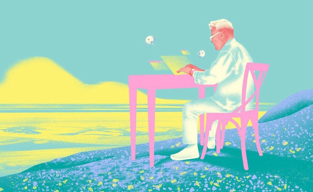
By all means, 90s space psychedelia features different retro techniques, such as Memphis Design patterns, Saturday morning cartoon styles, and colors reminiscent of Lisa Frank’s school supplies, along with the futuristic elements listed above.
Reasons to Use
Stimulating the minds of an audience is a surefire way to capture and captivate their attention, and psychedelia has been doing it for a long time. Even more, it’s much better with its retro-futuristic elements and is making the audience do double takes.
Elements
- Memphis Design Elements
- Saturday morning cartoon styles
- futuristic themes
- vaporwave landscapes
- simulated environments
- cyberpunk neon
- bright, imaginative illustrations
Y2K Aesthetics
The 2000s saw a digital revolution that made the most iconic designs possible. This aesthetic is defined mostly by a blend of nostalgic elements with futuristic visions of the present to make it more captivating and unique. The rise of different social media influenced the rise of Y2K aka Cyber Y2K, Futuristic Y2K, or Kaybug.
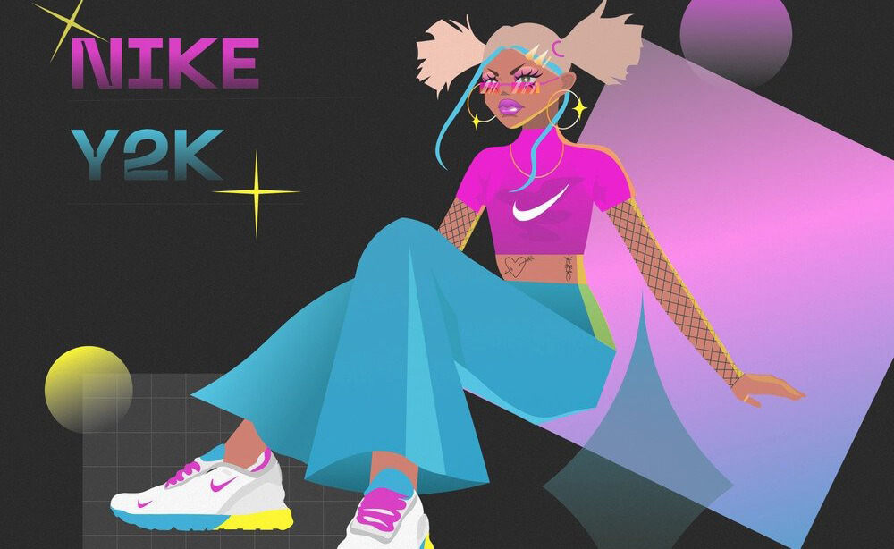
Y2K aesthetics are taking different directions like a retrofuturist, or incorporation of different styles in one. More so as the world is only reviving from the doom of pandemics, nuclear war, and global warming.
Reasons to Use
This style can be used to trigger nostalgia and familiar feelings in the project while relieving the uncertain fear of the future and connecting with audiences on a relatable and personal level.
Aesthetics
- Fun, trashy
- Thick lines
- Heavy use of iconography
- More gradients
- Obnoxious colors
- Kitsch textures (such as plastic, and metallics)
- retro typeface
- pixelated fonts
- images, and custom cursors.
Punk Revival
Punk is a 1970s movement against norms, modernism, staidness, and propriety. This is artwork associated with the punk subculture and the no-wave movement, which is prevalent on punk rock album covers, and flyers and prolific in other mediums. As the year 2023 witnesses more ample causes to rail against failing systems, this year is seeing a revival of punk aesthetics.
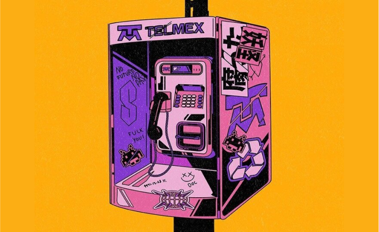
With a lo-fi approach, these visuals tend to capture the chaos of the anarchist spirit by attacking the pre-existing compositions and elements visually and remixing them into violent contrasts in shape, color, and form.
Reasons to Use
Punk revival aesthetics are mostly found on posters, flyers, and album covers. The world is seeing emerging punk aesthetics as these websites instantly capture audiences’ attention with bold and custom typefaces and unique DIY attitudes.
Aesthetics
- The usage of black or gray colors
- Cut-out letters
- Scribbled lettering
- Cutouts
- Mismatched fonts
- Chaotic collages
- A blatant anti-establishment look
Illustrations complement website content and are crucial as a medium to reach out to the right audience. If you want your site to stand out, appeal to emotion, and tell a unique story, strategically created and arranged illustrations can be the area of focus.
Hopefully, you’ve got a better insight and idea about illustrations. Let your creativity run wild with existing illustration trends and enrich your site for better and enhanced user engagement.
