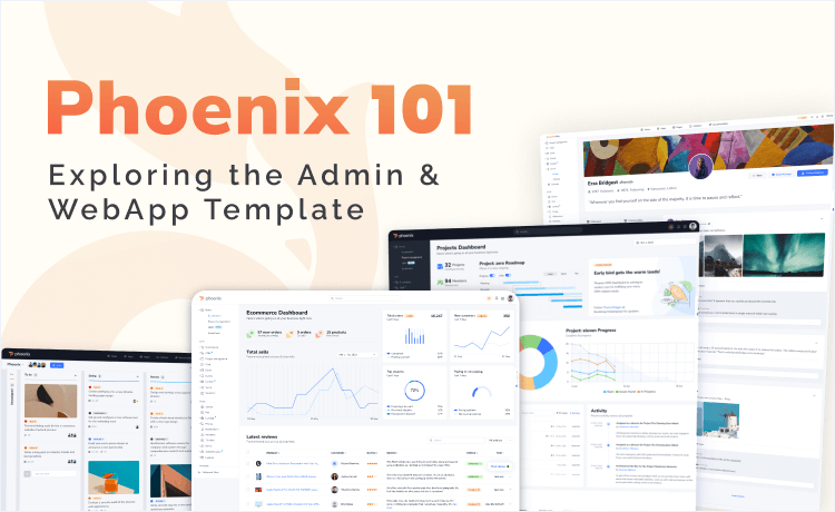
Get ready to dive into the world of Phoenix, the kick-ass admin & webapp template powered by Bootstrap 5. In this talk, we’ll dig deeply into Phoenix Admin & WebApp Template and show you how you can take advantage of its power in your own development.
Whether you’re a coding newbie craving a solid foundation or a seasoned pro seeking insider tips on this killer template, this session will provide you with a comprehensive overview of the topic. We’ll uncover the juiciest features, mind-blowing functionalities, and mind-boggling optimization options that the Admin & WebApp Template brings to the table.
We’ll uncover the key features, functionalities, and benefits of the Admin & WebApp Template, equipping you with the knowledge to build robust and efficient web applications using Phoenix. Furthermore, we’re here to equip you with the knowledge and skills to wield this template like a true coding ninja. So, let’s unleash the full potential of the Admin & WebApp Template together, and let your developer dreams soar high!
A Bit About Phoenix
Phoenix Admin & WebApp Template is a premium template from ThemeWagon, the creators of Falcon admin & WebApp template. The template is built using all the latest frameworks like Bootstrap 5, HTML5 & CSS3. You can start your project with Phoenix, not only because it’ll make your site look good, but also it has a solid codebase that’s well-documented and performant with simple modifications.
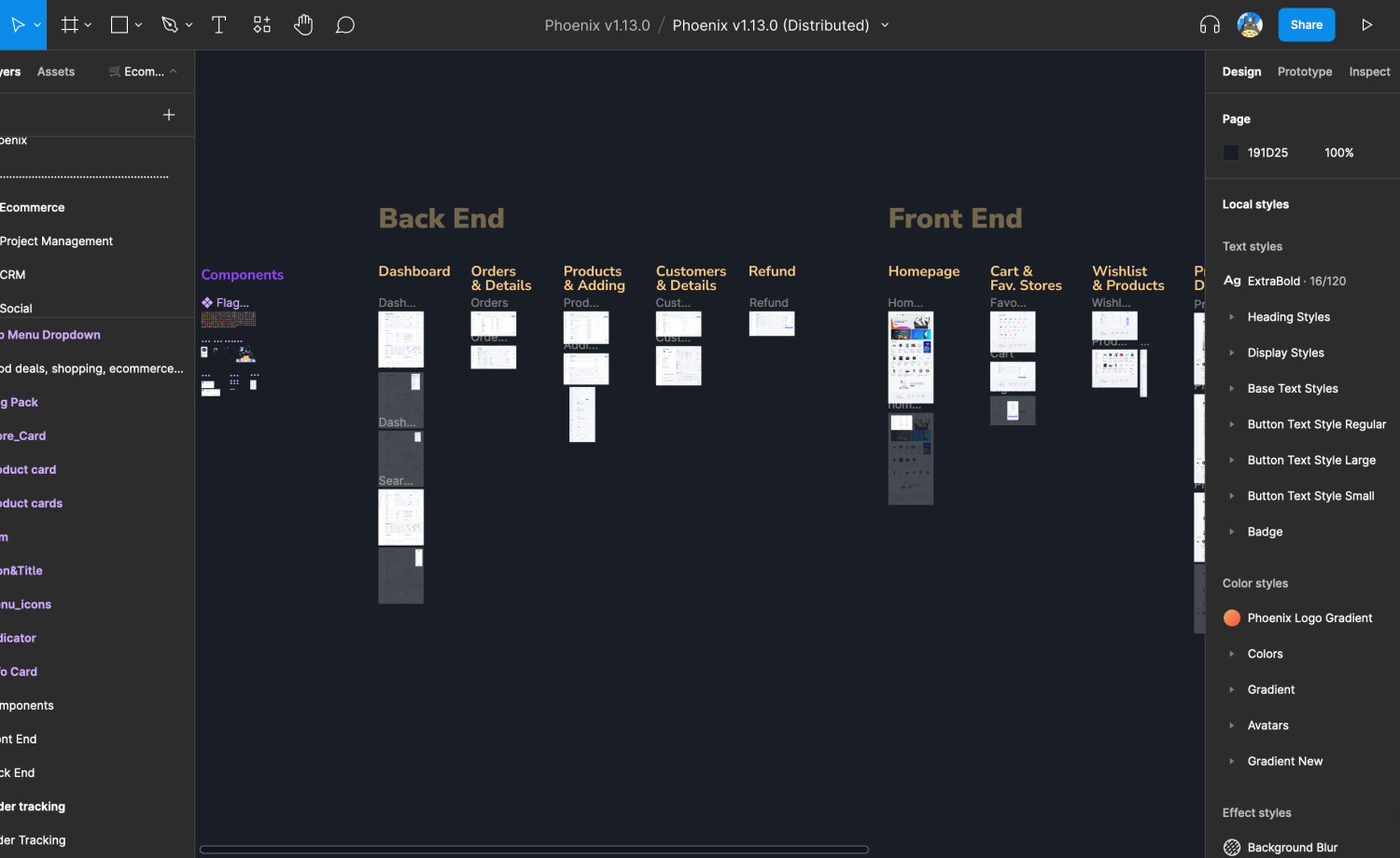
Dig in Phoenix Admin & WebApp Template
Phoenix admin template is a feature-rich admin panel template. You can see the jest of the theme on the showcase page. The catch-features of the theme are as follows:
- Multiple Demos of Built-in Layouts: You’ll get to see multiple demos of the inclusive layouts that Phoenix offers, such as the default layout with a vertical sidenav, dark layout, Dark Navbar, Slim Topnav, topnav-only layout, horizontal slim layout, combo nav, and dual nav. Likewise, you can see the detailed layouts in those.
- Card & Cardless Design: The theme layout is designed with card and cardless designs of advanced forms, and is coded for any screen size, so the admin panel offers more functionality among the most there are.
- Important Apps: Phoenix avails important WebApp pages for assisting you with your necessary applications. Its inclusive apps contain a built-in email, a chat, a calendar, a and a kanban.
- Necessary Pages: Phoenix has a wide range of built-in pages to help you create an efficient admin panel. The pages include- a profile page, a pricing page, an FAQ page, a notifications page, an authentication page, and an event page.
- Figma Design File: Phoenix avails the Figma design file with the template in the box of the modern and highly customizable UI components.
Intro to the Apps
Phoenix Admin and WebApp template offers a wide range of user-friendly applications to help you grow as you want to and assist you in creating any WebApp that you might need for your project. Let’s dive into the built-in apps of Phoenix and see what awaits ahead.
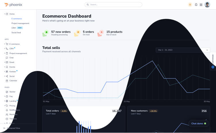
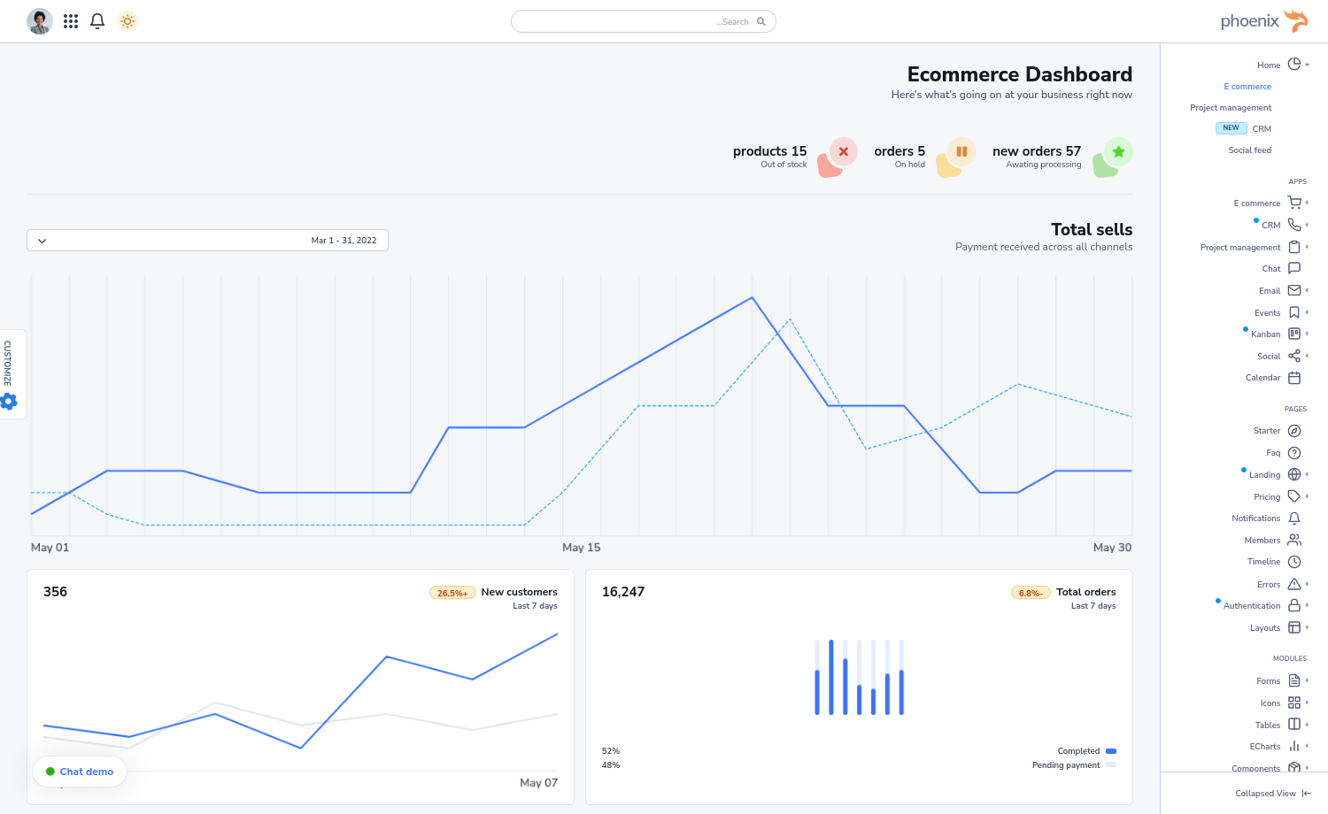
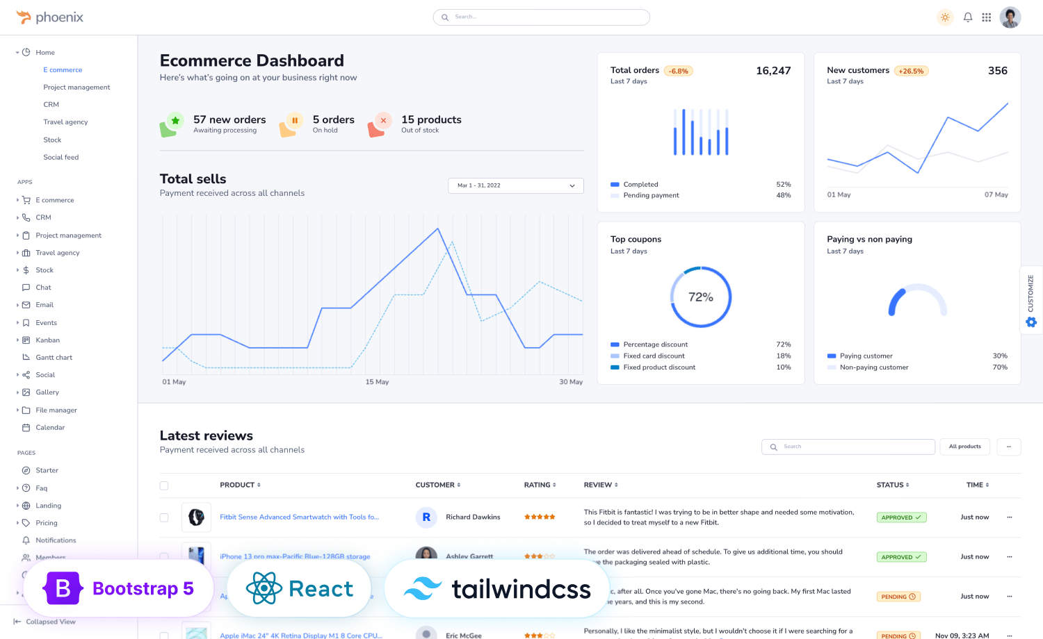
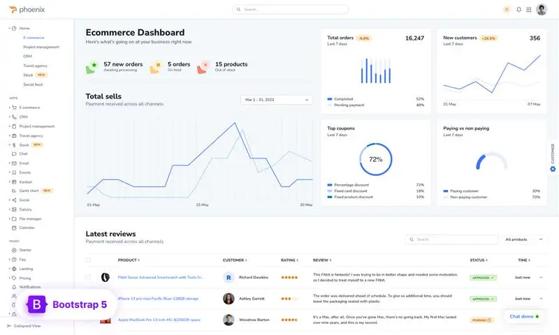
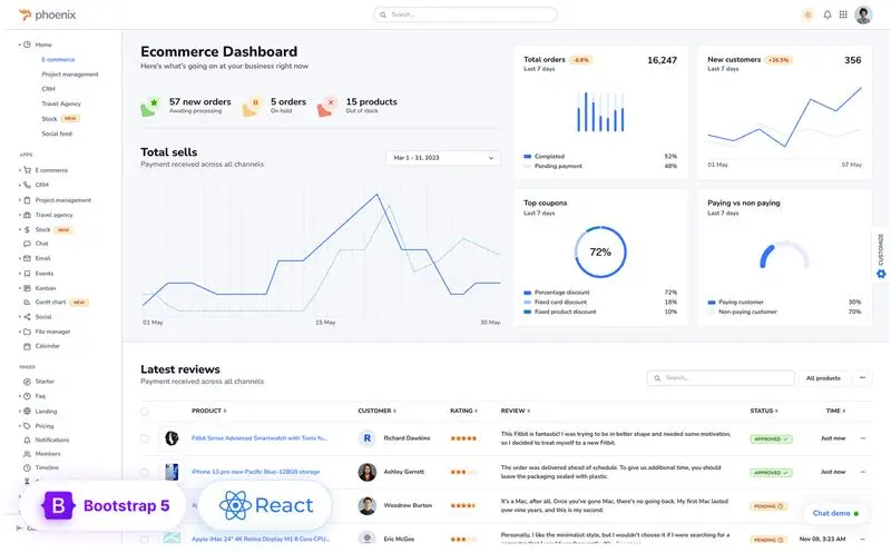
Ecommerce
The Ecommerce Dashboard of Phoenix is a very user-friendly and completely responsive one. It comes with all the necessary components you might need to create an all-inclusive data visualization for strong business operations. The app will help you with analytical data metrics and monitor KPIs such as conversion rates, customer acquisition expenses, revenue, and many more. The app includes the following pages:
- Admin
- Add Product
- Products
- Customers
- Customer Details
- Orders
- Order Details
- Refund
- Customer
- Homepage
- Product Details
- Products Filter
- Cart
- Checkout
- Shipping Info
- Profile
- Favorite Stores
- Wishlist
- Order Tracking
- Invoice
CRM
The CRM module of Phoenix allows you to track and monitor necessary insights into your leads, customer needs, offers, and conversions, and helps you optimize your site to run campaigns and ads. Moreover, it’ll help you with task automation for your projects.
The inclusive CRM module comes with:
- Analytics
- Deals
- Deal Details
- Leads
- Lead Details
- Reports
- Reports Details
- Add Contact
Project Management
Phoenix’s project management tool includes many user-oriented UI components to help you keep your projects on track, foster better collaboration among teams, and improve risk management.
The inclusive features of the project management app that Phoenix Admin & WebApp Template offers are:
- Create New
- Project List View
- Project Card View
- Project Board View
- To-do list
- Project Details
Chat
Phoenix Admin and WebApp Template offers a polished and suave chat module that can make it easier for you to create any communication model for your organization, and its clean codebase makes the modification and customization simpler. The chat module will help you make your communication easier and simpler for your efficient task management.
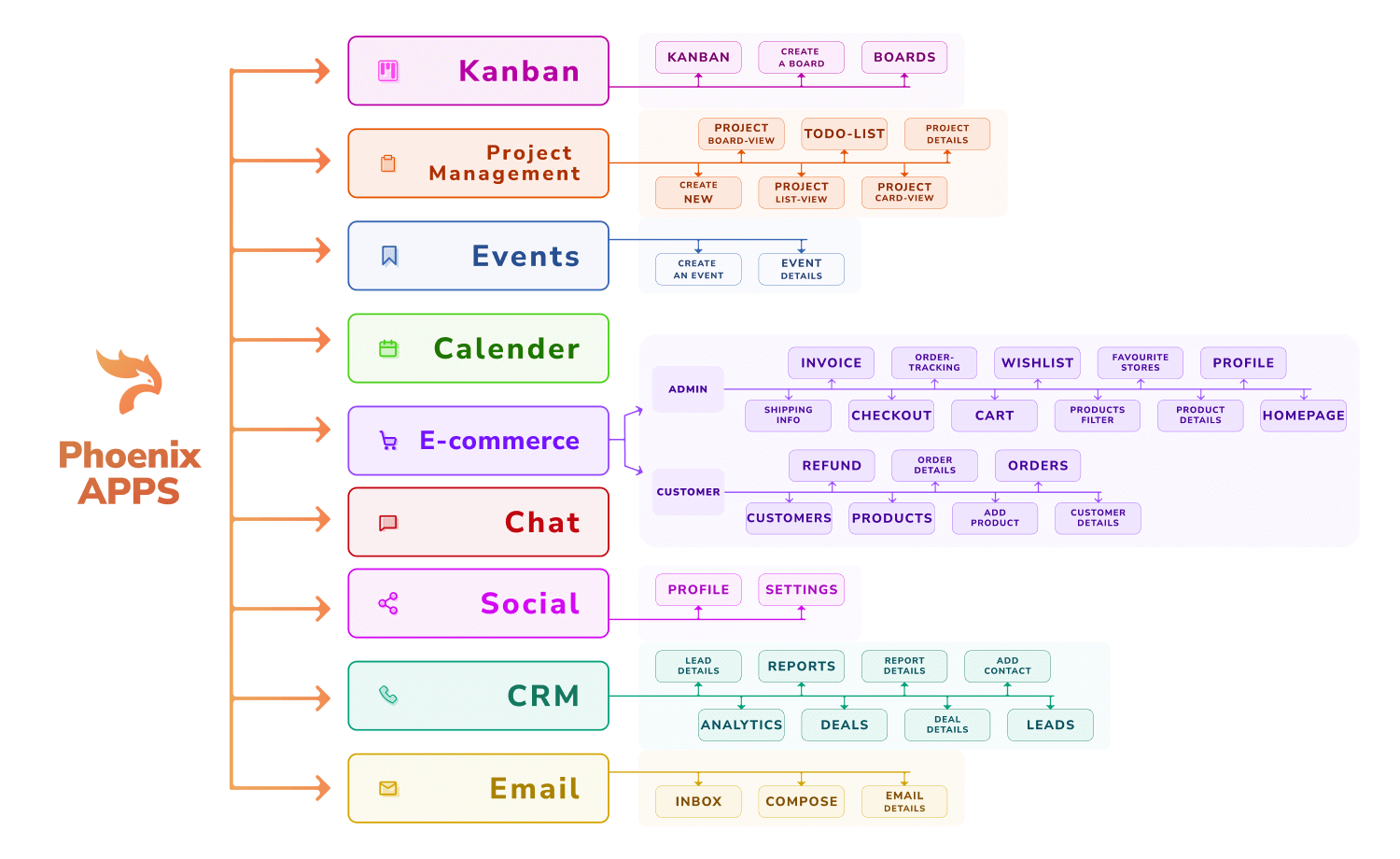
The email module of Phoenix Admin & WebApp template avails a number of features for easy email communication to make your business operation less time-consuming and more comfortable. The prebuilt pages inclusive to this module are as follows:
- Inbox
- Email Detail
- Compose
Events
If you need to create, manage, and monitor an event, Phoenix’s all-inclusive event page can be of great help for you. The page will help you understand different data metrics and get you analytical insights all on the same page.
The inclusive pages of this module are as follows:
- Create an Event
- Event Details
Kanban
The Kanban page of Phoenix Admin & WebAppp Template offers a wide and convenient board to assist you with easy team and project management. This page is user-friendly and can help you enhance your growth with different data regarding the ongoing projects under your management.
The prebuilt pages availed with this module are as follows:
- Kanban
- Boards
- Create Board
Social
Phoenix includes a social web app part for its users. If you’re creating a website or a social app, you’ll have all the important features oriented meticulously on its layout, and all the components used to make this page are completely responsive and compatible with all major devices and browsers. This page also includes a multi-level dropdown for the following three pages:
- Profile
- Settings
Calendar
The pre-built calendar module includes a variety of functions, including the ability to schedule tasks and set reminders. This app page can be used as a responsive, all-inclusive calendar application that is completely functioning.
Check the complete live preview or purchase from here!
Customization of Phoenix
Phoenix Admin & WebApp Template is an easily customizable template that allows necessary modification with little knowledge and the least effort. It’s a time saver in creative projects. Let’s dive in!
Configuration of Phoenix
Phoenix Admin & WebApp template has a global configuration system and allows easy customization with a single global JavaScript object.
You can set the configuration using the gulp-based workflow or without Gulp. Let’s see how you can do it:
Without Gulp
If you aren’t using Gulp-based workflow, edit the public/assets/js/config.js file
With Gulp-based Workflow
If you’re using the Gulp-based workflow to configure Phoenix, edit the src/js/config.js file
In both cases, use the following configuration object:
const initialConfig = {
  phoenixIsNavbarVerticalCollapsed: false,
  phoenixTheme: 'light',
  phoenixNavbarTopStyle: 'default',
  phoenixNavbarVerticalStyle: 'default',
  phoenixNavbarPosition: 'vertical',
  phoenixNavbarTopShape: 'default',
  phoenixIsRTL: false,
  phoenixSupportChat: true
};
The available options that Phoenix offers, are:
| Option | Defaults | Description |
| phoenixIsNavbarVerticalCollapsed | false | Set true to make the vertical navbar stay collapsed when the page loads. |
| phoenixTheme | light | This option is for setting up the default color mode (dark or light) for your project. Set dark to make the default color mode dark. |
| phoenixNavbarTopStyle | default | Set darker to make the top navbar darker when the page loads. |
| phoenixNavbarVerticalStyle | default | Set darker to make the vertical navbar darker when the page loads. |
| phoenixNavbarPosition | vertical | This option is for changing the navigation type. Available values: * vertical* horizontal* combo |
| phoenixNavbarTopShape | default | Set slim to make the top navbar slim when the page loads. |
| phoenixIsRTL | false | Use true to make the whole layout RTL (Right to Left). Recommended for languages such as Arabic, Hebrew, or other RTL languages. |
| phoenixSupportChat | true | This option is for showing the chat widget. Set false to hide the chat widget when the page loads. |
Styling
The Phoenix team recommends customizing the style sheet using the user.css file. You can change the theme style in both gulp-based and non-gulp workflow. The process is briefly described below:
Config for styling: Without Gulp-based workflow
To configure Phoenix without Gulp for styling, add your own CSS and override the theme style in public/assets/css/user.css file.
Config for styling: With Gulp
If you’re configuring Phoenix with Gulp-based workflow, Please follow these steps:
- Add your own SCSS and override the theme style in the src/scss/user.scss file.
user.scss- To make more distinctive and wider array of changes and customize the design of the theme, use src/scss/_user-variables.scss. Any variable from the node_modules/bootstrap/scss/variables or src/scss/theme/_variables.scss can be overridden with your own value.
_user-variables.scss- You can also remove the Bootstrap components and update the src/scss/_bootstrap.scss file.
_bootstrap.scssChanging theme colors
If you want to customize the theme colors for your project, you can approach it in both gulp and non-gulp workflows. Let’s see how you can do it:
Change colors without gulp: Using CSS
As aforementioned, you can edit and override the theme style in public/assets/css/user.css file. You can change all colors, including the grays, using CSS variables. You’ll need to assign its corresponding RGB color to change any color. Likewise, you might sometimes need to update the component’s corresponding CSS variable.
/*-----------------------------------------------
|   Theme Styles
-----------------------------------------------*/
:root, :root.light, :root .light {
  --phoenix-primary:  #00d27a;
  --phoenix-primary-rgb: 0, 210, 122;
  ...
  ...
  ...
  /* grays */
  --phoenix-gray-100:  #f9fafd;
  --phoenix-gray-100-rgb: 249, 250, 253;
}
.dark{
  --phoenix-primary:  #e63757;
  --phoenix-primary-rgb: 230, 55, 87;

  .card{
    --phoenix-card-bg: #00d27a;
  }
}
Change colors with Gulp: Using SCSS
You can bring in your own preferred colors from src/scss/theme/_colors.scss and paste it into src/scss/_user-variables.scss. Remember to update the necessary variable. Our recommended approach is as follows:
_user-variables.scssThe default theme mode of Phoenix is light. If you customize Bootstrap components, it’ll take effect in the light mode. To update any color, find the corresponding variable for the colors and place them to _user-variables.scss file.
An example of the code should look like this:
//*-----------------------------------------------
//|   Theme Colors
//-----------------------------------------------*/

$primary: $blue !default;
$secondary: $gray-600 !default;
$success: $green !default;
$info: $cyan !default;
$warning: $yellow !default;
$danger: $red !default;
$light: $gray-100 !default;
$dark: $gray-1100 !default;
If you want to update any theme color for the dark mode, you’ll need the $dark-theme-colors variable and to update the gray colors, update the $dark-grays variable.
Change ALL COLORS with Gulp
All the Phoenix color variables are available as Sass variables, as well as the Sass map in the src/scss/theme/_colors.scss file.
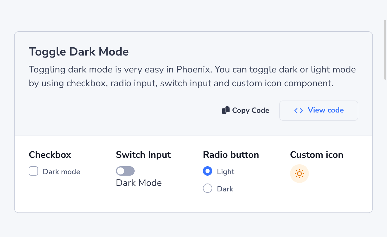
Dark Mode
You can see the configuration for setting Dark as the default mode in the configuration section of this blog, or in the configuration page of the theme’s documentation.
Phoenix avails 4 prebuilt toggle options to choose from to switch between dark and light modes:
- Checkbox
- Switch Input
- Radio Button
- Custom Icon
Without Gulp
You can easily customize the theme without using Gulp-based workflow. The customization is easy. Here’s how you do it:
Modify colors with CSS
In the /public/assets/css/theme.css file, look for the :root.dark class, and you’ll find all the variables to modify the colors for dark mode. Copy the variable you want to override to your /public/assets/css/user.css file and update as you want it.
An example of the code might look as follows:
/*-----------------------------------------------
  Theme Styles
-----------------------------------------------*/
:root, :root.light, :root .light {
  --phoenix-gray-100: #eff2f6;
  --phoenix-gray-100-rgb: 239, 242, 246;

  --phoenix-gray-200: #e3e6ed;
  --phoenix-gray-200-rgb: 227, 230, 237;

  --phoenix-gray-300: #cbd0dd;
  --phoenix-gray-300-rgb: 203, 208, 221;
}

.dark {
  --phoenix-gray-100: #222834;
  --phoenix-gray-100-rgb: 34, 40, 52;

  --phoenix-gray-200: #31374a;
  --phoenix-gray-200-rgb: 49, 55, 74;

  --phoenix-gray-300: #373e53;
  --phoenix-gray-300-rgb: 55, 62, 83;
}
Use dark CSS Classes in HTML
You can customize Phoenix by using custom CSS classes in HTML. Let’s see the thorough process:
Keep a style constant
- .light – It will keep the color light even if the current mode is dark
- .dark – It will keep the color dark even if the current mode is light
Phoenix allows keeping a style constant regardless of the current theme mode. To do so, do these:
Override Background and Text color
Likewise, you can override the background and text color only for dark mode. You can follow these steps:
To use a different color for any element rather than the default dark theme colors, use the special “dark” classes:
- dark__bg-*
- dark__text-*
Emit JavaScript event on color scheme change
When transitioning between dark and light modes, or modifying any settings within the global theme configuration during runtime, Phoenix will trigger a custom event called ‘clickControl.’ Employing this event will toggle colors through JavaScript. For instance, this event is utilized to change the colors of charts. You can capture and utilize this event by employing the following code snippet:
const themeController = document.body;

themeController.addEventListener(
  "clickControl",
  ({ detail: { control, value } }) => {

    if (control === "phoenixTheme") {
      console.log(value) // value will be localStorage theme value (dark/light)
      // your code here

    }
  }
);
With Gulp
If you want to modify Phoenix theme colors with a Gulp-based workflow, you can modify all the colors using SCSS. Find all the variables to create the dark mode in the /src/scss/theme/root/_dark.scss file. Update the file as you see fit. Remember to ensure a running Gulp while you’re doing so.
Plugin
Phoenix offers a number of built-in plugins that you can install in two approaches – with or without using npm. Follow these for hassle-free installation:
Simple approach (without npm)
If you’re not using npm, place your new plugin in the public/vendors folder.
For example:
If you’re trying to add the flatpickr plugin download it, unzip the folder and place the faltpickr-master in the public/vendors folder.
Using npm
For example, suppose you’ve picked faltpickr plugin. Follow these three steps for installing:
Step 1
Firstly, run npm command to install the faltpickr plugin like this:
npm i faltpickrStep 2
Go to vendors.json file and give the path directory from node modules as follows:
"flatpickr": {
	"src": ["dist/flatpickr.min.js", "dist/flatpickr.min.css"],
	"dest": "flatpickr"
}
In this case, dest refers to public/vendors/, where gulp will copy files from the flatpickr plugin. It’s recommended to use the vendors folder to store necessary plugins.
Step 3
Run the following command:
gulp vendor:moveInclusive Figma Design File
Phoenix Admin & WebApp Template avails its Design file created with Figma inclusively to the pack. The design file is getting updated with every release to be more user-oriented from before. You can add your own twitches to the template.
All you’ll need to do is:
- Download Figma
- Open the Figma link from the
README.md - This file is
"read-only".So, to customize the design on your own, you have to duplicate the Figma file and start the editing process on the copied file.
Optimizing Phoenix
You can optimize Phoenix admin & WebApp Template and keep just what you need. You can attempt it with both gulp and non-gulp workflow.
Without gulp
Let’s see how you can attempt minimizing and optimizing the theme with and without Gulp-based workflow, as described below:
Modify the Theme
If you’re using any non-gulp workflow, keep in mind that your changes will be confined to the HTML page you’re customizing and will be visible only when the HTML page is opened. Unwanted HTML should be removed from the public directory.
Stylesheet
It is best not to change the theme.css file. Instead, all changes should be made in the user.css file. You can use your own custom CSS in your project by adding it to the file.
Remove RTL
Phoenix Admin & WebApp Template avails a fully-functional and efficient RTL layout inclusively.
If you don’t need RTL for your project, remove the stylesheets, links, and scripts that are linked to RTL from the necessary HTML files and the related CSS files from the public/asset/css folder.
Disable Dark Mode
Simply delete all the relevant variables from :root in the public/assets/css theme.css file to turn off Dark Mode for your project.
Reduce Unwanted JS
You can also reduce the unnecessary JavaScript files from public/assets/js/phoenix.js according to your need
Remove Unwanted Plugins
If you want to remove any plugin that you might not need to install for your project, remove the corresponding folder from public/vendors.
With Gulp
You can customize Phoenix with any gulp-based workflow as well. The approach is easy to follow. Let’s see how to do it:
Modify the Theme
You can modify the theme SCSS used to create Phoenix Admin & WebApp Template. It’s easy to modify the file and minimize the CSS imports from src/scss/theme/_theme.scss and src/scss/_bootstrap.scss files.
Remove RTL
You can remove the inclusive RTL feature of the theme if you do not need to incorporate it into your project. Remove the related stylesheets links and scripts from the src/pug/layouts/LayoutTheme.pug pug.
Disable Dark Mode
To remove the dark mode from your project, remove the _dark.scss from src/scss/theme/root directory and remove the imports from the file from src/scss/theme/_root.scss.
Reduce Unwanted JS
Remove any unwanted JavaScript file from src/js/theme directory and the imports of those files from src/js/phoenix.js as you need.
Remove Unwanted Plugins
Phoenix avails a number of plugins with the template. If you need to remove any of them, just remove the unnecessary plugin and clear paths from vendor.json folder.
Throughout this exploration, we’ve discovered that, the Admin & WebApp template emerges as a true gem, providing developers with a friendly head start in creating secure, customizable, and visually appealing applications. With its intuitive UI design and flexible customization options, this template enhances the user experience and enables developers to align the application’s look and feel with specific branding or project requirements.
Wrapping up the exploration with hope that you can now confidently leverage Phoenix to efficiently create high-quality applications that meet the ever-evolving demands of the digital landscape.
Purcahse now to dive into the world of Phoenix and let your creativity soar!

