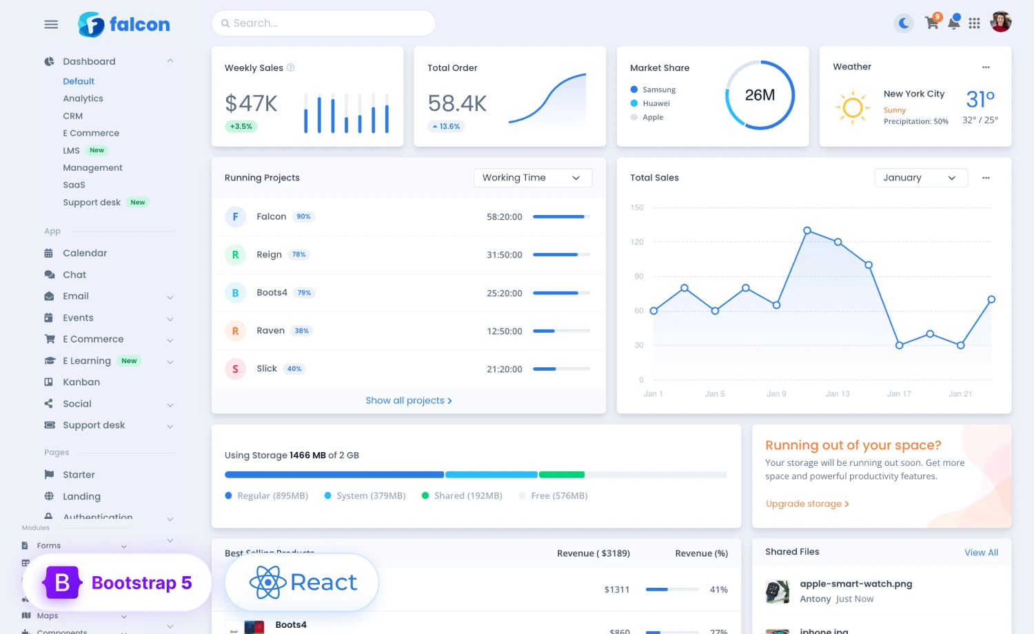
It’s time to unleash the power of React through Falcon-React, the React version of Falcon Admin & WebApp Template! Let’s unfold the perfect blend of cutting-edge technology and seamless user experience together along this article. We will unveil the extensive functionality of the Admin & WebApp template on this brief tour – through the theme’s customization and optimization options, for you to get those done without much hassle.
If you’re creating a web app with the Falcon-React, let’s revolutionize that with these easily modifiable, yet completely responsive and compatible as well as visually stunning interfaces, and redefine your way of project development.
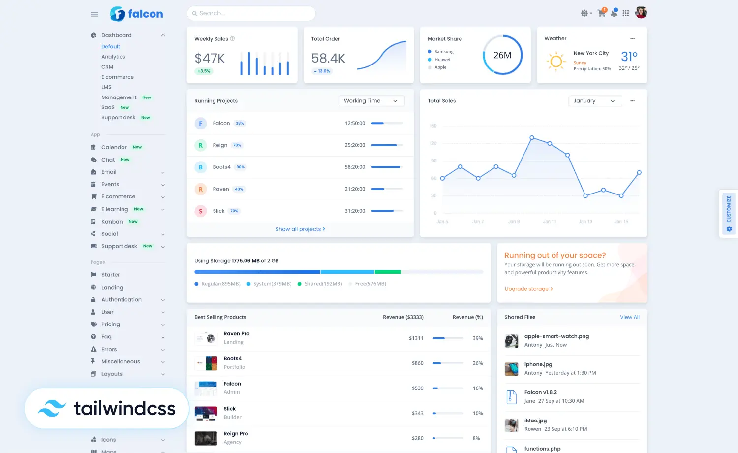
Intro to Falcon-React Admin & WebApp Template
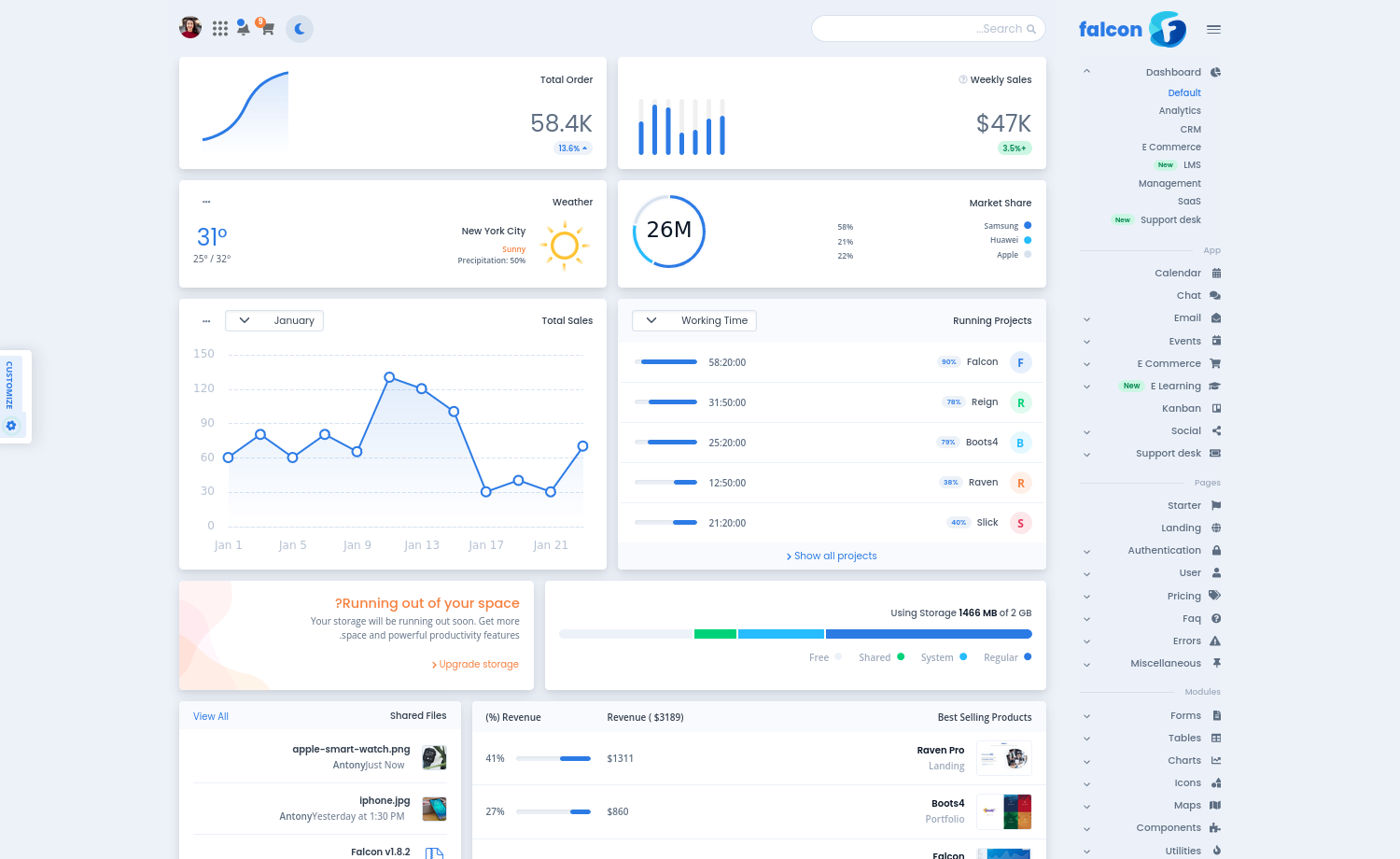
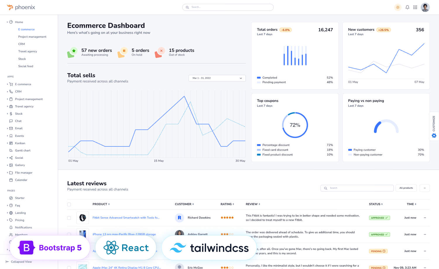
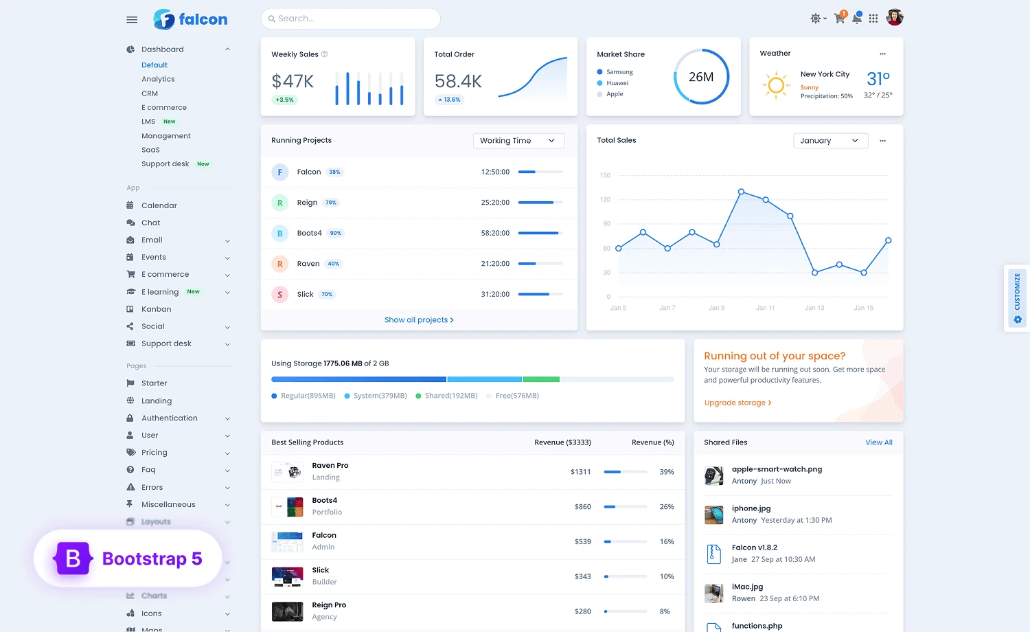
Falcon-React Admin & WebApp Template is, as aforementioned, the React version of Falcon. The template is made to assist you in monitoring your operations and keeping the track of different data metrics for smooth business operation. Moreover, on its detailed design and thoughtfully styled layout, the template incorporates completely responsive components built using React-Bootstrap, so that the modification and customization gets easy and simple.
In this blog, we’ll focus primarily on the customization and the optimization of the theme for now. If you want to discover more, feel free to explore the dashboards of Falcon, dive deep into the apps, or get a brief insight into the modules inclusive to the theme.
Nevertheless, you can check the live preview & Purchase Falcon-React now!
Easily Customize Falcon-React
The customization of Falcon-React is as easy as it can get, with the simple documentation to understand for easy modification. Let’s see how you can dig deeper into the React version of this amazing Admin & WebApp Template.
Get Started
If you’re running Falcon-React locally, remember that this project is scaffolded using “Create React App”, which is why, you’ll need to follow this process:
- Install Node.js if you do not already have it installed on your machine.
- Open the “Falcon-react” directory with your cmd or terminal
- Run
npm i
This command will download all the necessary dependencies for Falcon in thenode_modulesdirectory. - Run
npm start. A local web server will start athttp://localhost:3000
After you’re done following the process, you’ll need to create a production build. For this, you’ll need to edit the homepage in your package.json file to change the relative paths of the asset files.
Then you’ll need to run npm run build command in your project directory for making the Production build.
Doing so will create an optimized production build by compiling, merging and minifying all the source files as necessary and will put them in the build/ folder.
To run the production build locally at http://localhost:5000 run the following commands:
npm install -g serve
serve -s build
Contents
Inside the zip-file you’ll find the following directories and files. Both compiled and minified distribution files, as well as the source files, are included in the package.
theme/
  ├── .env
  ├── .eslintignore
  ├── .eslintrc.js
  ├── .gitignore
  ├── .prettierrc.js
  ├── jsconfig.json
  ├── package-lock.json
  ├── package.json
  ├── README.md
  ├── webpack.config.json
  ├── public/
  │   ├── css/
  │   ├── favicon.ico
  │   ├── index.html
  │   └── manifest.json
  └── src/
      ├── assets/
      │   ├── img/
      │   ├── json/
      │   ├── scss/
      │   └── video/
      ├── components/
      ├── contex/
      ├── data/
      ├── helpers/
      ├── hooks/
      ├── layouts/
      ├── reducers/
      ├── routes/
      ├── App.js
      ├── config.js
      ├── index.js
      └── Main.js
Setting Up Configure
Falcon-React has a global configuration system, that you can easily change with a single JavaScript object.
You can control the side panel settings from one place. You’ll need to go to src/config.js file to set up the configuration.
If the config value is already saved in your local storage and if you need to change the default config, clear the local storage first.
export const version = '4.1.0';
export const navbarBreakPoint = 'xl'; // Vertical navbar breakpoint
export const topNavbarBreakpoint = 'lg';
export const settings = {
  isFluid: false,
  isRTL: false,
  isDark: false,
  navbarPosition: 'vertical',
  showBurgerMenu: false, // controls showing vertical nav on mobile
  currency: '$',
  isNavbarVerticalCollapsed: false, // toggle vertical navbar collapse
  navbarStyle: 'transparent'
};

export default { version, navbarBreakPoint, topNavbarBreakpoint, settings };
Falcon-React avails the following options for its configuration:
| Option | Defaults | Description |
| isFluid | false | Set true to enable fluid mode. This will make the container full-width. |
| isRTL | false | Set true to make the whole layout RTL (Right to Left). Recommended for languages such as Arabic, Hebrew, or other RTL languages. |
| isDark | false | This option is for setting up the dark color mode. Set true to make the default color mode dark. |
| navbarPosition | vertical | For setting the navbar position. Available values: For setting the navbar position. Available values are: top, vertical, & combo. |
| showBurgerMenu | false | This option is for showing up the vertical navbar menus in small screens (sm to lg). |
| currency | $ | Set the currency symbole for the whole project. |
| isNavbarVerticalCollapsed | false | Set true to make the vertical navbar stay collapsed when the page loads. |
| navbarStyle | transparent | This option is for changing the vertical navigation styling. Available values are: transparent, vibrant, inverted, & card. |
Styling
It’s recommended to edit the user style files to customize the theme. You should proceed with these approaches:
Edit SCSS
You can add your own SCSS and override the style in the _user.scss file. If you want to extend your area of changes in the theme design, like customizing the font sizes or color scheme, use src/assets/scss/_user-variables.scss. Any variable you want to customize from node_modules/bootstrap/scss/_variables.scss, or src/assets/scss/theme/_variables.scss, can be changed and overridden according to your needs.
Using Scss Variables
_user-variables.scssYou can also bring your necessary variable colors from src/scss/theme/_colors.scss and paste it into src/scss/_user-variables.scss then update as you need.
Light mode is the default theme style in Falcon. So, if you update any bootstrap’s SCSS variables, it will affect in Light mode. If you want to update any color, find the corresponding variable for those colors and place theme to _user-variables.scss file. For example:
//*-----------------------------------------------
//|   Theme Colors
//-----------------------------------------------*/
$primary: $blue !default;
$secondary: $gray-600 !default;
$success: $green !default;
$info: $cyan !default;
$warning: $yellow !default;
$danger: $red !default;
$light: $gray-100 !default;
$dark: $gray-1100 !default;
Update the $theme-dark-colors variable to update any color in dark mode and update the $dark-grays variable if you want to customize the gray colors.
Using CSS Variables
_user.scssIf you’re attempting this by updating the CSS variables, you’ll need to update the CSS variables for both modes. Remember to assign the corresponding RGB color of the one that you need to customize. Note that, you might need to update the corresponding CSS variables as well. For example:
/*-----------------------------------------------
|   Theme Styles
-----------------------------------------------*/
$success: #00d27a;
$danger: #e63757;
:root, :root.light, :root .light {
  --falcon-primary:  #{$success};
  --falcon-primary-rgb: #{to-rgb($success)};
   ...
   ...
   ...
}
.dark{
  --falcon-primary: #{$danger};
  --falcon-primary-rgb: #{to-rgb($danger)};
  .card{
	--falcon-card-bg: #{$success};
  }
}
Compiling SCSS
Run the command npm run build:css in your project directory to compile SCSS. This will compile all the SCSS files from src/assets/scss/ directory and generate theme.min.css, theme-rtl.min.css, user.min.css, user-rtl.min.css files in public/css/ directory. Reload your browser to see the changes. You can also use the SCSS watcher to automatically compile and reload your browser every time you save your SCSS files by running the command npm run watch:css in a separate terminal window while running npm start in another.
Dark Mode
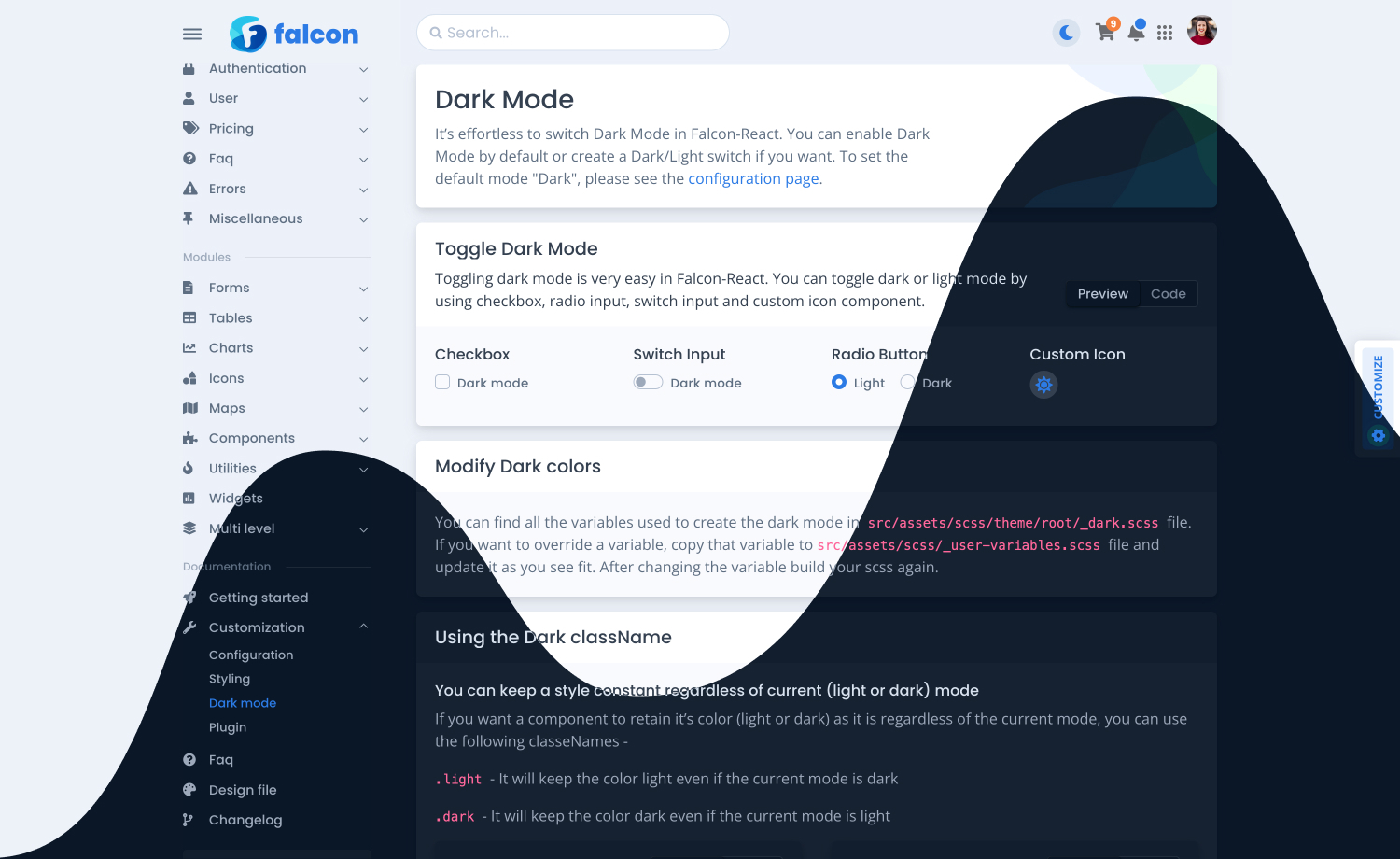
Falcon-React Admin & WebApp template avails easy switch between dark and light mode. You can also enable default dark mode, as we mentioned in the configuration of the theme. You can choose from four available toggle options – checkbox, radio input, switch input, & custom icon input, to enable switching between the two.
Modify Dark Colors
You can find and modify all the variables used to create dark mode in the src/assets/scss/theme/root/_dark.scss file. If you want to add a custom variable of your own, copy that to the src/assets/scss/_user-variables.scss file and update it accordingly.
Using Dark className
You can modify and override theme styles in the dark mode. To do such, you should follow the enlisted steps below:
- Keep a Style Constant: You can keep a style constant regardless of the theme mode, by using the following classNames-
.light– It will keep the color light even if the current mode is dark..dark– It will keep the color dark even if the current mode is light.
- Override Background & Text Color Only for Dark Mode: If you want to use a different text color or background color rather than the default dark theme color for any element, you can use the special “dark” classNames:
dark__bg-*dark__text-*
An example should look as such:
<Card bg='light' className="dark__bg-primary">
  <Card.Body>
	<p className="mb-0 dark__text-success">
  	<span className="fw-bold">
    	This element will retain it's color if you switch between light and dark mode.
  	</span>
	</p>
  </Card.Body>
</Card>
Optimize Falcon-React as You Need
As you know, Falcon Admin & WebApp Template avails easy and simple modification of the theme. Alongside of which, it allows you to minify the file and theme according to the bare minimum of your most needed ones.
Let’s get into the clean codebase to see how you optimize the theme:
Dark Mode
If you need to change the codebase to optimize the theme and remove Dark Mode, please follow these steps:
- Remove the
isDarkproperty from settings object fromsrc/config.jsdirectory. - Remove all the references of
isDarkfrom thesrc/Main.js,src/hooks/useToggleStyle.js& other project’s directories. - Remove the
src/assets/scss/theme/root/_dark.scssfile and import statement fromsrc/scss/theme/_root.scss.
RTL Mode
If you do not need to integrate the inclusive RTL in your design, you might want to remove it from the theme. To do so:
- Remove the
isRTLproperty from settings object fromsrc/config.jsdirectory. - Remove all the references of
isRTLfrom thesrc/Main.js,src/hooks/useToggleStyle.js& other project’s directories.
Fluid Layout
You might want to remove the inclusive fluid layout if you don’t need that for your Project. In that case, follow the steps enlisted below:
- Remove the
isFluidproperty from settings object fromsrc/config.jsdirectory. - Remove all the references of
isFluidfrom thesrc/Main.js,src/hooks/useToggleStyle.js& other project’s directories. - Remove
isFluidvariable andclassNameprops fromsrc/layouts/MainLayout.js
Figma Design File
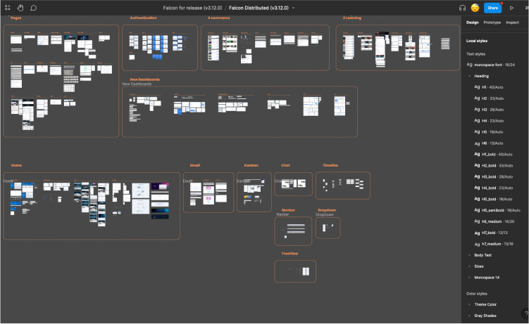
Falcon Admin & WebApp Template provides users with a Figma design file, which is still in progress because the template was originally designed with direct codes and not all the designs are redone with Figma.
If you want to tweak and twitch the design file of Falcon-React, do the following:
- Download Figma
- Open the Figma link from the
README.md - The file is “read-only”, so you’ll have to duplicate it! Go to your grid of documents in Figma, click the ellipsis icon on Falcon (Distributed), and then “Duplicate” to create an editable version.
From its beginning, Falcon Admin & WebApp Template has been offering developers a wealth of possibilities. With its robust features and intuitive interface, Falcon empowers developers to create stunning and highly functional web applications. In addition to that, Falcon-React streamlines the development process and delivers exceptional user experiences by leveraging the full potentials of React. Whether you’re a seasoned developer or a beginner, Falcon-React opens the doors to cutting-edge application development.
Purchase now & embrace the harmony of React and Falcon, and embark on a journey of limitless creativity!


