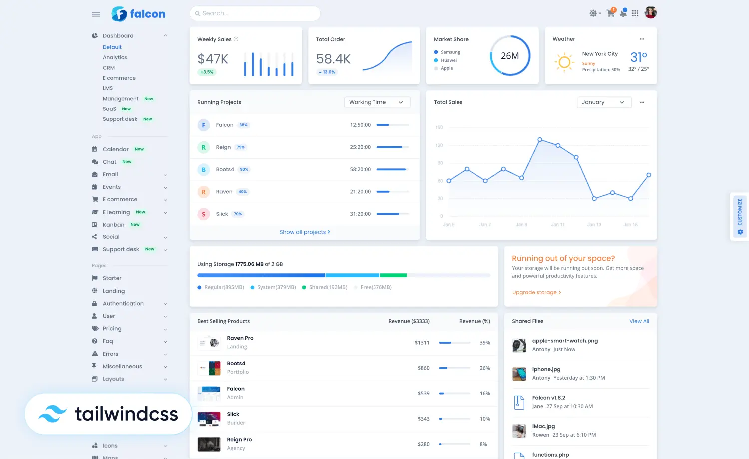
As web development is taking newer turns every other day, developers are designing every UI component with careful consideration and well-structured plans. Now is the time for interactive design development, which calls for interactive user interfaces on websites.
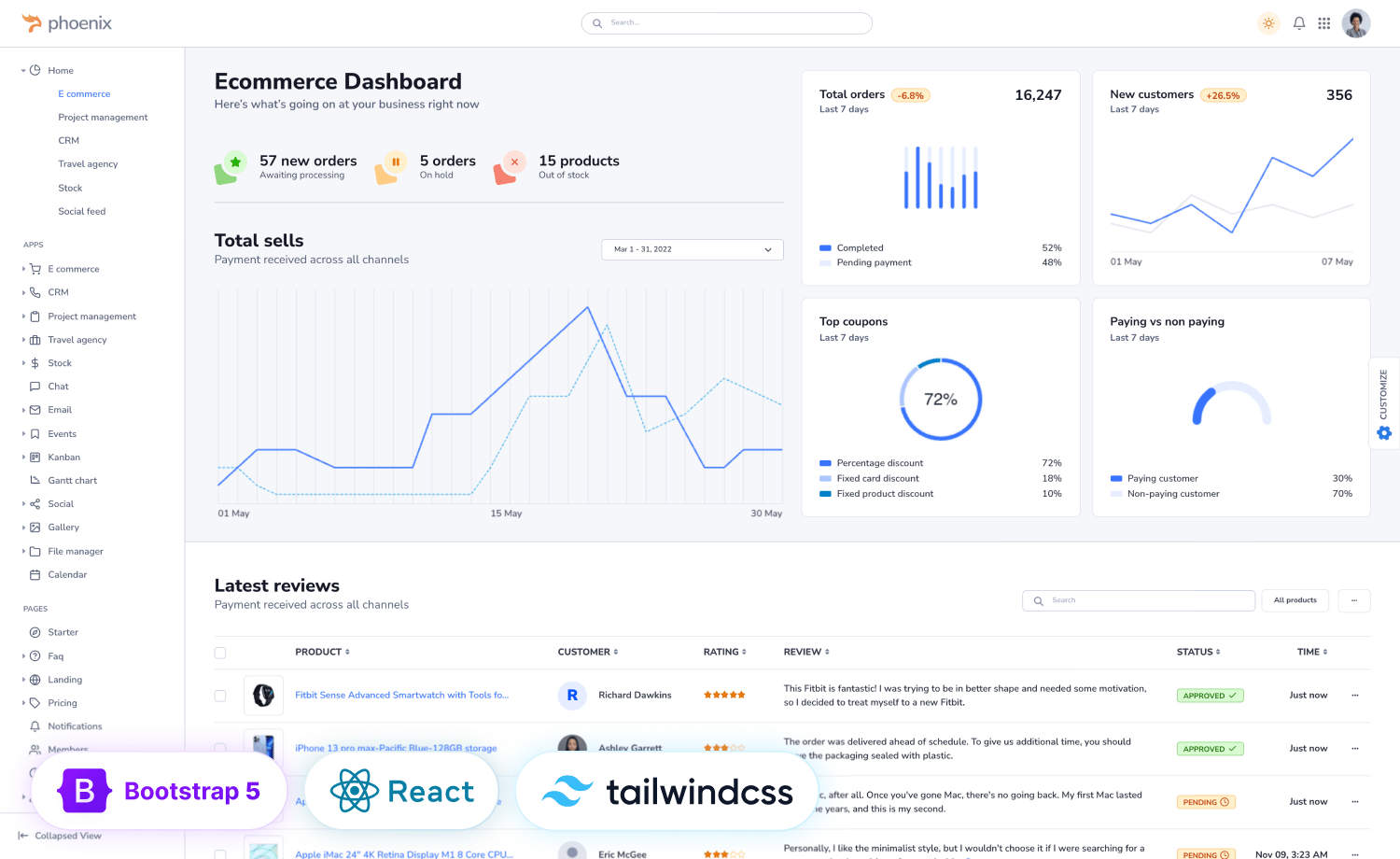
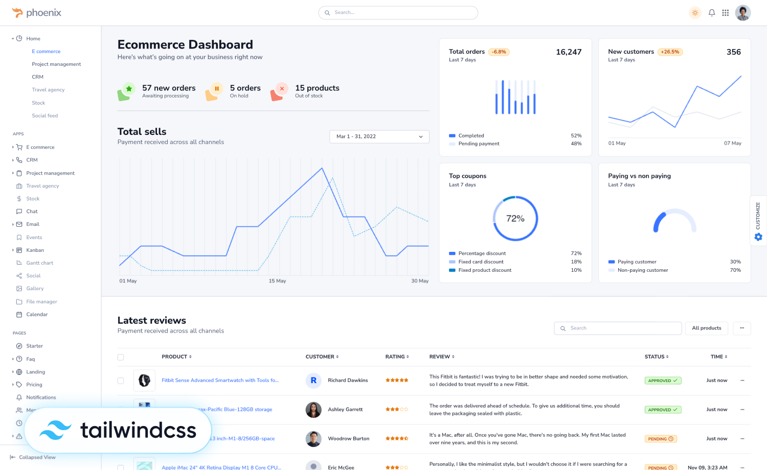
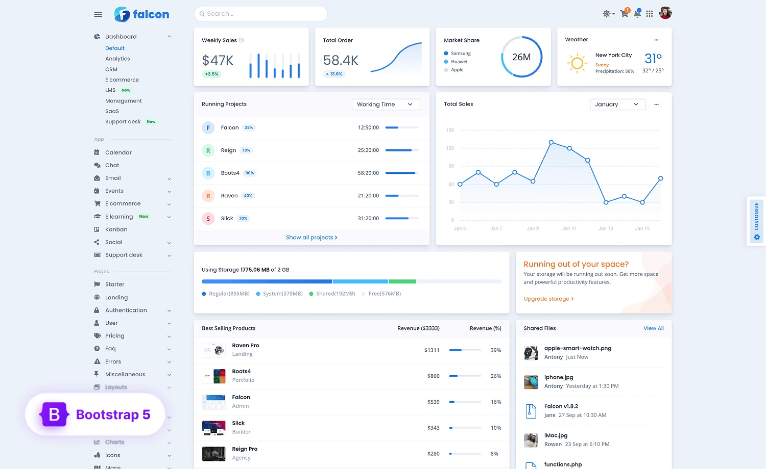
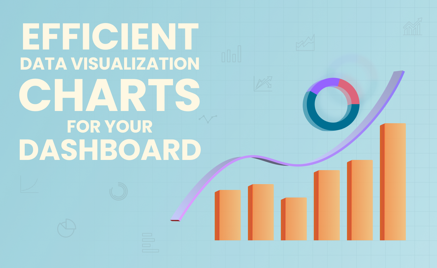
As a result of the growth of eCommerce has hiked the demand for charts and graphs on websites to ensure simple and efficient data visualization.
The growing need to exhibit data and information through concrete structures and categories compels developers to design effective charts for eCommerce websites. Certainly, data visualization needs to be more precise and vivid while keeping viewers’ interests.
There are many different types of charts, and the use cases are numerous. Moreover, developers need to know precisely how to use them to earn more engagement on the site. In this article, we’ll try to walk you through the basics of using different charts on eCommerce websites, different types of charts, their use case benefits, and the best ways to use them on your site like a pro!
Let’s read the details.
What is A Chart?
A chart is the graphical visualization of data where the data is represented by symbols and can represent tabular numeric data, functions, or other quality structures and provides different information on visualization.
Benefits of Using Charts On E-commerce Sites
Data visualization plays a crucial role in eCommerce websites. It mostly helps you get an overall idea about things you need to sort out to cut a sudden loss. Moreover, this can improve your overall user-experience design. Some key benefits include:
Unlocking Key Values
Data visualization ensures unlocking key values from massive data sets. Particularly, a large amount of data can be enormous and can be difficult to process. Data visualization makes understanding data easier with clear and easily visible key values.
Identify Patterns
Data visualization helps identify otherwise invisible patterns. Inherent properties can show and formulate newer insights that were unseen before if presented as data visualization. It allows business owners to understand the relationship between the relationships and patterns in the data. Moreover, it gives greater reasoning for focusing on specific data areas to determine the importance of these areas to moving the business forward.
Easy to Understand
Data visualization provides an easy way out of the presented data and helps clarify them in a simpler and more appealing way. Since the useful information would certainly be highlighted, the visual will be less noisy.
Attractive and Engaging
Data visualization is made attractive using appealing ways and adhering to design best practices and the by presenting data in a more sensible way using effective charts and graphs as well as appropriate formatting options. Thus it facilitates a smooth way to move between different points in the line of visualization, increasing engagement on the page. This way, the result resonates strongly with the audience.
Display Complex Relationships
Data visualization helps present numerous and vast data sets in a simpler way. A data visual allows interactive hierarchies. The interactivity then helps in data exploration to meet specific user needs.
Types of Charts
A good graph can effectively reduce the burden of comprehending the data based on bulk texts. As used for a visual representation of data, there are many types of charts and graphs to work on.
But firstly, we’ll be talking about the basic kinds; roughly, there are four, of which all other kinds have derived:
- Bar Graphs: Show the numbers that are independent or unconditioned of one another.
- Pie Charts: Show how fractionized elements divided up into different proportions.
- Line Graphs: Show how the input data changes over time. Anyone can use these for representing connected mutually correlated data.
- Cartesian Graphs: These graphs have data on each axis showing the smallest effects on one caused by the slightest changes.
Almost all other kinds are derivatives of these four. Below is a list of different types of charts and their uses that will help you decide the best type to use in your case without misleading the audience:
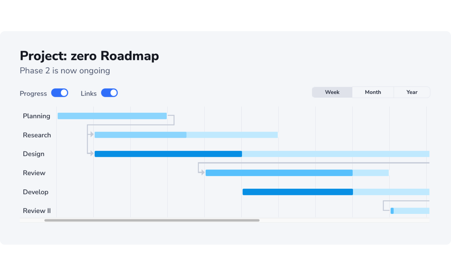
Gantt
Gantt chart is a bar chart, mostly used in project management. This chart is a powerful way to project activities against time. Also, besides tracking a project schedule, this chart is used to show additional information about the given tasks, phases, etc., of the ongoing project. So, it’s a graphic depiction of a project schedule.
Scattered
Scattered charts are one of the best practices in using charts and types of statistical graphs. This graph takes unclear data and makes it clear. This chart shows the relationship between two variables allowing the viewers to immediately understand a relationship or trend that would otherwise be incomprehensible or unclear.
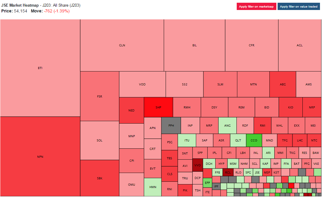
Heatmap
Heatmaps are used to graphically represent numerical data where the value of each data point is indicated using distinguished colors. The most common color scheme for these is warm-to-cool colors, representing high data points with warm colors and low data points with cool ones.
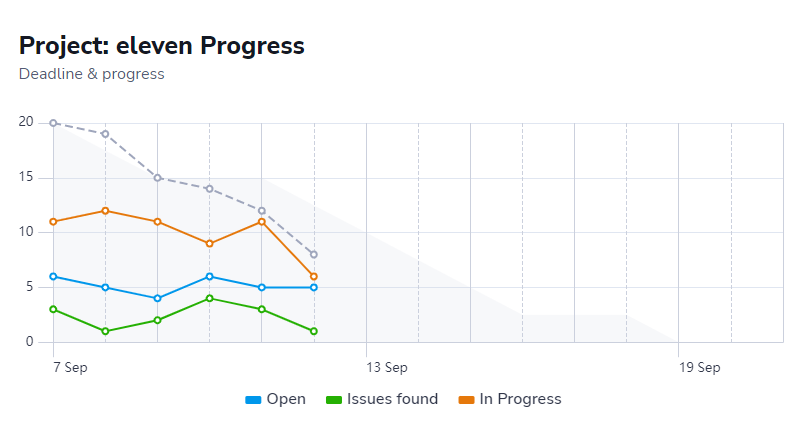
Burn Up
A burn-up chart shows progress over time. There are two main codependent lines to track the progress according to the plan. Burn-up charts keep track of what’s been accomplished across each point, thus allowing the analysis of necessary improvement fields and covering daily audits.
Burn Down
Burn-down charts are the graphical representations of work left to do versus the time left. These are run charts of outstanding work and are useful for the completion prediction. These can be applied to any project containing measurable progress over time.
Nested Pie
Nested pie charts are multi-level pie charts that allow incorporating multiple levels into your pie. They are module variations of standard pie charts.
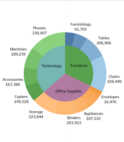
You can create nested pie charts, nested doughnut charts, etc., from the data you have in hand.
Funnel
Funnel charts are used to represent how data moves through a process. In a funnel chart, the dependent variable’s value is diminished in the subsequent stages of the process.
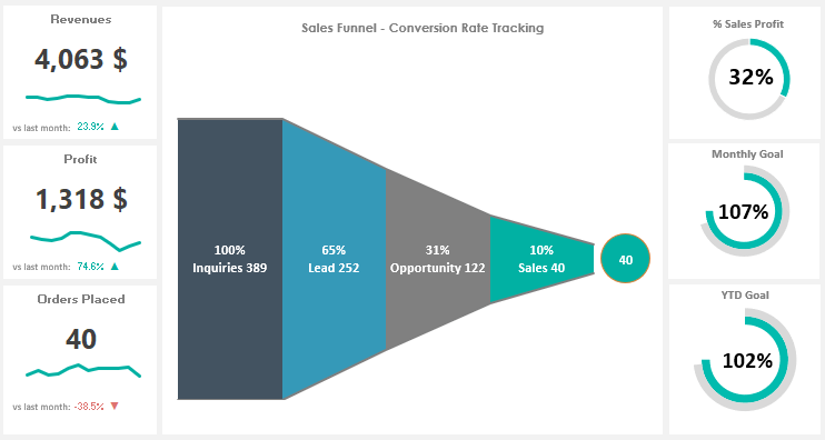
In this chart, the top bar, aka head or base, represents 100% or the whole, and the subsequent ones have lengths representing the proportion.
Sunburst
Sunburst visualization illustrates how underlying data predicts a chosen target and highlights key insights. The different levels represent different hierarchy levels which can be colored according to the category to which the hierarchy level belongs.
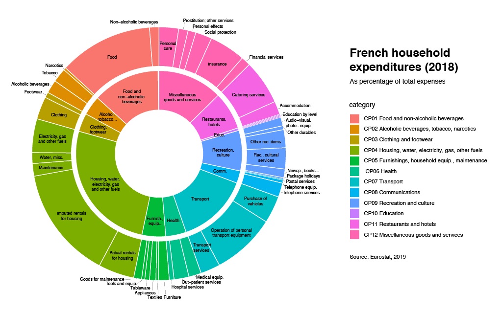
Its segments are proportional to value or divided equally under the parent node.
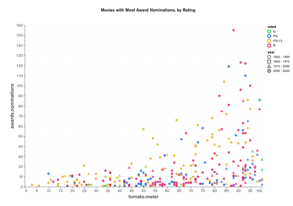
Bubble Chart
A bubble chart, also known as a bubble graph, displays data in three dimensions. Each data point is mapped as a disk, with two of the point values expressed through the disk’s coordinate system location and the third through its size.
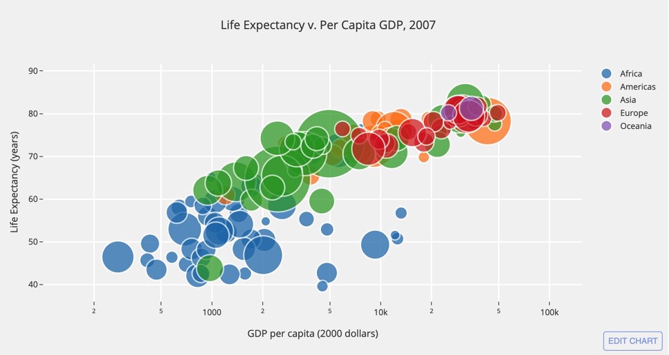
This can facilitate an understanding of social, economical, medical, or other scientific relationships.
Candlestick
This type of chart is most visible in trading and stock exchange. It is used as a trading tool to visualize and analyze price movements. Candlestick charts represent multiple bits of information through the candlestick-like symbols, which are look-alikes, not to be confused with bar charts.
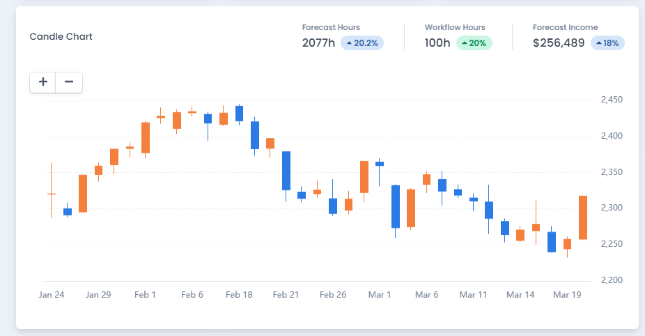
The main rectangle in the symbol is referred to as the real body, and it is used to display the price range between the open and closed prices for that period. Lower and upper shadows are the lines that extend from the bottom and top of the real body (or wick). Each shadow represents the highest or lowest price traded during the specified period. The body is usually white or green when the market is bullish (the closing price is higher than the opening price). When the market is bearish (the closing price is lower than the opening price), the body is usually black or red in color.
Nightingale
Nightingale Rose charts are drawn on a polar coordinate grid. Using this radial chart, the data can be examined by segmenting the circle into equal parts for each group or interval. The length of each segment from the center of the polar axis is determined by the value it represents. As a result, each ring from the polar grid’s center can be used as a scale to plot the segment size and represent a higher value.
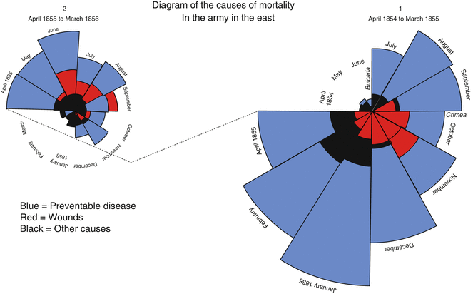
As a result, when using Nightingale Rose Charts, it’s important to remember that the area of a segment, rather than its radius, represents its value.
Hybrid
Hybrid charts combine multiple data types into a single network arrangement, making it easier to analyze real-world unorganized data. These charts combine more than one type of chart so that different datasets can visualize simultaneously in a more organized way.
Gauge/Progress Bar
Gauges are simple charts to indicate progress towards meeting a target or how close the current value is to the goal. This doesn’t include ranges but rather shows the value in percentage. It needs three columns or rows of data- one contains the current value of the gauge, another includes the maximum value, and the last one includes a label that appears above the gauge.
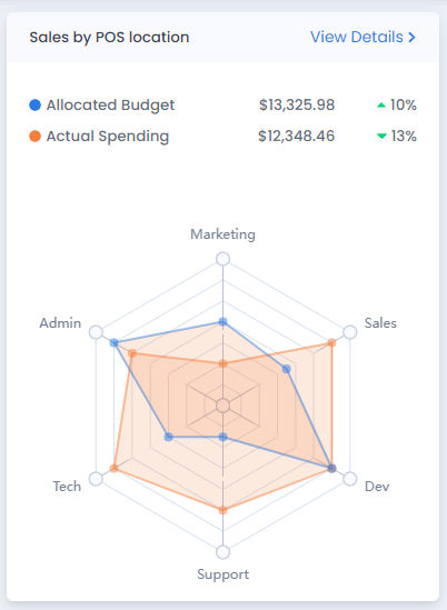
Radar Charts
Radar charts are used to display multivariate data in the form of a two-dimensional chart of three or more quantitive variables represented on axes starting from the same point. Useful for comparing the points of two or more different data sets. It can also be applied to sort the variables into relative positions that reveal distinct correlations or a multitude of other comparative measures.
Area Charts
Area charts are derivatives of line graphs and display quantitative data. It is a graph that combines a line chart and a bar chart to show changes in quantities over time. The data points are connected by line segments. The area below the line is colored or shaded so that other values are plotted below the lines and shaded in a different color, resulting in a chart with layers.
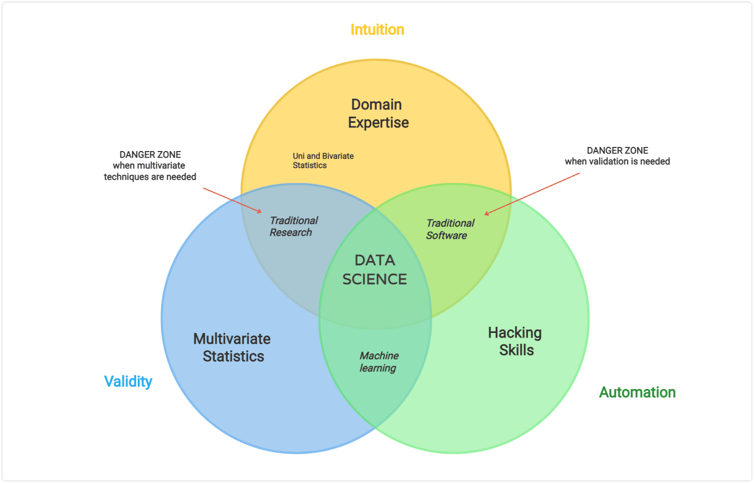
Venn Diagram
A Venn diagram shows the relationships among things or finite groups of things through illustrated circles, where overlapped circles mean commonality and the circles that do not overlap mean they don’t share the same traits.
Choose the Best Chart for Your Data
As discussed above, there are too many chart types to visualize your data on your site. As crucial as it is, there’s much to think about before thrifting any chart into your data visualization process. We have hence pinpointed some details below for your easier attempt:
To Show Comparison
While comparing different values or attributes within the dataset to each other, tables usually come in handy. Column and bar charts used to showcase comparisons across different categories.
| Chart Type | Ideal Use |
| Column Chart | Comparisons with fewer categories and short names (for display and readability purposes). |
| Grouped Column | Direct comparisons of multiple data series per category; become complicated to compare a single series across categories. |
| Bar Chart | Comparisons with a large number of categories and for displaying negative numbers. |
| Line Chart | Showing trends in continuous data over time. |
| Overlay Line | Showing trends in continuous data over time with multiple dimensions. |
To Show Distribution
This types of data seek to understand how each data point distributed within the broader data set. In this case, scattered charts show the distribution in large data sets, columns help find out the frequency of a process. Data over time.
| Chart Type | Ideal Use |
| Candlestick | Showing how data is distributed based on a five-number statistical summary, where a small box falls within a consistent range of data, whereas the larger ones indicate more widely used datasets. |
| Column Histogram | Showing the distribution of variables, plotting quantitative data, and identifying the frequency of something within a bucketed range of values. |
| Scattered Chart | Show data is distributed with two variables, which is especially good for large data sets; quickly identifying specific data points that are outliers. |
To Show Composition
Composition-related data visualizations aim to find the general data features present in the data set.
For these, pie and donut charts are best for smaller composition proportions, area charts to put the data composition within the context of trends over time, and column charts to show the overview of the data’s composition.
| Chart Type | Ideal Use |
| Donut Chart | Examining part-to-whole relationships when simple proportions provide meaningful information and pivots for multiple categories are needed. |
| Pie Chart | Examining part-to-whole relationships when simple proportions provide meaningful information. |
| Area Chart | Showing trends in continuous data over time in the context of part-to-whole relationships. |
| Stacked Bar | Showing an overview of the |
| Stacked Percent | When the pure data composition is the message you want to deliver, the exact values aren’t necessary. |
| Stacked Column | Showing an overview of data composition. |
To Show the Relationship Between Values
This kind of data seeks to show the relationship between values and traits. In this case, bubble charts and heat maps can come handy.
| Chart Type | Ideal Use |
| Bubble Chart | Showing the relationship between data points with three variables |
| Heat Map | Quickly relating information across a larger data set of exact values |
These data visualization charts provide users with an outlook of the data from a single compact location. Among these data visualization types, very none fits all. Afterward you should be careful before landing on any particular chart type. This will help you with your purpose and fuel deeper study leading to better business insights.
Moreover, you might also want to know about tips and tricks for using data visualization charts on your admin dashboard. After getting all the help you need, consider each decision entirely and you’ll face no problem ahead.