When designing pages that need to contain a lot of figures and data, you’ll naturally find that using a chart or a table is the absolute best way to convey that data. If you were to leave it buried deep within your copy, it would likely be much less useful — and thus much less likely to inspire a conversion.
However, once you’ve identified the chart or the table as the best tool for getting your message across, you’ll still be left with questions of organization, formatting, and structure.
Let us help you out and offer some tips on using charts and tables to better showcase important facts and figures, boosting your conversions at the same time.
Compare Your Data
Do you offer different programs, different levels of commitment, or different packages for your services? Do you sell similar products that come in at different prices and feature some differences that are easy to miss?
When this is the case, your best bet is to use a table that will compare and contrast the main elements and features of these products or services. It should enable your customers to determine at a glance what it is they’re getting, as well as which price point and product would be the best solution for their needs.
You often see these kinds of tables on pricing pages, especially in the SaaS industry. Here is how Shopify does it on theirs — allowing their customers to see all of the most important features of their plans without having to read through piles of data.
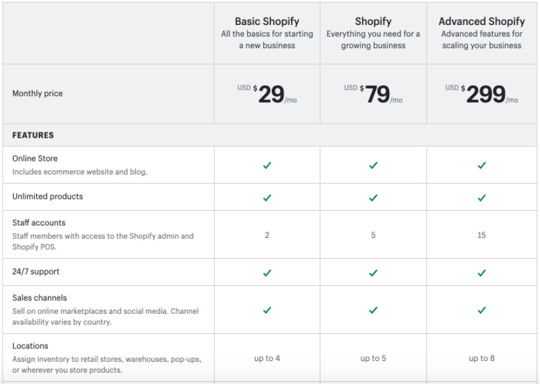
Source: shopify.com
Compare Main Features
Sometimes, you can’t identify your key comparison points as easily because different items will have very different features. Or perhaps your chart would be just too big to make any easy sense of, in which case it will instantly be defeating its own purpose.
When this is the case, you should try to compare the main features of the items or packages, or explain the main characteristics more clearly. You can see just this kind of comparison in Newsweek’s hybrid mattress post, where hybrid mattresses are compared to memory foam mattresses.
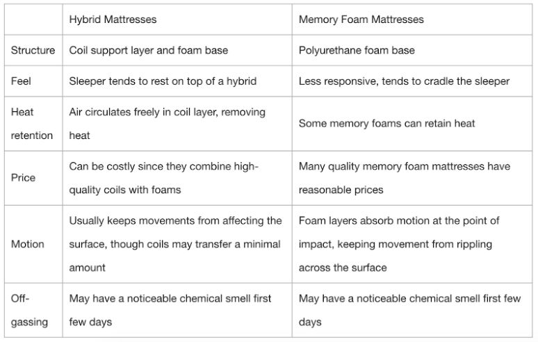
Source: newsweek.com
Bearing in mind that your main goal is to help your readers come to an easier decision, focus on the features that will make that possible. Don’t burden them with the minor characteristics that may be interesting to note but that don’t actually differentiate one product from another.
List All the Features
When it comes to pages that feature a single product, you might want to take a leaf out of Amazon’s book.
True, their pages often feature comparison tables with other products, but they also have very informative tables about individual products, listing the key features. They feature this same information in the product description section, but the table itself is all anyone needs to look at to be able to determine whether the product is right for them.
Here’s a Canon camera’s page that illustrates the point: there are several tables (albeit not formatted all that well) that can help a visitor determine whether or not this is the kind of product they are looking to buy.
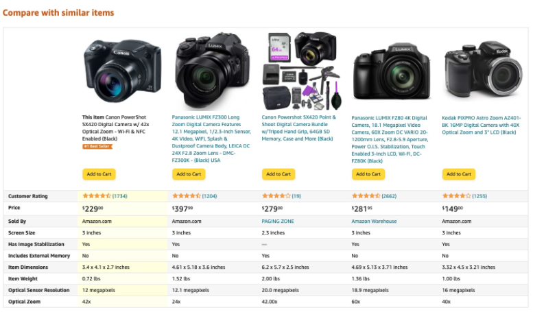
Source: Amazon.com
Make Sure the Information You List Is Correct
When listing product information, especially when comparing products you haven’t manufactured yourself, make sure you only use reliable and completely trustworthy sources. The internet is full of misinformation, especially about products that are being sold by different vendors.
If you can, always check with the manufacturer in order to ensure you don’t inadvertently claim something that isn’t strictly true. Something as simple as claiming the cord of a certain device is longer than it actually is can make you seem less professional and thus less trustworthy.
If unsure, get your hands on the product and check the details on the box. Or, you can make your own measurements and write the descriptions. When a customer receives exactly what was promised, they will be much more likely to not only come back but also to recommend you to their friends.
Don’t Use a Chart if You Don’t Need One
We all know how important visuals are for a page. However, throwing them in just for the sake of having them is not the best choice.
If you don’t have enough data to add to a table or chart, don’t force the more elaborate table design. Likewise, don’t force a chart or table when it’s much simpler and more visually appealing to use bullet points to illustrate the given data.
Remember that your ultimate goal is always to help your visitors. If they don’t need a chart, don’t make one.
Make Sure They Read Well on Mobile
The fact that most people surf on their mobile devices is nothing new. However, it’s astonishing how many websites still refuse to adapt their pages to mobile users.
Charts and tables often need to be additionally tweaked to ensure they load well on a smaller screen, with a different orientation especially. Otherwise, it may be too large and not fit properly — something that no amount of scrolling will fix — or it may not show up on the mobile page at all.
When you add your desired visual, always ensure that it loads well and fast enough across all kinds of devices and screen sizes. After all, there is a lot of difference between a tablet and an iPhone, so check your settings, and maximize your UX potential.
Final Thoughts
Whether you’re trying to sell something or to compare different products, cleverly using charts and tables on your pages can be a great way to boost conversions. That is, if these presentation tools are designed and filled out correctly.
Consider your target audience’s needs when coming up with these visual aids. What data would be most useful to them? How can you make this data easy to digest and understand?
Test out several different designs, sizes, and content in order to figure out what works best. Most importantly, remember to always double-check your data. You never know when a case of inverted figures can cost you a conversion.