
TL; DR:
Web frameworks such as React, Tailwind CSS, MUI, and Chakra UI offer comprehensive UI libraries that enable seamless development while preserving user freedom. Most of them are open-source, ensuring seamless access to high-quality features. Some also include pro versions with advanced or premium features, providing greater scalability for your website development.
- Copy-paste simplicity with zero setup: HyperUI, DaisyUI, Shadcn UI
- Full styling freedom with logic only: Headless UI, Radix UI, HeroUI
- Enterprise-grade, data-heavy UIs: Ant Design, MUI, PrimeReact
- Components with rich hooks & theming: Mantine, Chakra UI, DaisyUI
- Tailwind-native with modern tooling: Hummingbird, Flowbite, DaisyUI
As the ecosystem grows, choosing the right UI library is no longer just about popularity. A library that works well for faster projects may feel limiting as your app grows. On the other hand, more flexible options often require additional setup early on. Therefore, it’s necessary to understand the design philosophy, level of customization, design consistency, and other factors to choose the right UI library for your workflow.
In this blog, we’ll dive into the handpicked list of the best open-source UI libraries in 2026.
By the end of your reading, you’ll get a clear concept of the core differences and strengths of these libraries, which can help you select the right one for your next project.
How we selected these UI libraries
We curated this list based on the following criteria:
- Regular updates
- Active Community Support
- Real-world applications
- Developer Experience
- Ease of use & maintained codebases
Additionally, the list balances popularity with practicality, featuring both top libraries and established enterprise-grade solutions, as well as specialized tools.
The Most Sensible Open-Source Tailwind UI Library – Hummingbird is live!

Open-Source UI Libraries: A Quick Overview
Open-source UI libraries are freely available collections of interface components whose source code is publicly accessible. Unlike proprietary solutions, you can inspect, modify, and contribute to them without licensing restrictions.
Why Use Open-Source UI?
Open-source UI libraries come with a set of practical advantages worth understanding before you pick one. Such as:
- Community-driven quality: Libraries like React, Tailwind CSS, and shadcn/ui are battle-tested by thousands of developers across diverse projects. Bugs get caught faster, features evolve organically, and solutions reflect real-world needs rather than vendor assumptions.
- Transparency and control: You can read the exact code running in your application, audit security yourself, and customize components without waiting for vendor approval. No black boxes, no vendor lock-in, no surprise pricing changes.
- Cost and flexibility: They provide zero licensing fees, unlimited customization, and the freedom to fork if your needs diverge. When issues arise, active communities on GitHub and Discord often provide faster support than traditional tickets.
Therefore, open-source UI libraries provide production-grade tools without the constraints of proprietary software, ensuring compliance with standards.
Let’s move on to the curated list of top open-source UI libraries:
Hummingbird
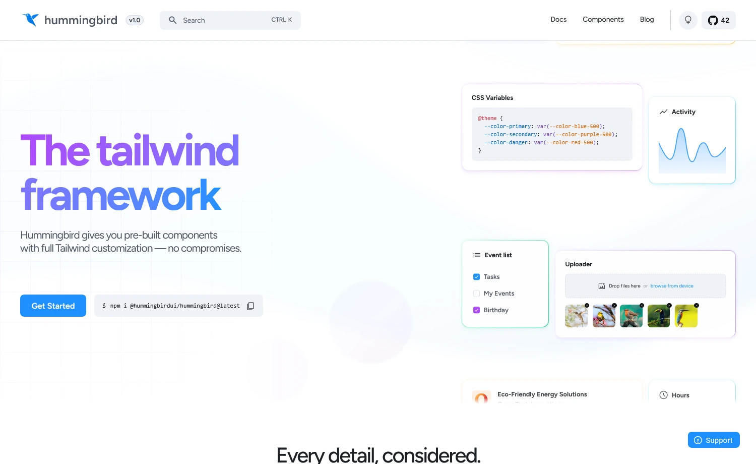
Built on the latest Tailwind CSS, Hummingbird is a feature-rich, open-source user interface framework from ThemeWagon. It offers well-structured UI components for scalable web apps, facilitating quick development. It is designed to be one of the most sensible and developer-friendly UI libraries for a flawless experience. In addition, the new Tailwind component system offers plug-and-play integration and an architecture that prioritizes performance, usability, and simplicity.
Developer Experience with Hummingbird
Available Components
- 320+ reusable components
- Semantic Tailwind component system
- Uses Bootstrap JavaScript core for interactive components
Framework Support
- Works with React, Vue, Vanilla JS, or any framework
- Faster setup via CLI
npx create-hummingbird-app@latest my-app --yes - ESM and CJS are built for modern & legacy tooling
- Framework-specific integration guides available
Customization Practice
- Semantic component classes built on Tailwind utilities
<!-- Semantic classes & utilities -->
<button class="btn btn-primary rounded-full px-8">
Button Component
</button> - Minimal CSS variable theming
/* Theme customization */
@theme {
--color-primary: var(--color-blue-500);
--background-color-default: var(--color-white);
}

@variant dark {
--color-primary: var(--color-blue-400);
} - Extend with Tailwind utilities as required
Learning Curve & API
- Low learning curve for Bootstrap & Tailwind users
- Semantic class names reduce code writing
- Data attributes for interactive components
- JavaScript API for programmatic control
TypeScript Support
- Full TypeScript support
- Built-in type definitions for JavaScript API
- Component-specific TypeScript modules available
Accessibility & Performance
- WCAG-compliant color contrast by default
- ARIA attributes included in interactive components
- RTL support via
dir="rtl" - Tree-shakeable components for optimized bundle size
When to Choose Hummingbird
Choose Hummingbird
- Want cleaner markup with Tailwind’s power
- Require a framework-agnostic UI library
- Need minimal theming with CSS variables
- Prefer Tailwind-style Bootstrap interactivity
Consider Alternatives
- Need React-specific components
Alternative: shadcn/ui, Chakra UI, Mantine - Need headless primitives
Alternative: Radix UI, Headless UI
Headless UI
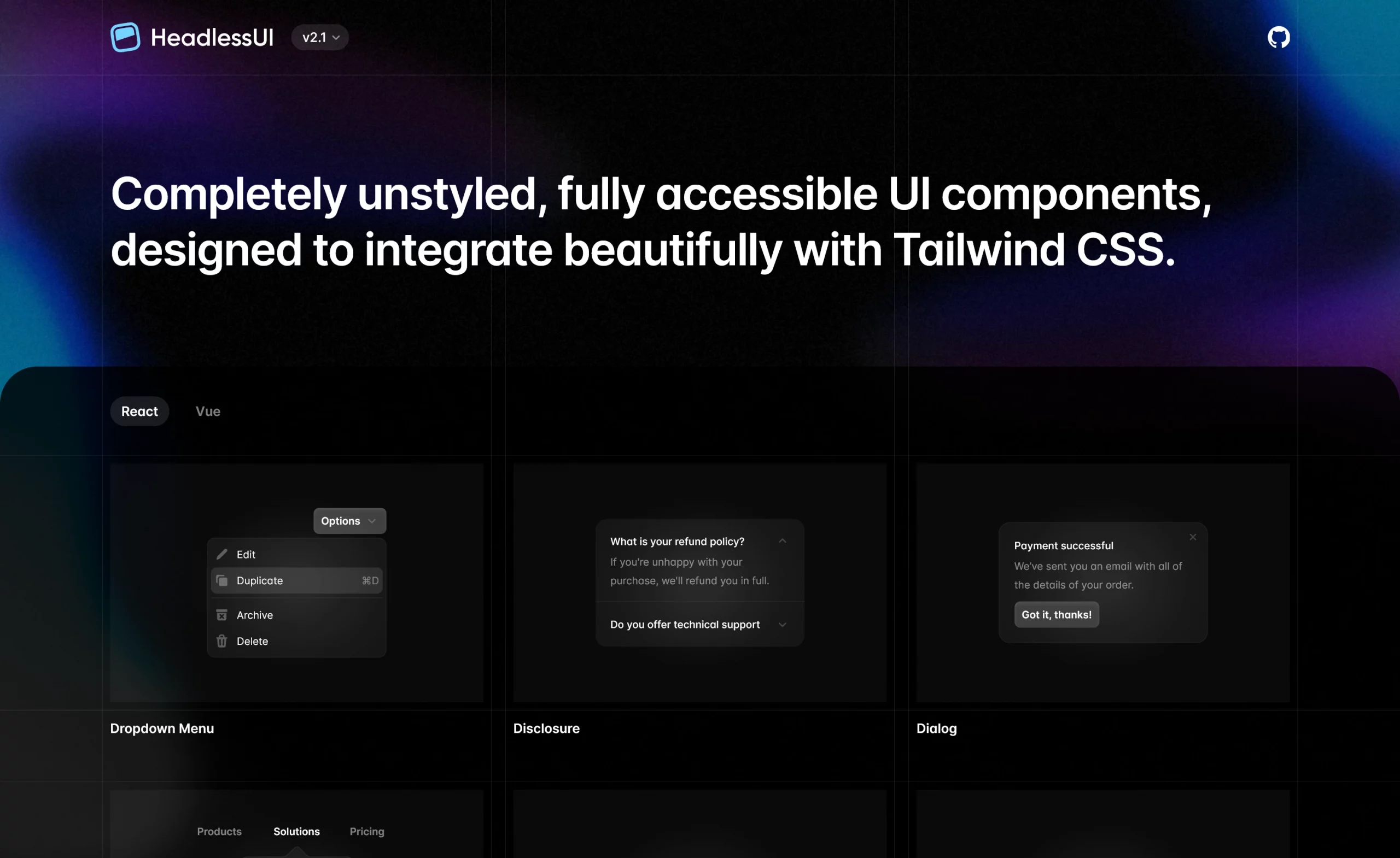
Headless UI is an unstyled component library built by the creators of Tailwind CSS. The open-source UI library leverages logic-ready UI components, eliminating styling constraints. Additionally, it offers lightweight, flexible, and production-ready solutions for a wide range of design requirements.
Developer Experience with Headless UI
Available Components
- Limited but focused component set (20+ components)
- Covers essential interactive components: modals, dropdowns, toggles, tabs
Framework Support
- Available for React and Vue.js
#for Reactnpm install @headlessui/react#for Vuenpm install @headlessui/vue - Smoothly integrates with modern SSR frameworks (Next.js, Nuxt.js, etc.)
Customization Practice
- Complete design control
- Immediate component access after installation
npm install @headlessui/vue/*main.css file*/
import { Input } from '@headlessui/react'function Example() {
return <Input name="full_name" type="text" />
}
This code builds an input section, where you could use theInputcomponent instantly after the installation. - Custom styling through
classNameprops and CSS-in-JS methodimport { Button } from '@headlessui/react'export default function Example() {
return (
<Button className={customStyle}>
Click me
</Button>)}
Like CSS-in-JS, this code calls theButtonin a function and lets you style it with theclassNameprops.
Learning Curve & API
- Deeper CSS knowledge and design concepts
- Beginner-friendly Documentation
- Consistent API across all components
- Predictable naming conventions
- Requires compound component pattern knowledge
TypeScript Support
- Excellent TypeScript support out of the box
- Full type definitions included
- Generic components support proper typing
- IntelliSense works perfectly in VS Code
Accessibility & Performance
- Lightweight & efficient
- Reduces your bundle size by shipping with no CSS
- Consistent ARIA, keyboard navigation & screen reader support
When to Choose Headless UI
Choose Headless UI
- You have design expertise
- Building custom design systems
- Prefer logic over predefined styling
- Require full control over design
Consider Alternatives
- Building a larger or more complex project
Alternative: MUI, Flowbite, Chakra UI - Need fast prototyping with pre-built themes
Alternative: shadcn/ui, MUI, Chakra UI
Flowbite
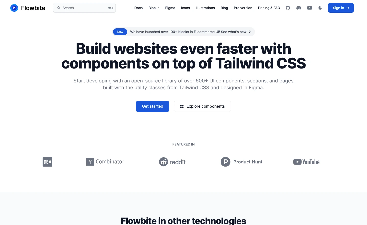
Flowbite is a UI library that offers both open-source and pro versions and supports native Tailwind CSS projects. It provides modern UIs, typography, RTL support, and DataTables for a seamless developer experience. Moreover, the latest Flowbite offers new AI tools utilizing LLMs, along with additional modern tools.
Developer Experience with Flowbite
Available Components
- Limited free components (over 56 UIs)
- Advanced components require Flowbite Pro
Flowbite Pro: The Pro version offers two types of editions.
1. Developer Edition, recommended for professional and enterprise-level development. This edition features a variety of UI blocks, core UI components, admin dashboards, landing pages, Figma file editing, and more.
2. Design Edition, which provides a comprehensive design system with an upgraded Figma toolkit. It features variants, a style guide, auto-layout, and more.
Here’s the pricing table for the different editions:
| Community Edition | Developer Edition | Designer Edition |
| Free & Open-Source | Buy at 299$ | Buy at 169$ |
Framework Support
- Native compatibility through framework-specific packages
- Framework-specific implementation. Example:
#For Reactnpx create-flowbite-react@latest;#For Next.jsnpx create-flowbite-react@latest -t nextjs;
Customization Practice
- Uses native CSS variables for natural customization
- Requires post-installation setup by importing the Flowbite plugin in the main CSS [input.css] file
/*index.css file*/
@import "tailwindcss";
@plugin "flowbite/plugin";
@source "../node_modules/flowbite"; - Offers many variable namespaces for custom styling
Example: Variable namespace for colors:--color-{name}
@theme {
--color-primary-100: #eff6ff;
--color-primary-200: #dbeafe;}
This is a list of two custom colors attributed to theprimaryvariable name. The utility class names, such asbg-primary-100will now use these colors with Tailwind.
Learning Curve & API
- Basic to moderate Tailwind CSS customization
- Straightforward API for easy component switching
- Built on plain HTML & Tailwind, no deep abstraction layers
TypeScript Support
- Written in JS with optional TypeScript Support
- Features built-in type declarations for all components
- Works as pure JavaScript without TypeScript
Example:/*Flowbite without TypeScript*/
import { Modal } from 'flowbite'
const modal = new Modal(element, options); // No types required
/*Flowbite with TypeScript*/
import { Modal } from 'flowbite'
import type { ModalOptions, ModalInterface } from 'flowbite'
const modal: ModalInterface = new Modal(element, options); // Types enforced
Hence, Flowbite does not depend entirely on TypeScript to function.
Accessibility & Performance
- All components follow WCAG (Web Content Accessibility Guidelines)
- Robust feature support:
– Typography
– RTL
– HUGO integration (a static site generator with taxonomy-based file organization)
– Rapid asset pipeline - AI-driven component generation with the latest LLM feature.
When to Choose Flowbite
Choose Flowbite
- Need AI tools for UI generation
- Creating data-heavy applications
- Need advanced UIs with minimal setup
- Require Figma design system support
Consider Alternatives
- Prefer deep customization
Alternative: shadcn/ui, HeadlessUI - If you’re using Angular or Vue
Alternative: PrimeVue, Vuetify

DaisyUI
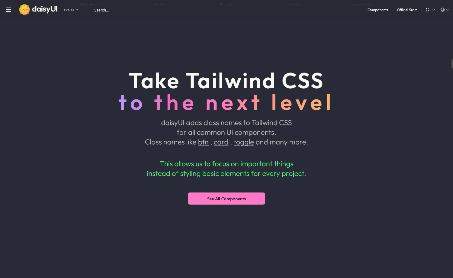
It is another popular open-source UI library that works through the Tailwind CSS plugin. The component library adds semantic class names to Tailwind CSS without compromising its utility-first approach. It’s also a framework-agnostic UI library that works everywhere Tailwind CSS is supported.
Developer Experience with DaisyUI
Available Components
- Offers over 63+ free components (59 unique)
- All components are free and open-source
- Elements are built considering accessibility
Framework Support
- Works with any framework supporting Tailwind CSS
- Easier to migrate between frameworks
- Simple setup with plugin installation.
/*app.css file*/
@import "tailwindcss";
@plugin "daisyui";
Customization Practice
- Uses Tailwind’s native configuration
- CSS custom properties for hassle-free customization
Example1:<button className="px-4 py-2 bg-blue-500 text-white rounded-lg hover:bg-blue-600 focus:outline-none focus:ring-2 focus:ring-blue-300">
Click me</button>
Example2:<button className="btn btn-primary">Click me</button>
Example1 uses multiple Tailwind utility classes to style the button, which can clutter the markup and reduce readability. Whereas Example2, withbtn btn-primaryfrom daisyUI abstracts the styles into semantic class names, making the code cleaner, more readable, and easier to maintain. - Theme switching via
data-themeattribute, without altering the code - Includes base styles, utilities, and variables for practical usage of the library
- Offers Theme Generator tool to design & export custom themes
Learning Curve & API
- Gentle learning curve for Tailwind CSS users
- Class-based API with no extra props or JS to learn
- Semantic, accessible class names that are easy to remember
- Basic understanding of semantic HTML and framework setup required
TypeScript Support
- No additional type definitions required
- Uses standard HTML attributes and CSS classes
Accessibility & Performance
- Enhanced accessibility and simplicity
- Zero third-party dependencies
- WCAG-friendly & improved ARIA-attributes roles
- Fully compatible with Tailwind CSS v4
When to Choose DaisyUI
Choose DaisyUI
- Utility-first Tailwind requires minimal setup
- Require extensive theme support
- Pure CSS solution preferred
- Need zero JavaScript for theme switching
Consider Alternatives
- Need advanced components
Alternative: MUI, Ant Design, PrimeReact - Require JavaScript with a utility approach
Alternative: Flowbite, Preline UI
HyperUI
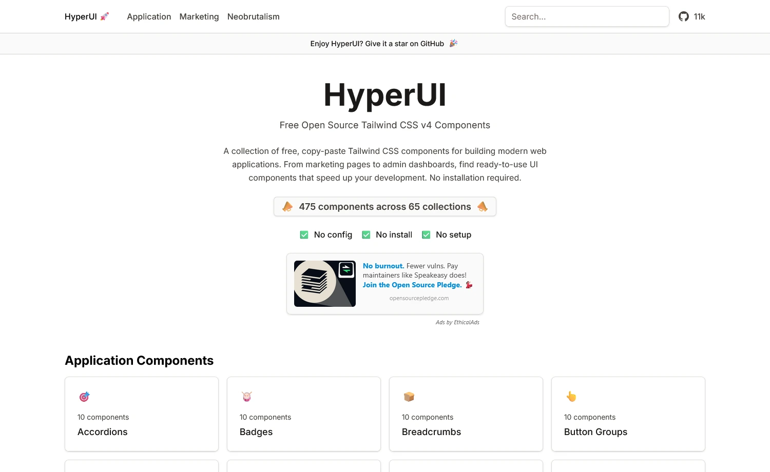
The next one is HyperUI. The library contains ready-to-use components built for Tailwind CSS projects. Simply copy the UIs directly into your project without installing any additional packages or dependencies. Besides, it’s a fast, lightweight solution ideal for prototypes and straightforward layouts.
Developer Experience with HyperUI
Available Components
- 200+ free components with categorized libraries
- Written in plain HTML with utility classes
- No JavaScript or framework dependency
Framework Support
- Copy-paste integration, no installation needed
- Compatible with any frontend framework using Tailwind CSS
Customization Practice
- Simple customization by editing utility classes or Tailwind config
- No additional theming, variant, or styling API required
<!--a HyperUI component-->
<button class="inline-flex items-center rounded bg-indigo-600 px-4 py-2 text-white hover:bg-indigo-700">
  Click me
</button>
<!--Customized by directly editing Tailwind classes-->
<button class="inline-flex items-center rounded bg-emerald-500 px-6 py-3 text-white hover:bg-emerald-600">
  Custom Button
</button>
Learning Curve & API
- Low learning curve
- No built-in JS API
- Beginner-friendly with Tailwind basics
TypeScript Support
- No TypeScript support needed (since it’s markup)
- Usable in any TypeScript-based project
Accessibility & Performance
- No setup required
- Skips repetitive work of designing base UI code
- Provides flexibility with editable open-source codes
When to Choose HyperUI
Choose HyperUI
- Want copy-paste production-ready UIs
- Need no hydration or runtime cost
- Building static sites or landing pages
- Prefer visual component browsing
Consider Alternatives
- Require framework-specific components
Alternative: shadcn/ui, Chakra UI, MUI - Want advanced features
Alternative: Tailwind UI (official, paid)
HeroUI
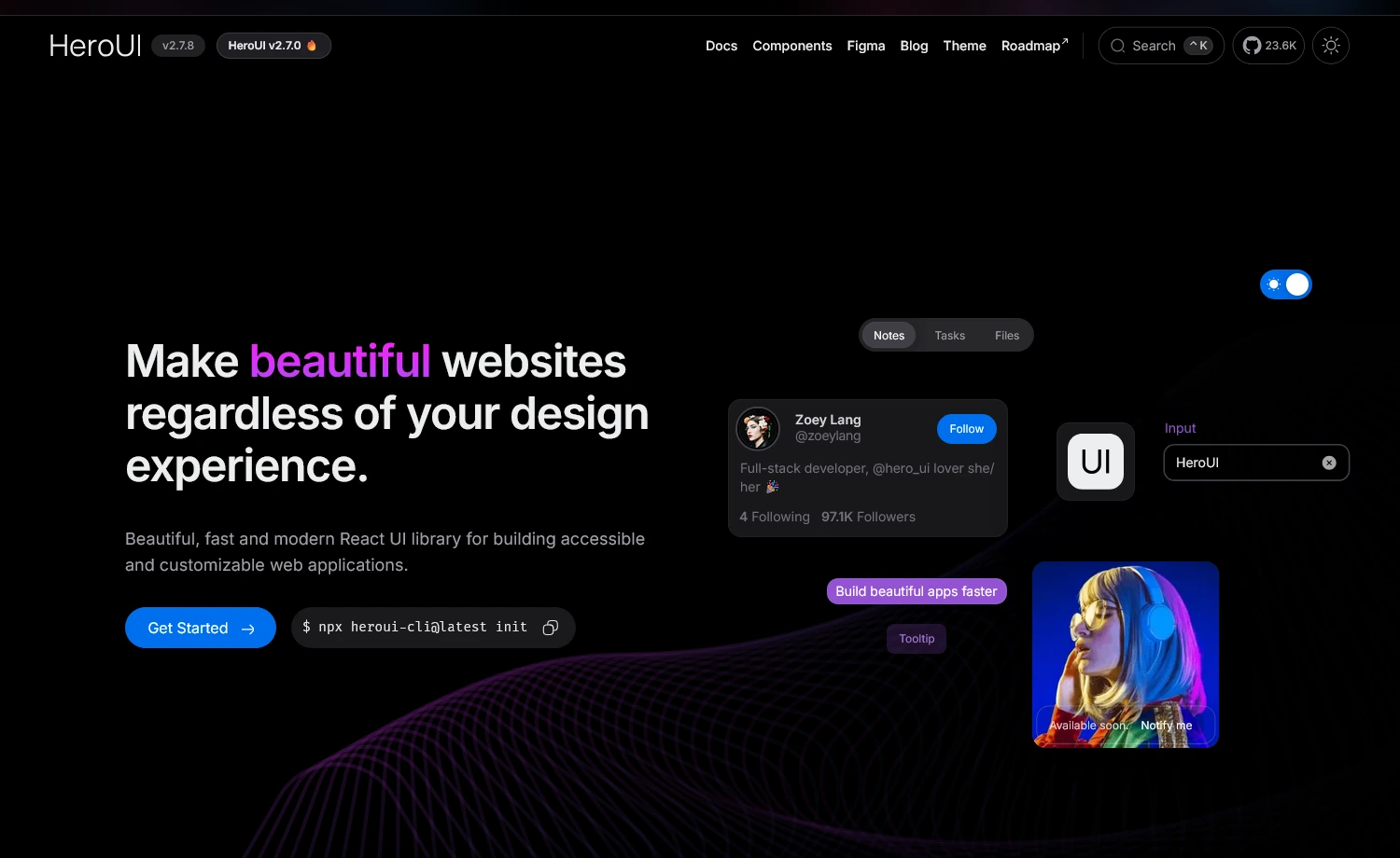
HeroUI (formerly NextUI) is a React UI library built on Tailwind CSS and React Aria, offering a variety of accessible, logic-ready components. With over 99k weekly downloads, the UI library is well-supported and growing. It provides fully styled, accessible React components that integrate seamlessly with Tailwind and help you build UIs faster, without sacrificing performance or customization.
Developer Experience with HeroUI
Available Components
- 50+ core UI components & patterns
- Community-driven regular updates
Framework Support
- Compatible only with React
- Works with Next.js, Vite, Remix
- CLI for automated npm-based installation
Example:#CLI installation
npx heroui-cli@latest upgrade --all --beta
#Manual installation
npm install @heroui/react@beta
Customization Practice
- Built on Tailwind CSS utility classes for easy styling customization
- Supports CSS-in-JS and styled-components patterns
- Theme-based customization through configuration files & the heroui plugin
- Component-level style overrides using
classNameprops<CircularProgress
classNames={{
svg: "w-36 h-36 drop-shadow-md",
indicator: "stroke-white",
track: "stroke-white/10",
value: "text-3xl font-semibold text-white",
}}
value={70}
strokeWidth={4}
showValueLabel={true}
/>
Here, the component slots:svg,indicator,track, andvaluewere customized using theclassNamesprops that create a customCircularProgresscomponent overriding the styles.
Learning Curve & API
- Moderate learning curve
- Familiarity with React & Tailwind CSS is a plus
- Consistent API patterns across components
- Well-documented API with clear prop interfaces
TypeScript Support
- Fully-typed TypeScript API
- Type-safe theme customization
- Strong type definitions for props & callbacks
- Complete IntelliSense & compile-time error detection
Accessibility & Performance
- Zero runtime styles
- WCAG compliant with proper ARIA attributes
- Default keyboard navigation & screen reader support
- Optimized animations via Framer Motion
- Individual package installation reduces bundle size
When to Choose HeroUI
Choose HeroUI
- Building React applications
- Want accessibility without manual work
- Building SaaS dashboards or admin panels
- Prefer a structured component system
Consider Alternatives
- Working with non-React frameworks
Alternative: shadcn/ui, DaisyUI - Require highly specialized components
Alternative: Headless UI, Radix UI
MUI
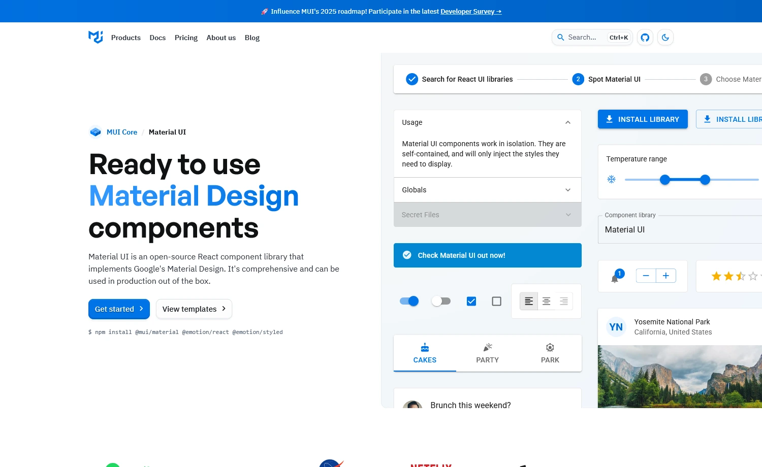
MUI (Material UI) is a comprehensive React component library, boasting 93K+ GitHub stars and powering thousands of production apps. Unlike Tailwind CSS component libraries, MUI provides enterprise-grade components with Material Design principles baked in. Its framework-like capabilities often lead to confusion with CSS frameworks. However, at its core, MUI is a component library that offers an advanced solution for UI/UX design, positioning itself as an all-in-one solution for React applications that need polish, consistency, and scalability.
Developer Experience with MUI
Available Components
- 80+ components covering most UI needs
- Advanced features requiring Pro or Premium licenses
- Layout components with a responsive grid system
- Icons library with 2000+ Material Design icons
Framework Support
- React-focused framework compatibility
- Built-in support for Next.js App Router and Pages Router
- SSR support with proper configuration
- React 19 required for the latest versions (MUI v6+)
Customization Practice
- Customization via
sxprop (inline styling), styled() API, or theme-aware styling<Button sx={{
backgroundColor: 'primary.main',
borderRadius: 4
}}>
Custom Button
</Button>
Here, we declared a JavaScript object using the theme-aware valueprimary.maininside thesxprop. So, the button gets a background color from MUI theme (theme.palette.primary.main). It ensures color consistency across the app. - Offers global customization using
createTheme ()const theme = createTheme({
palette: {
primary: {
main: '#1976d2',
},
},
});
This will create a new theme namedthemewith the declared color palette.
Learning Curve & API
- Moderate to steep learning curve
- React props & component pattern is required
- Standardized slot pattern with consistent API
TypeScript Support
- Comprehensive type definitions
- Full IntelliSense support in modern IDEs
- Requires TypeScript 4.9 or higher for optimal type safety
- Type-safe theme customization and component props
Accessibility & Performance
- Screen reader-friendly components
- Supports React Server Components (RSC)
- Tree-shaking support to reduce bundle size
- Container queries utility for responsive designs
When to Choose MUI
Choose MUI
- Require Material Design principles
- Building dashboard-heavy or data-driven apps
- Need ready-made complex components
- Want strong typing & documentation support
Consider Alternatives
- Simple styling with built-in accessibility
Alternative: Chakra UI - Need Tailwind-based, headless UIs for React
Alternative: shadcn/ui, Radix UI
Chakra UI
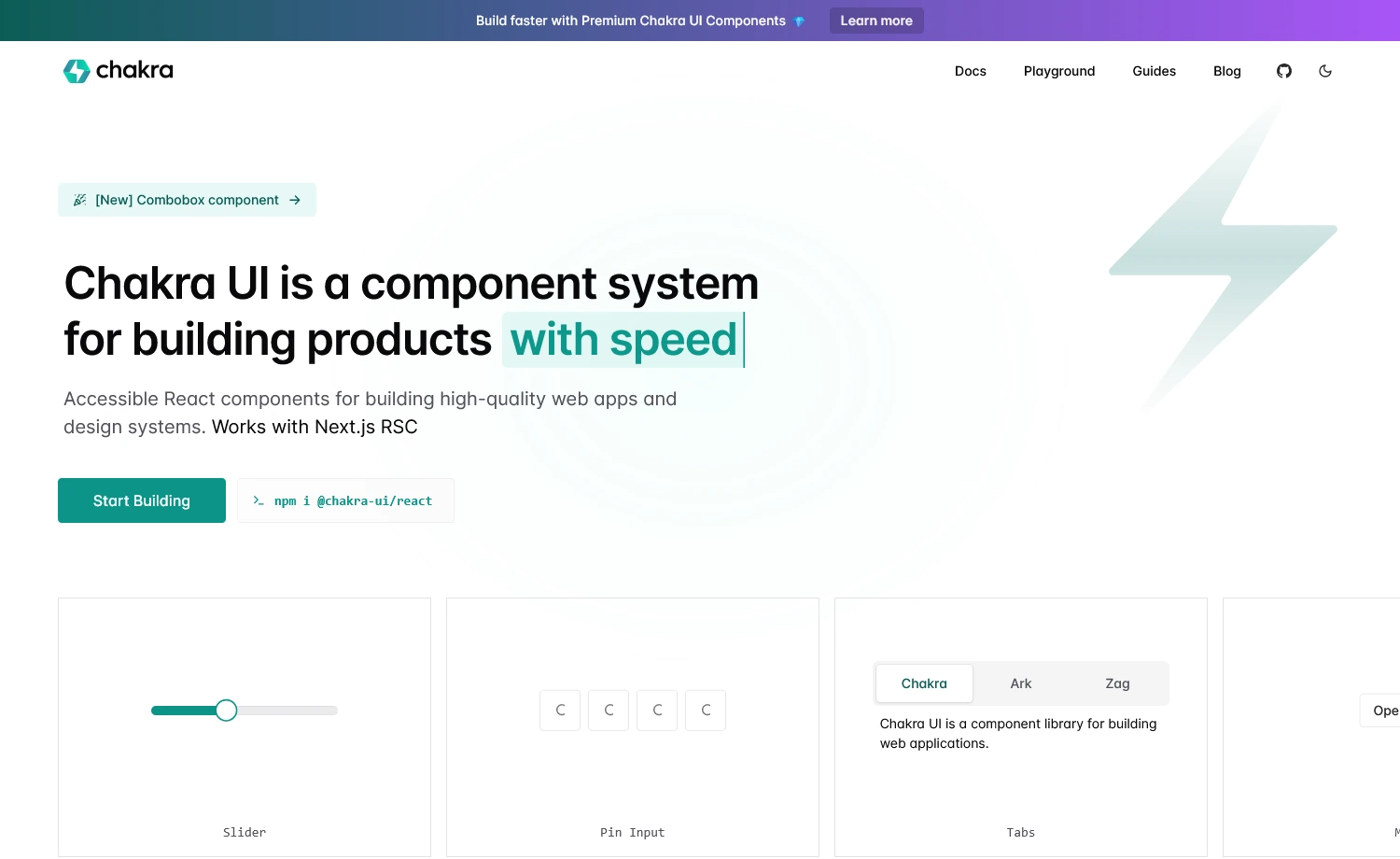
It is another comprehensive React component library with advanced components, including a combobox and a download trigger. The component library is popular for its variety of charts. Besides, Chakra UI is built with developer experience in mind and fully supports TypeScript.
Developer Experience with Chakra UI
Available Components
- Comprehensive library with 70+ components
- Advanced enterprise-grade components
Framework Support
- React-only library with full Next.js support
- Supports App Router and RSC
- Works seamlessly with SSR frameworks
Customization Practice
- Direct styling through component props without CSS
- Built-in themes with tokens for global customization
- Reusable variant system for consistent styling
import { Button } from '@chakra-ui/react'
//style props approach
<Button colorScheme="blue" size="lg" p={4}>
  Click me
</Button>
//Theme customization
import { createSystem, defaultConfig } from '@chakra-ui/react'
export const system = createSystem(defaultConfig, {
  theme: {
    tokens: {
      colors: {
        brand: { value: '#3182ce' }
      }
    }
  }})
This code defines reusable theme tokens in Chakra UI and shows styling with props.
Learning Curve & API
- Moderate learning curve
- Steeper if unfamiliar with prop-based styling approach
- Consistent API patterns across all components
- Well-documented with clear examples
TypeScript Support
- Excellent IntelliSense & autocomplete
- Type-safe theme customization
- Exported prop types for extending components
Accessibility & Performance
- WAI-ARIA compliant
- Automatic focus management
- Zero runtime styles with an externalized styling engine
- Native CSS animations (no Framer Motion dependency)
When to Choose Chakra UI
Choose Chakra UI
- Prefer prop-based styling with React
- Need strong accessibility with UIs
- Prioritize rapid prototyping
- Comfortable with the CSS-in-JS approach
Consider Alternatives
- Need zero-runtime styling
Alternatives: shadcn/ui, DaisyUI - Need minimal bundle size
Alternatives: Headless UI, Radix UI
Ant Design
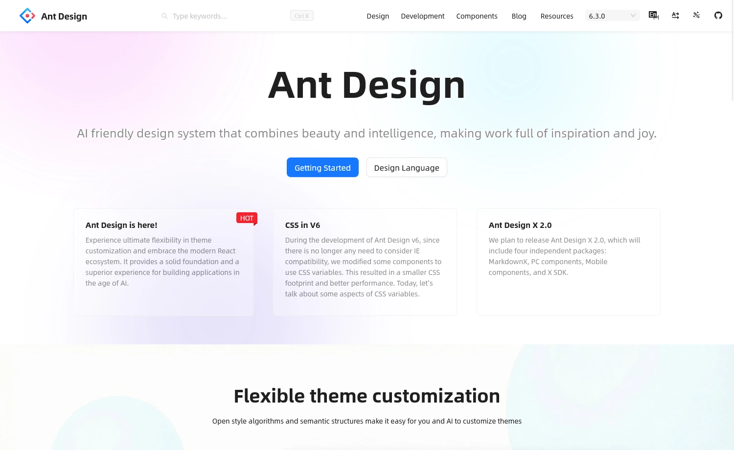
Ant Design (AntD) is a comprehensive React UI component library designed for enterprise-level applications. It offers a polished design system, rich component set, and strong internationalization support. Built and maintained by Alibaba, it provides high-quality defaults and robust TypeScript support, making it ideal for business dashboards and complex workflows.
Developer Experience with Ant Design
Available Components
- 60+ high-quality, production-ready components
- Fully free and MIT-licensed components
- Forms with built-in validation
- Tables with sorting/pagination
- Charts (via AntV), DatePickers, Modals, Uploads, etc.
- RTL support, tree components, and layout utilities
- New upgrades: Enhanced semantic structure, improved Table with virtualization
Framework Support
- React-only library (React 19 recommended)
- Full Next.js support, including App Router & Server Components
Customization Practice
- Centralized theming using design tokens (
colorPrimary,borderRadius) - Applied globally via
ConfigProvider - Styles are generated at runtime with CSS-in-JS
example:<ConfigProvider
theme={{
token: { colorPrimary: '#1DA57A' },
}}
>
<App />
</ConfigProvider>
Here, changing thecolorPrimarytoken updates the primary color across all components.
Learning Curve & API
- Moderate to steep learning curve
- Requires React & CSS-in-JS styling familiarity
- Consistent API patterns
- Detailed documentation
TypeScript Support
- Full TypeScript support with complete type definitions
- Excellent IntelliSense and autocomplete
- Strong type safety across all components
- Generic components support proper typing
Accessibility & Performance
- Partially WAI-ARIA-compliant with ongoing improvements
- v6 eliminates runtime overhead using CSS variables
- Tree-shaking support for reduced bundle size
- React Compiler enabled in bundled outputs
When to Choose Ant Design
Choose Ant Design
- Require data-heavy components
- Building desktop-centric interfaces
- Creating data-intensive applications
- Building enterprise-grade React applications
Consider Alternatives
- Need zero-runtime styling
Alternatives: shadcn/ui, DaisyUI - Need minimal bundle size
Alternatives: Headless UI, Radix UI
Mantine
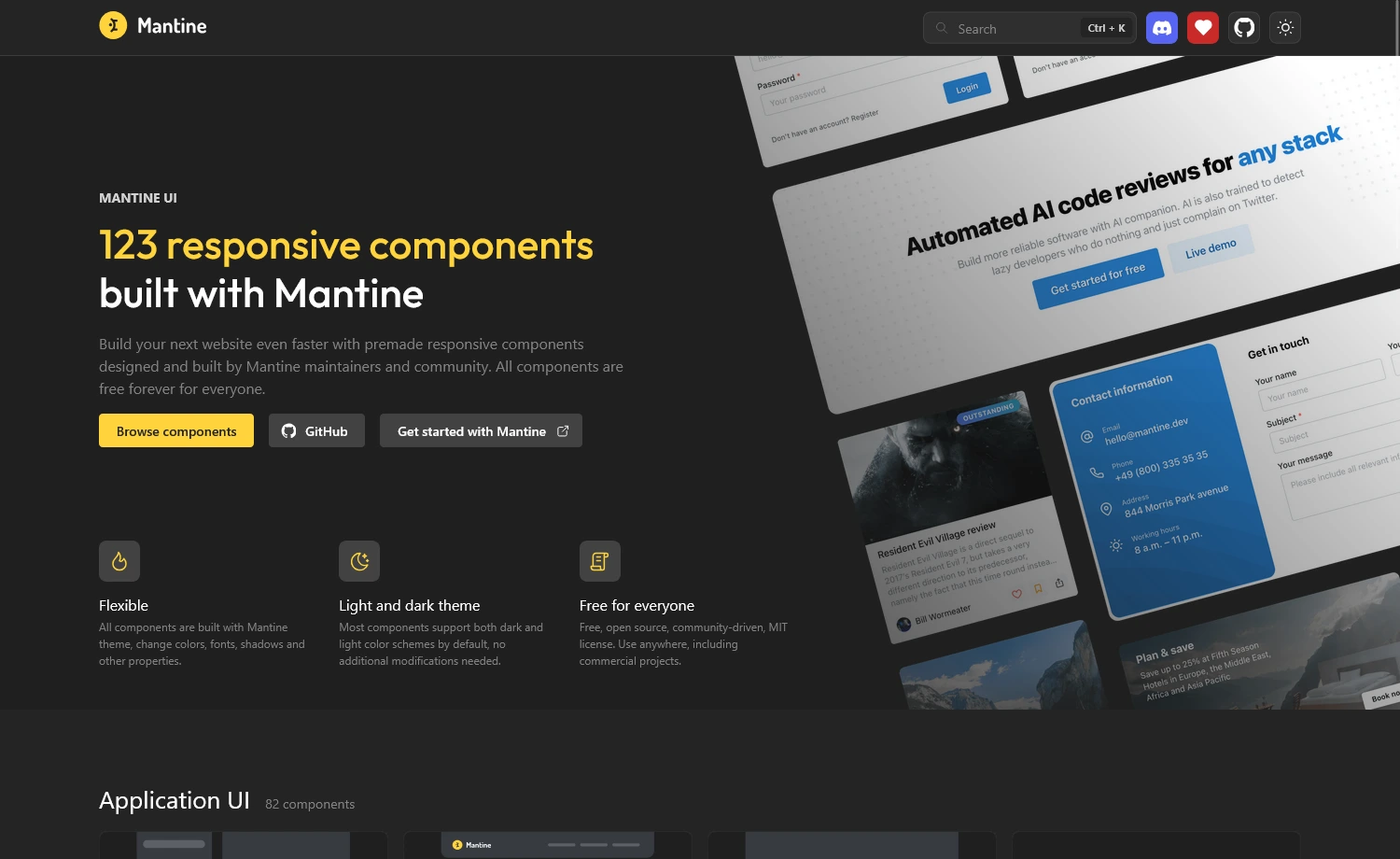
This is another React component library that offers more than 120 components. All the UIs are fully featured and include rich theming, hooks, form management, and accessibility out of the box. Also, the open-source UI library supports both server-side rendering and client-side apps, and integrates seamlessly with Vite and Next.js.
Developer Experience with Mantine
Available Components
- Comprehensive library
- 50+ hooks for common use cases
- Covers all essential UI patterns such as
- Forms, Data Display, Navigation,
- Feedback, Overlays, Typography, etc.
Framework Support
- React-only library (React 18+ required)
- Compatible with SSR frameworks (Next.js, Remix, etc.)
Customization Practice
- PostCSS-based styling with CSS modules
- Uses style props for quick prototyping
- Theme configuration through
MantineProviderimport { Button, MantineProvider } from '@mantine/core'
// Theme customization
<MantineProvider
theme={{
primaryColor: 'blue',
defaultRadius: 'md',
}}
>
<Button>Click me</Button>
</MantineProvider>
Learning Curve & API
- Moderate learning curve
- Easier for React developers familiar with hooks
- Comprehensive documentation with code playgrounds
- Predictable API patterns across components
TypeScript Support
- Type-safe theme configuration
- Excellent IntelliSense & autocomplete
- Full TypeScript support with complete type definitions
Accessibility & Performance
- Strong accessibility foundation
- Lightweight – minimal bundle size
- Built-in dark theme support
- PostCSS-based styling
When to Choose Mantine
Choose Mantine
- Prefer PostCSS-based styling
- Need built-in Form Management
- Building React apps with flexible styling
- Need components, hooks & utilities together
Consider Alternatives
- Need prop-based styling
Alternatives: Chakra UI - Building with non-React frameworks
Alternatives: Framework-specific libraries
Radix UI
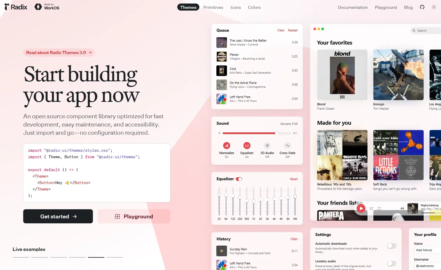
Radix UI is a headless React component library that provides unstyled, accessible primitives. While styled libraries come with pre-built designs, or copy-paste collections like shadcn/ui with ready-made styles, Radix UI gives you the building blocks to create your own design system from scratch. You get WAI-ARIA compliance, keyboard navigation, and focus management out of the box, but styling is entirely your responsibility.
Developer Experience with Radix UI
Available Components
- 30 components + 5 utilities
- Recent additions: Form, OneTimePasswordField, PasswordToggleField
- Foundation for shadcn/ui & many libraries
Framework Support
- React-only (React 16.8+)
- Full SSR support
- Works with Next.js, Remix, Vite, Gatsby
Customization Practice
- Completely unstyled (only behavior & accessibility)
- Granular access to each component part
- Composable with
asChildprop - Works with any styling approach (CSS Modules, Styled Components, Utilities)
import * as Dialog from 'radix-ui'
// full control over styling
<Dialog.Root>
  <Dialog.Trigger className="your-btn-class">
    Open
  </Dialog.Trigger>
  <Dialog.Portal>
    <Dialog.Overlay className="your-overlay" />
    <Dialog.Content className="your-content">
      <Dialog.Title>Title</Dialog.Title>
         {/* Your content */}
    </Dialog.Content>
  </Dialog.Portal>
</Dialog.Root>
Learning Curve & API
- Moderate learning curve
- Steeper for developers new to headless UI
- Consistent API across all primitives
- Excellent documentation with accessibility details
TypeScript Support
- Full TypeScript support
- Fully-typed API
- Excellent IntelliSense
- Type-safe props
Accessibility & Performance
- Zero styling overhead
- Tree-shakeable
- Strong WAI-ARIA design pattern
- Minimal bundle, only behavior logic
When to Choose Radix UI
Choose Radix UI
- Prioritize accessibility
- Comfortable with headless UI
- Need behavior without styling
- Building custom design systems with control
Consider Alternatives
- Need pre-styled components
Alternatives: Ant Design, Chakra UI, Mantine - Want faster prototyping
Alternatives: shadcn/ui (Radix-based), MUI
PrimeReact
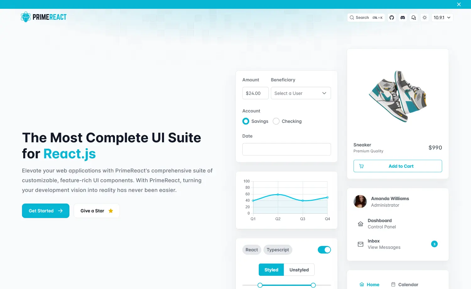
PrimeReact is an enterprise-focused React component library with 80+ feature-rich components designed for data-heavy applications. It prioritizes comprehensive functionality over simplicity, offering advanced data tables, charts, trees, and complex form components out of the box. Also, it’s part of the PrimeTek ecosystem, which offers commercial support options, making it a popular choice for corporate dashboards and admin panels.
Developer Experience with PrimeReact
Available Components
- Enterprise library with 80+ components
- Latest updates: OrgChart, Gallery, CommandMenu, InputTags, DatePicker
- PrimeBlocks (400+ UI blocks), PrimeFlex, PrimeIcons included
Framework Support
- React-only library
- Next.js support with TypeScript templates
- Works with all React frameworks
Customization Practice
- Styled & unstyled modes
- Theme Designer with 500+ variables
- CSS modules for customization
import { Panel } from 'primereact/panel'
import styles from './customPanel.module.css'

export default function CustomPanel() {
  return (
    <Panel header="Custom Header" className={styles.myPanel}>
      <p>Content goes here</p>
    </Panel>
  )
}
Learning Curve & API
- Moderate to steep learning curve
- Well-documented with extensive examples
- Consistent API across components
TypeScript Support
- Full TypeScript support
- Complete type definitions
- Excellent IntelliSense
Accessibility & Performance
- Tree-shakeable imports
- Responsive and touch-optimized
- Keyboard navigation & screen reader support
When to Choose PrimeReact
Choose PrimeReact
- Building admin dashboards or complex UIs
- Building data-heavy enterprise apps
- Need commercial support (PRO available)
- Want professional themes
Consider Alternatives
- Prefer a lighter library
Alternatives: Mantine, Chakra UI - Require Tailwind CSS
Alternatives: Flowbite, DaisyUI
Shadcn UI
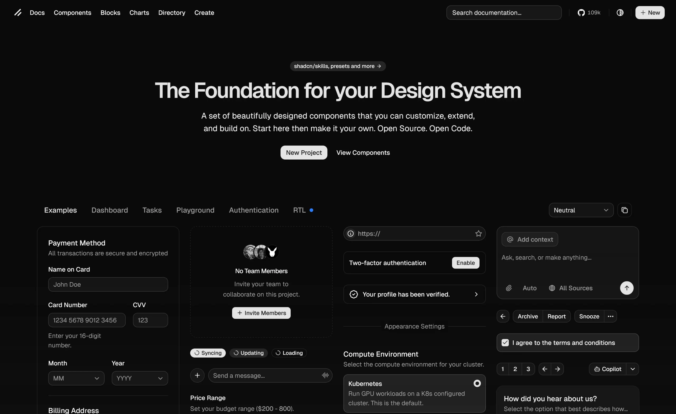
Shadcn UI is a collection of reusable React components built on Radix UI primitives and styled with Tailwind CSS. Unlike traditional UI libraries that require npm installation, shadcn/ui lets you add 50+ pre-styled components directly to your codebase using a CLI tool. So, you own the code, customize freely, and avoid the dependency headaches while bridging the gap between building from scratch and being constrained by a package.
Developer Experience with Shadcn UI
Available Components
- 60+ official components
- Covers forms, data display, Spinner, Item & more
- Registry directory for community components
Framework Support
- React (Next.js, Vite, TanStack Start, v0)
- Vue version available (shadcn-vue)
Customization Practice
- Components live in your project
- Modify directly in files
- CSS variables or Tailwind utilities for theming
- CLI handles formatting based on the config
Learning Curve & API
- Low to moderate learning curve
- Requires Tailwind CSS & React familiarity
- Well-documented with CLI automation
- Understanding of Radix/Base UI is beneficial
TypeScript Support
- Full TypeScript support
- Type definitions included
- IntelliSense support
- Type-safe props
Accessibility & Performance
- SSR/RSC compatible
- Built on accessible primitives (Radix UI/Base UI)
- WAI-ARIA compliant with keyboard navigation
- Minimal bundle size, import only what you use
- Zero runtime overhead (pure Tailwind CSS)
When to Choose Shadcn UI
Choose Shadcn UI
- Need customizable components
- Prefer copy-paste over npm dependencies
- Building with Next.js or modern React
- Prefer Tailwind CSS with React
Consider Alternatives
- Need pre-packaged library
Alternatives: Mantine, Chakra UI, Ant Design - Require non-React/Vue frameworks
Alternatives: Framework-specific libraries
In conclusion, all of these libraries are actively maintained and offer modern features to speed up development. However, the best choice ultimately depends on your design goals and workflow. If you have a clear UI vision for your design, any of these libraries should work well.
Happy Creating!
UI Libraries: Your Questions Answered
1. What is the difference between Open-source and Free?
Open-source software methodologies prioritize collaboration and practical knowledge with publicly available source code, while free software prioritizes user freedom following the GNU General Public License.
2. Can I Use Flowbite & Tailwind CSS Together?
Yes, you can combine Flowbite and Tailwind CSS to generate UIs and integrate them into your own tech stack using LLMs and AI tools.
3. Can I use multiple UI libraries in one project?
Technically, yes, but not recommended. Using multiple UI libraries in a single project can increase bundle size, creating styling conflicts and making maintenance harder. So, it’s better to pick one primary library and build custom components for unique needs.
4. What’s the difference between headless UI libraries and component libraries?
Headless libraries provide behavior and accessibility without styling. Component libraries offer pre-styled components or designs that are ready to use.
- Headless = full control, but more work.
- Component libraries = faster setup, but less flexibility.
5. Which library has the smallest bundle size?
Generally, Headless libraries are small because they don’t include styles. Among styled libraries, Mantine is the most lightweight. Ant Design and PrimeReact are heavier due to their comprehensive features.


