Almost everything from communication to business, photography to movie making, demand to production and supply etc., is transformed online. In this digitized era, from where we stand, an online presence has become a must-to-have to ensure growth and enhance productivity. If you are a developer, you should know to strengthen one’s online presence by being updated about the ongoing web trends since 66% of users will necessarily prefer to see something with a beautiful design within any given 15 minutes to consume the contents of a website. [ref.]
A beautifully designed website helps ace online marketing and reach out to potential customers. This is why 2023 calls for a user-first approach to designs. With a neatly styled, user-friendly website, customer engagement touches the peaks since it takes any user a fraction of time (.05 seconds to be exact) to be opinionated about any website, and 94% of their first impressions are design-related [ref.]. Thus, it is primary to know about ongoing business trends before choosing the type of website you are to offer your customers.
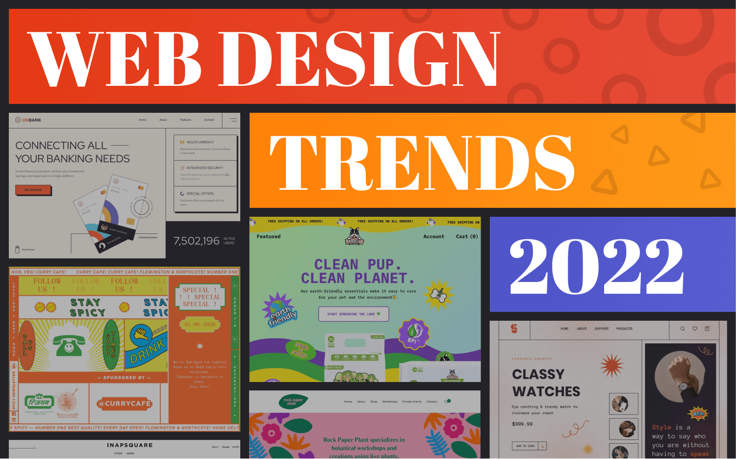
Web design trends go through a broad spectrum of changes from design to typography. Creating an engaging and straightforward digital experience has become more challenging with growing expectations of a better user experience. In this blog, we’ll try to cover all the significant areas of web design that are going through this change and are about to dominate 2023 web designs.
Style Trends
Approximately 50% of users consider designing a crucial factor in opinionating a website [ref.]. But, the only thing constant about web design trends is change. Hence, keeping up with the change is vital for developers to implement them on their projects. Several design trends go around nowadays. Some of the exciting ones are enlisted below:
01. Glassmorphism
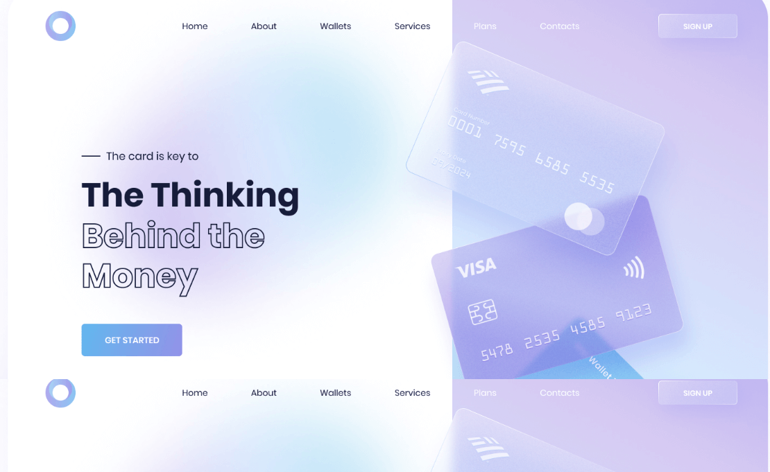
The Glassmorphism approach has emerged as the go-to approach for attaining the desired “light on dark, dark on light” UI design and connecting and combining all of the UI’s applications of the “frosted glass” effect. From music videos to app prototypes, glass morphism can be found in practically every modern media. This natural lighting technique improves contrast and reduces optical distortion. Nowadays, many designers use glass-morph designs to build UIs.
Characteristics
- Muted Colors
- Muted Shadows
- More depth and immersion
- UIs blended with the background
02. Gender Neutral Design
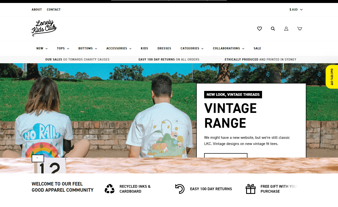
This age is about non-bias and neutrality towards gender. The disruption of pre-existing conventional gender styles is a vital aspect of the gender neutrality concept. If you are to sell something to many consumers regardless of their gender, you should create a gender-neutral website. You can look for existing examples for inspiration.
Characteristics
- Gender Neutral Color Scheme
- Fonts Labelled as Classic, i.e. Helvetica
- Emphasis on Product Functionality
- More Androgynous Aesthetics
- Gender-Neutral Icons, Packaging and Glyphs
03. Memphis Design
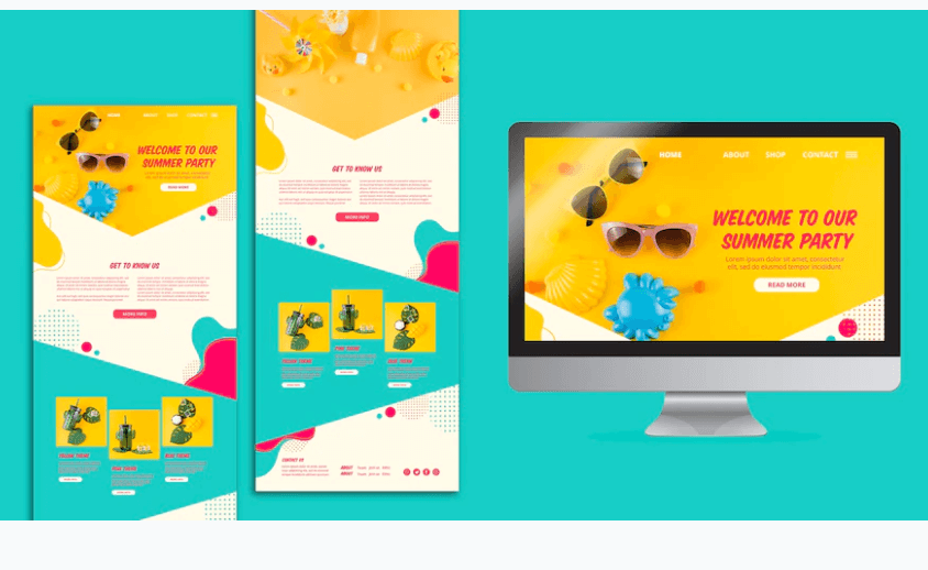
A distinctly postmodern style that blends stylistic traits of kitsch, art deco and pop art is making its way back in website designs of 2023. Bold patterns and retro color palettes make Memphis-inspired websites unique to look at, and viewers get tempted to scroll down.
Characteristics
- Brash & Bold Colors & Patterns
- Bright Neon, Primary and Pastel Colors,
- Geometric Shapes
- Bold, Repetitive Outlandish Patterns
04. Behavioral Design
Behavioral design is a method used to build a website combining psychology, design, technology and creative approaches to guide people through a website by emphasizing what the owner wants to grab their focus on. In this new era, when people focus only on what they want to and skip the rest despite their usability, behavioral design helps to keep people on the site for longer. A website built with a behavioral design ensures better response and less bounce rate naturally.
Characteristics
- Created with Systematic Understanding of the Patterns of People’s Behavior
- Created to Influence Users’ Interactions
- Combine Psychology, Design, Technology, and Creative Methods
05. Material Design
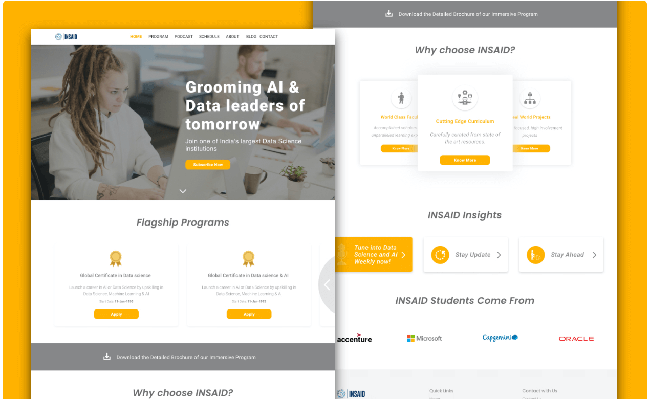
The physical environment and its textures and how they reflect light and produce shadows are motivating factors for Material Design. Paper and ink are reimagined as material surfaces. It uses print design principles to provide hierarchy, meaning, and emphasis, all of which help engage viewers in the experience.
Characteristics
- Inspired by Physical World Textures, Light & Shadows
- Guided by Print Design Methods
- The motion focuses attention and maintains continuity.
06. 3D Visuals
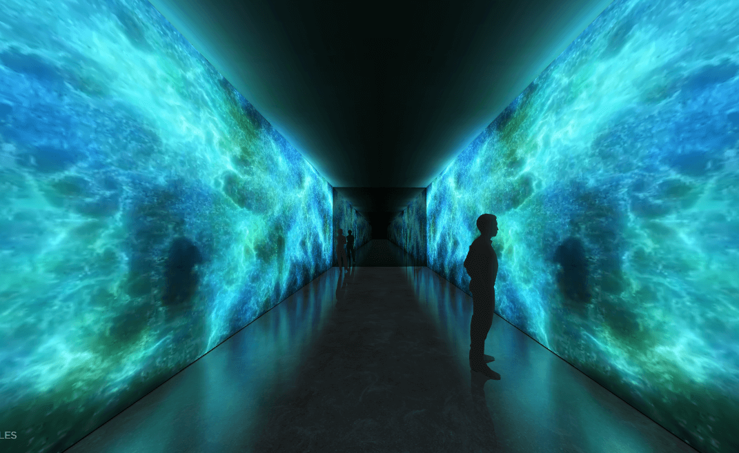
If you have a website too basic to engage the visitors for long, it’s time you switched to reconstruction of the site with more 3D visuals. The motive is to keep visitors on the page as long as possible and raise meaningful engagement with the carrier. This trend helps reduce the bounce rate of your website.
Characteristics
- To Mimic Real-life Object as Realistically as possible
- The illusion of Depth & Volume
- Employment of Lightening Effect
- Employment of Shades of One Color
- Combines Better with Abstract, Fun and Playful, Grunge, Illustrated, Masculine
07. Black and White Designs
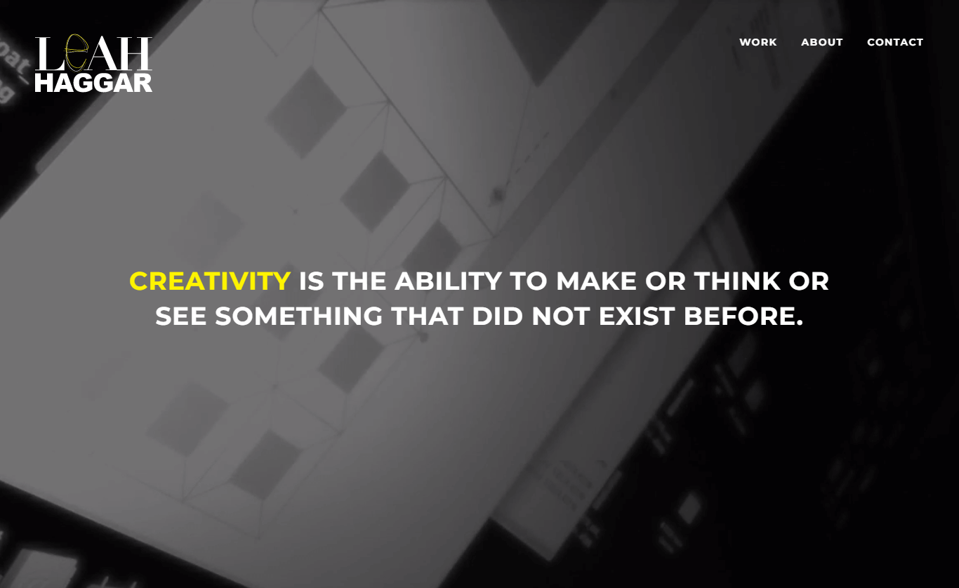
The most austere and elegant design trend of the year is black and white color themes. You have to think about and design within limits when you do not have enough color. While this may appear frightening at first, it can be freeing and assist in sparking creativity. In addition, the results could be remarkable, as you can see here.
Characteristics
- Can Depict Any Identity
- Used as a Perfect Color Scheme
- Less Eye-Straining Contrast
- Clean & Simple
UI Trends
While 88% of online shoppers are less likely to get back to a site with a bad user experience, [ref.] 57% won’t recommend a business without a mobile-friendly website [ref.]. Mobile devices permeate our everyday lives in unprecedented ways, showing how UIs shape our daily lives. These UIs are changing over time to be more accessible and engaging for a better user experience. Some of the ongoing UI design trends are enlisted below:
01. Minimalism & Simplification
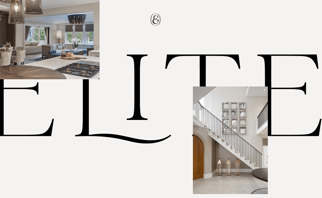
Flat design has evolved into minimalist design, and it brings a professional and clear impression to users. The minimalist approach is on growth as it is beneficial beyond visuals. A minimal interface loads fast on any screen size and device. So minimalist UIs are going to rule 2023.
Characteristics
- Flat Patterns and Textures
- Limited or Monochromatic Color Palette
- Restricted Features and Elements
- Maximized Negative Space
- Unique Use of Typography
02. Dark Mode
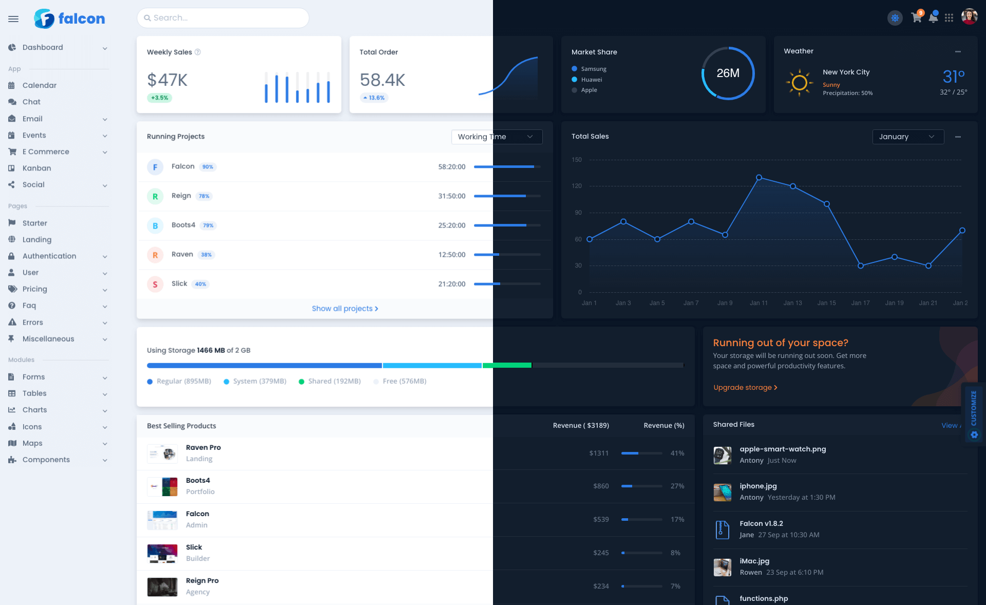
More and more web designers opt for sustainable designs that apply sustainability from different perspectives. Many websites are now pushing their users to dark mode, which earlier was a choice. This trend is ongoing because not only does it conserves energy, but also it is said to decrease eye straining with less blue light emission. In 2023, this trend is about to rule the web.
Characteristics
- Dark Grey, Rather Than Black to Express Elevation & Space
- Higher Contrast with White Body Texts
- Desaturates Primary Colors
- Uses Limited Color Accents
03. Voice UI
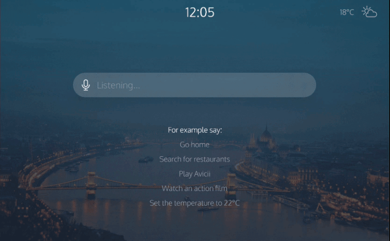
Voice UIs will dominate 2023 as keyboards and mouses are becoming redundant. About 40% of adults use voice search at least once every day. It guides users to navigate complex digital products, but it also eliminates the requirement of a graphical user interface and elevates user experience.
Characteristics
- Empathy While Designing
- Intentions Expressed in Examples
- Limited Amount of Information
- Visual Feedback Used
04. Brutalism & Return of Flat
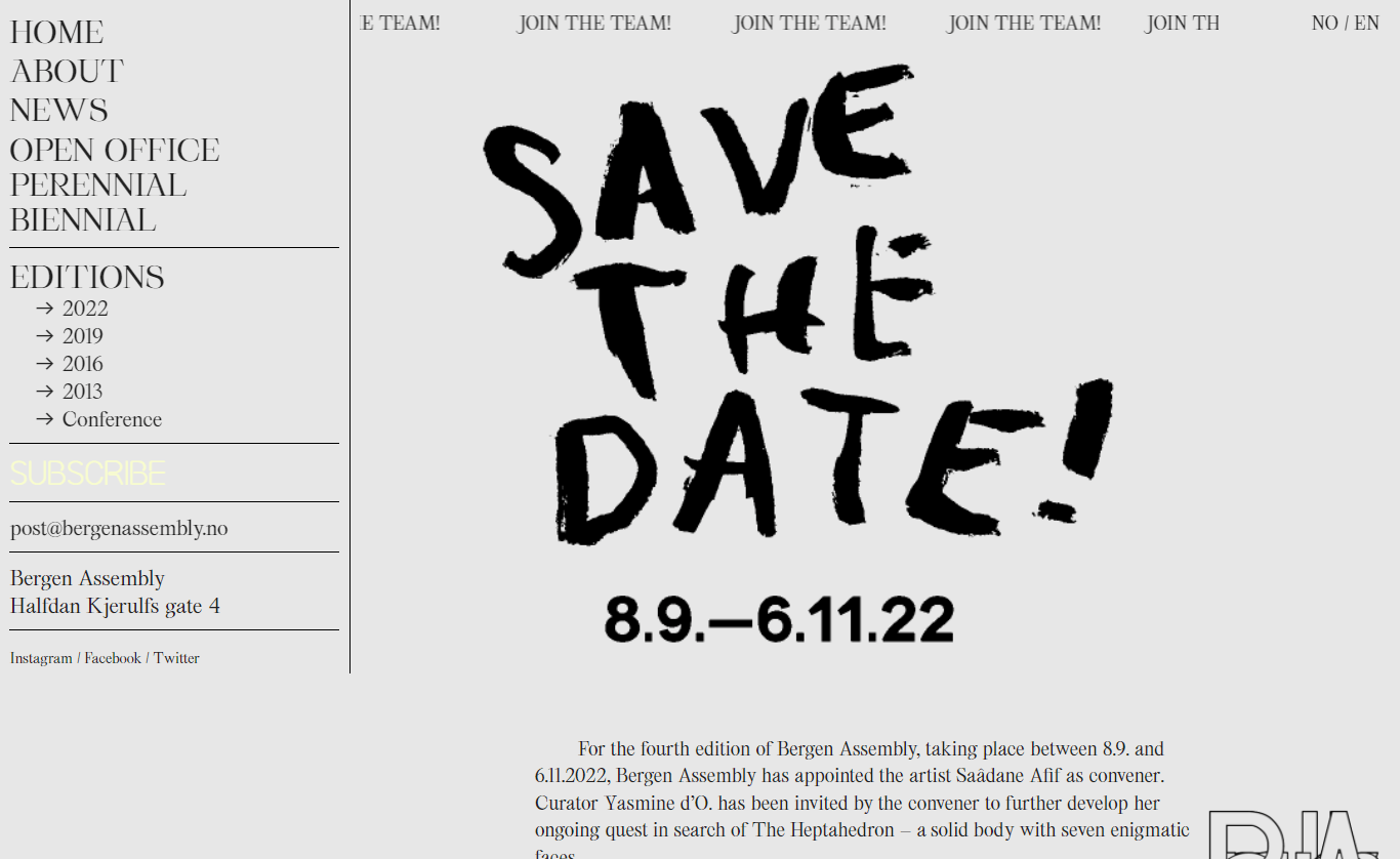
Brutalism in UI is characterized by its raw appearance and experimental nature. It is a non-comforting style to rebel against established web designs with known use of primary and web-safe colors, gradients, and shadows. Usually, the web is filled with raw and micro-interactions. Typography plays an essential role in brutalist UIs. Since there is no how-to imposed, brutalist UIs often results in unique designs.
Characteristics
- Exposure of Materials, i.e., Default, Unstyled HTML
- Monochromatic Colors Schemes
- Emphasis on Bare Functionality, Devoid of Decoration
- Modular & Repeated Design Elements
- Layered, Articulated or Extruded Pieces
- Rectilinear Edges
- Unedited or As-is Design Elements
05. Aurora Background
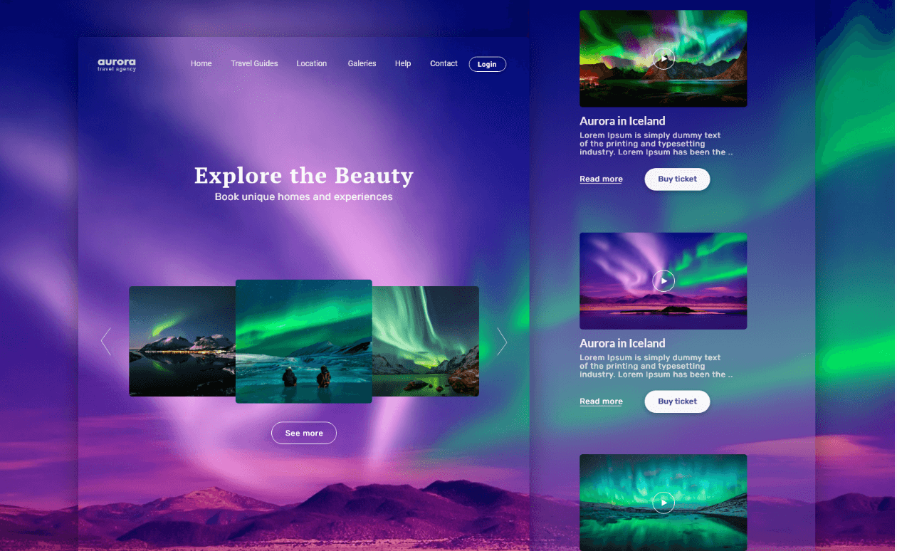
If you don’t want to be visually monotonous but want to maintain the flexibility of functions while still having a sense of raw texture visually, you can opt for Aurora UIs. From functional aspects, mixing the creative “aurora wind” background with UI components is the best compromise presentation method to ensure practical usability and overall accessibility.
Characteristics
- Creative Backgrounds MIxed with Minimal UI components
- Works Particularly Better with Glassmorphism
- A mix of Multiple Gradient FIlls with Decreasing Opacity Towards the Outer Edges.
06. Neon or Holographic
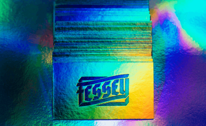
This cyber holo/neon trend looks to be associated with the Metaverse, virtual reality, and hologram interface era. Designers are inspired by all of the creative avenues contemporary virtual worlds provide. Bright, vivid colors, eccentricity, circular shapes, and hologram-like textures are prevalent in this trend. In the crypto space, it’s also frequently used to illustrate futuristic interfaces.
Characteristics
- Vibrant & Glowing Colors
- Abstract & Round Shapes
- Hologram-Looking Textures
07. Wild Typography
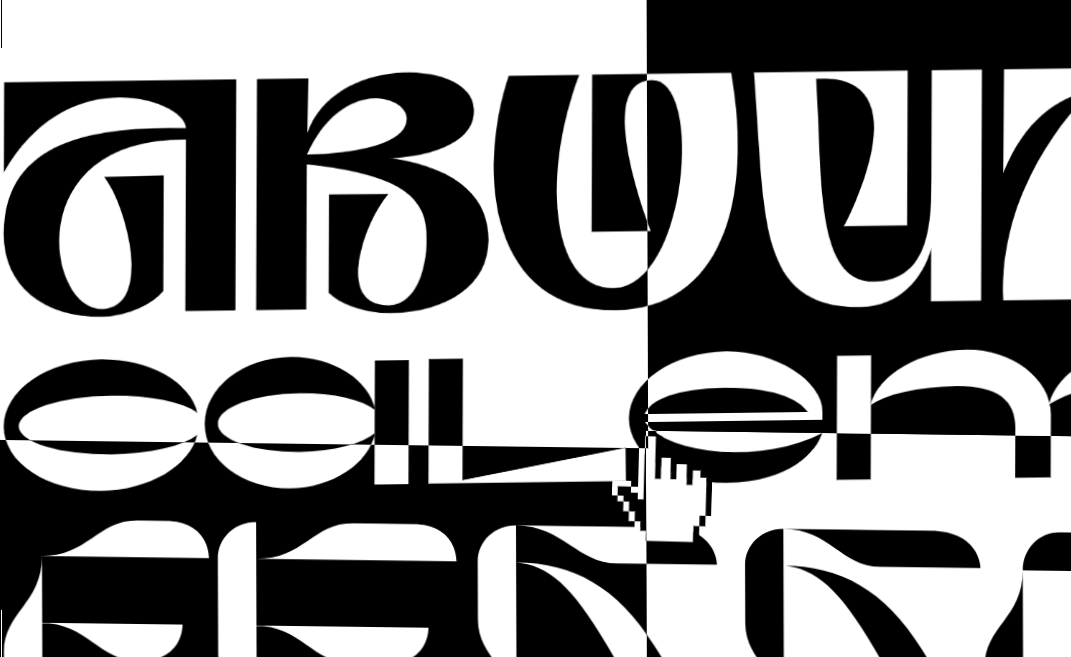
Typography rules are not as strict nowadays as they used to be. The contemporary trend is to mix shapes with texts, colors, photos, and emojis or experiment with the grid. This intriguing experiment can result in an eye-catching effect to divert attention to all necessary information. It can get messy, unreadable and irritating if not done correctly.
Characteristics
- Bold Types Instead of Hero Image
- Can Convey Emotions
- Asymmetric Design
- Monospaced Typography
- One Font Used Throughout
08. Clay-morphism
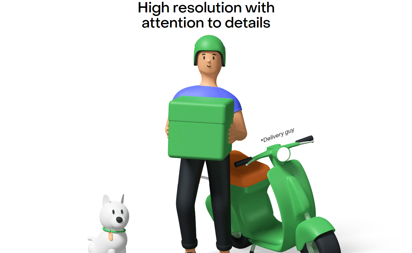
Clay morphism is a simplified version of 3D. Inner and outer shadows are also combined in clay morphism. The entire effect is created with two internal shades that give it a clay-like, three-dimensional appearance. The inner shadow on the top left should be slightly lighter, while the inner one on the bottom right must be a little darker. Adding a delicate inner shadow to a fluffy glass-morphic pane can also make it look intriguing and new.
Characteristics
- Rounded Corners
- Two Inner Shadows & One Outer Shadow
- Can Have Any Background Color Independent of the Background
- Minimal Typography
Typography Trends
Most users spend 5.59 seconds on written texts and only read 20% of the words on a page [ref.]. This is why typography trends can play a significant role in conveying a brand’s style and purpose and reflecting the feeling of a particular era. Some of the ongoing trends that are changed over time are enlisted below so you can go through typography trends in web design of 2023 all at once as it is primary to web design:
01. Brutalist Style
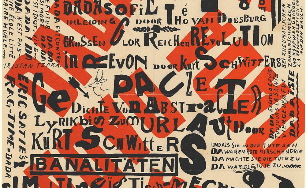
A style that emerged in architecture and is easy to characterize by harsh straight lines and a lack of decorative elements manifest in digital typography as significant, imposing lettering being placed in unexpected ways. These fonts show the best outcome with muted colors and can respond neatly with brightened color schemes.
Characteristics
- To Create Visual Tension in Users
- Raw & Unpolished Typefaces
- Unorthodox User Experience
- Contrasting & Clashing Color Palette
02. Big & Bold Fonts
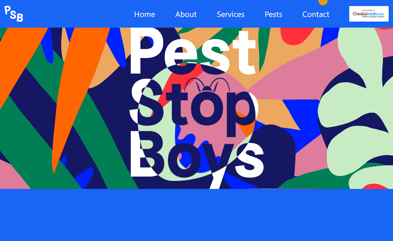
Most readers skip the detailed reading of the content. To build an impossible-to-ignore content block that grabs your audience’s attention, the use of bold and big oversized fonts, especially in the hero header, has become a trend in 2023. While still on-trend, feel free to experiment and create dramatic headlines this year.
Characteristics
- Overwhelming Size of Letters
- Numerous Weight of Fonts
- High Contrast of Fonts
03. Outlined Fonts
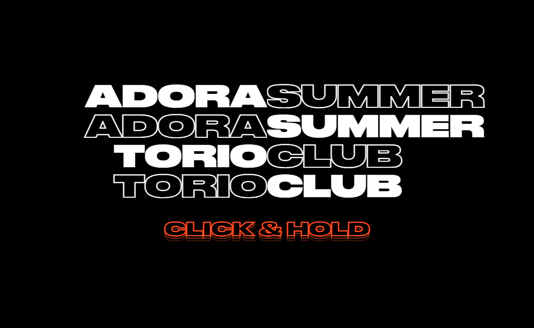
Outlined fonts can make your site outstanding and be a solid addition to the hero section. When using outlined typefaces with a simple background, attention to color contrast is crucial because accessibility can be an issue. Try combining outlined fonts with bold, filled-in text for a sharp distinction and emphasis, as shown in the example above.
Characteristics
- Style Flexibility
- Flexible Background Design
- Unusual Design
04. Broken Typography Layouts
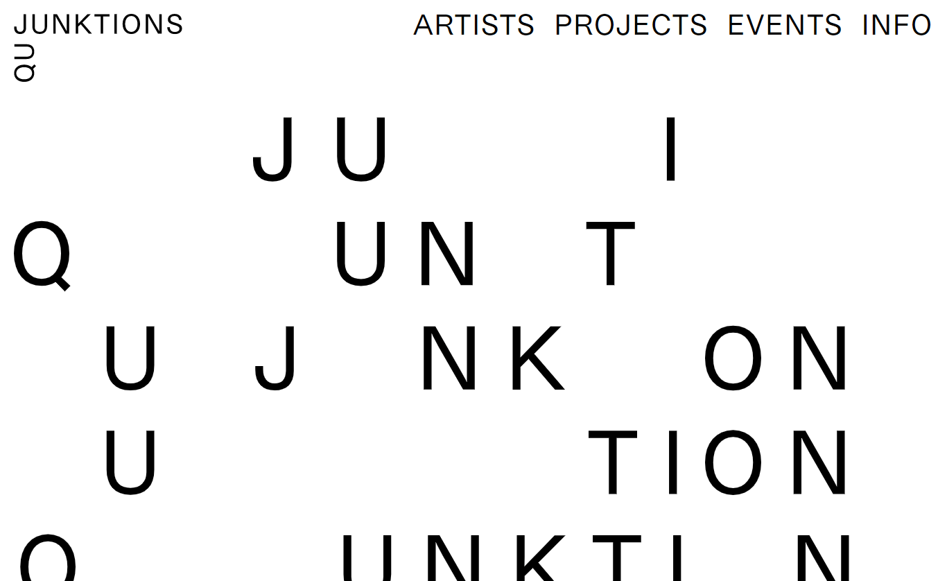
Words may be combined in unexpected ways in broken typography layouts. While the impact might be startling, it can draw attention without detracting from reading when used effectively. Headlines and other material that needs to stand out benefit from broken typography. Keep in mind that some typefaces can be difficult to read depending on your font. As a result, you should avoid utilizing them for sensitive information.
Characteristics
- Mostly Used on Headlines
- Unique Outlook
- Merged Background Design and Color Visibility
- Offers Interesting Outlook & Design
05. Fat Low Fonts
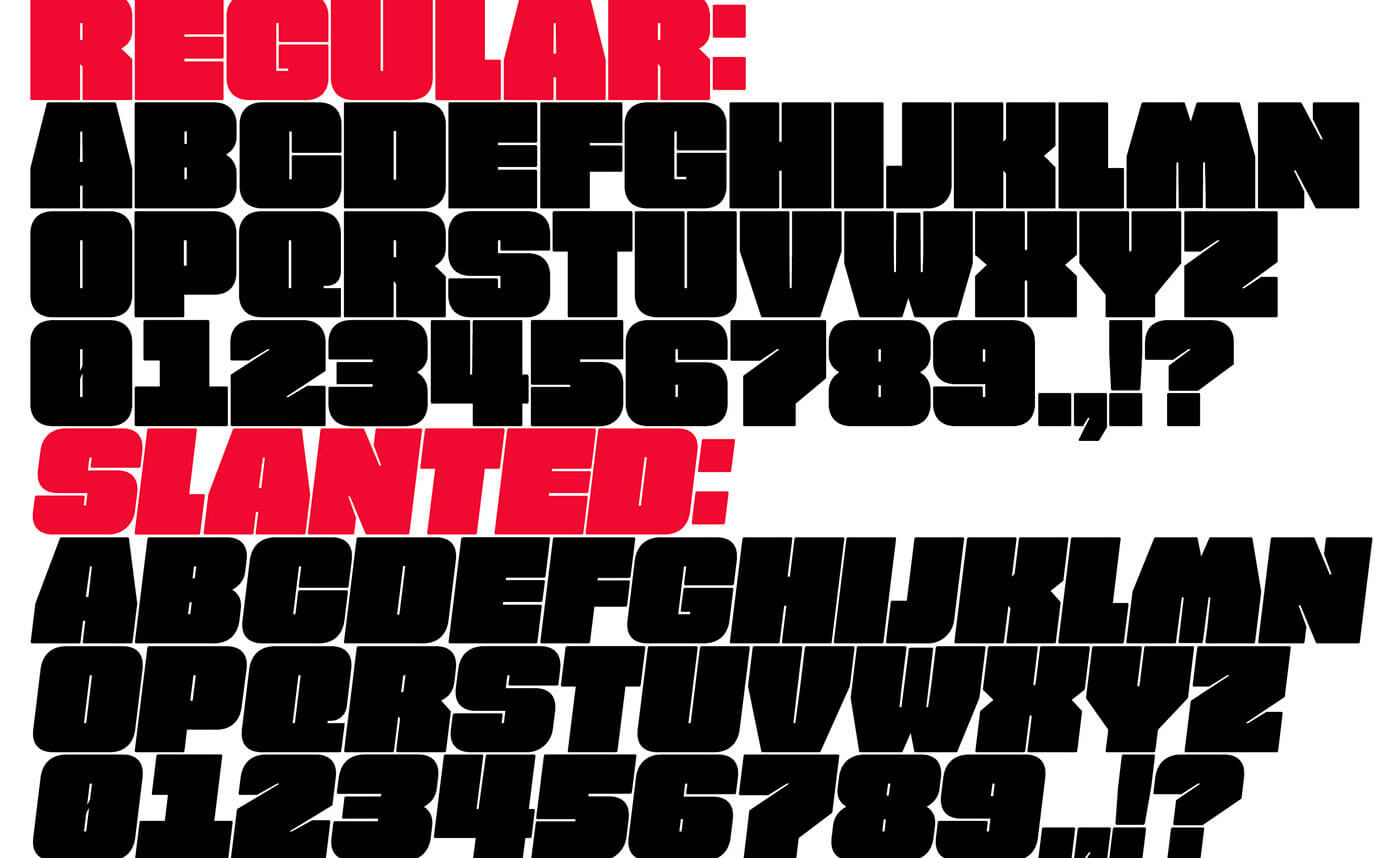
These fonts have a low x-height which makes the width more prominent than the height. Works efficiently with a white space background; these fonts usually work better for headlines or short quotes.
Characteristics
- Lower Height than Weight
- Usually used for Headlines and Quotes
- Better Efficiency with White Space Background
06. Glitch on Texts
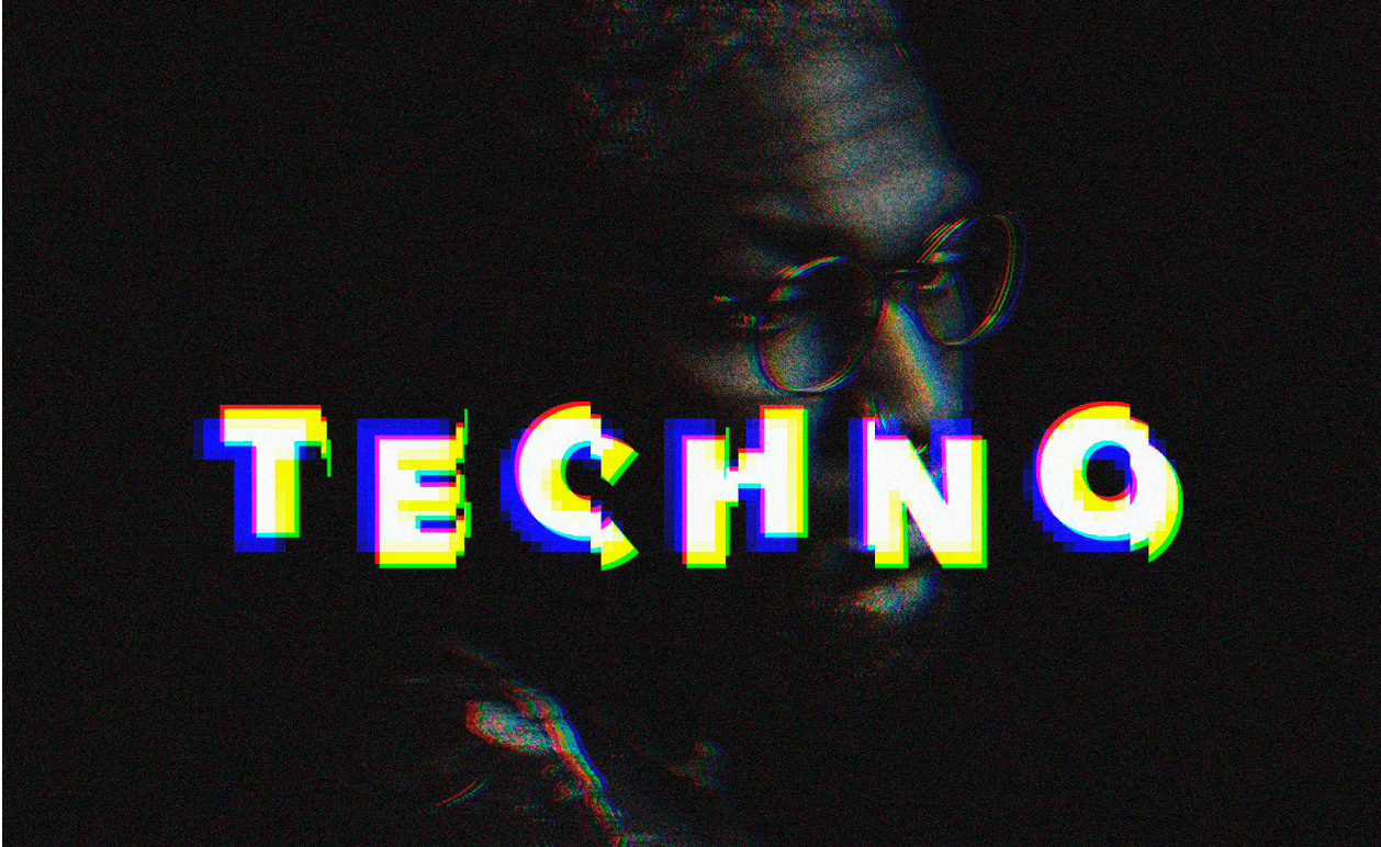
Glitches on texts can add extra edge and artistic elements to the remaining font types of your site. Though challenging to apply, these fonts bring a lot of energy and uniqueness and functional readability combined with animation.
Characteristics
- A Sci-Fi Trend
- Mimic Malfunctioning Effect
- Uses Jagged Lines or Waves
- Frozen or Static Visuals
- Inverted Colors on Images
07. Retro Fonts
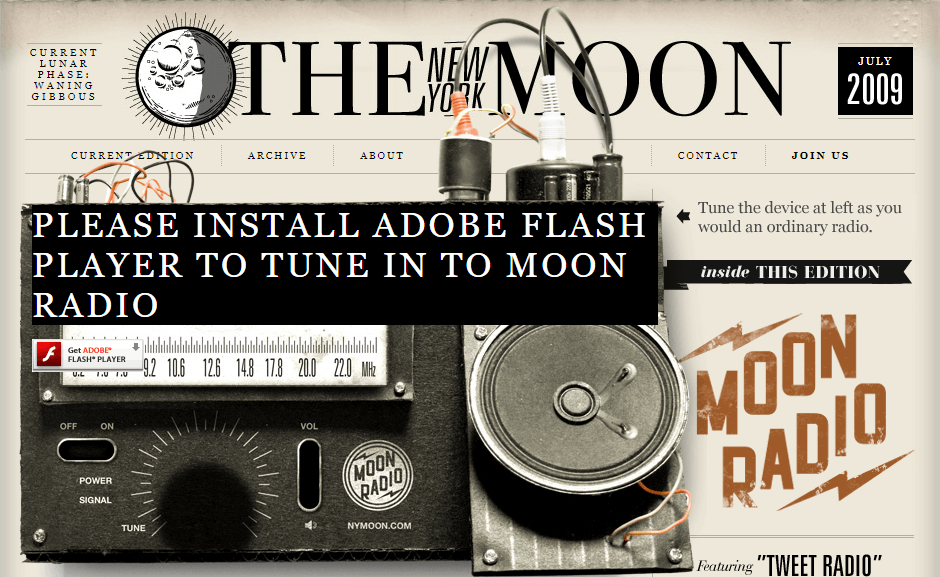
The uniqueness of this font family is the vintage outlook with a bold style similar to those found on old nostalgic prints or ads. Using a serif font with a flair of personality adds to the feeling of nostalgia with a minimal style to win the throwback feel.
Characteristics
- Groovy Appeal with Colorful Aesthetic
- Creates Contrast to Add Visual Interest
- Offers Analogue Antitode to Modern World
08. Extra Sharp Angles
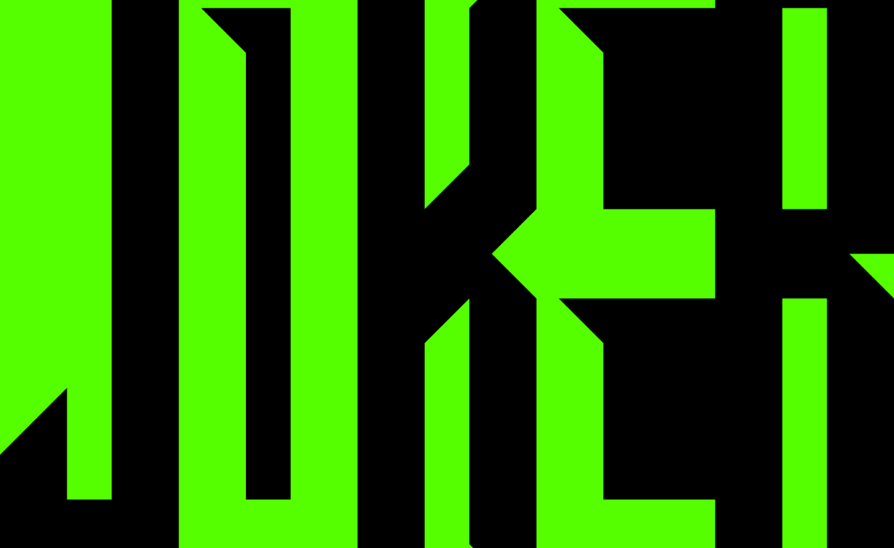
Designed to accentuate their most poignant edges, these modern fonts demand attention with their extreme angles. The feeling of rebellious courage to go well with any darker color ensures a smooth walk on the wild side.
Characteristics
- To Create & Convey Tension & Expression of Discomfort
- Chiseled Edges, Hard Angles & Oblique Forms
- Embodies a Flair for the Dramatic
09. Authentic Handwriting
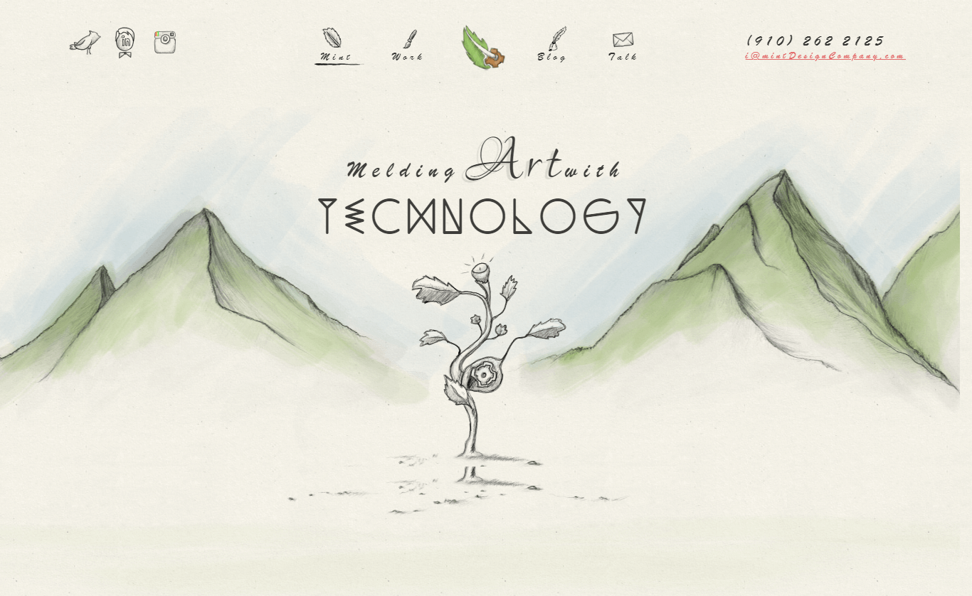
Handwritten font styles are regaining popularity, and the messier, the better this time. Messy scribbles give projects a grunge style, but they also add the vital reality for an emotional, human connection with the observer. Many font families give a similar impression, and so do many websites as you can find here.
Characteristics
- More Complex One to Use
- Have More Personality
- A Time-Tested Option
- Can Generate Focused Attention
- Uses Swqashes, Ligatures & Alternates
10. Morphing Animations
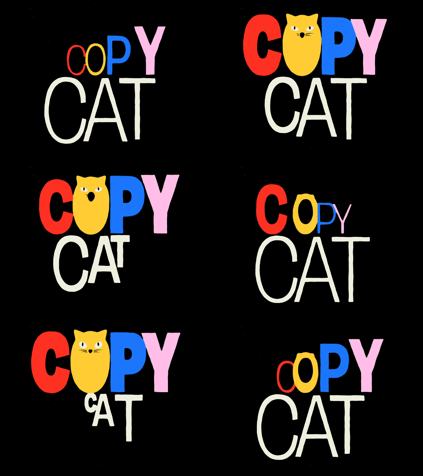
Typesetters have historically had to choose a single, consistent font style. But, typographers are twisting letters through numerous types with inventive morphing using the magic of animation. All at once, these letters are large, thin, big, tiny, italic, and bold. This experimental trend generates the idea that type is alive and breathing, as it has in some ways always been.
Characteristics
- Used to Maximize Versatility
- Provides the Illusion of Living & Breathing Typefaces
- Fewer Compromises for Designers
Web design trends are meant to be evolved as per user demands, and developers are to create what their clients ask for. It calls for more attention to detailed design to create a user-centric website to make more engaging and accessible websites flow seamlessly with better navigation. Also, to reduce the creation of repetitive and monotonous websites, it is compulsory to evolve the techniques with ongoing design trends, and this blog is one tiny contribution to help you keep up with it.
