Shoppers tend to read product information pages when they’re in the “decision” phase of their journey.
This is the last of three stages in the buyer’s journey. They’re aware that a specific product will meet their needs, but they’re still not ready to pull the trigger.
Before they make a decision, they need to weigh up their options.
The purpose of your affiliate informational page is to give shoppers the info they need to make this decision. To show them what their options are and subtly urge them to go through with a purchase.
While affiliate marketing doesn’t have a paint-by-numbers approach that guarantees success, there are certain design principles you can use to boost the chances of conversion.
Let’s take a look at five of them.
1. Give Your Readers Early Calls to Action
Some of your readers aren’t as interested in your review insights as they are in your ability to compile a good range of products.
These shoppers trust your curation abilities. They’re happy to take a quick look at what you’ve selected and click straight through to the sellers’ pages.
If you force these readers to trawl through your entire page to find these links, you may lose them.
That’s why many affiliate marketers choose to lead with a short summary of the products being reviewed.
These summaries comprise the minimum information a reader needs to differentiate one product from another and includes things like:
- The product’s name
- The Manufacturer
- One call to action link
- An image
- A particular feature of the product (size, color, weight, etc.)
- One or two unique selling points (warranty, technical features, shipping cost, etc.)
- The price (range)
- A short selection of pros and cons
For three examples of affiliate sites nailing this summary, take a look at these informational pages:
- Mashable — Best Juicers
- Very Well Health — Best Best Blue-Light-Blocking Glasses
- Best Mattress Brand — Best Adjustable Beds
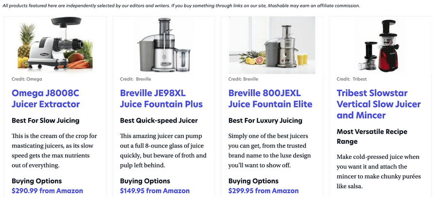
Source: mashsable.com
Obviously, the info you choose to include here depends on the type of product you’re reviewing.
When designing this section, simply think about it from the customer’s perspective. Ask yourself what info you’d need to differentiate one product from another.
2. Make it a Visual Experience
A product information article needs to showcase the best aspects of the products it reviews.
Most reviewers lean towards written information here, describing the products (and their experience with them) in great detail in text format.
But always remember that a few well-chosen images will go a long way towards motivating a shopper to click on that Buy Now button.
This is especially true for products that have a “deployed” or “set up” state. For example, in this Top Affordable Home Golf Simulators post from Rain or Shine Golf they used photographs that show these products after they’ve been unpacked and set up.
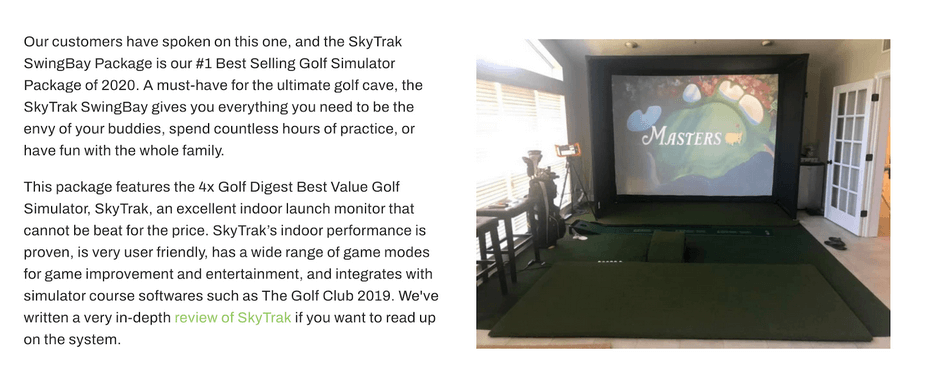
Source: rainorshinegolf.com
Oftentimes, affiliate sites choose shots of the packaging as the product visual. This denies them the opportunity to show a shopper how desirable an item looks while it’s being used.
3. Present Granular Ratings Visually
Some reviewers choose to allocate rating scores to the products in their list. This is a great way of not only communicating valuable information to an audience but also generating credibility for the review itself.
Credibility is a very important part of affiliate marketing. When you can show that you know what you’re talking about — that you really understand what makes one product better than another — readers trust your review.
Granular rating displays are an excellent way to create this credibility.
This post by The Outdoor Lab on the Best Hiking Shoes for Men is a great example.
First, the reviewers chose the six criteria that they would judge each shoe on. Each of these was then allocated a score out of ten, with the results displayed below the product’s overall score.
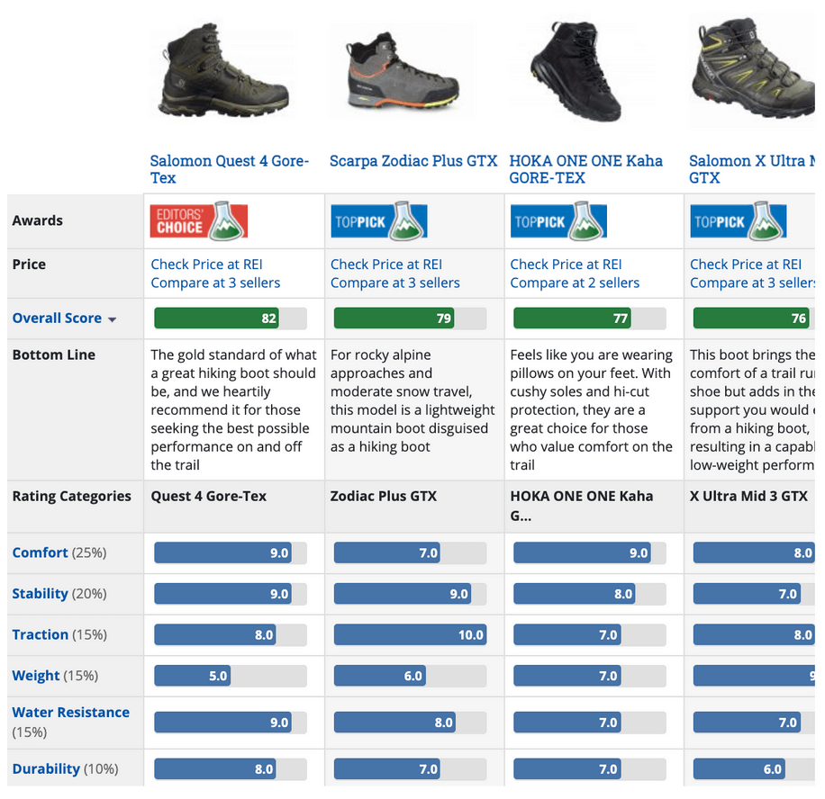
Source: outdoorgearlab.com
4. Give Each Product a Unique Award
When you give a product a very specific award, you’re doing more than simply saying what it’s best at. You’re allowing potential customers to instantly spot the item that’s ideal for them.
In many cases, shoppers don’t know exactly what they want yet, although they do have an excellent idea of what their needs might be. They have a decent sense of what their priorities are.
If you tell one of these shoppers that a specific item is the “best for shoppers on a budget” or “most durable on the market,” you’re creating connections between people and products and making conversion far more likely.
For a good example of this tactic in action, take a look at Tom’s Hardware article on 2021’s Best Gaming Monitors. They give each monitor a different award like “Best Gaming Monitor” and “Best Budget Gaming Monitor”
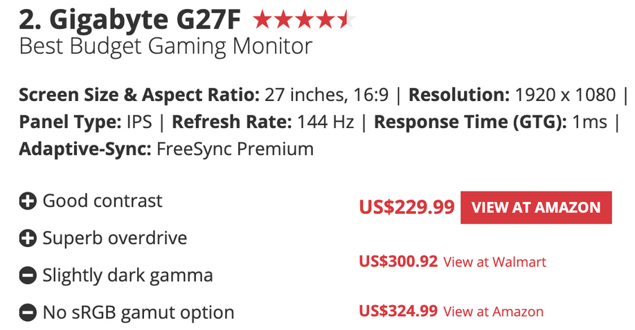
Source: tomshardware.com
5. Avoid Walls of Text
Most of your readers won’t read every word you write in your reviews. In their landmark study on the topic, the Nielsen Norman Group found that almost 80% of people scanned a web page’s content while only 16% read it word for word.
Smart web designers accommodate skim-readers by “chunking” their content into short, visually accessible sections of info.
This makes information more readable and easier to process.
Take a look at how engaging Techradar’s post on the Best Wireless Earbuds is. Each product is allocated a section of conventional written text in paragraph format. But the majority of the information is laid out in an attractive grid that’s super inviting and extremely easy to read.
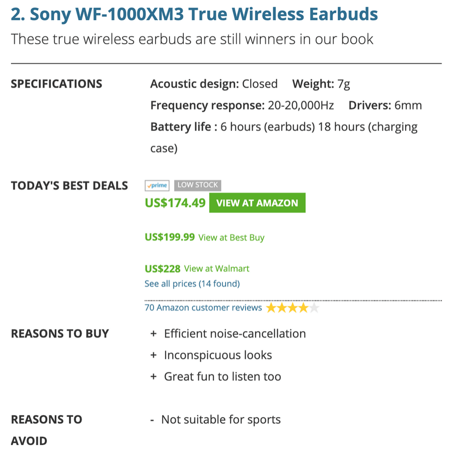
Source: techradar.com
Some Final Thoughts
When you’re designing the layout of your informational page, remember what your main goals are.
You want to package your messages in a way that prompts action from your audience.
You want to keep them engaged with your content and not alienate them with an inaccessible layout.
You want them to spot what’s important as they scan the page.
As you sit down to design (or redesign) your affiliate site’s informational pages, bear these goals in mind. Every aspect of your page must work together to achieve them.
Good luck!

