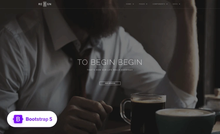
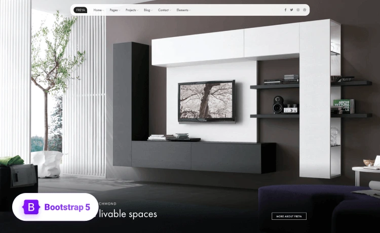
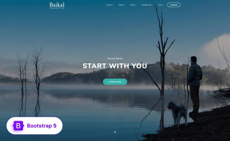
User experience (UX) is one of the most important factors when it comes to boosting conversion rates. You have to impress the website visitors who manage to get to your landing page so that you can encourage them to explore further.
Nailing that first impression greatly increases your chances of converting a visitor to a customer. That said, the first impression matters the most because consumers have quite high expectations. You have to be able to meet, if not even exceed, those expectations so that you can truly capture their attention.
However, once visitors land on your welcome, home, or any other page you’ve chosen as a landing page, you’ll have a short window of opportunity to work your magic. With that in mind, here are a few tips on improving your landing page UX so that you can skyrocket your conversions.
The KISS approach
KISS or Keep It Simple Stupid is an approach that can do wonders for your landing page UX. As you may already know by now, consumers don’t like to be overwhelmed with information, especially not right off the bat.
Imagine landing on a page that’s swarming with elements to the point where you have no idea where to begin. Good chances are that you’d turn around and leave immediately. So, the KISS approach is designed to eliminate all the unnecessary elements from your landing page and drastically reduce friction for consumers. Here are a few things you should consider.
● Write a clear copy but make it short, simple and on point.
● Structure the copy around a single objective, i.e., a clear CTA (Call to Action).
● Offer an incentive, such as a free eBook, discount, coupon, etc.
● Enrich the landing page with stunning visuals or build a web app.
Impress with the visuals
Visuals are one of the most important aspects of a killer landing page, especially when it comes to UX. Here’s a fun fact: consumers get the first impression of your website in less than a second based on visuals alone.
That said, you’ll have to really impress visitors with visuals. As a matter of fact, adding a video to your landing page can boost conversions by 80%. However, you have to be creative to nail video landing pages down, so if you don’t know how to do it yourself, you might want to consult with professionals on that one.
For example, if your company is based in New York, your best bet would be to look for a New York website design agency that can help you out. That way, you eliminate pesky issues like time zone conflicts and other inconveniences. The key is to use the video wisely so that your visitors engage with it and allow your messages to sink in.
Optimize your CTA
Your CTAs are very important in encouraging visitors to take the next step, which means you have to optimize your CTAs the right way.
Of course, you might be thinking that it’s just a button; how difficult can it be to optimize it? Well, the thing is that CTAs are much more than just buttons, so they do require a bit of attention. Here are a few things you should consider doing.
● Write a clear and memorable message – Messages, such as learn more, subscribe now, get started and so on tend to have a compelling effect.
● Decide where is best to place your CTA – For instance, top of the page, near the search bar, a welcome pop-up window, etc.
● Leverage urgency – You can use FOMO (Fear of Missing Out) to nudge visitors to proceed.
● Be creative – You can even place a CTA in your landing page video.
Promote your landing page
If you want to boost conversions, you have to make your landing page more visible. Now there are plenty of ways you can do this, but one of the most effective methods is to turn your landing page into an ad. This affects UX because you make it more convenient for consumers to find you via PPC (Pay Per Click) advertisement and learn more about your offers from your ad copy.
Again, if you don’t know how to do it yourself, there are plenty of pay per click agencies that can help you out. When you generate more exposure for your landing page, chances are you’ll have more visitors coming your way. Since conversions can mean a lot more sales and revenue, it’s actually a good investment to opt for PPC as you can generate more traffic in a relatively short amount of time.
Improving the UX of your landing page isn’t easy. However, if you’re creative and innovative enough, you can create a truly unique experience for your website visitors and skyrocket your conversions in the process. You can sharpen your skills more on UX by taking online courses. Here is a good comparison of what platform you can choose for learning.
