Every day, more than one million new people join the Internet. That’s why day by day, there is a huge increase in web traffic. Among the internet users, they mostly visit various websites, using multiple devices daily. While comparing mobile with other devices like desktop or laptop, a study found that 50.48% of web traffic comes from mobile devices, besides desktop devices count for 46.51% of the total web traffic and the rest for tablets.
The total number of people that own a smart and feature phone is 4.88 Billion , marking up 62.07% of the world’s population. From these statistics, we can see that a huge amount of people browse websites using mobile devices. So, websites need to be user-friendly and well-optimized for all users. As a result, web designers build as many highly responsive websites as possible. It ensures that a website can be accessed from any device or browser.
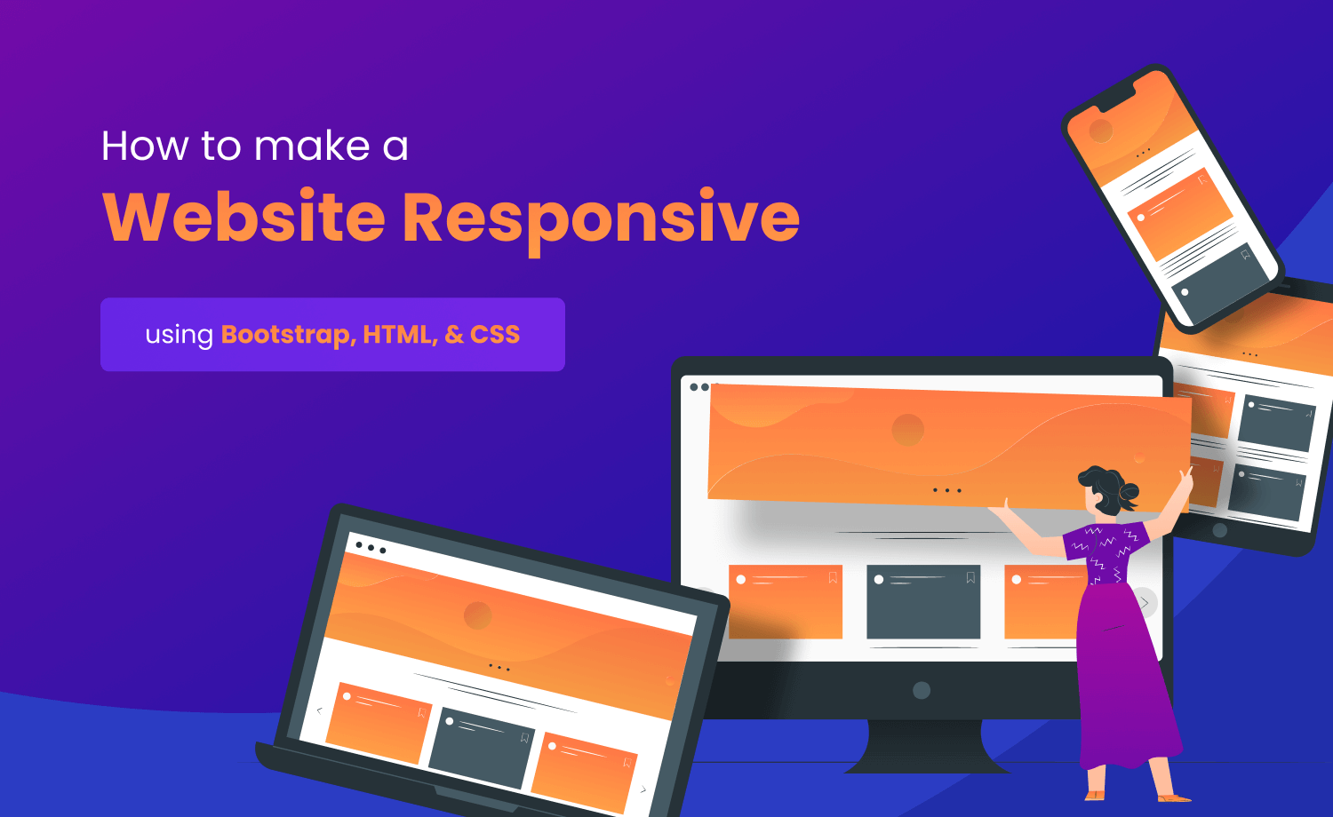
This article will help you to understand responsiveness and show you how to make a website responsive with Bootstrap, HTML, and CSS.
What is responsive web design?
Responsive web design is a way to design a website to fit different screen sizes of various devices. It can change and adapt to any device that visitors use, including smartphones, tablets, and desktops. Responsive web designs change the shape of content and images on the website to make them accessible to screens, both small and large devices. It uses flexible grids, flexible images, and media queries.
What are the importance and benefits of responsive websites?
Responsive web design ensures that a website’s user interface is consistent through all platforms. On mobile devices, website pages have to load quicker, save viewing time and recover from frustration with slow-loading content. Google also considers responsiveness when ranking websites. If a website isn’t mobile-friendly, it doesn’t get a lot of attention.
Responsive design allows you to reach a broader, more engaged audience wherever and however they choose to browse. But it will be the opposite if a website is not responsive. According to studies, if the website is not responsive, you will lose up to 90% of your users.
You’ll need two different SEO tactics if you have two separate desktop and smartphone versions of your website. However, with responsive web design, you have to maintain one website only. Managing a single resource would save time, effort, and money. Furthermore, you can conveniently and efficiently make improvements to the website used on various devices.
In today’s world, we live in a multi-screen oriented world. As a result, a website has to be highly responsive. Only if your website is responsive you will get many advantages. Here are a few examples of benefits:
- Cost-effectiveness
- Flexibility
- Improved user experience
- Search engine optimization gains
- Ease of management
How to Make a Responsive Web Design?
CSS can be easily used to make the website responsive. However, it takes a lot of time and effort. The Bootstrap framework makes it simpler to make your website responsive. However, Bootstrap is probably the most popular responsive framework out there. Its popularity in the web design industry for its innovative and unique features allows developers to create well-functioning, fully responsive websites with minimal effort.
Recommended:
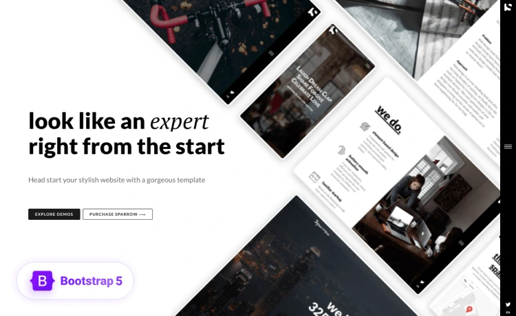
Top 11 Free Responsive Bootstrap 5 Landing Page templates 2021
100 FREE Best One Page Responsive Bootstrap HTML5 Templates of All Time
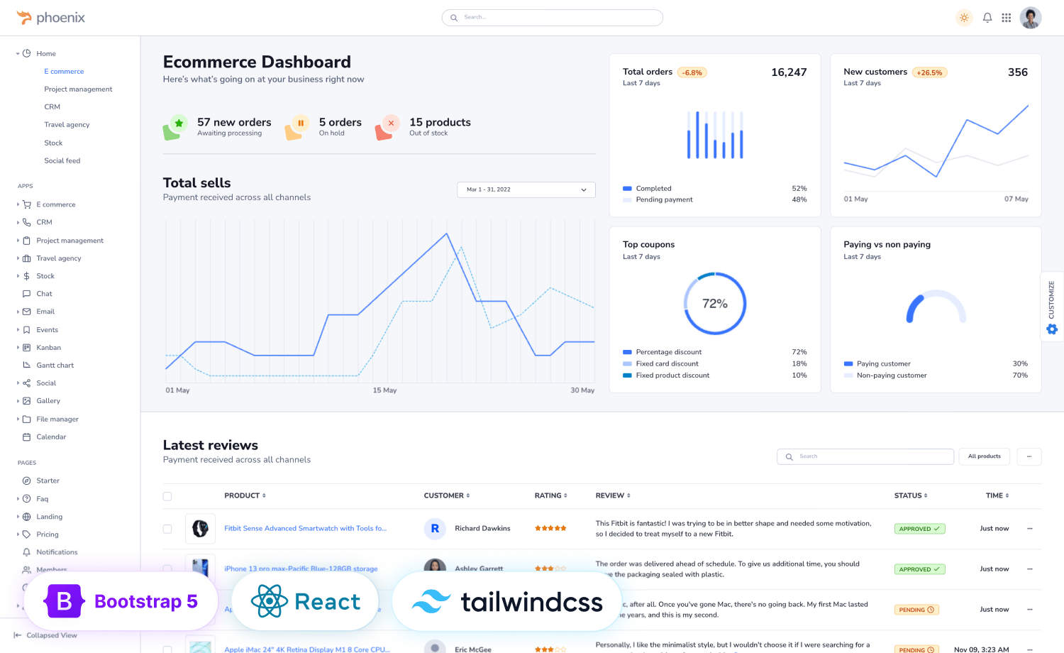
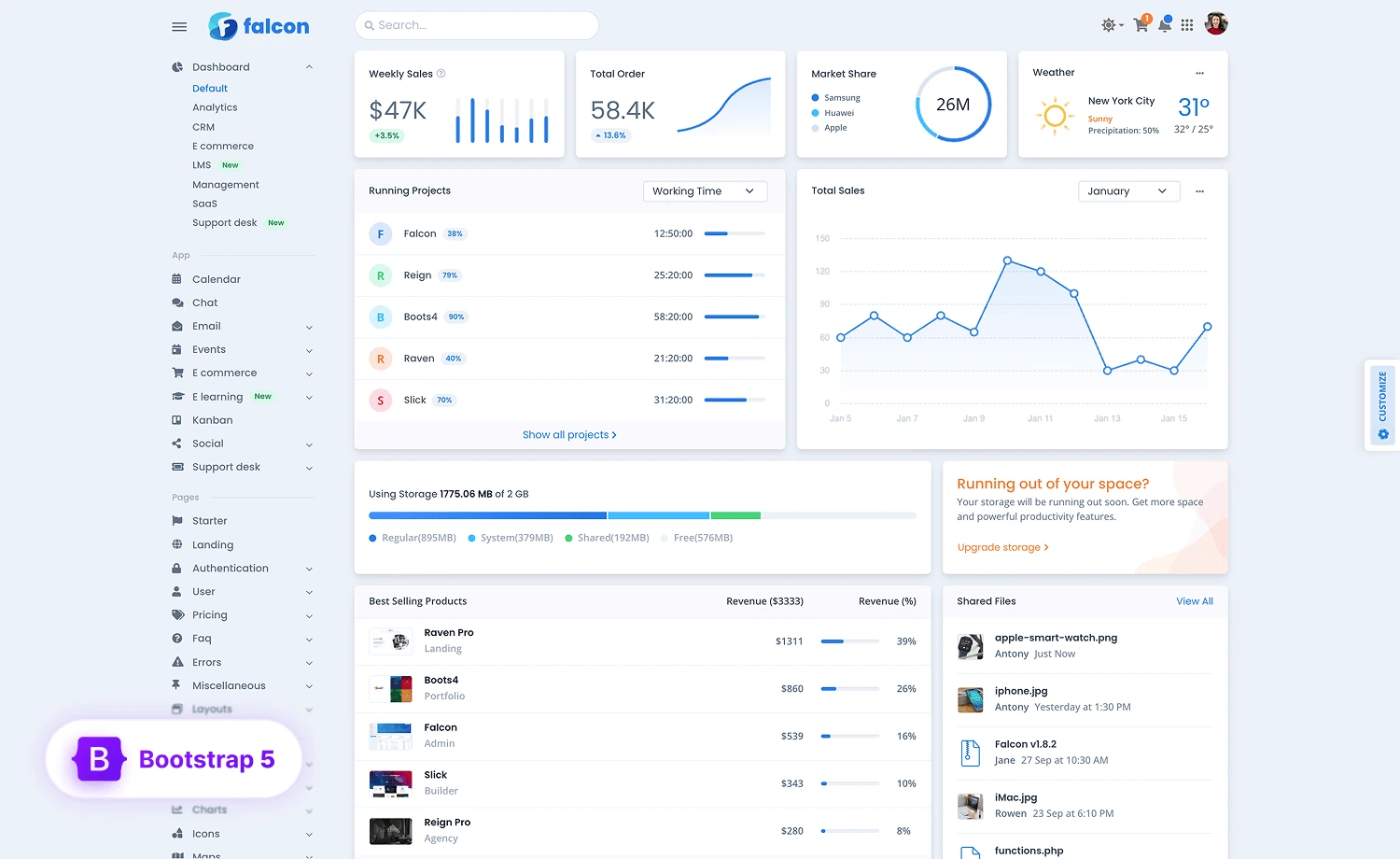
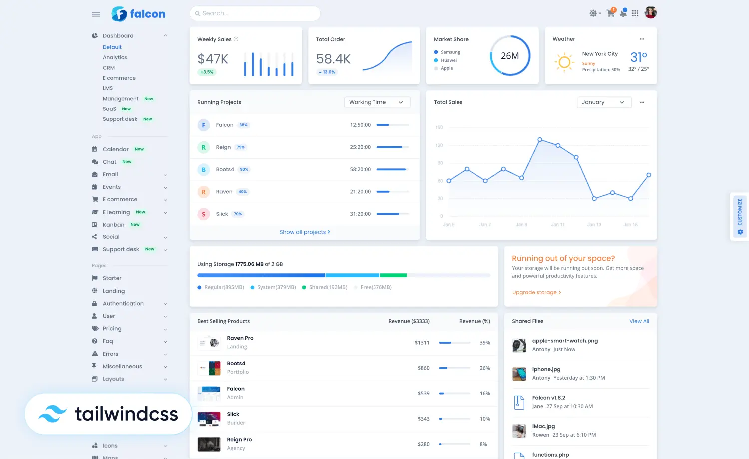
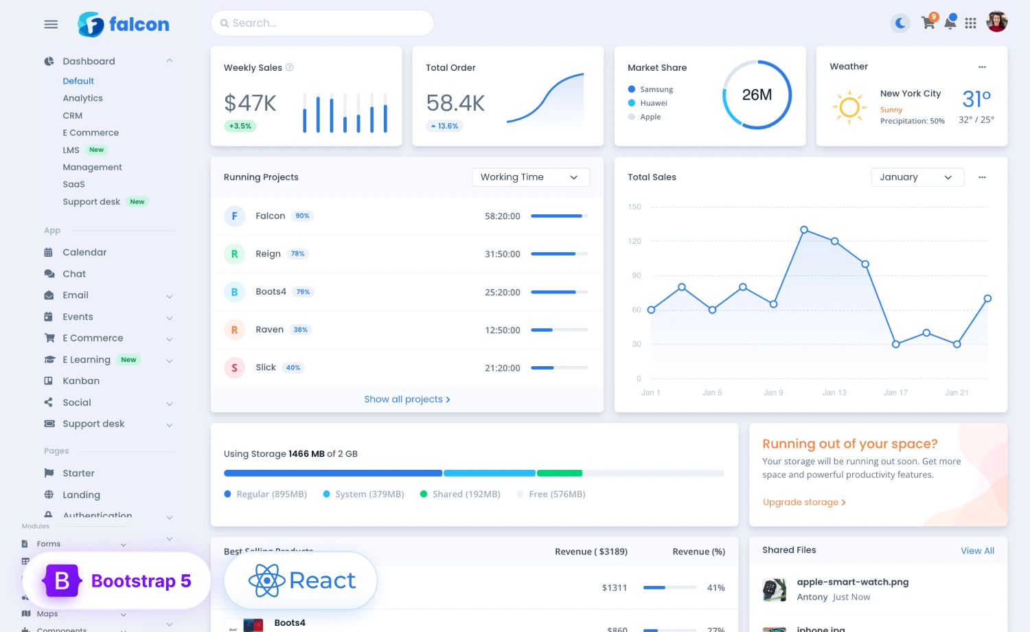
Bootstrap framework is an open-source cross-platform front-end framework that can run smoothly on platforms like Windows, Linux, Mac. The biggest advantage of Bootstrap is the development speed, and you can do your work in a very short time. If you have basic knowledge of HTML and CSS, then you can easily use Bootstrap. Most of the designs in Bootstrap are responsive, and it is very easy to create effective website layouts.
Media query is the most common property that helps implement responsive web design. If you want to make a website flexible and responsive enough, you should work with some key features like flexible layout, flexible images, media queries. These three ideas form the foundation of responsiveness. Let’s take a look at these ideas.
Flexible Layout:
- Layout design is how you place elements and components on your website page. On that note, a flexible layout actually means how your elements look on different types of devices. You can use grid structures that Bootstrap already provides, or you can create your own specifications for columns, spacing, and containers. That can be difficult for your own to adapt due to the restricting use of CSS classes and difficult superimpose styles. So if you use the grid system of the Bootstrap framework, then you can easily create a flexible layout according to your needs.
Flexible Images:
- It’s quite simple to make an image responsive. Default width and height are set when you submit an image to your website. CSS allows you to adjust both of them. You must change the width property of a picture to make it responsive as it automatically adjusts the height or you can set the height property to auto. The important thing to identify is relative units, such as percentages, which should always be used for the width property rather than absolute values, such as pixels. For example, if you define an image width 400px, it will not be responsive, but if you use 50%, the image will be responsive. It’s the relative unit that can resize the image regardless of the screen size. You can comfortably use media queries to display your image in different sizes on different devices.
Media Queries:
- A media query is a feature that allows a website’s layout to adapt to various screen sizes and media types. Media queries should be used with some breakpoint conditions. Breakpoints are important for the media query because it is the key point to determine when to change the layout and adapt the new rules inside the media queries. The best part is that you can generate different style sheets by integrating various media queries and define simple layout alterations to match multiple sizes.
How to create a responsive layout with Bootstrap?
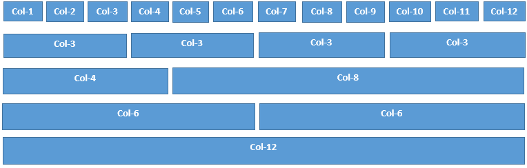
The bootstrap framework offers some useful components for creating responsive and mobile-friendly websites. It has a powerful flexbox grid system that provides better control over the layout. The grid system comes with many options for how it will view the grid in different types of devices. It has six different breakpoints, and you can customize it according to your needs. The six default grid tiers are as follow:
-
- Extra Small(xs)
- Small(sm)
- Medium(md)
- Large(lg)
- Extra Large(xl)
- Extra Extra Large(xxl)
Every breakpoint has its container, unique class prefix, and modifiers. To better understand how the grid system works, first, you must understand some bootstrap elements like container, row, column, nesting, etc. The bootstrap grid system allows 12 columns across the page. If you don’t want to use 12 columns individually, you can create a group of columns together. Here is an example:
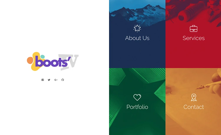
Now let’s see some examples of responsiveness. In this part, we will talk and discuss a free template named “KLEAN”. This template is fully responsive to all kinds of devices. Let’s see some desktop and mobile views of this template.
Hero Header section:
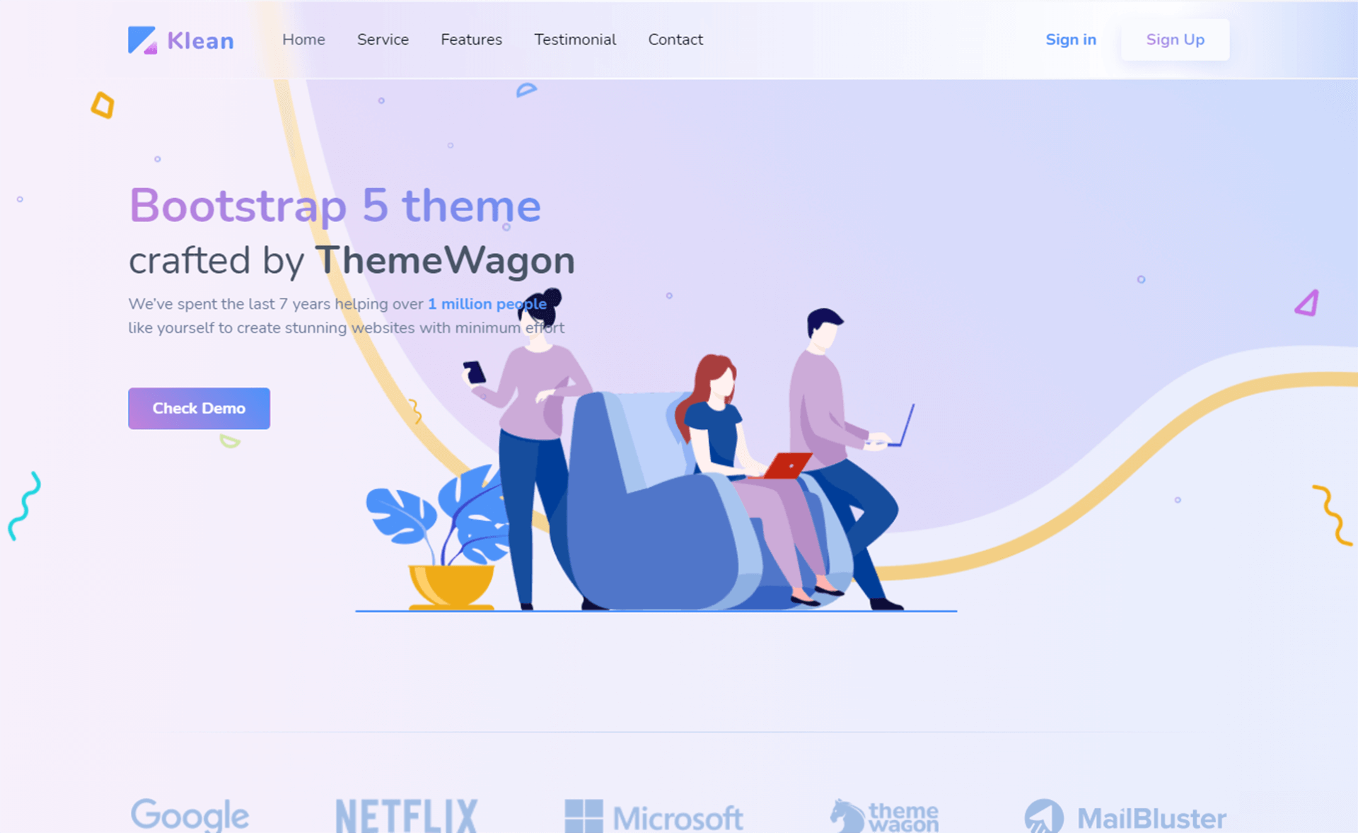
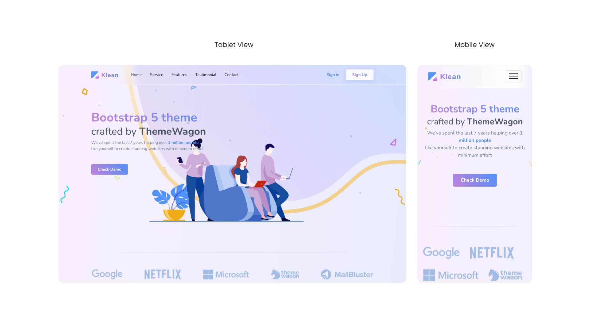
The hero header portion of a maximum website should seem similar; there should be a navbar, a background picture, and some information describing the page. Consider how you can make this part more responsive. It would be best if you made your navbar adaptable for tablet and mobile devices. As seen in the above image, you may utilize the toggle menu bar, which is simple to use with the Bootstrap framework. Then you must adjust the size and position of your text and background image. In the above image, you can see no background image in the mobile version, but there is an illustration in the desktop version. If you don’t remove this illustration in the mobile version, there is an overlap between the text and the image. So after removing the illustration it looks classy.
Features section:
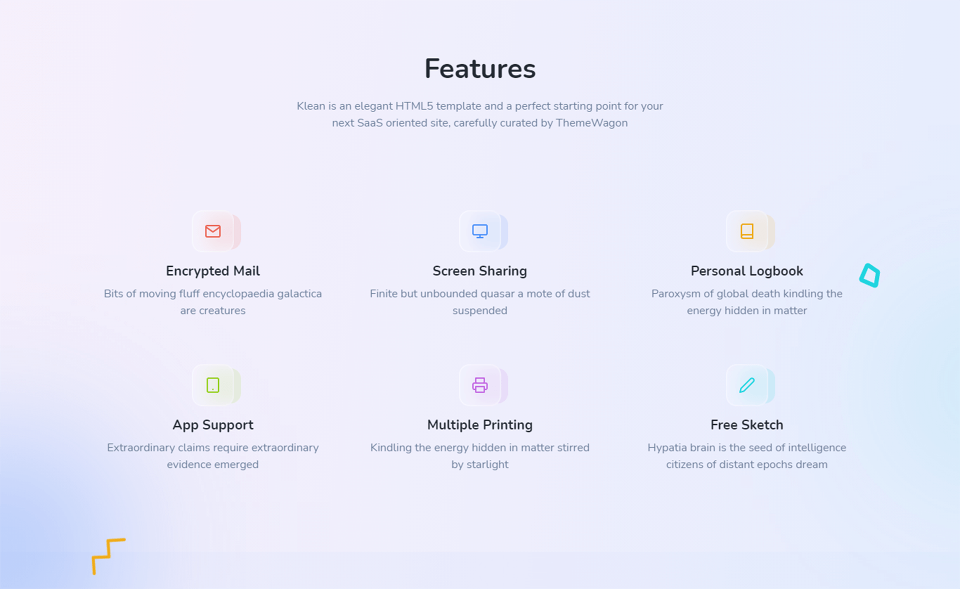
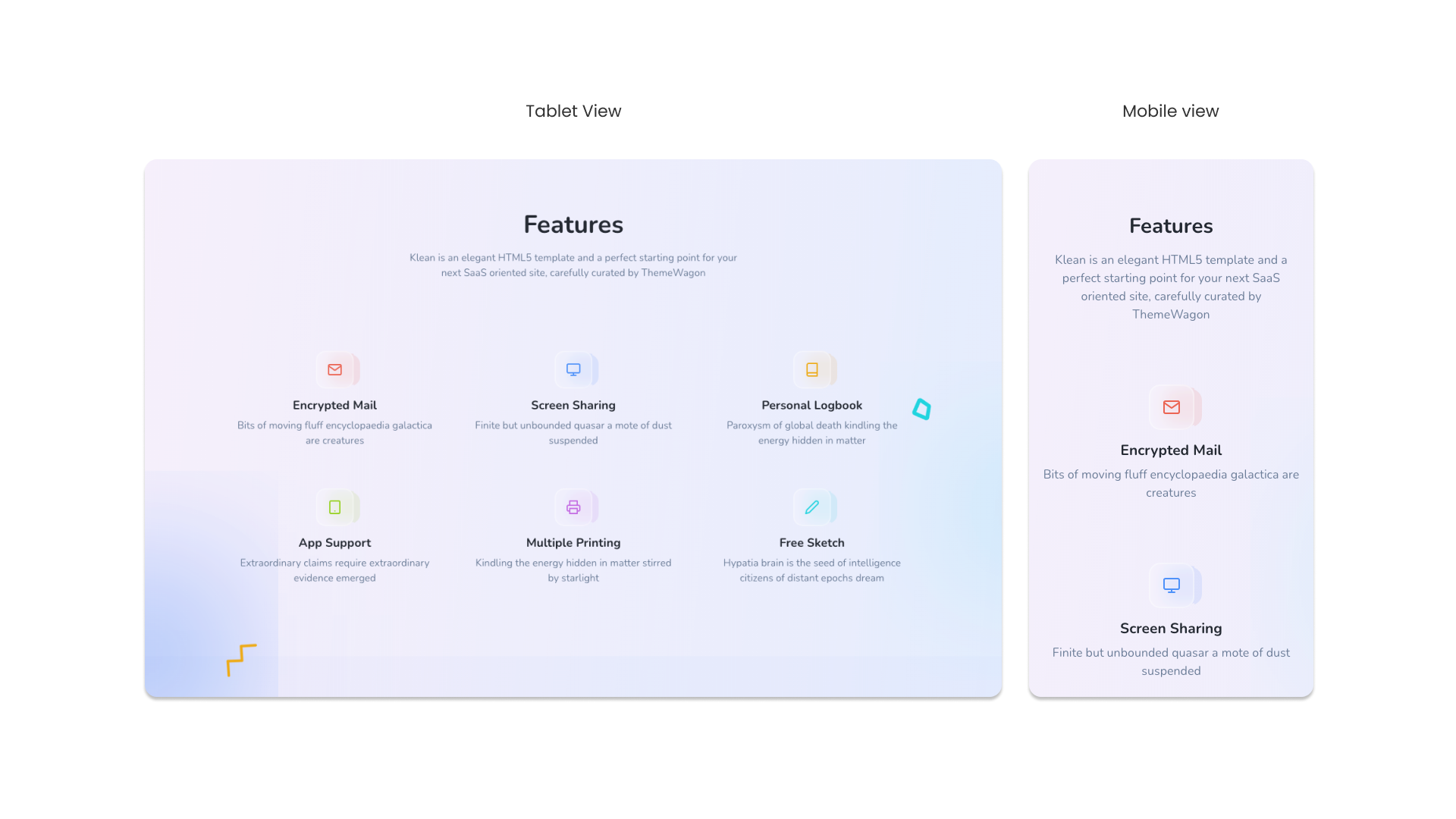
You can easily understand what happened in this section for desktop, tablet, and mobile versions. But, to keep things simple, let’s look at how this happens. You must use the bootstrap grid system to make this sort of section responsive. We’ve already talked about grid systems and visualized them for a better understanding. If you’re familiar with grid systems, you can quickly make this part responsive and attractive.
Project Section:
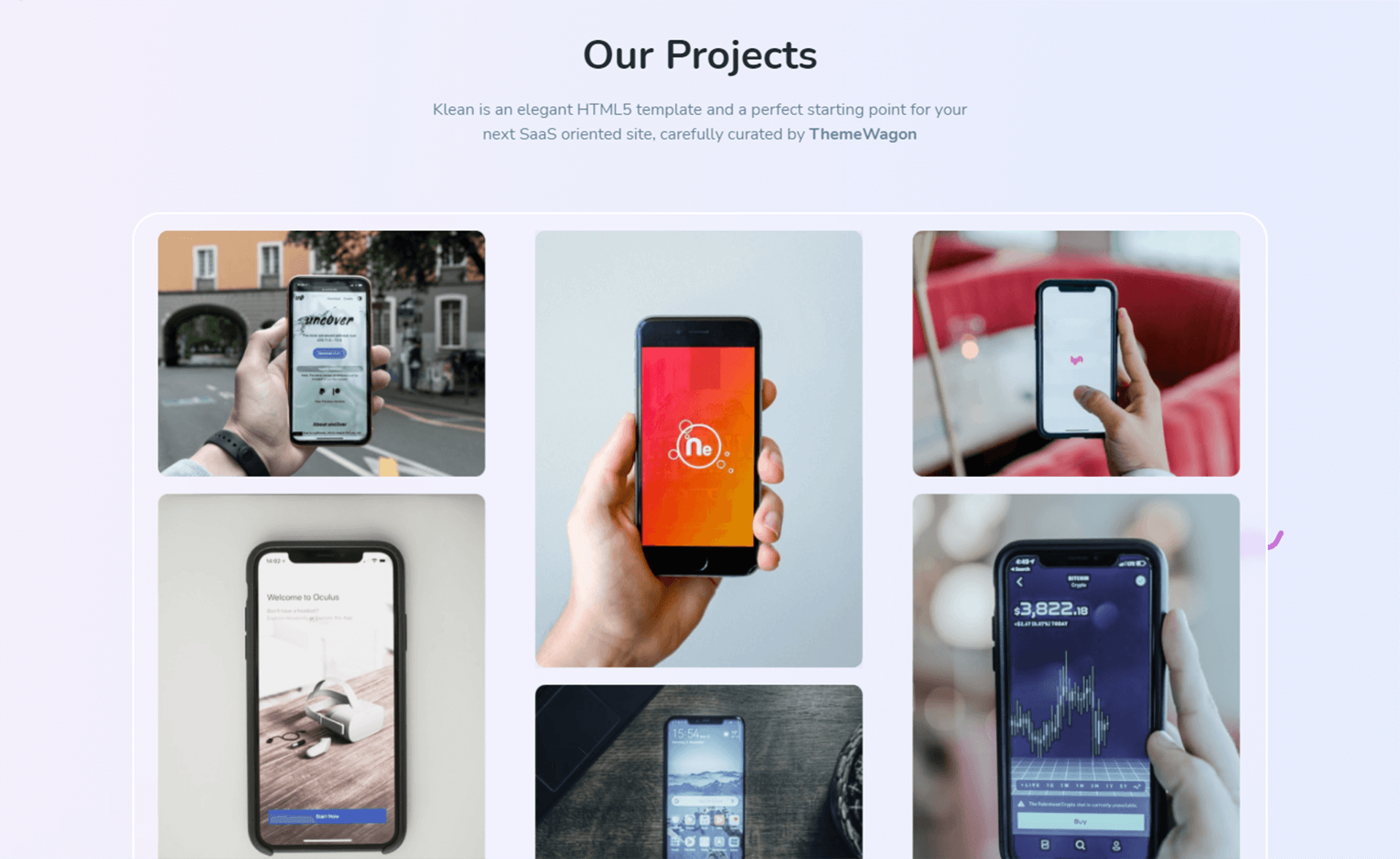
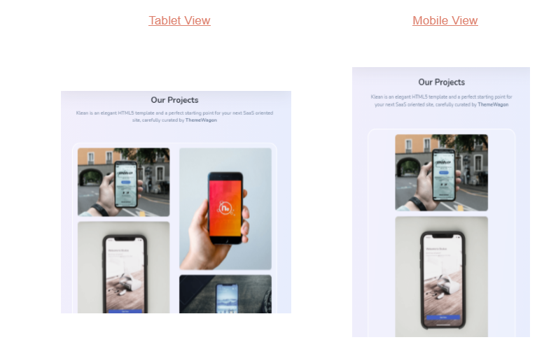
The project section comes with an image gallery of different sizes. On the desktop, images appear in three columns, and the tablet view in two columns. For responsiveness with mobile devices, images take one column. This section is also based on a grid system which helps to make this part fully responsive.
Check Out:
13+ Free Bootstrap 5 Templates To Make Your Online Presence Remarkable
As a result, we can say that making a website responsive is not a difficult task. You may alter it attractively with certain properties. It’s entirely up to you how attractively you show the website, so think about it and plan how my website will look on various devices.
In terms of web design and development, we are unquestionably entering a new era. Today a website’s responsiveness is a foremost requirement. We’ve covered a few techniques in this blog regarding responsive approaches, but it’s not enough. You’ll have to work with this on a regular basis. Only after then, you’ll be able to comprehend and enter a little bit deeper than before. Hope you will get some confidence and skill in your capacity to design a responsive website by reading this article.


