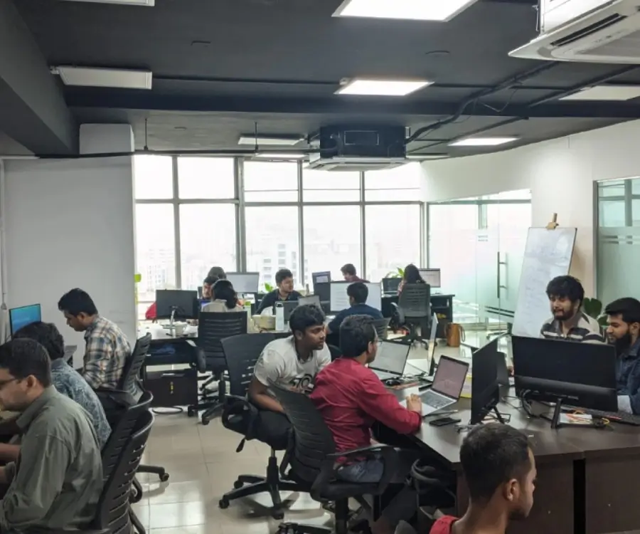
Well, I guess you are a web designer or have knowledge on web development. I recommend to read and follow the guidelines before designing a responsive HTML template. There are few factors which you must consider before start designing or development.
If you are a client or a business owner, this post may help you too! You can check a HTML5 template before purchasing it. Just make a check list and see if all the things are present in a template, you can download it or buy it.
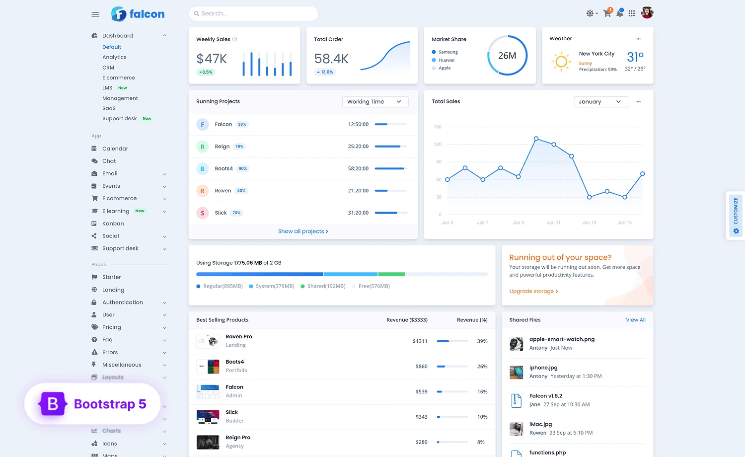
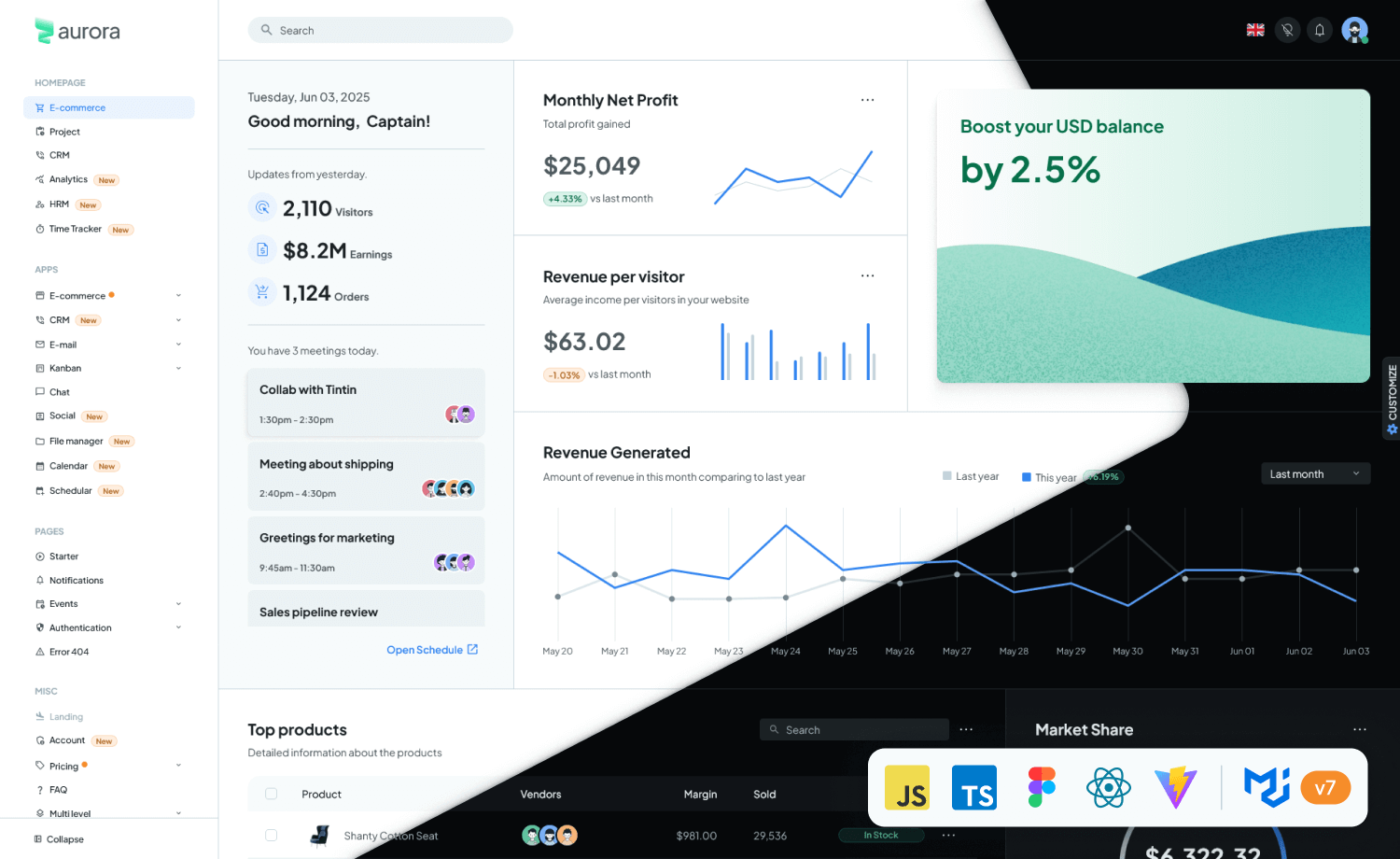
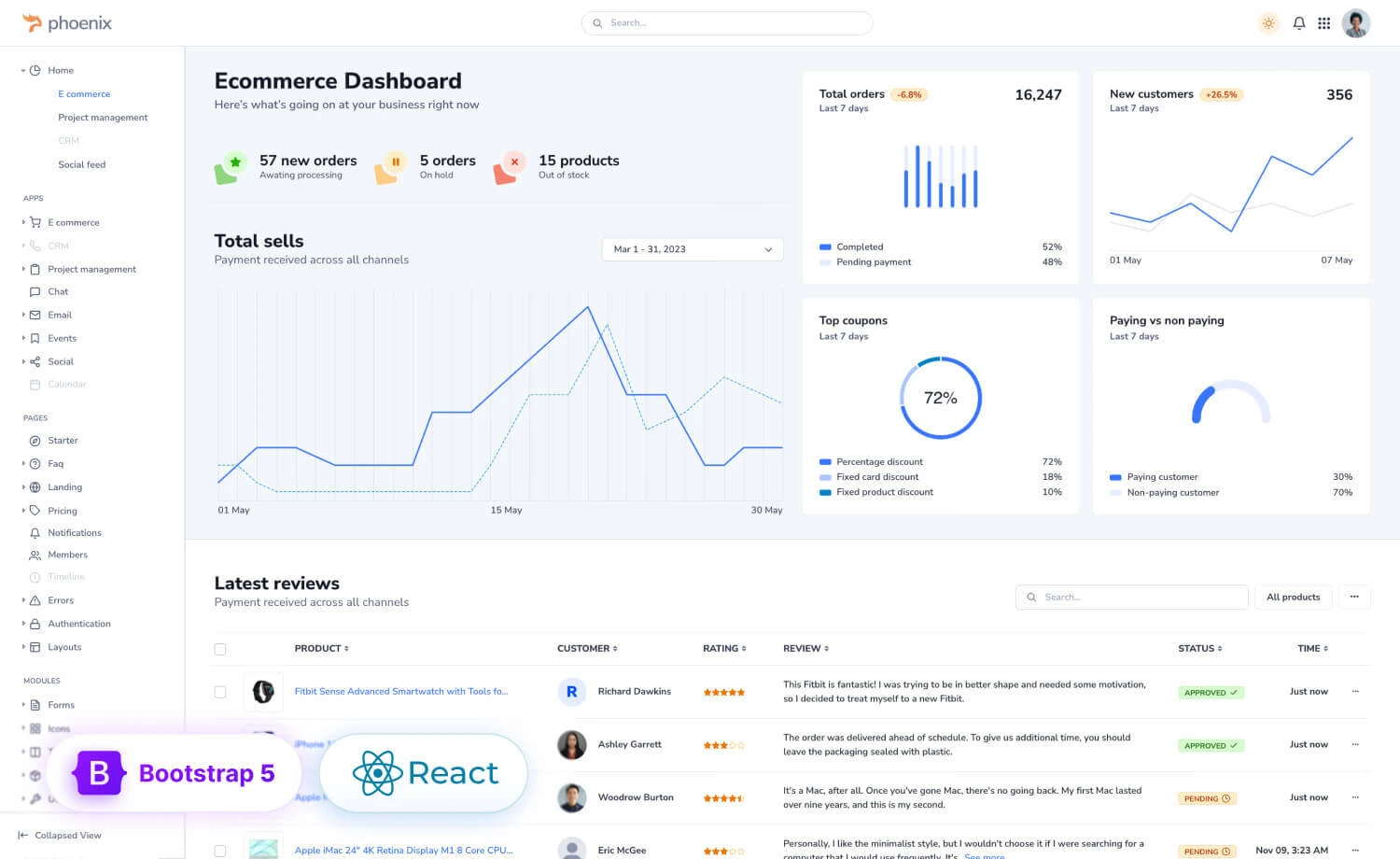
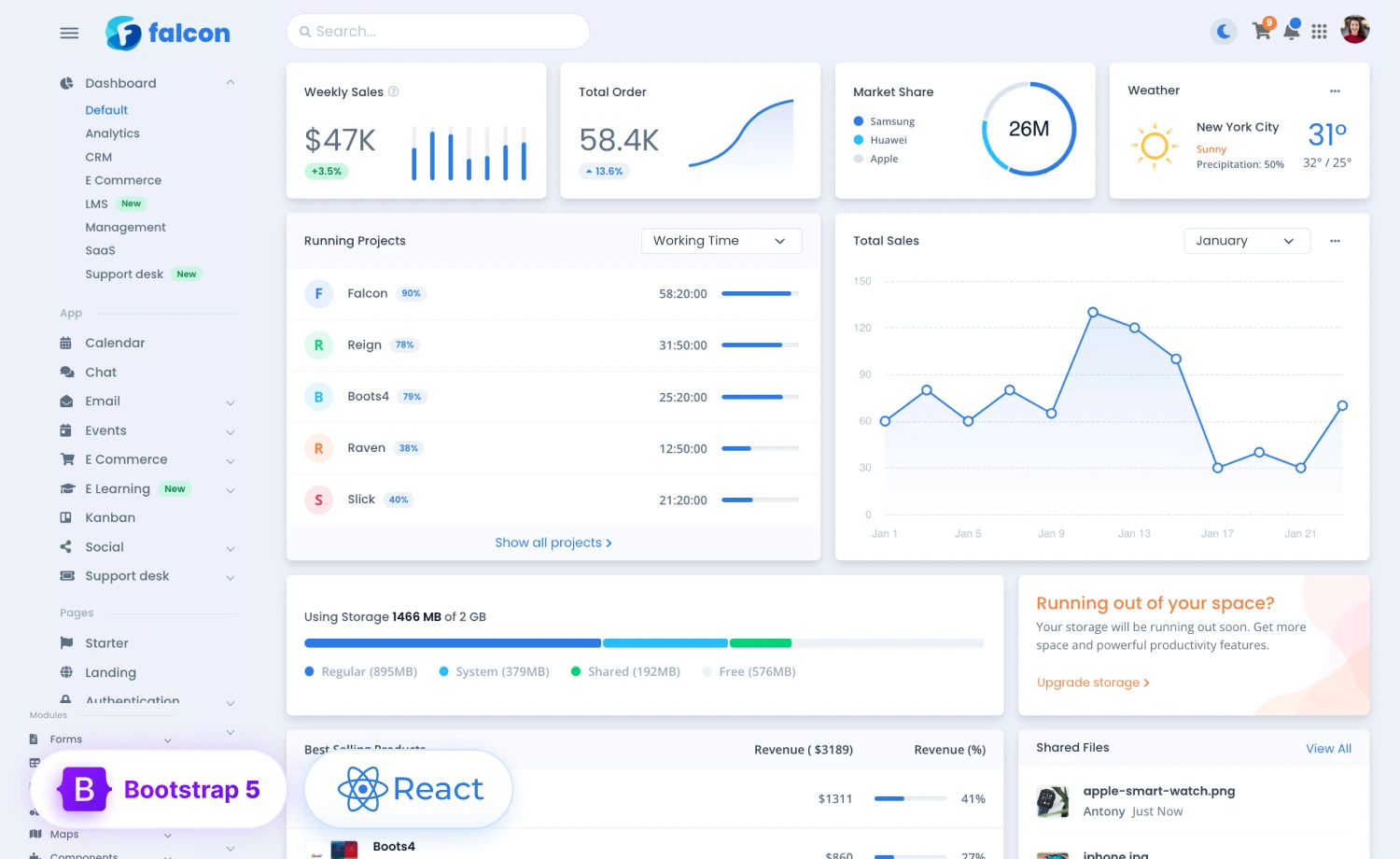
Responsiveness – Design a Mobile Friendly HTML5 Template.
The leading web design trend is responsive web design. Lot of people visit websites from their mobile phones, tablets and iPads. So it’s extremely important to make your HTML5 template responsive and mobile friendly.
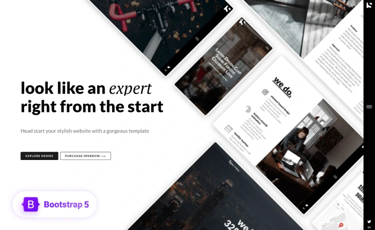
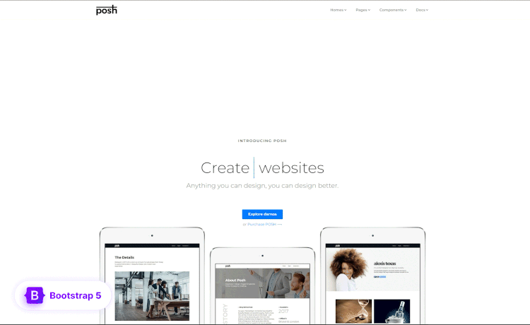
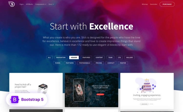
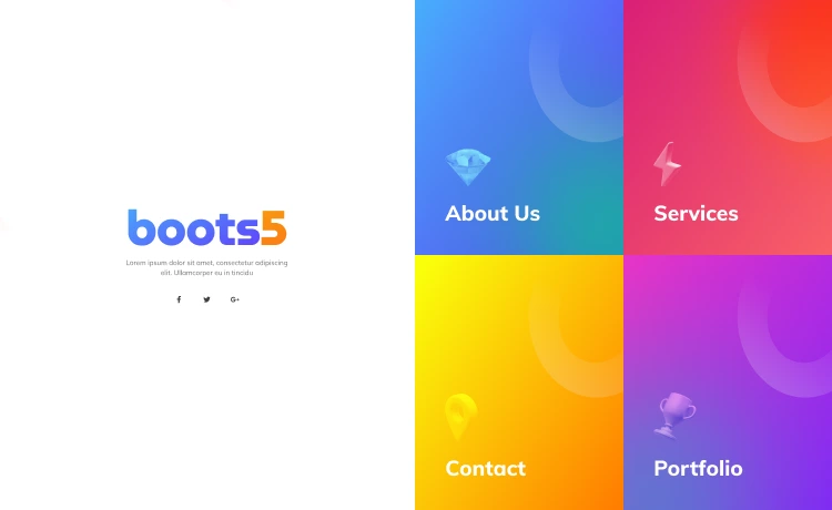
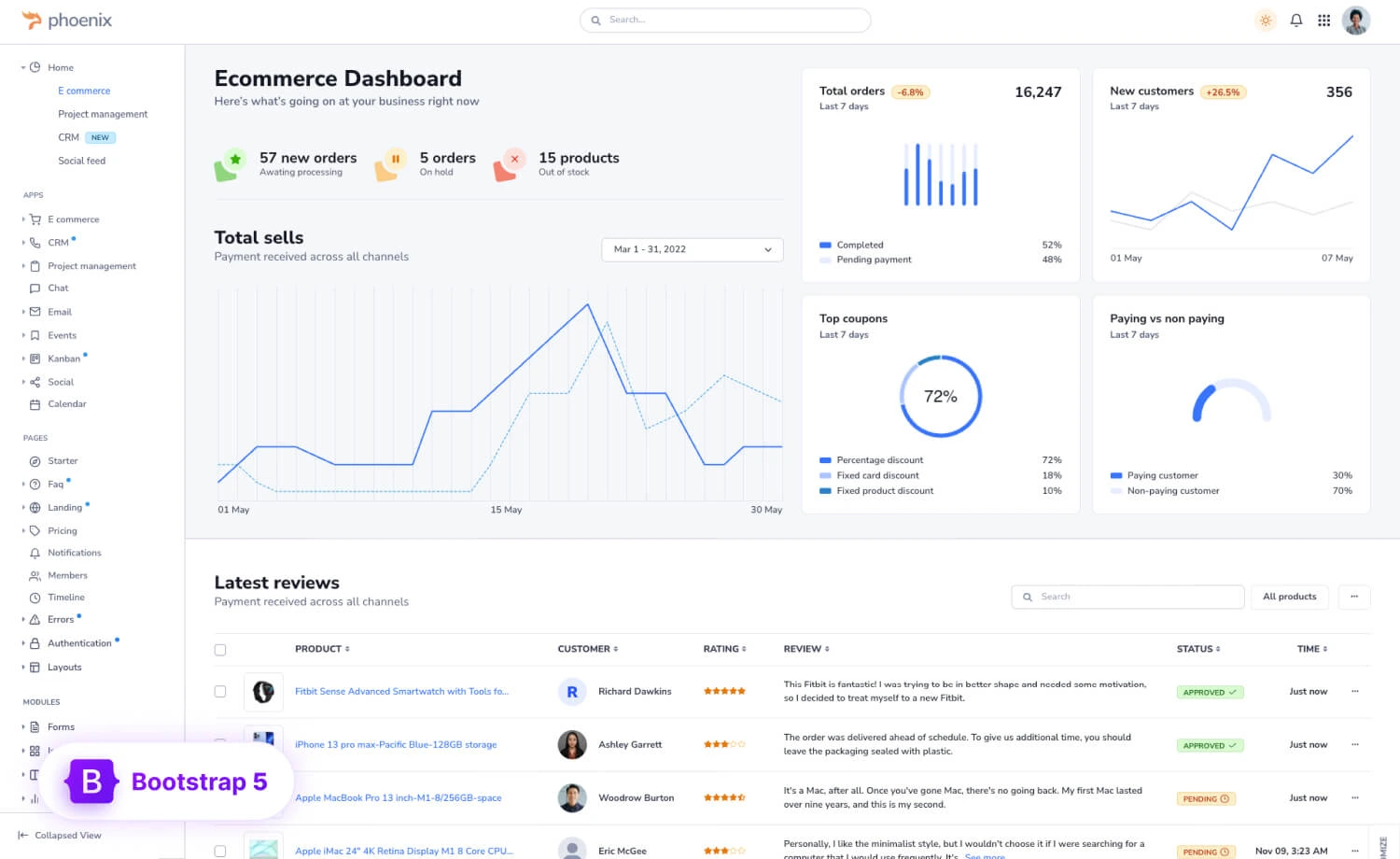
You can consider using Bootstrap framework or any other css framework you like. We recommend you to use Bootstrap, this is the best one.
There are few other things to maintain.
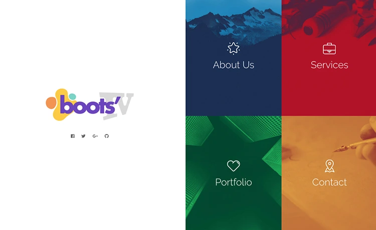
- Have different menu for mobile and desktop version – Check this HTML5 App Landing Page Template
- Use small fonts and less images in the mobile versions
- Use Responsive Video plugin- FitVid
- Use FitText for big heading text
- Use Google chrome emulator for testing different screenshots
- Use px for body font sizes and rem for other font sizes
- Â Mobile first development with @media(min-width)
- Test mobile friendliness in Google of your great HTML5 Template

Fast Loading – Check the Page speed.
This is extremely important to load your website faster. SEO has a great points on loading website quickly. So try to minimize the loading time, try to keep it under 2 seconds if you can.
You can use Lazy Loading plugin to load your images later.
Two Fonts Maximum – Try to use free fonts.
If you are a great UX designer, you already know that it’s good to use less fonts. While designing a responsive HTML5 template, we recommend you to use not more than two fonts.
First, it will help you to load your website or the template fast.
Second, it will help you maintaining the ration of the font types and sizes.
Try to use Google fonts as they are free to use and there are really some great fonts out there.
Use Font icons – Have you heard about fontawesome or ionicons?
In Responsive Web Design, using too many images is a great challenge. The file size increased, it requires http request to load images. Instead if you add icon fonts, they don’t need any http request. They are like character we write; just in shape.
Also the font icons are scalable, changing font icons are easy.
Icon fonts are awesome! – Chris Coyer. He describes it well with examples.
W3C Validation – It’s really important!
If you are designing a responsive HTML5 template, you MUST validate the HTML5 in W3C. Why? Well, it’s the global coding standard. There are many things in CSS if you use a framework, your CSS code will not be validated in W3C. But HTML5 will if you code it well.
If you are a webmaster, you already know that Google webmasters recommend you to validate the code. Google ranks your website well if the code is 100% validated.
SEO Friendly – Make your client’s life easier.
While we surf the internet, we see that many websites don’t have SEO friendly title and meta tags! So who are stupid, you or your clients? Off course its you, because it’s your job to add the seo title and meta tags in the website or ask your clients know about it.
You design well, you a great developer! You shouldn’t make this mistake. It costs a lot to your client. So while designing a responsive HTML5 template, you should make the HTML5 template SEO friendly.
Well Documented Code – It should be your passion.
As a great designer or web developer, it should be your passion. You need to document the code well. We are designing a responsive HTML5 template at Themewagon last week and suddenly while reviewing the template, we found that few sections we not documented clearly. So other developers were finding it tough fix few things.
So document the code, use proper text at the beginning and ending of each section when you are designing a responsive HTML5 template.
Maintaining Indentation – Get used to it to avoid curses from other developers!
Well, this is very true. When we found any HTML5 template or a WordPress theme didn’t maintain indentation, we curse them. Sometimes we email them to learn coding standard before claiming himself a great designer or developer.
At Themewagon, we don’t accept template if they don’t use indentation and maintain the documentation.
Simple Color Scheme – Well, not everyone is color blind!
We always check out the best design awards websites and browse the awarded ones. I know how creepy they are, they really sucks using many colors. People or visitors don’t like many colors in the website.
Have you ever check Apple’s official website? You see how clean and simple it is! That’s the thing, design minimal and clean HTML5 template. This is the best practice, it will give your visitors aesthetically pleasing experience.
Use CSS3 animations – they are lightweight!
CSS3 is sexy, lightweight and loved by the thousands of coders around the world. Don’t panic, using jQuery is cool, but it increases the loading time. If you don’t need that much luxury, you can definitely use the cool css3 animations and amazing effects.
This CSS3 website may be useful for you!
Cross browser compatibility – have you checked it?
Designing a responsive HTML5 template is easy, but be careful about the nasty browsers. You know many of them sucks. So check your website properly in the cross browser testing tools.
Though it’s a great victory for the responsive web design world, Microsoft is not continuing Internet Explorer anymore! But you need to check and make it works on the most popular browsers like Chrome, Firefox, Safari, Opera.
Check out this Cross Browser Testing Tool.
Conclusion – Was this post helpful?
Off course there are many more things you should have in consideration while designing a responsive HTML5 template, here in short I tried to give you a brief. Please let me know your opinion so that I can make edit; it will be more useful then.
