Web Design is the most frequent changing thing. Today you design a website, after a month it will look outdated. Looking back at 2014, we can see some spectacular trends emerging the web design landscape: single-page website, parallax effects, background video, responsive design and many more. The top web design trends in 2015 will be material design, though you need to focus on many other things too.
While many design trends are fleeting, a select few are natural evolutions of the industry. To discover which trends will flourish over the year 2015, I asked the web design team at Technext, a professional website design company. We’ve predicted some killer web design trends which will be popular in 2015.

1. The Dawn of Material Design – top web design trends in 2015
We will see design inspired from Google’s Material design language, Meaning full “z” index in web page and interactive animations.
“Material,” to quote their brief, “is the metaphor. A material metaphor is the unifying theory of rationalized space and a system of motion. Our material is grounded in tactile reality, inspired by our study of paper and ink, yet open to imagination and magic.”
Websites will not just flat for the sake of being flat, a design based on classic principles of material design. You can “Materialize” your website for 2015 trend.
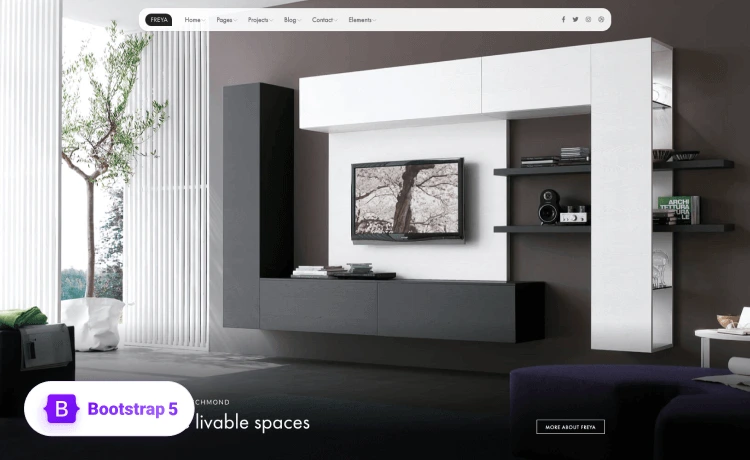
2. Minimalistic – “Less is more”
2014 was all about high resolution Images and heavy weight jQuery animations like parallax, smooth scroll, full width sliders. In fact, these are great fun for a while, since it can also distract the user from content on the page and effects on loading time. Minimalistic will be one of the top web design trends in 2015.
Content will take prime position and interactivity should be used to enhance the key information on the page. Expressing the webpage with minimal elements will give the best UX. You can try Black n White template, it’s a super minimal blog theme.
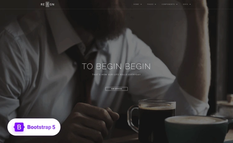
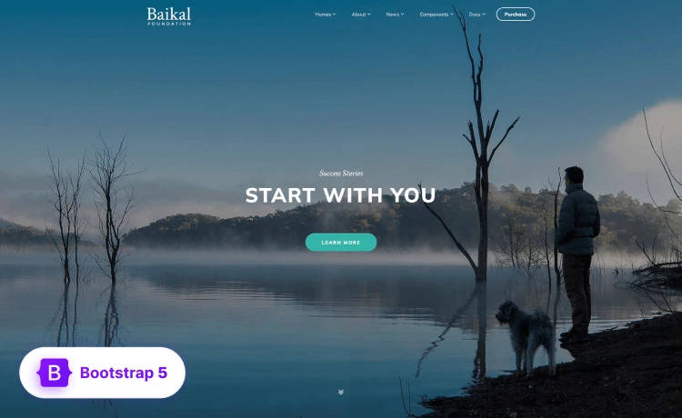
3. Full Screen Background Images & Videos
As we have seen in 2014, more and more website will use full screen background image or video. This is really interactive and make the website alive. A well designed background image or video helps the visitors to understand the key terms of your website without reading a single line of text.
But the most important principle to remember is that backgrounds should remain an accessory and not a necessity. We should use fallback solid colors.
4. Responsive Design or Mobile Optimization
We have already a large variety of screen sizes. And we will have more. As we don’t know from which screen size the use will view out website, we have to make the website responsive at least for standard screen sizes. You can redesign your website using a responsive css framework like Twitter Bootstrap or Foundation.
Responsive web design is going to impact a lot in 2015 and upcoming all years. Google also emphasis on the responsive websites and in the search results, Google indicates if a website is mobile friendly or not. So the key factor in the top web design trends in 2015 is responsive web design trends!
5. Long Scrolling Single Pages
Scrolling is the only simple way people love to see content. People hate to click and wait for a page to load. By combining multiple pages to one page, like lead pages, you can give people the facility to see more content with less clicking. With a simple long scrolling page you can even convince people to purchase your product or signup to your newsletter. Here is some free landing page templates you can try.
6. Focusing Content, Enhanced Typography
“90% of web design is typography” – Strong representation of content will help user to find what they need. You can try google’s new font Roboto. It is slightly wider and rounder, giving it greater clarity and making it more optimistic.
So Typography and focusing on the original and useful content is one of the important thing to consider a top web design trends in 2015.
7. Transitions, Animations and SVG
Animations make a website alive. Simple and elegant animations make the website not only appealing but also increase user interaction. People love to see feedback from website when they click or hover on something. According to google’s material design spec “Sometimes, it is difficult for a user to know where to look or understand how an element got from point A to point B. Carefully choreographed motion design can effectively guide the user’s attention and focus through multiple steps of a process or procedure, avoid confusion when layouts change or elements are rearranged, and improve the overall beauty of the experience. Motion design should serve a functional purpose.”
So, what do you guys think the top web design trends in 2015 for WordPress themes will be for this year? Write your comment bellow. We will update the post if we miss any important factors as top web design trends in 2015.
