There is a close and intricate relationship between psychology and UX design. The valuable insights derived from cognitive psychology help designers understand how the human brain perceives, processes information, and makes decisions. This understanding and knowledge lay a foundation for optimizing typography, layouts, color schemes, and other design elements to evoke specific emotional responses, enhance user engagement, and encourage action.
The UX Laws better explain the relationship between psychology and design in a comprehensive way. These laws are the guiding principles for UX designers that help them nail their digital product user experience every single time. Ignoring these laws could negatively affect the effectiveness of a design.
As a presenter, you might be wondering how these UX laws are applicable to slide design.
Stay calm and read this article to get answers to your questions!
1. Law of Simplicity
Check the two images given below and tell us which image you find comprehensible and engaging.
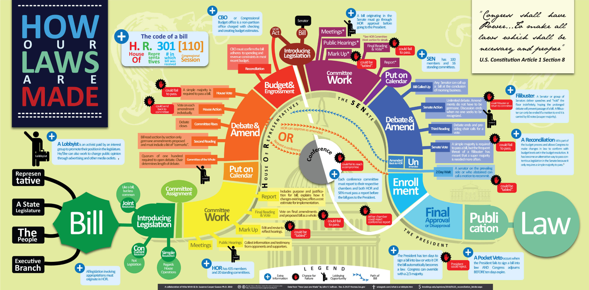
It’s image 2, right? Because it communicates and explains the procedure in a simple manner.
Simplicity implies extracting the essence, removing all the unnecessary stuff, and adding the relevant and meaningful bits and pieces. Thus, this law states that designs must be simple but not simplistic to get more attention and make understanding easy. This design law led to the emergence of the concept of ‘minimalism.’
How to apply it in presentation design?
- Use uncomplicated diagrams and charts that take minimal time and effort to view and comprehend.
- Use simple words; avoid jargon.
- Maximize the impact of your slides by using simple layouts and themes or even a slide management software to ensure consistency with your brand identity across all presentations.
- Use white spaces to separate paragraphs, words, and graphics.
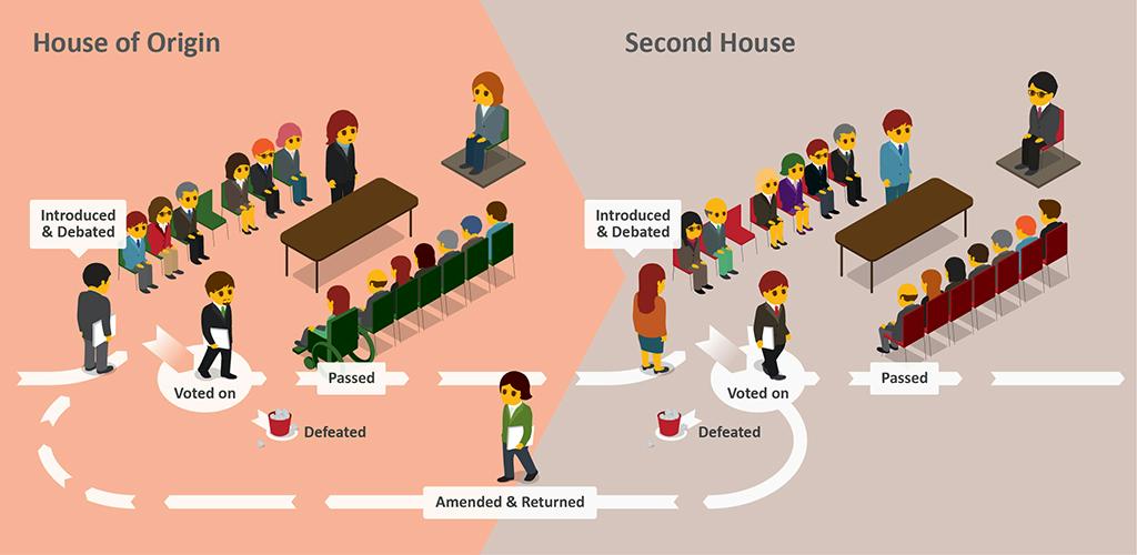
2. Hick’s Law: Avoid the Decision Fatigue
Let’s get back to the 1980’s and recall the fun you had playing Super Mario. The controls (left, right, and jump) were limited and so simple that anyone could learn to play in less time.

p { line-height: 115%; text-align: left; orphans: 2; widows: 2; margin-bottom: 0.1in; direction: ltr; background: transparent }a:link { color: #0000ff; text-decoration: underline Contrary to this, today’s PC games and gaming consoles offer many choices for input controls, making it difficult and time-consuming for players to understand and play the game.
Despite so many options and controls, why is modern-day gaming difficult to learn? Hick’s law explains the reason!
Hick’s law focuses on the relationship between the reaction time of a person and the number of options presented. It states that if users are presented with more complex choices, they will take a longer time to reach a decision and choose the best option.
How to apply it in presentation design?
- Limit content on each slide to reduce the cognitive load on the audience and draw their attention to the aspect that is the most relevant to them.
- Use images and graphics that add meaning to your presentation. Avoid overusing them; otherwise, you will leave your audience confused.
3. Law of Proximity
Check out the following two images-
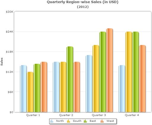
This chart depicts four different groups (Quarter 1, Quarter 2, Quarter 3, and Quarter 4) showcasing the sales of four regions (North, South, East, and West). This makes it easy to analyze and compare each region’s sales within a quarter (as they are grouped as per the Law of Proximity).
But comparing the North region’s sales (blue bars) across the four quarters is difficult with this chart. So, let’s reverse the chart (Image 2) and see the difference.
Image 2
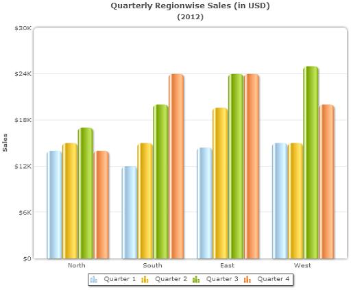
Now, use this revised chart (created considering the Law of Proximity) to compare the North region’s sales across the four quarters. Isn’t it easy now?
Both charts are created on the basis of the Law of Proximity; however, with a different focus. The law states that data points that are placed close together are perceived as a group.
How to apply it in presentation design?
- Understand your information priority first and then put the relevant data points in proximity.
- Use whitespaces to separate information that is not related.
4. Fitts’ Law
The law states that the bigger object placed closer to us is easier to reach. It takes much time to reach a smaller-sized object placed at a longer distance.
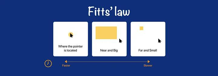
Let’s understand it with real-life examples-
Have you ever wondered why the brake pedal is kept bigger than the accelerator pedal? Why are the important keys, like Shift, Enter, and Space, on the keyboard bigger than the rest of the keys? Why is the ‘Off’ button on some machines so big?
The reason is – to make the brake pedal, important keyboard keys, and ‘Off’ buttons distinguished so that you can easily access them.
How to apply it in presentation design?
⦁ If your presentation is interactive, comprising polls, quizzes, etc., make sure that the size of the buttons or other clickable elements is bigger than the text placeholders. It will help the audience navigate these elements/buttons easily.
⦁ For enhancing readability, highlight the title of the slide with one color, the sections with the second color, and text placeholders with the third color.
⦁ You can depict the relationships between data points and other elements by grouping them. It enables the audience to shift their focus from one point to another in a short time.
⦁ Ensure the most crucial information and actions are easily accessible and require minimal effort to understand.
5. Law of Similarity
Let’s take a look at the below-given image, and tell us what you observed.
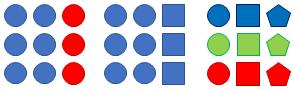
In general, you will observe-
- The elements in the left array are grouped in two colors: blue and red.
- The elements in the middle array are grouped in two sizes: circle and square.
- The elements in the right array are grouped in three colors: blue, green, and red.
This example explains Gestalt’s Law of Similarity, which states that the human mind tends to perceive similar-looking elements as related and a part of the same category or group.
How to apply it in presentation design?
- Use similar shapes, sizes, colors, etc., to present relationships or categorization of objects.
- For graphs and charts, use a color similar to your presentation’s color scheme (as shown in the below image).
6. Jakob’s Law
What similarities do you find in Amazon’s and Flipkart’s websites?
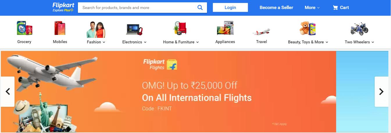

Both have-
- the logo, search bar, login option, and cart icon in the top bar
- category options in the second bar
- sliders showing hot deals
A lot of eCommerce websites follow a similar pattern (the standard design and elements) to give users a familiar experience and avoid confusion. This is what Jakob’s law states – build familiarity! The product’s usability will increase if it is designed considering the customers’ existing mental models.
How to apply it in presentation design?
- Rather than using innovative color schemes in your corporate presentations, use the color scheme linked with the brand identity of your company.
7. Law of Relevance
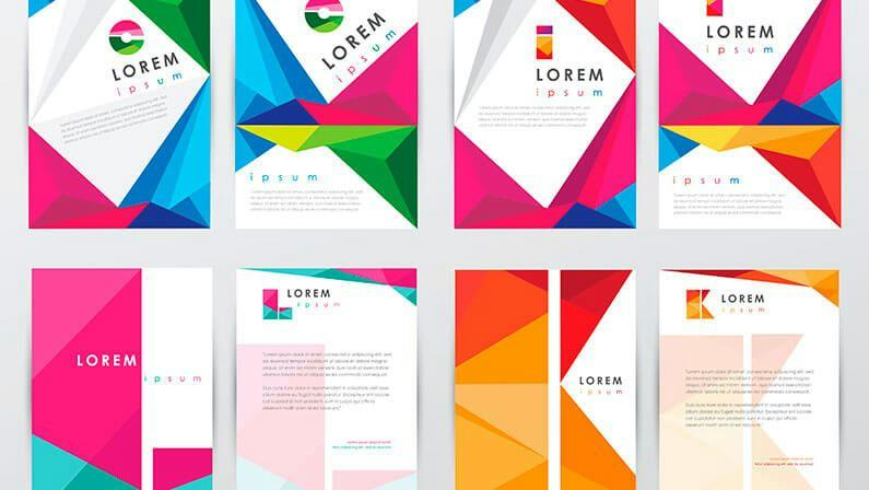
Check these 2 images and tell us which image will better resonate if we talk about cost, saving, and investment. It’s image 1.
And which image will complement the information related to mobile banking, mobile security, and m-commerce? It’s image 2.

The Law of Relevance stresses providing users with information and features that are meaningful and useful to them.
How to apply it in presentation design?
- Include the content that matches the audience’s interests and needs.
- Organize the content in a logical manner so that the audience can process it easily.
- Use images and visuals that complement your text and enhance its meaning.
8. Law of Symmetry
Suppose you landed on the homepage of a music streaming app just to find that design elements are randomly scattered, the layout is chaotic, and the options (songs, artists, playlists, albums, and genres) are not arranged logically and symmetrically. Would you like to explore the app further, or would you prefer to abandon it quickly?
The Law of Symmetry states that each design element carries visual weight. To create a visual balance, it is important to ensure that the design has equal weight on both sides of the central point. This balance creates visual harmony, preventing your design from looking chaotic.
How to apply it in presentation design?
- The background, layout, and organization of content in slides must be symmetrical.
- Align objects and images symmetrically.
9. Law of Prägnanz
What comes to your mind when you see the two images given below?
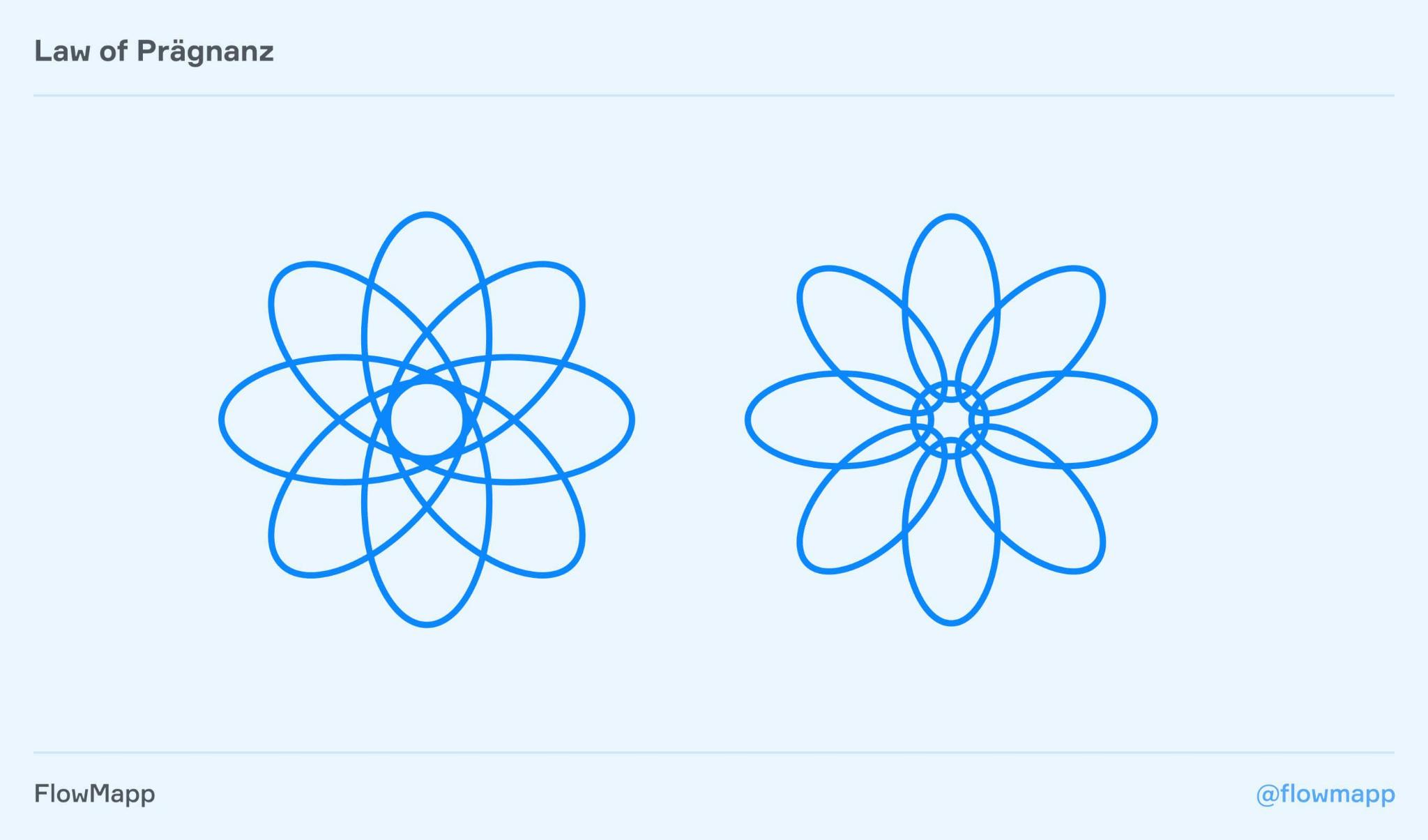
The left image resembles an atom, and the right image is of a flower. Right? Instead of seeing them as a group of curves, you are trying to relate them with familiar objects.
This is the Law of Prägnanz, which states that when we are presented with a set of cryptic elements or complex patterns and shapes, our mind makes an effort to interpret them in the easiest possible way.
How to apply it in presentation design?
- Opt for simple designs to reduce the audience’s cognitive load.
- Don’t overload your slides with information.
10. Von Restorff Effect
See the pricing plans of a company below. Which plan catches your eye first? We are sure it is the ‘Yearly’ plan.

The Von Restorff Effect theory states that if we are presented with many similar objects, we are likely to remember the one that differs from the rest.
How to apply it in presentation design?
Make the core message, important information, or key takeaway visually distinct. You can use a different size, font style, color, or animation for this purpose.
11. Miller’s Law
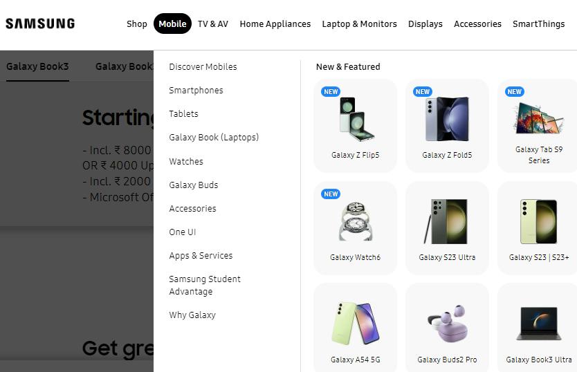
Suppose you visit the product listing page of an e-commerce website. The page showcases dozens of products with complex and lengthy names and multiple attributes. There are no thumbnail images and sorting options. In such a scenario, won’t it be difficult and overwhelming for you to browse product listings?
Miller’s Law states that humans can keep about 7 pieces of information in their memory. They get overwhelmed when presented with more than that. So, instead of presenting one large piece of information, it’s better to divide the information into smaller, digestible chunks.
The Samsung online store is the best example of this law. Though the page shows more than 7 products, the clear visual separation makes it easy to memorize a product.
How to apply it in presentation design?
- Limit the number of slides.
- Create a clear visual hierarchy displaying headings and subheadings. You can use pre-designed presentation templates for PowerPoint or Google Slides for a more consistent look.
- Include shore paragraphs having not more than 2-3 lines. The lines must have white space between them.
- Each line must not have more than 80 characters.
12. Law of Aesthetic-Usability Effect
Below are the landing pages of two websites.
The first website’s landing page is cluttered, lacks whitespace and CTA, and has unorganized content.
The second website’s landing page has all important elements organized well with a clear visual hierarchy.

Which landing page will attract the target audience? Obviously, the second one, as its appealing and clear designs influence user experience and overall usability.
According to the Law of Aesthetic-Usability Effect, people positively respond to an aesthetically pleasing design, perceiving that it is easier to use.
How to apply it in presentation design?
- The design of your slides must be clean, aesthetically pleasing, and visually attractive.
- Organize the content in such a way that the audience can comprehend it easily.
- Avoid using unnecessary and irrelevant design elements and content.
13. Law of Cognitive Load
The Law of Cognitive Load is related to Miller’s Law. It states that cognitive overload occurs when the working memory of humans is exposed to more information/data than it can actually handle easily. It reduces the chances of users processing the essential things.
Amazon is the best example of this law. Amazon didn’t want to break the mental model and increase the cognitive load of its users by confusing them with how the site works. So, it redesigned the website gradually, keeping the interface familiar.

How to apply it in presentation design?
- Use simple yet effective language in slides; avoid jargon.
- Add the most relevant content and images in an organized and logical manner that resonates with the audience.
- Reduce text by incorporating high-quality visuals, such as videos, graphs, charts, etc.
14. Law of Continuity
Suppose you are driving home from the office. At a traffic light cross, you saw a Ford Mustang car. On the way, you suddenly notice four more Ford Mustang cars. It’s not that this car started running on the road, only that particular day you noticed. It’s just that you associated your brain with the car and started noticing it.
The Law of Continuity states when all elements, data, or information are presented in a continuous state of interconnection, the users experience a flow of state and give their 100% attention.
How to apply it in presentation design?
Complement your speech with a well-crafted and aesthetically pleasing slide design to induce a flow state. Your words and design elements on slides must be interconnected so as not to break that continuity state.
15. Law of Closure
What do you see when you look at these 2 images?

A square and a triangle, right?
The Law of Closure states that when we see visual elements arranged in a complex pattern with missing parts, our mind connects the dots to recognize the pattern and complete the image.
How to apply it in presentation design?
- Instead of showing the entire idea at once, show some elements of it at the beginning of your presentation so that the audience will get a clue of what will be presented and stay attentive to what you have to say next.
- Evoke the audience’s memory through graphical representation and then explain the complex idea using analogies.
Conclusion
These are the 15 UX laws that work wonders for presentations, too. These laws help you keep the audience at the top of your mind while designing your slides and convey your message in the best possible manner that resonates with them.
Go through these laws and identify which law is the right fit for the presentation you are working on. You can also use a combination of two or more laws to make your presentations stand out.