Design matters, but maybe not in the manner you may assume. The design makes an emotional point that might otherwise be difficult to express verbally.
With the aid of flavor and color, a graphic designer who creates any graphic art brings the visual aspects to life. There are several methods for properly communicating information, but balance is the most crucial one.
It’s a common misperception that a piece of art must be symmetrical to be balanced. In reality, symmetry has nothing to do with balance.
The first thing you need to know in order to balance artwork that combines text and images in which design elements will serve as the main focal point. You must balance a design by considering each component’s tone, texture, placement, contrast, and size.
This article will help you understand every aspect of text and graphics balance in a design and why it is essential.
What Is The Relationship Between Text and Graphics?
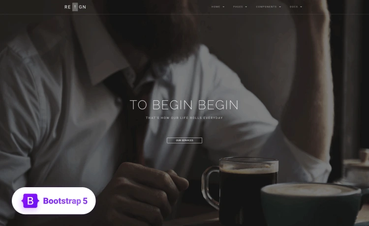
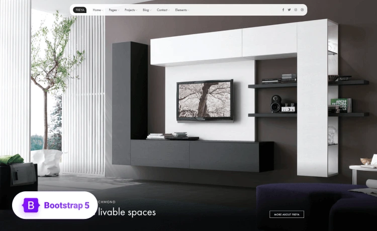
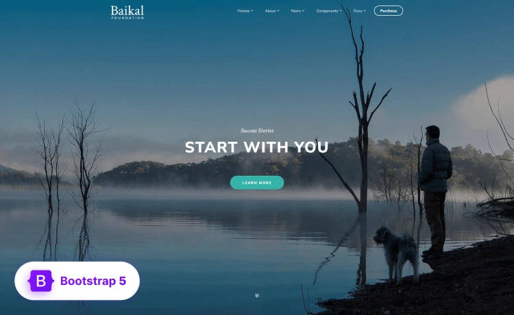
The goal and intended use of a website should determine how it looks. For example, a website intended to present scientific research needs to appear differently from a website showcasing a photographer’s work. People will also judge an artist based on their work’s website design.
It’s not that text or visuals are superior to one another. On the contrary, the designs that strike a balance between the two are the finest.
A skilled designer can guide your eye to focus on what they want you to see. However, excessive use of either may make a design seem uninspired and bland.
Reducing the number of visuals in your website design has several advantages. Generally speaking, graphics are heavier than text and code when it comes to filing size.
A page might easily get bloated with a few more photos, which will slow down download times. On the other side, visitors may be more responsive to your material if your site is visually appealing before they even know it.
Why Maintain Balance Between Text And Graphics?
To achieve coherence, completeness, and pleasure in a design, the visual weight of the parts must be balanced with respect to one another on both sides of the design.
Your composition should be balanced vertically, horizontally, diagonally, or between the backdrop and the foreground to obtain the best balance.
Any graphic design element, including logos, brochures, flyers, applications, and web pages, needs to be attractive and well-put-together.
The logos and marketing strategies of the businesses you know and love have all evolved over time, according to a carefully observed pattern of fonts, colors, and texts.
There are certain typefaces that are so ornate that it is difficult to read the words. The right amount of whitespace inside the photoshop text styles and a pleasing arrangement of various fonts and colors are key components of good typography.
A graphic designer’s responsibility is to develop a visual identity consistent with a brand’s values.
Things You Must Know When Figuring Out Your Designing Balance
If you’re wondering how to maintain a balance between your text and graphics in a design, you first need to answer the following questions—
What Are You Aiming For?
Goal and medium have a significant impact on how the design of a project develops. Therefore, it’s crucial to consider both larger and more specific objectives for design initiatives.
The fundamental objective is to contact while designing a business card, for instance. Similarly, website design projects could have several objectives that change from page to page.
What Type Of Content Are You Planning To Create?
The ratio of text to images might vary depending on the primary content type of a design. For example, books and e-books are more usually represented using text, whereas text is more frequently used to represent text.
Finding that balance may be as easy as considering the type of material you anticipate having and whether it will be more visually oriented or require words for context.
Who Are Your Viewers?
When it comes to language and images, designers must take their audience’s expectations into account.
For instance, a reader can be disappointed with a new book with few words if a writer writes it since they would not anticipate that. Build on the achievements since you have experience with previous designs and know what works and what doesn’t.
How To Achieve Balance Between Text And Graphics In A design?
Given below are some of the best ways you can achieve a balance between text and graphics in a design—
Apply The Technique Of Composition
Text alone cannot solve the problem; the placement of the image inside your design must also be taken into consideration.
Your design won’t be as successful or aesthetically attractive if the text is too small, the backdrop is too cluttered or distracting, or anything else is harming readability.
Aligning your text with a form in the image is one method to make a composition where the image and text work well together.
Create A Point Of Focus
Every now and again, a photograph will turn out softer than you anticipated. Sometimes you may have chosen the incorrect focus point, but other times the autofocus simply completely messes it up.
The number of out-of-focuses and other criteria affect—
- Whether a picture may be successfully sharpened.
- What is the ISO level?
- How dark or bright is the picture?
Balancing
The structure becomes imbalanced when a design has an excessively dominant and visually hefty component. Any bad layout decisions will stand up more visibly the more understated the design is.
The graphic below the brand name on the box serves as a counterbalance. The design is balanced as it stands since the two sides appear to be equally important.
Select The Image Carefully
Whether they are depictions of actual things, people, locations, or more abstract images, images are very efficient communication tools.
In graphic design, pictures may clarify the information offered in a layout by adding meaning and invoking connections, as well as assisting the reader make a connection with the text.
In the manner that a font may transform into an image that carries a certain message, it can also be altered to become a typographic.
We may tell a story and, in certain situations, alter the meaning that a single image would have on its own by juxtaposing two images (juxtaposition).
Provide Your Text With A Background
The background of your text is extremely important when trying to create balance in your design. Make sure the image you choose has enough white space and is simple to read and see.
The ideal possibilities are images with broad, distinct regions or characteristics that offer a minimally detailed space for the text.
The writing may become challenging, if not impossible, to read when there are intricate or complex visuals behind the text. There are other methods to do this, for as adding a translucent color overlay or backdrop shape.
Use Contrast To Make Your Text Conspicuous
One of the most crucial things you want to make sure of as a graphic designer is that your content stands out on the page or screen.
Color and contrast are two of the finest methods to do this. A nice place to start is with the complimentary (or opposing) color pairings on the color wheel, such as blue and orange or purple and yellow.
Focus On The Method Of Delivery
Different balancing issues arise when using print versus screen and large versus tiny. Print endeavors often utilize more text than images.
Different balancing issues arise when using print versus screen and large versus tiny. Print endeavors often utilize more text than images.
Use A Hierarchical Pattern
Give your most crucial message greater visual weight when using many visual components in a design. Decide what information is most crucial to know initially.
Make sure that is the centerpiece of your design after that. In this way, the headers or portions of your design that you want people to pay the most attention to will be drawn to when they look at it.
Infographics— Analyzing Textual Graphic Designs
An infographic, often known as an “information graphic,” is a pictorial depiction of information intended to make the material quickly and easily understandable.
Bar graphs, histograms, line graphs, pie charts, mind maps, Gantt charts, tree diagrams, and network diagrams are examples of infographics.
An infographic is a group of images and data visualizations, such as pie charts and bar graphs, that clearly summarize a subject.
The persuasion map is an interactive visual organizer that aids in familiarizing students with the process of persuasive writing.
It helps them plan and develop their essays, speeches, debates, etc., and arguments. The use of graphic organizers can help pupils become more adept at addressing problems. It aids pupils in finding and assessing solutions to issues.
Wrapping Up!
Graphic designers may guarantee that the many components of a page are distributed aesthetically acceptable, lessening eye fatigue and visual overload by using balance in their designs.
Because it contributes to an image’s ability to communicate a message through a more organized framework, balance in graphic design is crucial.