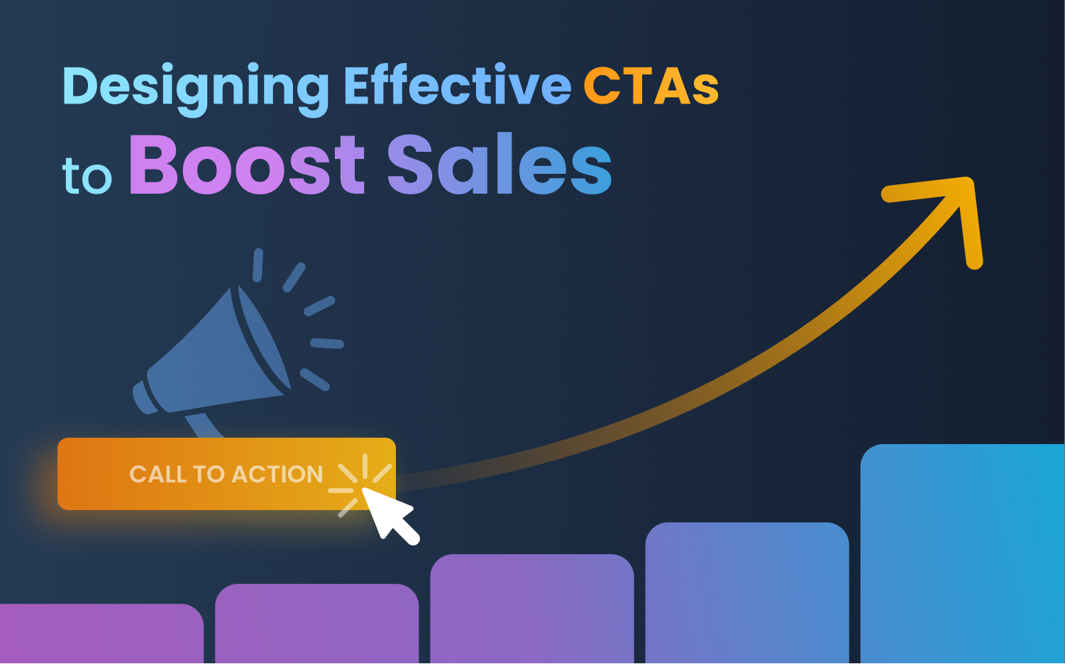
Got a good, user-friendly website, but still not enough engagement on-site? Maybe it's time you opted for a strong call to action, aka CTA!
Since the internet and the world wide web have made people much more competent and informed, you’d better have it planned before implementing. A well-designed and effective CTA doesn’t necessarily confirm a sales boost, but it does pave the way. It’s one of the first steps to turning visitors into customers or active clients. It’s a determining factor between a lead and a conversion.
What is a CTA?
A CTA or call-to-action refers to the step a marketer wants their audience to take. To be effective, a CTA should be obvious and direct and immediately convey the marketing message so that the audience finds it clear.
Effects of Having A Strong CTA
With all your marketing efforts, losing potential customers elsewhere shouldn’t be on your wishlist. You can lose your potential customers in many ways; let not the presence of a weak CTA be one. Let’s see how a strong CTA affects your website and sales:
- A good CTA motivates the audience to engage better with your brand and helps them move faster along the buyers’ journey.
- It impacts your marketing assets by growing your contact information, allowing you to nurture and build relationships with a broader set of leads.
- Also, it builds a customer base by directing people to their website, creating brand awareness. Also, as a part of the sales funnel, effective CTAs have a higher conversion rate, eventually leading to sales.
- Moreover, companies use CTAs to identify the target audience, generate leads by analyzing the data collected, and continue to market to them directly. Also, a well-designed and effective CTA makes your website easier to access for people with just a click of a link provided on the CTA.
- Briefly, an impactful CTA impacts your lead generation, speeds up conversions, also aids in increased sales.
Strategies to Build A Strong CTA
Creating a well-designed and effective CTA begins with a basic understanding of your target audience. Then you can make one that resonates with them and speaks their language. It’s high time to drop excuses and focus visitors on simple and effective decisions to boost conversion by creating compelling CTAs.
The key is to measure and ensure the fine line between developing a sense of urgency and being too commanding. More strategies you could opt for are as follows:
Sell Trials
Though this tactic is usually workable for software service providers, you can always offer a free trial or a free pdf and then try to convert the potential clickers into your customers.
It will help if you guide your visitors in every stage of the purchase process to turn them into active customers. This way, you’ll be able to identify the essentials and ignore the unnecessary ones to get the audience to click the button, and the conversion rate will increase.
Also, you should help them through the action by removing all junk on the way. The placement of the button on clean skin will do the magic.
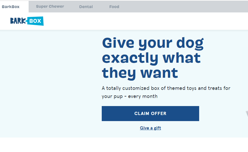
Check this example from headspace. The unique CTA offers a free recording before deciding to start. Moreover, another button will offer a 5 minutes listening option for meditation on the home page.
Write Benefit-Oriented CTA
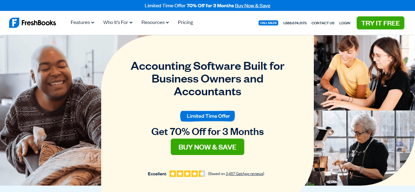
Prompting customers to take the desired action is the primary responsibility of any CTA. It should offer something special to the customers clicking on it, so your CTR (click-through rate) doesn’t get hampered. Your CTA must offer the audience some benefit, or the CTR will drastically decrease. Offering values by creating copies around the benefit will get the users on board. It would be best to consider everything from the placement of the button to the color choices you make so it remains effective.

You’ll certainly get more clicks if you use a CTA that offers immediate solutions to users’ problems. Like the example above, they have offered only two options to the solution. You’ll have to take either action to get to the next step to ensure you get what’s offered.
Showcase Gratification
When persuading people online to act as intended, the click-through rate will fluctuate depending on the page loading speed and any slight latency. People usually have trust issues in virtual spaces and do not click everything in sight. Hence, you should convey instant gratification, especially if you have a slower-loading page to work on.
People might value things they wait for in real-life situations, but in a virtual world, the slightest delay in response can make your users unhappy about the service or product. Showing instant gratification means anything from availing of a free trial to the cost-free download of an ebook. You can use any that merges with your business.
But remember that satisfying your customers is what you work for and a CTA showcasing gratification gets you a better outcome. These well-designed and effective CTAs appeal to visitors’ emotions and persuade them to opt into a bigger campaign.
Evoke Curiosity
The most potent tool in clients and business development is curiosity. It would be best to find out what and how much you need to tell them. Telling your targeted audience everything might get them bored instead of curious. Also, contrarian and unusual perspectives can surprise them and entice them to be your customers. You might also consider asking provocative questions. When asked how they will do something, ask them why they want to do it.
If you can craft a CTA to create desire in the prospects to know the other end, they’ll click more and become potential leads for conversion. Increased customer curiosity for your products can boost your sales. And that can easily be achieved through emotional triggers like trust, delight, surprise, fun, satisfaction, aesthetics etc.
Offer Solutions to Aggravated Problems
Identifying your users’ problems can enable you to offer the best solutions. It’s a way to attract traffic to your site for free. Moreover, if you know what a person wants, you’ll be able to create a CTA that acknowledges your customers’ problems and get you better clicks.
If your target audience doesn’t know the implications of the issues, you have to inform them about the solution you have in hand. For that, you’ll need to agitate the problem to the users and make them anxious before providing them with the solution.
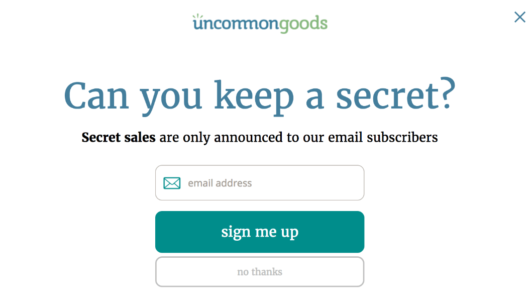
Check the example below. Wootric uses three CTAs on one page and keeps them relevant to their purpose. Check how they used different action phrases on the buttons, emphasizing their brand value with the action color chosen.

You know, offering a solution can make or break the CTA you will use. Simply identifying the problem isn’t all; you must also make the solution available. With an enticing CTA, you can get the leads to be converted into customers.
Take Advantage of FOMO (Fear of Missing Out)
Fear of missing out, aka FOMO, is another tactic you’d like to apply before creating a CTA. It’s an efficient motivator as people do not want to miss out on opportunities that might not come around. This thought provokes them to click on the button more. Like curiosity and enthusiasm, creating the fear of missing out can also get you additional clicks.
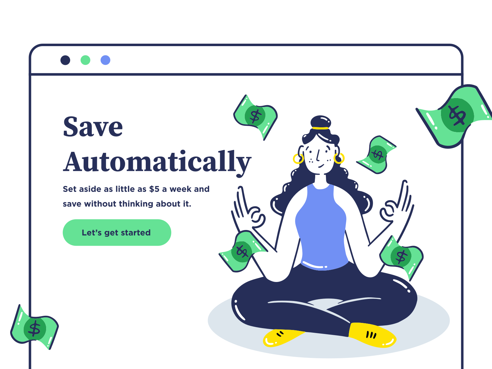
See the image above? A strong call to action with a limited offer can easily entice visitors and trigger their fear of missing out on a great opportunity. This is what happened with the call to action above. This CTA calls out to the visitors’ intent and casually gets clicked more as it offers a benefit after creating a strong FOMO.
Use Cliffhangers
Cliffhangers grab your enthusiasm and make you get to the next page. This is why you can consider doing this with your CTAs. This will motivate your audience to click and find out what’s next. Since a well-designed and effective CTA is a crucial element of every landing page, you can apply it thoughtfully and get higher clicks.
So, do you get what I mean? the CTA page above comes with enticing text to catch users’ attention. The CTA texts provoke the users to take action to end their curiosity. These CTAs are strong enough to engage visitors with your brand.
Offer Bonus
It’s another effective way to entice and attract your customers. Since the risk is on them, offering a bonus is a reward that can tempt people to click on the CTA, thus increasing sales. There are many ways to add an offer to your CTA. Most service providers add these offers to their CTAs; the button texts are essential to convey the message and get paid. These buy-one-get-one offers help in generating more leads.
Bonus always feels more rewarding, so offering a bonus or discount can easily intrigue your visitors to click on the CTA and be actively engaged on the page. Above is an example of how a bonus offering CTA might look!
Plan Wise, Avoid Pitfalls
Many providers do not know how to use CTAs effectively, which ruins their chances of growing and boosting their sales. The conversion rate hinders because of it, and you might not get the desired outcome if you’re doing so. Everything you need to keep in mind before using the well-designed and effective CTA on your website is as follows:
- Do not overwhelm the users: Using multiple CTAs is an excellent strategy to grow your business and generate leads. But if you burden the users with too many CTAs, they might fall into the decision fatigue trap, overloaded with too many possibilities.
- Don’t make your visitors work too hard: Asking for too much information can also inhibit the performance of your conversion assets. Asking for too much information can make the user second-guess conversion while asking for less positively affects the website.
- The invisibility of the CTA: Make sure your CTA is easy to find. Sometimes they can be buried under all the texts and images or lack contrasting colors to stand out from other page elements. And CTAs do not convert if the users have issues finding them.
- Lack of Mobile Optimization: If your CTAs are not mobile-friendly, you’ll lose your potential leads. As mobile browsing grows more than earlier, no one drains their energy in pinching and zooming to get to those CTAs. hence, maintain visibility!
- Wrong or Insufficient Word Choice: Using the wrong choice of words might affect your purpose. If your action words do not convey the value you want to propose, or if you’re using too few words to comprehend any directive, you’d better review them to make them suit your purpose.
- Purchase Offer Before Value Proposition: If you ask the audience to make a purchase even before providing the value, you might lose the chances of converting them into customers. It’s always better to initiate a conversation to increase the conversion rate.
- Don’t Leave Out Benefits: If you leave out benefits, you’ll struggle to motivate people. You should be specific and speak to pain points to efficiently offer benefits to entice your target group.
- Not Using Action Colors: Context is the key when choosing an action color. A color for your CTA button can make it stand out from the page and be a distinct action point. This will help the users with easy navigation.
If you’re done reading this post, hopefully, you know now how to design a compelling, well-designed and effective CTA to entice your users and convert them into active customers. Not only does a CTA aid in easy outreach, but also adds to the sales rate by taking your customers down through your sales funnel. If you are a website owner, rethink your plan and design strategy, add effective CTAs, and you’ll be good to go!