Small businesses are mostly dependent on ROI. Without an interesting website, you cannot build your brand.
When you search for something on Google, their whole thing is to give you the most relevant and trustworthy results. If you want your site to show up higher, you need to use the right keywords and phrases that match what people are looking for.
If you are thinking of setting up a website or renovating your existing one, you may want to have the features we’re about to discuss.
1. Unique Typography
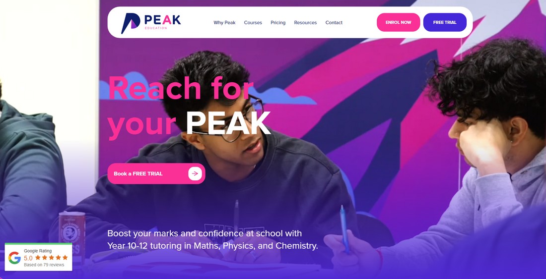
Typography is the first thing visitors will notice on your website. The font, sizing, spacing and styling choices are known as typography. It has a massive effect on how you receive and process information.
The typeface and fonts are basically your brand. And the wrong ones ruin your brand. Here’s how you can be strategic:
- Use Non-Distracting Fonts: Use clean and not-so-flashy fonts like Arial, Futura, or Helvetica. Don’t even think about Comic Sans or Papyrus as they are hated for being gaudy and outdated.
- Set Minimum Font Size: For headlines, the typical size should be over 24px. For body text, anything below 16px becomes hard to read.
- Don’t Forget Line Length: The vertical space between lines should be proportional to the font size. The ideal proportion to make it easier on the eyes would be 1.2 to 1.6 times the font size.
- Styling Tips: Pair fonts that look good against each other, like a serif and a sans-serif. Choose 2-3 fonts for your design. Typically, one for headlines, one for body text, and a possible third for accents.
Massive walls of text are boring to read. Use headings and bullet points to make your content more engaging and easier to skim, especially for topics like WordPress hosting.
When you’re uploading content on your website, make sure to maintain a proper text hierarchy. It makes Google scanning easier and the content more readable.
- H1: Title
- H2: Main Points
- H3-H6: Subheaders
2. Accessibility
Modern web and UI design is impossible to imagine without accessibility. The general rule of thumb is to keep the color and contrast cute. However, if you want to go the extra mile, you can add different things, as listed below.
Header
An ideal header should be interesting because it contains significant details about your brand— the logo, search bar, and often a sticky navigation feature.
Your website needs to have a consistent layout. You can start with your logo design. When setting the size of the logo, make sure it stays between 24px and 36px. Provide a “skip to content” link that lets viewers bypass the headband and jump right in.
Keyboard focus is a large part of designing headers. Keep all the interactive tools (dropdowns or search inputs) here at the top.
Hamburger Menu
Hamburger menus are the shorthand for navigation. You should provide a clear visual indication when the menu is opened. This could be changing the button’s color or animating the icon to show the menu is active.
When the hamburger menu is open, make sure the focus stays inside the menu so people don’t accidentally scroll through stuff they can’t even see. And hey, make the buttons big enough—like at least 44x44px—so it’s easy to tap, even if you’re using your phone.
Sidebar
Sidebars play a secondary role in your web design. Since they are the side characters of your brand, be mindful of where you place them. Don’t let these take the attention away from the main content.
A collapsible sidebar is the most liked one to this date because of its ability to make everything look put together. Just like the hamburger menu, a sidebar should be in the spotlight until it’s closed. This prevents confusion for keyboard-only users.
Footer
It’s the bottom of the page, so keep it clean and simple with all the important links, like privacy policies, contact info, and site maps.
3. Mobile Friendliness
Globally speaking, a large amount of website traffic is from smartphones. Especially if you have a large social media presence, a lot of your visitors are directly coming from there. It turns out that it is impossible to cross off mobile friendliness.
When you are adding accessibility features like headers or footers touch control is a crucial issue. Use high-contrast text and layer enough padding around clickable items to prevent mis-clicks. Make sure the headbar works smoothly on all devices. On mobile, you might wanna shrink those big menus into a hamburger or cut down on how many links you show.
4. Vivid Descriptions
Make every word roar on your website, as it greatly impacts SEO ranking. In today’s fast-paced internet world, you have only a few seconds to hook visitors when they first land on your site. Most people will skim through content before diving deeper.
Your website should serve as a visual treat. Tell a story using harmonized color palettes and fitting images. Images are more memorable than a block of text and also emotionally appealing.
5. Page Loading
Data shows that 25% of your visitors will leave your page if it doesn’t load within four seconds. If you have a graphics-heavy page and it takes forever to load, try adding a loading animation. This animation helps create a false sense that something is actually happening.
6. CTAs
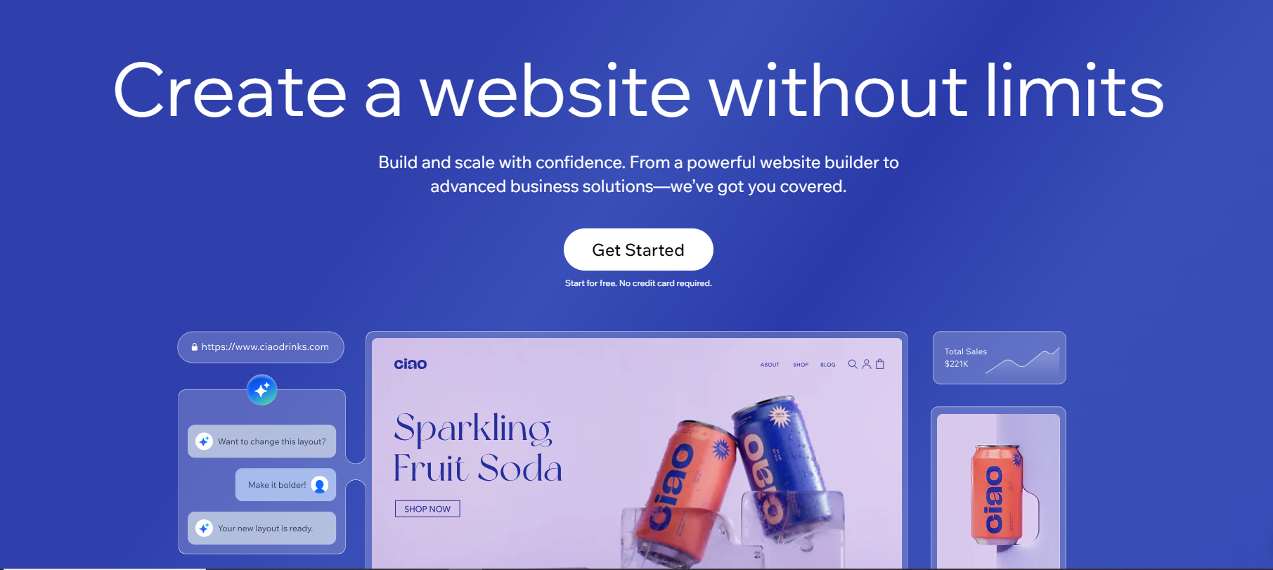
Clear calls to action are necessary for a website. This is where you tell your guests what to do. You are basically trying to get what you want by saying things like “Sign up now!” “Rate us”, or “Subscribe to our newsletter today!”
Be clever when you’re using CTAs. Too many CTAs on one page brings in a plethora of problems— users will get frustrated and your site might come across as desperate.
7. Blogs
Since we’re talking about must-haves, how can we forget about blogs? The only rule you need to follow about blogs is that it has to be relevant to what you’re promoting and it’s kind of a no-brainer.
Your blog should mix it up with how-tos, SEO tips, industry trends, case studies, success stories, and some behind-the-scenes looks at your company. Having a solid content marketing strategy is crucial—it keeps things fresh.
8. Fixed Navigation Bar
Sticky navigation bars stay fixed at the top so you can access menu items without the hassle of scrolling back up. The familiar layout makes browsing the website feel seamless. They are great for increasing brand visibility.
9. Whitespace
A website’s blank spaces are called whitespace or negative space. Whitespaces are an integral part of a website because they point to where your guests’ eyes should go.
Just because “white” is in the name doesn’t mean the background always has to be white. You can choose any background or color blocks. It’s a great tool when used correctly.
10. FAQ Section
And finally comes the FAQ section. These FAQs should:
- have long-tail keywords
- address questions that you frequently receive from customers
- give direct answers
- avoid jargons
Just keep the answers short and direct. Don’t get into too many technical terms as it overcomplicates the situation. Well-structured FAQs can lead to rich snippets, so bear that in mind.
The Takeaway
So, the bottom line is that you need a solid value proposition. It’s what makes you stand out from the competition, especially when the market is clustered with similar products.
Basically, it’s like your brand’s promise to customers, and you have got to show it off on your website—either on the homepage or the About Us page. If you nail this, your audience will find you!
