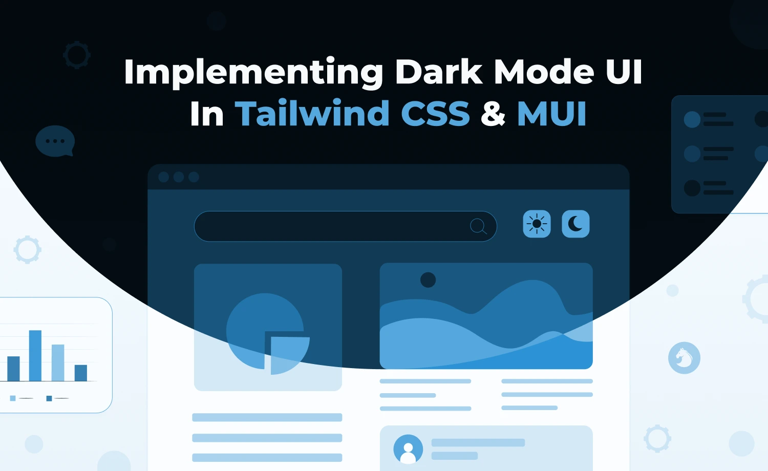
TL;DR:
Tailwind CSS and MUI offer different approaches to implementing dark mode. Tailwind CSS uses the Media & Class approach, prioritizing the device setup or enabling user control. MUI handles most styling automatically, allowing users to define light and dark color palettes and switch between them using the ThemeProvider. Both frameworks offer advanced theme management and seamless theme switching without issues.
Table of contents
Implementing dark mode depends on your design requirements, framework compatibility, and stability considerations. Some may require more code, while others may do it smoothly. For example: Tailwind CSS and MUI.
Dark mode design in Tailwind CSS offers an effortless experience with its intuitive dark: prefix. It lets you design stunning dark interfaces with a few utility classes.
MUI offers a completely different yet equally powerful approach. It simplifies the process with built-in theming that enables seamless switching between modes, dynamic color palettes, and automatic component adaptation.
Moreover, each framework delivers its own compelling path to creating a beautiful, user-friendly dark mode experience that will elevate your application’s visual appeal.
In this blog, we’ll explore how to design dark mode UI in Tailwind CSS (v4) and MUI (v6+) with real-world examples.
 Find the web design trends in 2025 — get your design inspiration for your next project now!
How Dark Mode in Tailwind CSS v4 Works?
Tailwind offers built-in support for switching between light and dark modes without external dependencies. It offers a simplified dark mode style using the dark: prefix. By integrating the dark variant into its utility-first architecture, Tailwind ensures a consistent design system with full control over appearance.
The`Media` and `Class` Strategies in Tailwind CSS
Tailwind CSS employs two primary strategies for implementing dark mode: the Media approach and the Class selector approach.
Media
This method uses the user’s operating system preferences by leveraging the prefers-color-scheme CSS media feature. It automatically applies dark mode styles if the user has enabled it on their device. Hence, use the media strategy if you want to rely on your device theme as your preferred theme. However, if you use this strategy, you can’t toggle dark mode manually within your application.
Class
If you want to enable your users to switch from light to dark and vice versa, you can override the dark variant using a custom selector.
:: The tailwind.config.js file has been removed in Tailwind CSS v4, and the darkMode: “class” setting is deprecated. So, add dark mode directly in your global CSS file.
Add the following to your CSS file to override the dark variant:
@custom-variant dark (&:where(.dark, .dark *));
This will detect the .dark classes in the HTML components or parent containers and apply the dark mode styles accordingly.
<div className= bg-white dark:bg-zinc-800 h-screen w-full  dark}>
      <div className='bg-zinc-100 p-2 rounded-xl'>

        <button className='bg-transparent dark:bg-green-700 text-black dark:text-white'>
          <CiLight />
        </button>

      </div>
</div>
This snippet adds a sunlight button with a transparent background and integrates it into the white browser interface. We set the styling for dark mode using the dark: variant. So, when the dark mode is enabled, the button will have a green background with white text.
Besides, for better user control, you need to render the dark classes conditionally using useState hook form React.
import { useState } from 'react';

const App = () => {
  const [theme, setTheme] = useState("");

  Return (
     //dark mode setup;
)
}
Export default App
It will control the app’s state for users to switch between light and dark modes and save their choice to localStorage. Here, theme is a state variable that holds the current state (light or dark) and setTheme is a state management function used to update the state.
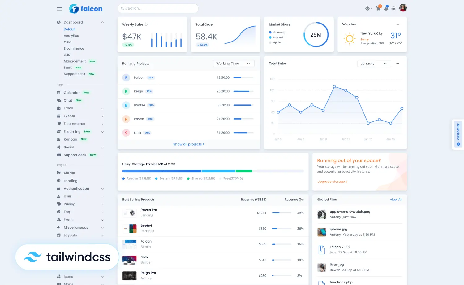
How to Design Dark Mode in Tailwind CSS?
In this section, we’ll learn how to implement Tailwind CSS dark mode in React with a step-by-step guide, helping you enhance the user experience with a dark theme. Let’s start!
Step 1: Creating a React Project
To create a React project, you need to ensure that Node.js is properly installed and have a basic understanding of React applications. Open your terminal (VS Code, Command Prompt, or PowerShell) and run:
npm create vite@latestto install React using Vite plugin- Then
cd [your project name]to navigate to the project library npm installto install dependencies- And
npm run devto run local server
If your result also looks the same, you’ve successfully created a React project.
Step 2: Organizing Your Project
To enable Tailwind CSS in the React project, organize it a little bit.
- Delete the App.css file as there is no need of it
- Delete codes from the CSS file
- Delete codes from the App.jsx file
Then, type rafce (React Arrow Function Component with export) in App.jsx file. It quickly generates the basic structure for the functional components.
import React from 'react'

export const App = () => {
  return (
    <div>App</div>
  )
}
We’ll write all the code for our layout, components, and styling within the div element.
:: If the shortcut doesn’t work, then install the “ES7+ React/Redux/React-Native snippets” extension in your VS Code and try again.
Step 3: Installing Tailwind CSS in React
Tailwind CSS offers a streamlined installation process with minimal configuration and reduced dependencies, facilitating seamless integration with other frameworks as a Vite plugin.
- Install the framework by running
npm install tailwindcss @tailwindcss/vite - Add the
@tailwindcss/viteplugin to your vite.config.js file.import tailwindcss from '@tailwindcss/vite'
export default defineConfig({
plugins: [react(), tailwindcss()],
}) - Add
@import "tailwindcss";into the CSS file
Next, run your build process or the local server to check if the installation was successful.
Step 4: Enabling Dark Mode in Tailwind CSS
If your project is running perfectly, it is ready to enable dark mode.
To start with dark mode, update your CSS file:
/*index.css*/

@import "tailwindcss";
@custom-variant dark (&:where(.dark, .dark *));
Run npm i react-icons in your terminal to install React Icons.
Then, we’ll create a toggle function inside the App function to enable user preference with a toggle switch.
See the code
/*App.jsx*/

const App = () => {
const [theme, setTheme] = useState("");
  console.log(theme)

  const toggleTheme = () => {
    setTheme(theme === "dark" ? "" : "dark");
  };
}
Here, we set the logical conditions for theme switching in the toggleTheme function. If the theme value is “dark”, it sets it to an empty string ( “ ” ), which represents light mode. Else (which says the theme value is “light”), it sets it to the dark mode.
See the code
return (
    <div>
      <button onClick={toggleTheme}

      className='bg-zinc-200 dark:bg-zinc-700 p-3 hover:bg-zinc-100 dark:hover:bg-zinc-500 rounded-lg text-black dark:text-white'>

      {theme === "dark" ? <MdSunny /> : <FaMoon />}

      </button>
    </div>
  )
Then, we rendered the function in a return statement using a button. This is our final toggle button for the website.
The className contains Tailwind CSS classes for styling buttons in both light and dark modes. For example, the background color zinc-200 (bg-zing-200) is for light mode and zinc-700 (bg-zinc-700) is for dark mode, which is a darker hue of the previous one.
It also includes a conditional rendering for intuitive icon rendering. If the theme value is ‘dark’, it displays the sun icon; otherwise, it displays the moon icon.
The next step is to add a component for a good website layout and verify that the dark mode is functioning correctly.
See Code
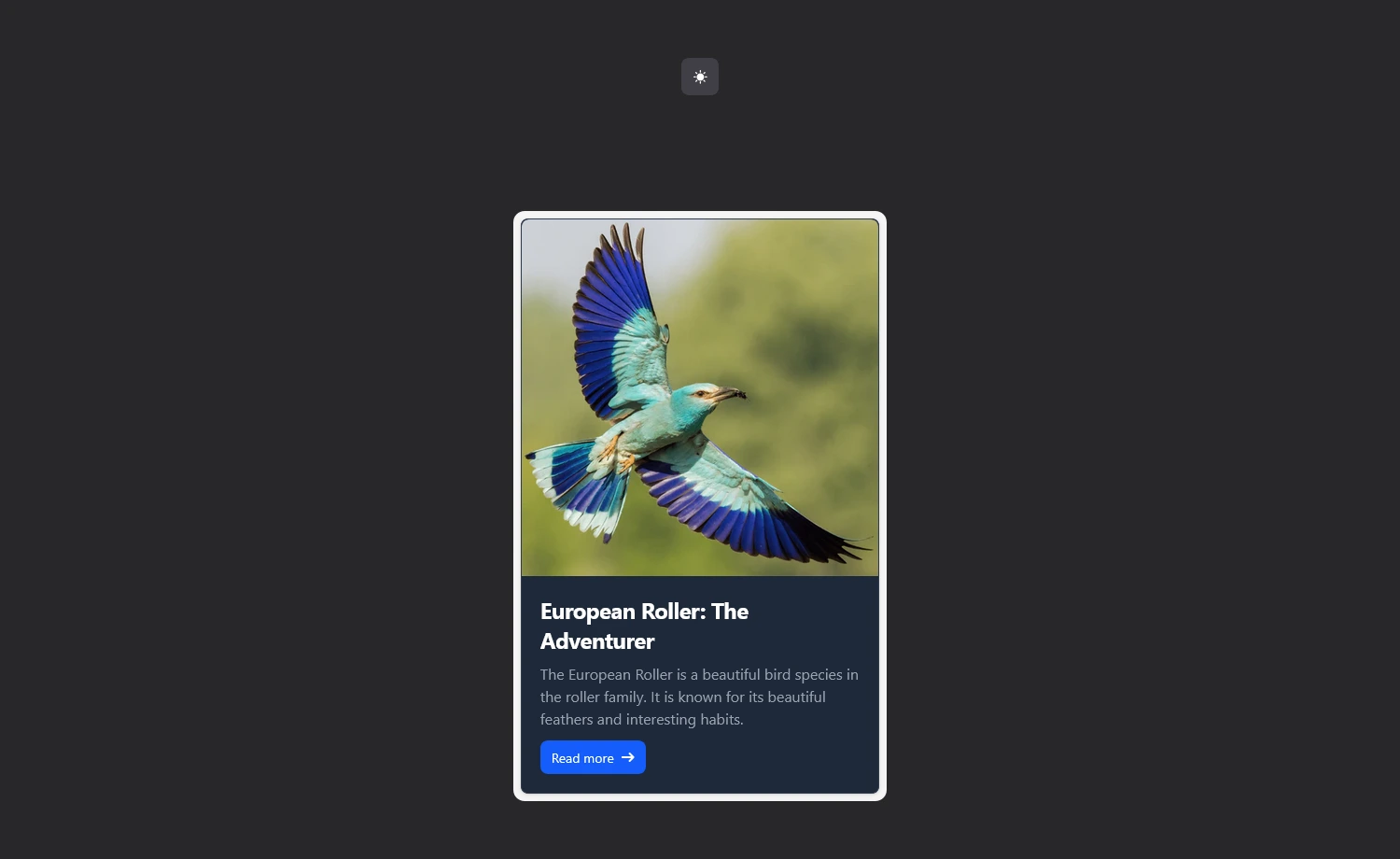
<div className='bg-zinc-100 p-2 rounded-xl'>
  <div className="max-w-sm bg-white border border-gray-200 rounded-lg shadow-sm dark:bg-gray-800 dark:border-gray-700">
   <a href="#">
     <img className="rounded-t-lg" src="https://cdn.shopify.com/s/files/1/0782/9346/7416/files/European_roller_480x480.png?v=1702633105" alt="" /></a>
   <div className="p-5">
     <a href="#">
     <h5 className="mb-2 text-2xl font-bold tracking-tight text-gray-900 dark:text-white">European Roller: The Adventurer</h5></a>

<p className="mb-3 font-normal text-gray-700 dark:text-gray-400">The European Roller is a beautiful bird species in the roller family. It is known for its beautiful feathers and interesting habits.</p>

<a href="#" className="inline-flex items-center px-3 py-2 text-sm font-medium text-center text-white bg-blue-700 rounded-lg hover:bg-blue-800 focus:ring-4 focus:outline-none focus:ring-blue-300 dark:bg-blue-600 dark:hover:bg-blue-700 dark:focus:ring-blue-800">
           Read more
<svg className="rtl:rotate-180 w-3.5 h-3.5 ms-2" aria-hidden="true" xmlns="http://www.w3.org/2000/svg" fill="none" viewBox="0 0 14 10">
 <path stroke="currentColor" strokeLinecap="round" strokeLinejoin="round" strokeWidth="2" d="M1 5h12m0 0L9 1m4 4L9 9"
</svg>
</a>
</div>
</div>
</div>
In this section, we used a card component with an image, text, and a button. We’ve added Tailwind utility classes for dark mode using the dark: variant, and it works perfectly.
How Dark Mode in Material UI(MUI) Works?
Material UI(MUI) offers a robust dark mode implementation and handles most styling automatically. It allows you to define light and dark color palettes and switch between them using the ThemeProvider. It also lets you create custom themes with its built-in theming support.
MUI Dark Mode Setup
By default, MUI uses light mode. For setting dark mode, MUI includes two approaches:
- Traditional theme switching using
createThemewith palette mode
- CSS theme variables with
useColorScheme()hook ( modern and recommended)
Traditional Theme Switching in MUI using CreateTheme()
In traditional theme switching, it allows you to use the dark theme as the default by adding ‘mode: dark’ to ThemeProvider function.
import { ThemeProvider, createTheme } from '@mui/material/styles';

const theme = createTheme({

  palette: {
    mode: 'dark',
  },

});

function App() {
  return <ThemeProvider theme={theme}>...</ThemeProvider>;
}
In this snippet, mode: in createTheme() enables the current mode for the app and modifies several palette values. If ‘mode: light’, the app will be in light mode and, if ‘mode: dark’, the app will be in dark mode. Then, we render the theme to the browser by wrapping it with ThemeProvider.
CSS Variable-based Theming in Material UI (MUI)
CSS variable-based theming in MUI includes advanced and flexible theme management (light/dark). It makes the theme switching and toggle implementation smooth without re-rendering, flickering, or hydration issues. It also allows you to create custom themes applying different styling.
CSS theme variables with useColorScheme() hook:
Using colorSchemes provides automatic switching between light and dark color schemes based on the user’s preference. It also allows for disabling the transition issue when color changes.
import { createTheme } from '@mui/material/styles';

 const theme = createTheme({

  colorSchemes: {
    dark: true,			//enable dark mode
  },

});
This ensures the built-in support of MUI light and dark mode. We only need to set the value for dark mode, as MUI’s default mode is light. It removes the manual switching of themes in the old approach.
The colorSchemes object also handles multiple color modes for theme. When you set dark: true inside the object, it automatically generates a complete dark color palette, so you don’t need to create the modes manually with mode: variant, like a traditional approach.
Additionally, it enables automatic system preference detection and settings for media query support (prefers-color-scheme: dark). So, in the background, it generates CSS variables like:
--mui-palette-primary-main: #1976d2;

--mui-palette-background-default: #fff;
Here, --mui is the built-in label for the generated CSS variables.
However, you can customize it to your project or brand name using the cssVarPrefix string inside the cssVariables object while creating the theme.
const theme = createTheme({

  cssVariables: {
    colorSchemeSelector: "data-test-scheme-selector",
    cssVarPrefix: "test",
  },

});
It will generate custom CSS properties for targeting different color schemes in the DOM with the ‘-test‘ label, replacing the default ‘-mui‘ prefix.
Now, we’ll walk through designing Material UI dark mode in your React project.
How to Add Dark Mode in Material UI (MUI)?
In this section, we’ll cover the modern approach of dark mode implementation using CSS variables with colorSchemes() hook.
Step 1: Implementing MUI in Your React Project
First, create a new React project and install the MUI library to get access to all the components, icons, and styling provided by the framework.
We already know how to create a React project, so now we’ll start with the MUI implementation in React. To do that, run:
npm install @mui/material @emotion/react @emotion/styled
It’ll install all the MUI packages in your project.
Step 2: Setting up Dark Mode with CSS Variables in MUI
After installing MUI, we’ll create a theme using the new CSS variable-based system.
const theme = createTheme({

  cssVariables: {
     colorSchemeSelector: "data-test-scheme-selector",
     cssVarPrefix: "test",
  },

  colorSchemes: {

    light: {
      palette: {
        primary: {
          main: "#90caf9",
        },
        secondary: {
          main: "#131052",
        },
      },
    },

    dark: {
      palette: {
        primary: {
          main: "#90caf9",
        },
        secondary: {
          main: "#131052",
       },
      },
    },
  },
});
The code builds a complete dual-mode theme system with custom CSS variable naming (test) and consistent light and dark color palettes. It automatically switches modes based on user preference or manual toggling.
The colorSchemes object specifically defines the modes with similar colors. It’s beneficial to use the same blue as the primary color and dark navy as the secondary color in both theme modes to maintain brand consistency.
Let’s create a function with a toggle switch. MUI enables the toggle function using mode (holds the current state) and a state management function, setMode.
See the code
const { mode, setMode } = useColorScheme();
  const toggleDarkTheme = () => {
    setMode(mode === "light" ? "dark" : "light");
};
return (
    <div
	<Switch checked={mode === "dark"} onChange={toggleDarkTheme} />
    </div>
)
In this code snippet, we’ve defined a simple conditional switching function in the setMode. If the mode is currently light, it’ll switch to dark, else (mode is dark) switch to light. Then we called the toggle function,toggleDarkTheme inside a button or MUI switch component, to use it actively.
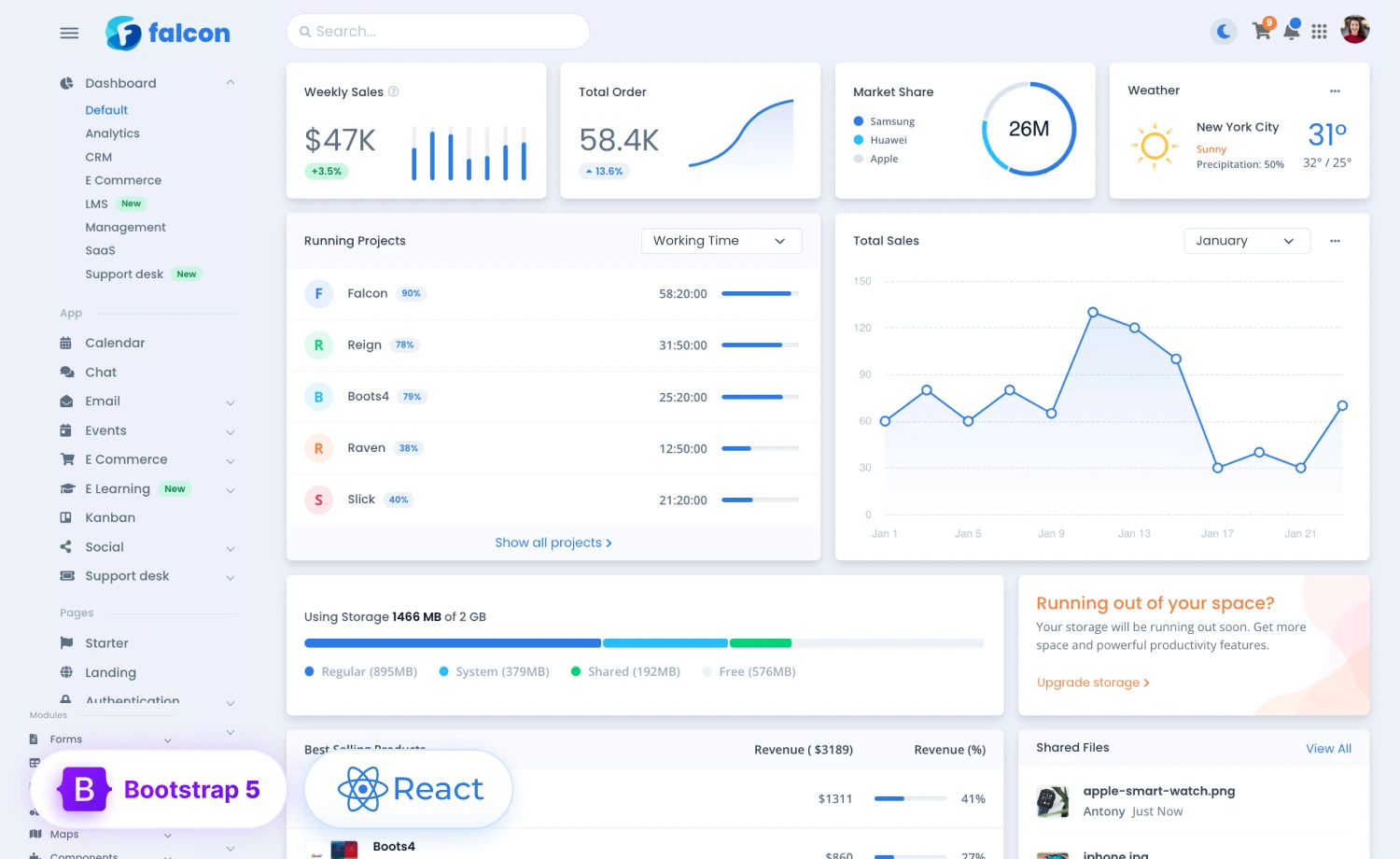
Step 3: Adding a Component
The next step is to add a component or other web elements and check the application’s progress.
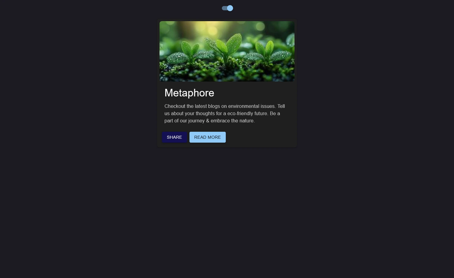
See the code
<div
style={{ display: "flex", flexDirection: "column", alignItems: "center" }}>

<Switch checked={mode === "dark"} onChange={toggleDarkTheme} />

<Card sx={{width: "30%", borderRadius: 2, padding: 1, margin: 2}}>
 <CardMedia
   sx={{ height: 200, borderRadius: 2 }}
   image="https://static.vecteezy.com/system/resources/thumbnails/049/855/272/small/nature-background-high-resolution-wallpaper-for-a-serene-and-stunning-view-photo.jpg"
   title="green leaf"/>

<CardContent>
  <Typography gutterBottom variant="h4" component="div">
     Metaphore
  </Typography>
  <Typography variant="body1" sx={{ color: 'text.secondary' }}>
    Checkout the latest blogs on environmental issues.Tell us about your thoughts for a eco-friendly future.Be a part of our journey & embrace the nature.
  </Typography>
</CardContent>
<CardActions >
<Button variant="contained" size="medium" color="secondary">Share</Button>
<Button variant="contained" size="medium">Read More</Button>
</CardActions>
</Card>
</div>
This is a MUI card component with built-in theming support. You simply call the toggle function in a switch, and it automatically renders the color schemes for dark mode across the entire website.
Let’s take a quick look at how Tailwind CSS and MUI work with dark mode:
| Comparison Area | Tailwind CSS (v4+) | MUI (v6+) |
| Setup Method | dark: prefix | Uses colorScheme() hook |
| Setup Complexity | Minimal | Moderate |
| Dark Mode Strategy | Class-based (Class) or Media-based (media) | Theme-based, using createTheme and ThemeProvider |
| CSS Variables | Projects requiring a complete design system with automatic dark mode switching | Theme token autometically generates CSS variables |
| Toggle Implementation | Manual JS to add/remove dark mode | Built-in useColorSchemes() with toggle functionality |
| Ideal For | Projects requiring minimal setup & maximum styling control | Projects requiring complete design system with automatic dark mode switching |
Contrary to popular belief, a well-designed dark theme is easy to use. Proper contrast and typefaces are essential for maximizing the benefits of a dark theme. Moreover, designers are increasingly employing tools and accessibility criteria to ensure WCAG-compliant color contrast, which enhances web experiences for all users seamlessly.
Happy developing with dark mode UI!
FAQs About Dark Mode UI
• What is colorSchemeSelector in MUI, and why is it useful for dark mode?
The ColorSchemeSelector is a property inside a configuration object, passed to determine how the color scheme (light or dark) is applied in MUI’s theming system using CSS variables.
• Can I use Tailwind CSS and MUI together in a single project?
Yes, you can use Tailwind CSS and MUI together for better accessibility and consistency with prebuilt components. However, be cautious of styling conflicts and the increased bundle size.
• Is it possible to apply dark mode only to a specific section of a page?
Yes, it is possible to apply dark mode only to a specific section of a page by applying styles to specify components or classes, both in Tailwind CSS and MUI.


