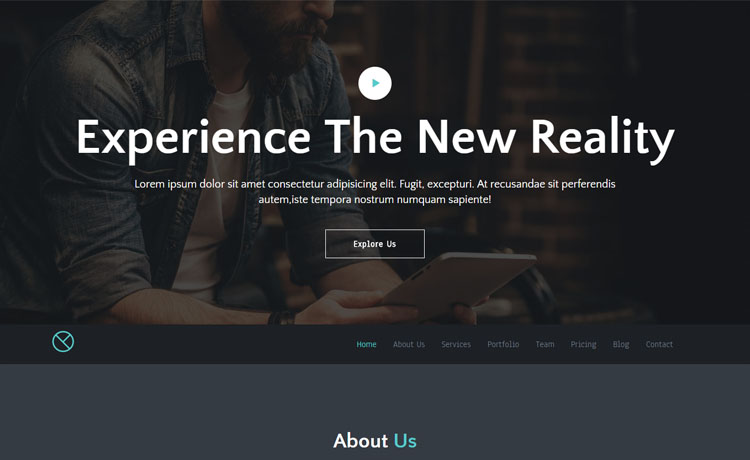
Meghna is a Free Responsive HTML5 Business Template. It is designed with HTML5, CSS3, Bootstrap. This is a free responsive Bootstrap template suitable for any business, agency or office website.
This template is free for personal and commercial use. Please don’t remove the Themewagon credit link until you donate.
Recommended Reading:
Travelers – A Free Bootstrap One Page Agency Website Template
Free Responsive HTML5 Business Template Meghna
Meghna is one of the best free responsive HTML5 template. Meghna is a Responsive minimalist, simple, elegant and clean style, a strong focus on contents and readability. It is carefully built using the mobile first design concept. So, Meghna is fully Mobile-Friendly.
Why Meghna- A Free Responsive Business Site Solution?
It represents a modern business solution. Meghna is suitable for websites such as business, company, portfolio. It is superbly responsive adapting to any kinds of smartphones and mobile devices. The code is easy to modify and understand so you can personalize it in the simplest way.
Key Features
- Unique Mordern Design
- Full Screen Slit Slider Header Background
- Optimized Code
- Clean And Minimal Design
- Free Responsive HTML5 Business Template
- Cross-browser Compatibility
- Animated Preloader
- Customized Scrollbar with Smooth Scroll experience
- Smooth CSS3 animation
- Sticky Top Navigation and One Page Navigation
- SEO Optimized
- 100% Fully Customizable
- Sticky Header
- Google Fonts
- Built with HTML5 & CSS3
- Strong focus on Usability and UX
- Owl Carousal Count Up
- Responsive layout
- Back to Top button
- Sortable and expandable Portfolio gallery with MixItUp
- Radial progressbar with EasyPiChart
- CSS Framework – Bootstrap 3
- Customized Twitter Feed
- FontAwesome Icon Integrated
- stylish UI
- Well commented coding
- Easy to use
- Embedded Google Map
- It’s Free!
Credit
This template is created by Themefisher. This is a free responsive html5 business template by Themefisher.
Free and Premium Responsive HTML5 Website Templates @Themewagon
There is a bunch of Free and Premium Responsive HTML5 Website Templates and Responsive Bootstrap Themes in ThemeWagon.
You can browse All Premium Templates by Themewagon here and All Free Responsive Templates by Themewagon
here.
Got something to discuss?
While installing theme on my website this is showing, “The package could not be installed. The theme is missing the style.css stylesheet. Theme installation failed.”
I am afraid, if you are trying to install it in WordPress then it will not work. It is an HTML theme only.
While installing theme on my website this is showing, “The package could not be installed. The theme is missing the style.css stylesheet. Theme installation failed.”
I am afraid, if you are trying to install it in WordPress then it will not work. It is an HTML theme only.
Hi, however have the file senmail.php..???
Anyone got any code to make the navigation dropdown menu auto retract on mobile devices once the user has clicked an option??
I contacted ThemeFisher about it and ended up buying the template to get support and updates but have yet to receive any sort of update from them.
I’m sure it’s pretty simple just need whatever code it is and my website is finished
Thanks
$(document).on(‘click’,’.navbar-collapse.in’,function(e) {
if( $(e.target).is(‘a:not(“.dropdown-toggle”)’) ) {
$(this).collapse(‘hide’);
}
});
________________________________________________________
put that on top of jquery.nav.js
Just wondering if anyone has got the navigation to retract on mobile devices?
so whenever the user taps on the menu drop down, taps contact and the navigation disappears again?
Thanks
Just wondering if anyone has got the navigation to retract on mobile devices?
so whenever the user taps on the menu drop down, taps contact and the navigation disappears again?
Thanks
Thanks for downloading the template. Since it’s made by ThemeFisher, you have to contact with them. Or, you can consult with a web developer.
great …
Hi just wondering how I can make the slit slider auto scroll through images???
Go to jquery.slitslider.js and change the autoplay: false;
// slideshow on / off
autoplay : true,
Hi just wondering how I can make the slit slider auto scroll through images???
Hello,
This template is not scrolling on android phone. Can anyone resolve this issue????
Go at the top of animate.css and change the overflow: hidden; to overflow: visible;
______________________________________
html, body {
overflow: visible;
}
Hey, FYI, here’s the original website of this template: https://themefisher.com/. Would you please contact with their support?
Hello,
This template is not scrolling on android phone. Can anyone resolve this issue????
Go at the top of animate.css and change the overflow: hidden; to overflow: visible;
______________________________________
html, body {
overflow: visible;
}
Hi, thanks so much for the template! The only problem I have are the “visit website” buttons in the portfolio grid. I cannot find them in the code so I cannot remove them. Where in the code are they? Awesome work though!
Thanks, I already found it and removed it from the code 🙂
I appreciate it.
Hello, we’re sorry for that we can’t help you out there. As we didn’t make the template you have to contact with the original maker. Please go to the site (https://themefisher.com/) and ask for support.
Hi, thanks so much for the template! The only problem I have are the “visit website” buttons in the portfolio grid. I cannot find them in the code so I cannot remove them. Where in the code are they? Awesome work though!
Thanks, I already found it and removed it from the code 🙂
I appreciate it.
Problem in the old version animate.css!
Replaced with the latest version. The scroll problem is gone.
Hi, what do you mean, you installed a new version of the meghna template or of animate.css?
I still have the mobile problem, no scrolling possible, you only see the slider on top 🙁
Problem in the old version animate.css!
Replaced with the latest version. The scroll problem is gone.
Hi, what do you mean, you installed a new version of the meghna template or of animate.css?
I still have the mobile problem, no scrolling possible, you only see the slider on top 🙁
Hello I need a responsive drop down menu in one of the header
But im not able to handle can you share the code ?
Hello I need a responsive drop down menu in one of the header
But im not able to handle can you share the code ?
Thought I would comment on this regarding the scrolling issue, as I was able to fix it on my website.
Inside of ‘custom.js’ I commented out the ‘Nice Scroll – Custom Scrollbar’ section.
Yes, this means I had to remove the custom scroll bar, but it was worth it.
Then inside of ‘animate.css’ in the ‘html, body’ section, change overflow from hidden to visible.
That should hopefully do it.
There is another issue also where the parallax images are showing super zoomed in on mobile (at least on iPhones). I fixed this issue also by doing the following:
in ‘main.css’ go to the ‘parallax-section’ and remove the ‘!important’ tag from ‘background-attachment: fixed;’
Then, in ‘media-queries.css’ under ‘parallax-section’ for Tablet (portrait) and Mobile (portrait), add the following line:
background-attachment: scroll !important;
Rather than the image being fixed on mobile (and super zoomed in) it makes it scroll and scales it correctly.
Thank you for your sharing. quite successful. I changed the contents of “custom.js” as follows.
var ua = navigator.userAgent.toLowerCase();
var isAndroid = ua.indexOf(“android”) > -1;
if (!isAndroid) {
var nice = $(“html”).niceScroll({
cursorborderradius: 0,
cursorwidth: “8px”,
cursorfixedheight: 150,
cursorcolor: “#6CB670”,
zindex: 9999,
cursorborder: 0,
});
}
if you need a quick fix like if your site is already live, i’d recommend just redirecting to another page that’s just got an iframe with a hardcoded height so that the iframe does the scrolling instead of the nicescroll.js jquery plugin. That’s where the bug is. You can check out this stackoverflow post for instructions on how to redirect if an android browser is being used to view your site. http://stackoverflow.com/questions/6031412/detect-android-phone-via-javascript-jquery
Hi, How can I remove all works from the ‘Our Works’ section, if i remove ‘all’ from the html code it is still showing all pictures until we click on second tab
Thanks Nebir for your quick reply. I like the design too much… How can I use the use the portfolio section in another website template. I tried but it is not showing correctly… Thanks
If you want to use just this section in other website, you have to add the mixitup library file (jquery.mixitup.min.js) in your website. Now copy & paste all the html, css and js part using in this template for showing portfolio section.
If you are not clear or it doesn’t work, i will suggest you to submit a support ticket. Thanks
Hi, How can I remove all works from the ‘Our Works’ section, if i remove ‘all’ from the html code it is still showing all pictures until we click on second tab
Thanks Nebir for your quick reply. I like the design too much… How can I use the use the portfolio section in another website template. I tried but it is not showing correctly… Thanks
please can you tell me when the new version will be released as the mobile version does not scroll which makes it impossible to use as a website –
i would even buy a premium version to get this problem solved
please can you tell me when the new version will be released as the mobile version does not scroll which makes it impossible to use as a website –
i would even buy a premium version to get this problem solved
What causes a website to not scroll on mobile devices?
I have no overflows, I do have a youtube video in the site. The site is currently running in a local environment for testing. The site will not scroll on mobile devices whatsoever. Cant figure out why it wont scroll!. The theme in question that wont sc…
Wonderful work! The only problem is that the mobile visualization doesn’t scroll from phone (need to set Desktop view to see correctly). Is it possible to fix it?
hello mjewel are you guys able to fix this mobile scrolling issue yet? as i am willing to pay
Wonderful work! The only problem is that the mobile visualization doesn’t scroll from phone (need to set Desktop view to see correctly). Is it possible to fix it?
We will fix that in the next version.
hello mjewel are you guys able to fix this mobile scrolling issue yet? as i am willing to pay
I can forward you the receipt email if necessary
Nice Beautiful Job Respect
Nice looking template, but the scrolling is a little jittery. Anything that can be done to fix this?
Hi Carol, Thanks for your comment. We will fix this issue in the next update.
Thanks
Nice looking template, but the scrolling is a little jittery. Anything that can be done to fix this?
Hi Carol, Thanks for your comment. We will fix this issue in the next update.
Thanks
Free download
License- Open source
- Use in commercial projects
- Life time free updates
Streamline your project management, leads, client portal & invoicing in one app!
Try OneSuite For Free
Editor's Pick
View AllGet new themes or big discounts in your inbox. Never spam.
Created by
1 Customers Reviews
You must signup to leave a review.
If you already have an account , login to leave a review.
Good job
by Phil Jones 9 years ago
All good. Thanks