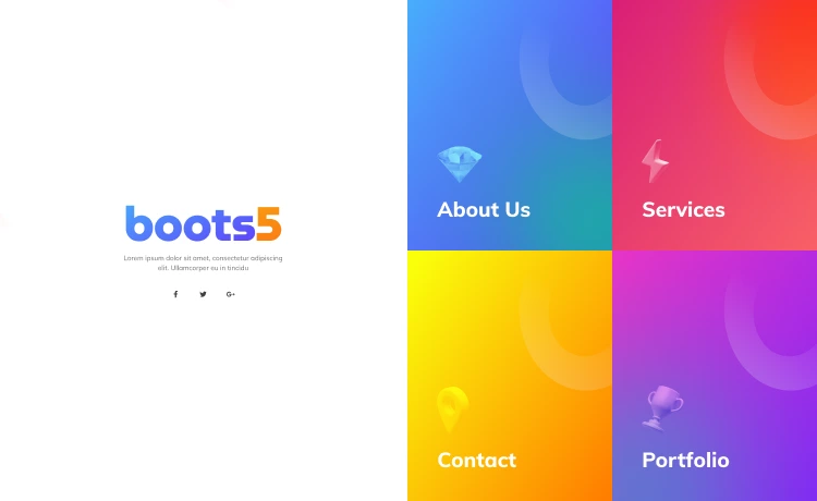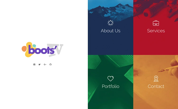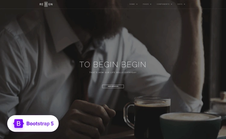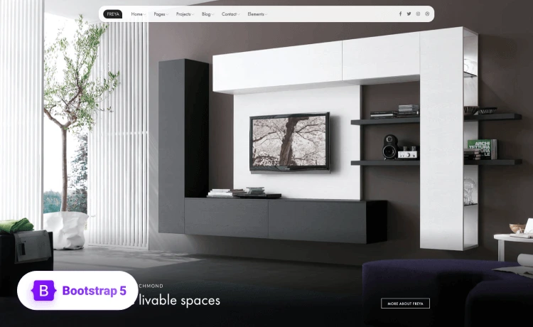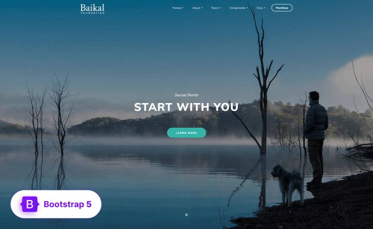
Calls to action are the gateway to converting a lead to a customer and taking them down the conversion funnel. This is why a CTA gone wrong can be a conversion gone wrong, resulting in an increased bounce rate. It’s crucial to design your CTA according to your business purpose.
Designing a good CTA can add to the conversion rate of your business. There are high chances of messing up a CTA, hindering conversions and the sales funnel.
You can plan and design a compelling CTA, but you should be very careful to remain clear to the people you target. If your users cannot make sense of the CTA, likely, they won’t click it, and your CTA will be rendered ineffective.
Why Are CTAs Important?
The CTA acts as the signpost of a webpage that lets the users know their next step. In most cases, a page without a compelling CTA becomes inefficient in turning the visitors into potential customers as uninformed users leave the site without accomplishing their tasks.
Moreover, a CTA helps remove friction in moving the users down the sales funnel.
Also, a compelling call-to-action content:
- Buyers’ Journey: A strategic CTA guides the audience along their buyers’ journey, alerting them about the next step and building trust and authority in your brand.
- Eliminates Decision Fatigue by Directing Audience: Simple directives to simplify the user journey by telling them where to go and what to do next. By doing so, a clear CTA directs the users and reduces the risks of them clicking away from the page due to overwhelming confusion and complex navigation.
- Improves Conversions: The more people you get to click your CTA, the more the possibility of them converting into customers.
Characteristics of Strong CTA
There are many ways to determine the effectiveness of the CTA you use on your site. You can check for the following characteristics in your CTA and take care of any modification needed:
- Design: A compelling CTA will instantly grab users’ attention, which calls for a well-thought design for the CTA you’re to use.
- Visibility: High visibility is a must for a good CTA. it should be the most noticeable thing on the page; it should be large enough to command attention.
- Proper Placement: Since effective CTAs have to be the most noticeable element on your page, the placement should also command attention.
- Clear Benefit: The CTA should consist of a clear benefit that the users will get after completing the task, which will get them to click on it.
- Actionable Text: A convincing CTA should have actionable words and texts designed to compel the users to take action. Moreover, it should provide guidance and reminders to the reader according to its purpose and meaning. Also, added pointers to process documentation for how to process the CTA or help notes to remind the assignees about how to best complete the CTA.
- Length: The CTA should be short in length and precise, and you should add no extra text to keep the place clean.
- Sense of Urgency: It is vital to provide a strong sense of urgency in compelling users to take action immediately as the internet distracts people in many ways.
- CTA Title: Ensure the CTA is specific to the task and the point.
- CTA Priority: If you’re using multiple CTAs on the site, ensure the priority of each is consistent with the other CTAs at that same priority.
Things to Consider Before Building A CTA
You can design CTAs in many ways. You can go to a developer or use a user-friendly drag & drop option to create a compelling CTA for your site. Whatever you do, you have to be tactful before you jump into creation. Some introductory notes that can help you with the creation of a compelling CTA are as follows:
Design
From a design perspective, the CTA should outstand all other elements to capture visitors’ attention. You must choose a different color for the CTA text or use high-contrast colors for the button to attract users. The key is to give the button higher visibility to stand out.
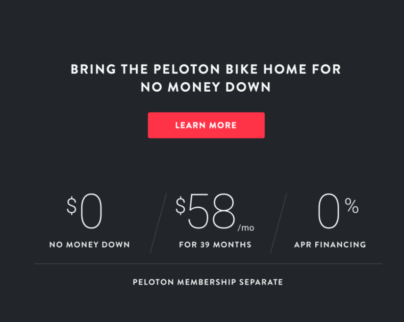
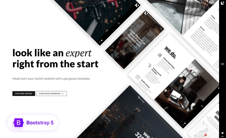
The CTA stands out for several reasons, from the color choices to the negative space showcasing the CTA. the button color stands out from the background and is eye-catchy simultaneously. So users will less likely to miss the CTA.
Personalize the Design
For a distinct audience, you should create different types of CTAs to entice them with the design. In such cases, it’s sensible to make distinctive CTAs for each audience; thinking from their perspectives can help you find a suitable format.

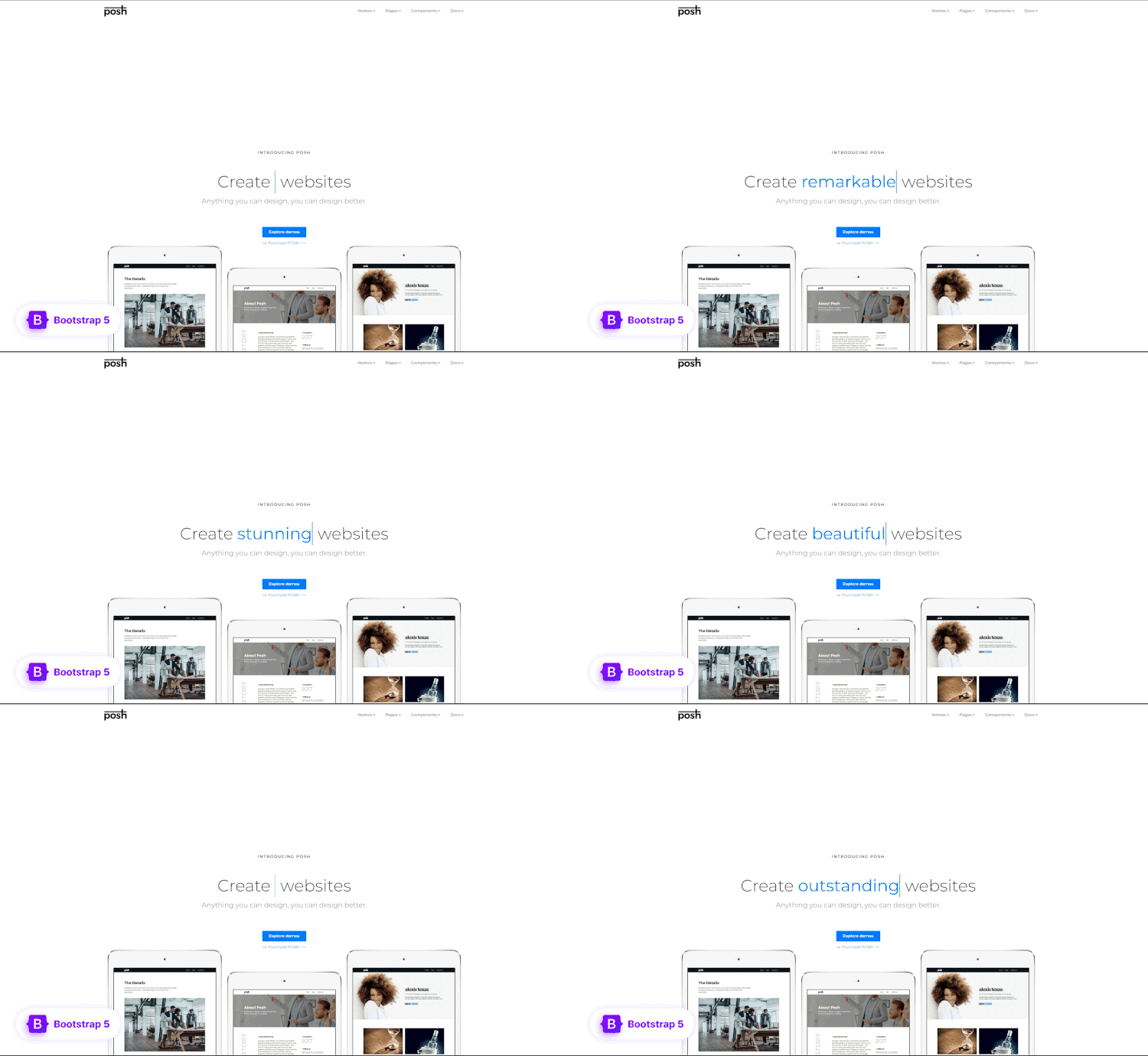
Why do you think this CTA made its place here? See how they have added distinctive CTAs for different audiences. They’ll help reduce confusion, take impactful actions, and get the owner a better click rate.
Be Concise
The CTA phrases should be short and precise. They must be easily understandable and clearly state what your target audience should do next.
Avoid using long phrases or sentences to say what you need to; to be particular, all you’ll need is 3 to 5 words, and you’ll be all set. And if you’re going higher, be sure to add value, i.e., “Click Now to Get 30% Off!”
Choose Action Words Wisely
It demands you be careful in choosing the CTA texts. The action words should consist of a strong command verb to start with. There’s a character limit of 35 characters per description line; it’s vital to get straight to the point and let the audience know exactly what you need them to do.
Use A Tone of Urgency
It’s essential to choose actionable and imperative words and phrases. The action words you choose should provoke emotion and enthusiasm that will elicit a strong response from the audience. The sense of urgency sparks a feeling of necessity among the digital audience. Also, if you’re tech-savvy, you might want to include countdowns surrounding the CTA, as no audience wants to miss out on anything.
Optimize Your CTA for Mobile Viewing
Most websites are responsive around all browsers and devices hence the call for mobile-friendly CTAs. Statista states that around 50% of web traffic comes from mobile browsing. So if you optimize your CTA for mobile browsers, you’ll likely get better page engagement. There are several screen sizes and device types, so you’ll need to check your CTAs for responsiveness and compatibility.
Use Multiple CTAs
You can create and use multiple CTA phrase examples and use them strategically throughout your marketing channels and check which performs better and apply that further.
Also, you can conduct A/B testing (Split Testing) to optimize the CTAs for conversion. Moreover, using the same CTA for all the marketing stages can be tedious, while using more than one can get you better subscribers.
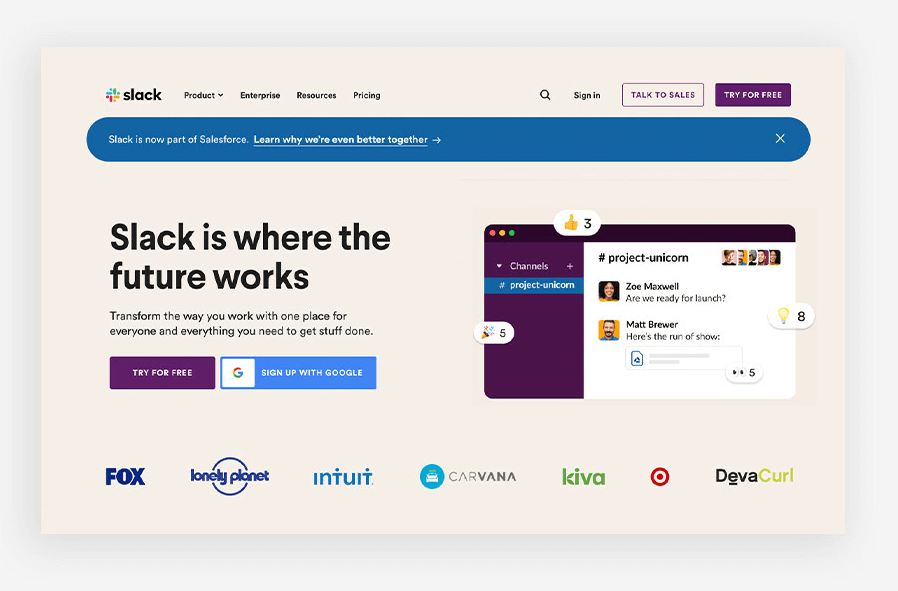
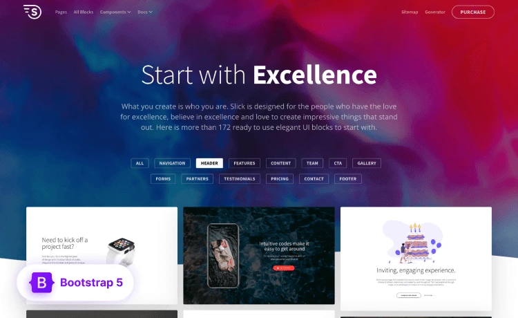
See the example above. slack uses multiple CTAs on its landing page, which is set according to its priorities. Not any CTA is overlapped or contrasted with others. This is how using multiple CTAs on one page works even better than using one CTA per page.
Planning the Placements of Your CTAs Tactfully
Many reasons can turn a compelling CTA into a non-functioning one. Tiny mistakes you might make while designing and allocating your CTAs can affect you tremendously. This will increase bounce-offs and lower conversion rates, hindering your business growth.
Some pitfalls that affect the efficiency of the CTAs you use are as such:
Button Blindness
Visitors are less likely to click if a CTA button is hidden or tricky to find. Seriously, who’ll do the odd job of zooming in and out to find a button only to click on it?

You can design a good button but hide it behind the texts and images you use on your website. If the blink and miss buttons are too small or lost in the graphic noises, this will lead to button blindness.
You must admit, in this fast-forward era, no one really has time to find the one to click.
Vague Button Texts
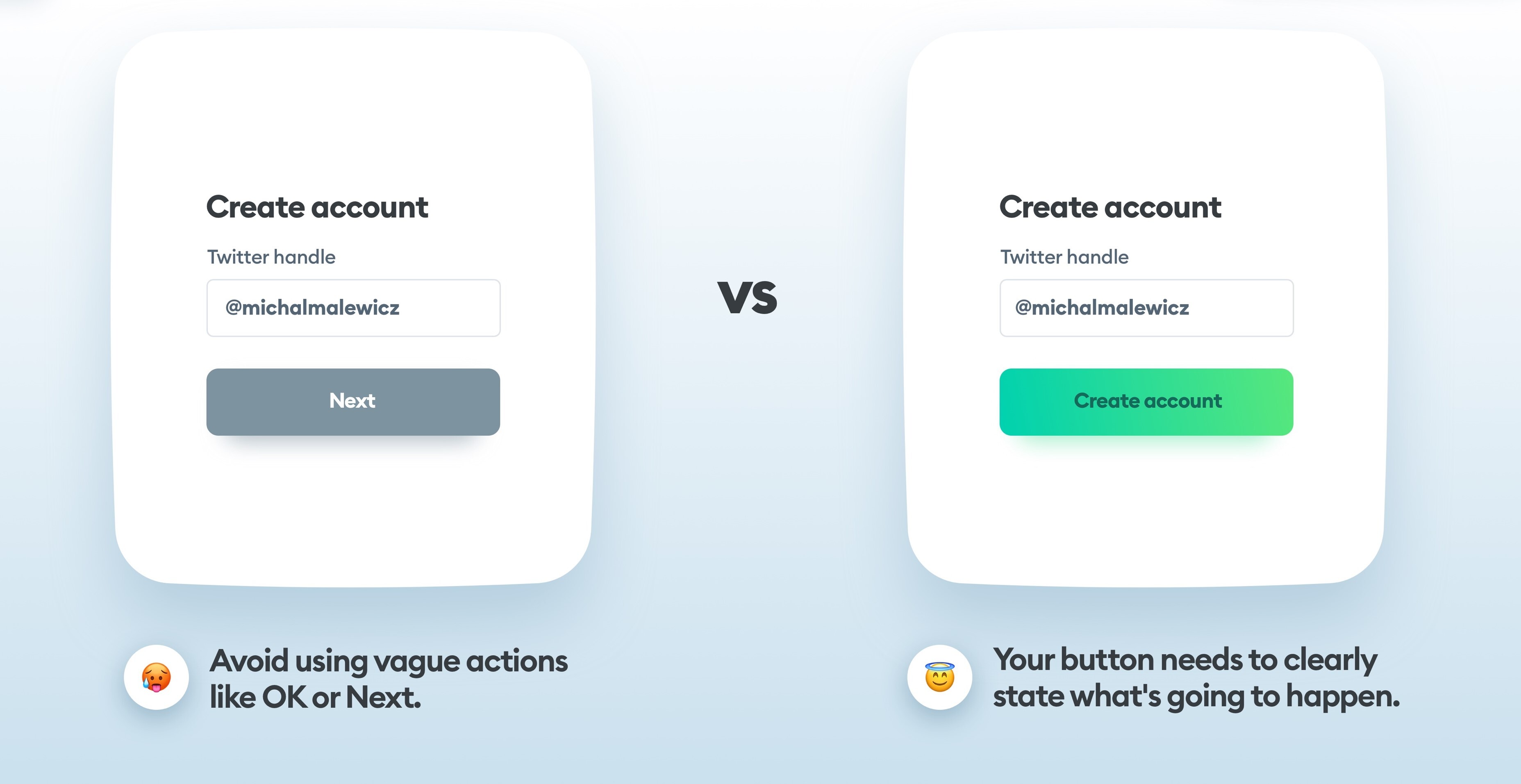
Button texts have to be self-explanatory. If you add a CTA, be sure to add the action text clearly stating the actions you want your audience. The statement or an obvious result should precede the purpose, or the resulting event should be defined clearly.
Too Many CTAs
You can use multiple CTAs and allocate them priority-wise. But what if you put more than one primary CTA on the page? Undoubtedly, this will put the visitors in a situation where they must choose between the two. So, if you are to use more than one on a page, you should set the priority of each. A secondary CTA shouldn’t be put in competition with a primary one.
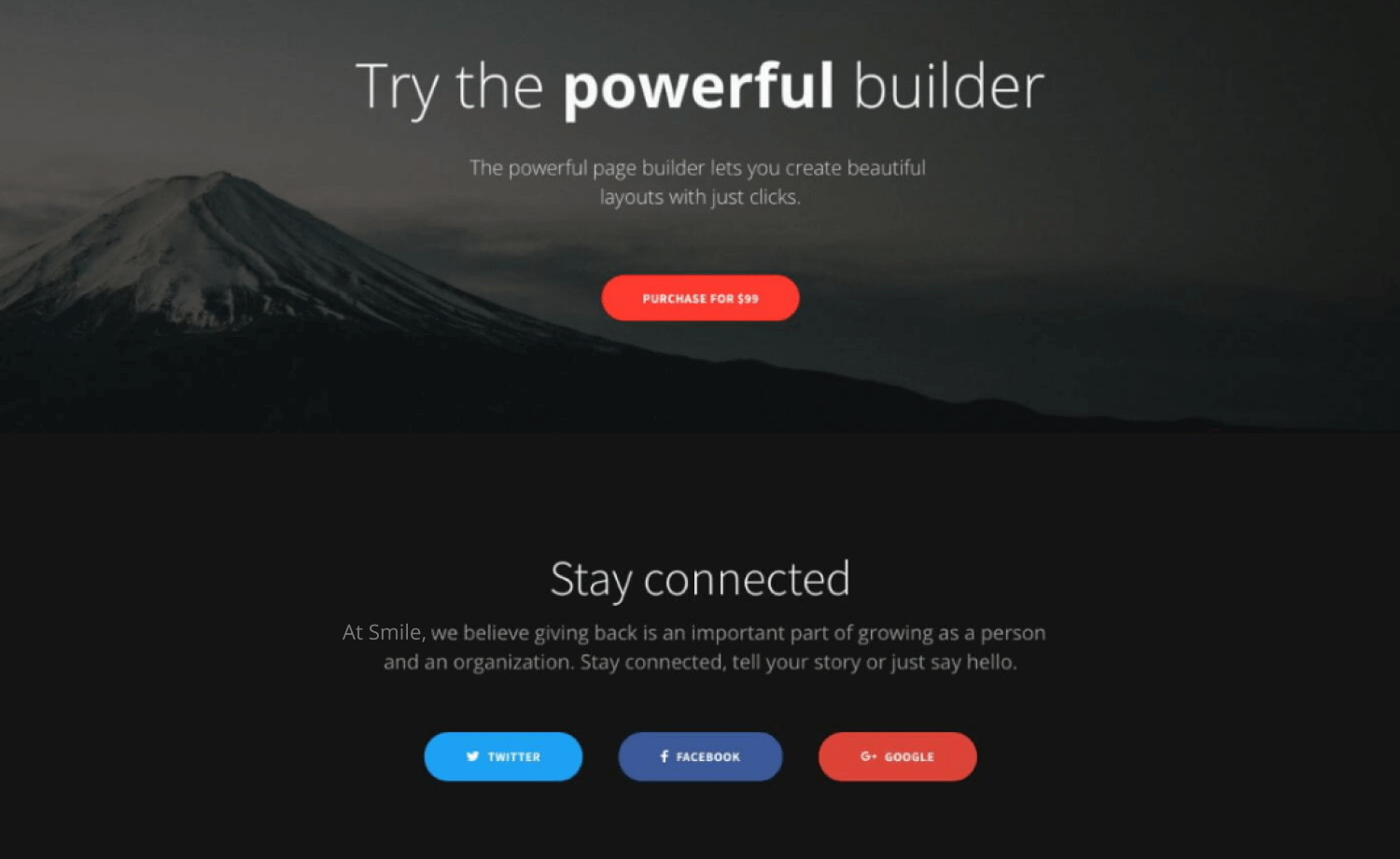
Sometimes you’ll need to add more than one CTA based on the availability of more than one on your end. But, make sure to set each purpose and state them clearly and distinctly. Too many options can deter people from making decisions, and you shouldn’t let your CTA perplex your audience.
If you add too many CTAs on your page, it’ll become tough to set the priorities, and your visitors might become confused about the action they’ll be taking.
Copywriting Woes & CTA Misses
The purpose of calls to action can be hampered by the contents surrounding the button. Even if that doesn’t get in the way, simple copywriting mistakes like using the wrong font, excessive adjectives, or unclear precedence and statement can always hamper the purpose of the CTA.

Visitors will bounce off your page if they cannot locate the button, and you’ll be left with a lost chance to convert your visitors. Some trigger words and phrases can get you favorable responses from your visitors.
Image Clutter
The conversion rate can be increased by adding related images to the texts on the page you’re adding your CTA/s. You just have to know where to stop to have the best output. Or else it’s possible to lose potential customers if they cannot find the button from under all the images.
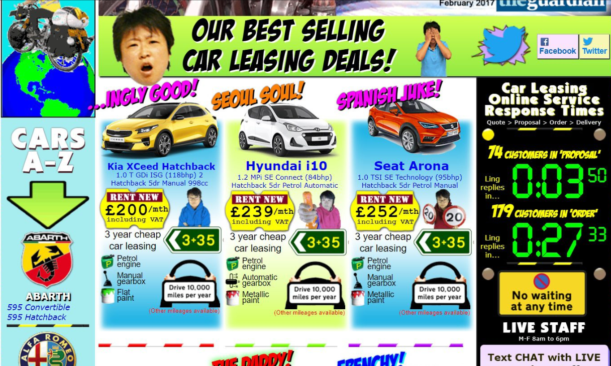
As we spoke earlier, your CTAs should be clutter-free, and that’s possible only if your web page is cluttered with irrelevant or too many images.
To be cautious, you can attempt to understand the images you use and their necessity. Since images help you grow curiosity and engage the users, you should use them without letting them overpower you. Hence, the images you use should aid in getting conversions instead of deterring them.
Background Covered Front
Imposing a button color blended in with the background can block the view of a CTA button. If you chose the color with the wrong contrast, you could lose the chance of getting enough leads, let alone turning them into customers. Using contrasting colors can help you manage this issue. Using negative spaces and different colors can improve the visibility and readability of your web page.
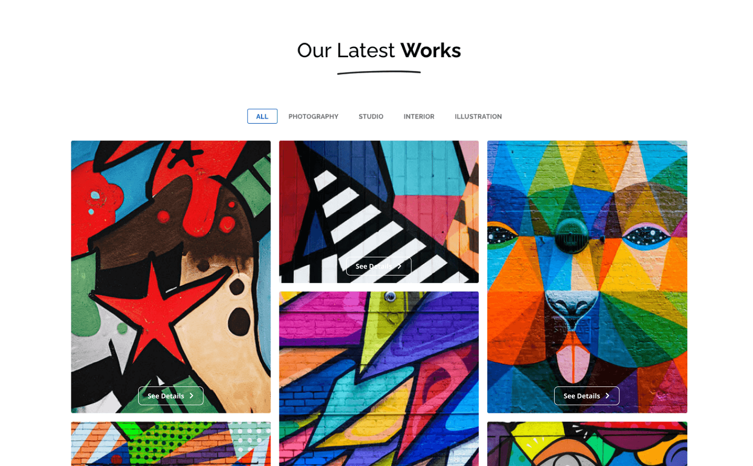
To avoid these malfunctions, you’ll need to keep the typography clean and choose a palette that coordinates the orientation and outlook of the page.
Misplaced CTA
Each one of your pages should have a definite purpose and adding a CTA helps you achieve it. For instance, placing a CTA on your homepage that is easy to find and helps users surf through your content better, will undoubtedly convert.
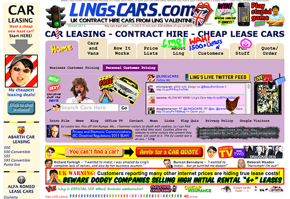
Regardless of the actions you want your audience to perform; you’ll need to assert the directive clearly and make the CTA accessible and noticeable.
The ultimate goal of CTAs is to direct your audience through the page and help them take clear action. It is essential as it helps to convert the generated leads into paying customers. So, plan your CTAs, distribute them priority-wise, and you’ll be good to set off freely!

