Often, the first interaction a customer has with a business is through their website. So, for a business to succeed, its website must provide a flawless user experience (UX) each time.
Over 80% of companies believe a great customer experience rewards the organization. And they’re right: great UX means customers will keep returning. On the flip side, poor UX could push customers to a competitor. So it’s no surprise 72% of digital team members have noticed a greater demand for UX design.
Every interaction a business has with a customer is a potential opportunity. But there’s a fine line between a good interaction and a bad one. Interaction design (IxD) can help ensure customers have a seamless UX each time. In fact, it’s an integral part of UX design.
What is interaction design?
Interaction design has its origins in web design. But it now includes every interaction a user has with a system. IxD aims to create meaningful relationships between people and technology. And with the rise of hybrid working, it’s more important than ever.
Every time someone clicks a link, presses a button, or swipes right, they’re using IxD. To make these interactions intuitive, interaction designers use psychology, communication, and behavior. After all, if users find a product frustrating to use, they’ll look elsewhere. Interaction design means every image, word, and icon gives users a seamless experience.
Interaction design and user experience
Interaction design doesn’t only focus on how to design technology; it also focuses on how to enhance UX. This might mean adding elements like sounds, images, and videos. The purpose is to create a dialogue between the user and the system that encourages the user to come back.
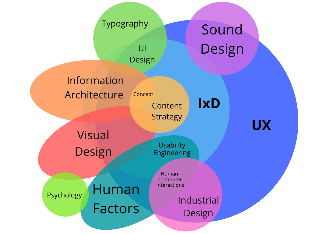
Interaction design falls under the umbrella of UX design. But it also overlaps with visual design, content strategy, and information architecture. Interaction designers focus more on processes, while UX designers focus more on products. So, for the best UX, you need both.
Interaction design methods and tools
Great interaction design has clear goals, best practices, and standards. There are several
methods and tools interaction designers use:
- Goal-driven design
- Usability
- Personas
- Cognitive dimensions
- Five dimensions
Let’s have a look at them before we talk about IxD best practices.
Goal-driven design
The goal (or goals) of the end user is central to goal-driven design. Designers focus on helping users achieve their goals, not what the technology can do. Goal-driven design has five fundamental principles:
1. Design first, program second. Start with how users interact, not technical considerations.
2. Separate responsibility for design from responsibility for programming. Focus on the user, and let developers worry about technical constraints.
3. Hold designers responsible for product quality and user satisfaction. Designers have a responsibility to users first, stakeholders second.
4. Define one specific user. Who is your typical user? What do they want to achieve?
5. Work in teams of two. Designers should work in teams, not alone.
Usability
Usability boils down to whether an interface is quick and easy to use. Designers should incorporate usability into everything from website card design to app design. Usability includes principles like:
● Learnability: how easy is it to learn the interface?
● Flexibility: how many ways can users interact with the interface?
● Robustness: how well are users supported when an error occurs?
● Efficiency: how quickly can users perform a task?
● Satisfaction: are users happy with how the interface works?
Personas
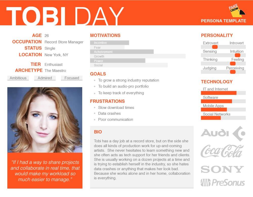
A persona is a representation of your ideal user. It’s usually a one-page or two-page profile that includes details like:
● Behavior patterns and motivations
● Personality, skills, and beliefs
● Goals, frustrations, and needs
To create a realistic persona, you need to conduct market research. 57% of companies believe research is important for understanding unmet user needs. Research can also help you segment your audience, so the end product should appeal to all your users.
Cognitive dimensions
You can use the cognitive dimensions framework to check the usability of an existing interface. It’s based on cognitive psychology, which studies people’s mental processes. The framework uses notations – elements a user interacts with – such as:
● Interface metaphors: use known user actions to help users do a new action. For instance, a trash icon tells users they can delete something.
● Affordances: visual representations that show the user what to do. For example, users who see a 3D button know to push it to make something happen.
● Consistency: familiar symbols that appear in the same places, like the home icon
● Mental models: the images in a user’s mind that form their expectations of an interaction. If designers can learn the user’s mental model, they can make software intuitive.
Five dimensions
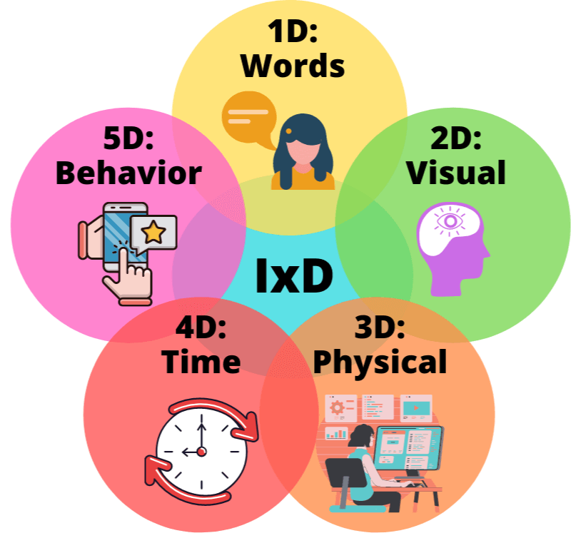
The five dimensions incorporate all the elements of interaction design, including:
● 1D: words
● 2D: visual representations
● 3D: physical objects and space
● 4D: time
● 5D: behavior
Interaction designers should consider all five dimensions when designing an interface.
Words (1D)
These are the words or text on an interface. When deciding which words to use, think about who you’re talking to. Avoid jargon and waffle; use language that’s concise and easy to understand.
Visual representations (2D)
These are visual elements like icons, images, fonts, and videos. They’re a great way to make a system intuitive and grab the user’s attention, especially on landing pages. But don’t use too many, or you could overwhelm the user.
Physical objects/space (3D)
These are the physical objects used to interact with an interface, like a computer or phone. It also refers to the user’s physical environment. Designers should always consider both when designing an interface to enhance UX.
Time (4D)
This is how long a user interacts with the interface, plus elements that use time, like videos. These elements help users navigate a system, and they’re a great way to communicate with the user.
Behavior (5D)
This includes several elements that designers should consider to maximize UX:
● The behavior and emotions of the user
● The behavior of the system in response to the user
● How the first four elements influence user behavior
Best practices when using interaction design
Now, let’s look at the best practices every interaction designer should know.
Consider your user’s needs
You need to know who your user is and what their needs are. In other words, you need to conduct user research. Currently, only 60% of companies say user research is well integrated into product development. But even creating a WooCommerce Coupon depends on considering the end user’s interaction with it.
65% of organizations think research helps identify user problems that need addressing. But user research doesn’t only identify problems; it also helps you think about what would give the best UX.
To understand your users, you could use surveys, online reviews, or even communication through live chat to gather relevant data that you can store and analyze on your database software. You could also conduct usability testing, which involves gathering feedback from real users. For instance, around 50% of companies use behavioral data like how long users spend on a task and how successful they are.
Be consistent
You need to keep the style consistent throughout an interface. Inconsistencies in colors and fonts can cause confusion, so you should avoid them. This is particularly important when designing composable architecture. After all, one of its aims is to streamline interactions throughout a business.
You can still have fun with the design; just use the same color palette and symbols. Remember, for the best UX, your interface needs to be easy to learn.
Less is more
84.6% of businesses say crowded web design is the most common mistake designers make. Why? It makes it harder for users to navigate the interface, so it can soon put them off your company. Simple, minimalist designs work best – as long as you don’t hide menus or icons to achieve it!
Nearly 90% of web designers prefer flat design as it gives users a streamlined experience. It involves using flat textures, images, and icons rather than 3D ones. But minimalism doesn’t mean your design has to be boring. You can still use creative fonts, bold colors, and images – just not lots of different ones.
Design for function
It’s important to think about the look and feel of an interface. But that doesn’t mean you should sacrifice function. For example, 88.5% of users say slow loading time is the main reason they leave a website. So interaction designers need to balance what looks good with what’s practical.
Designers also need to consider how an interface will function on different devices. For instance, 73.1% of users say website design lacks responsiveness across devices. So you need to test how websites look on computers, mobiles, tablets, and other devices. You should also test products on users with different abilities, like people with visual impairments. The best interfaces give all users a seamless experience.
Ask for feedback
Only around 50% of companies measure the result of their UX strategy. But ideally, you should gather user feedback before, during, and after development. There are a whole range of users with diverse backgrounds and goals, so feedback is essential if you want to give everyone a great UX.
47% of companies measure UX with self-reported data like the ease of use, appearance, and satisfaction. And 80.8% of companies look at conversion rate when deciding to redesign their website. To get the fullest picture of your interface, you should use surveys, metrics, and conversation intelligence.
Takeaway
nteraction design (IxD) is an integral part of user experience (UX) design. Done well, it enhances UX by streamlining how users interact with digital interfaces.
In this article, we’ve looked at some of the methods and tools interaction designers use. And we’ve outlined some IxD best practices every interaction designer should follow. The best advice, though, is to focus on the user and how to enhance their experience with great design.
Bio:
Grace Lau – Director of Growth Content, Dialpad
Grace Lau is the Director of Growth Content at Dialpad, an AI-powered enterprise
communication platform for better and easier team collaboration. She has over 10 years of
experience in content writing and strategy. Currently, she is responsible for leading branded and
editorial content strategies, partnering with SEO and Ops teams to build and nurture content.
She has written for Zumvu and Crocoblock Here is her LinkedIn.
Headshot: Image


