In the digital age, where users access websites on a diverse range of devices, from sprawling desktops to compact smartphones, responsive web design has become more than just a buzzword—it’s a necessity. Creating websites that adapt seamlessly to different screen sizes ensures an optimal user experience, regardless of the device being used. Luckily, we have a plethora of responsive web design frameworks that streamline this process, making it easier than ever to build websites that are both beautiful and functional.
Why Responsive Matters
Before diving into the frameworks themselves, let’s take a moment to understand why responsive web design is so crucial in today’s web design Houston landscape. Imagine visiting a website on your phone only to find that the text is minuscule, the images are distorted, and the navigation is a nightmare. You’d probably hit the back button faster than you can say “frustrating.”
A non-responsive website not only alienates users but also hurts your search engine rankings, as Google favors mobile-friendly sites. Responsive design, on the other hand, delivers a consistent and enjoyable experience across all devices, keeping users engaged and search engines happy.
The Frameworks That Power the Web
Now, let’s explore some of the most popular web development frameworks that make responsive design a breeze:
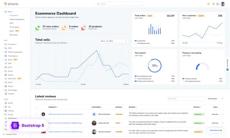
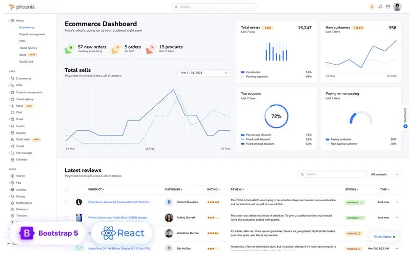
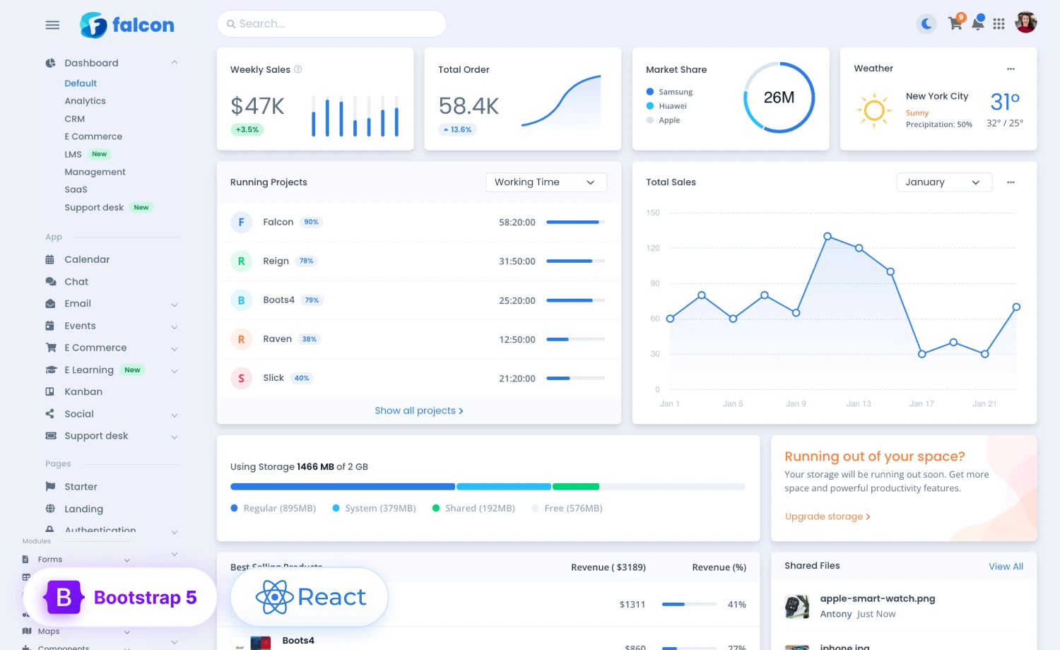
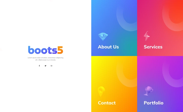
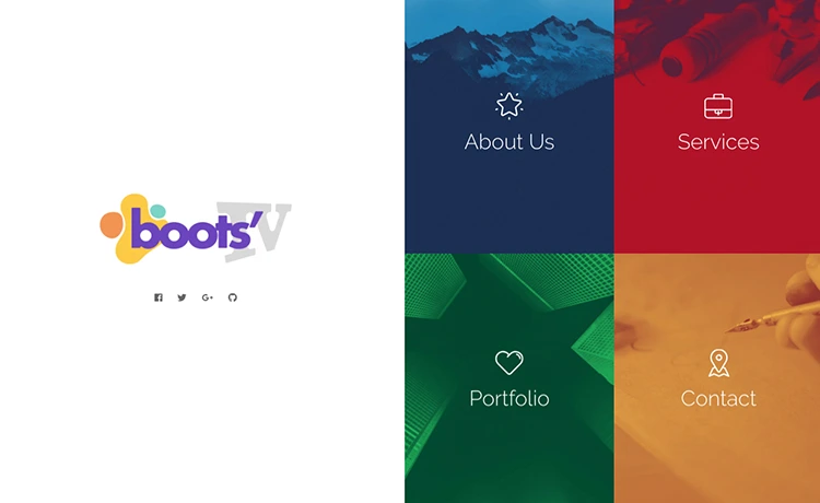
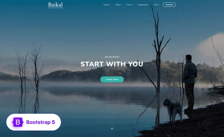
1. Bootstrap: The Undisputed Champion
Bootstrap is the heavyweight champion of the responsive web design world. It’s a comprehensive, open-source framework packed with pre-designed components, layouts, and utilities that make it easy to build responsive websites in a snap.
Bootstrap’s grid system is its crown jewel, providing a flexible structure for arranging content across different screen sizes. Whether you’re a seasoned developer or just starting, Bootstrap’s intuitive syntax and vast community support make it an excellent choice.
2. Foundation: A Robust Alternative
Foundation is another popular responsive web design framework known for its flexibility and customization options. It offers a clean, semantic grid system, along with a variety of UI components and JavaScript plugins that can be tailored to fit your specific needs.
Foundation’s focus on mobile-first design ensures that your websites look and function flawlessly on smaller screens. If you’re looking for a framework that gives you fine-grained control over your design, Foundation is worth considering.
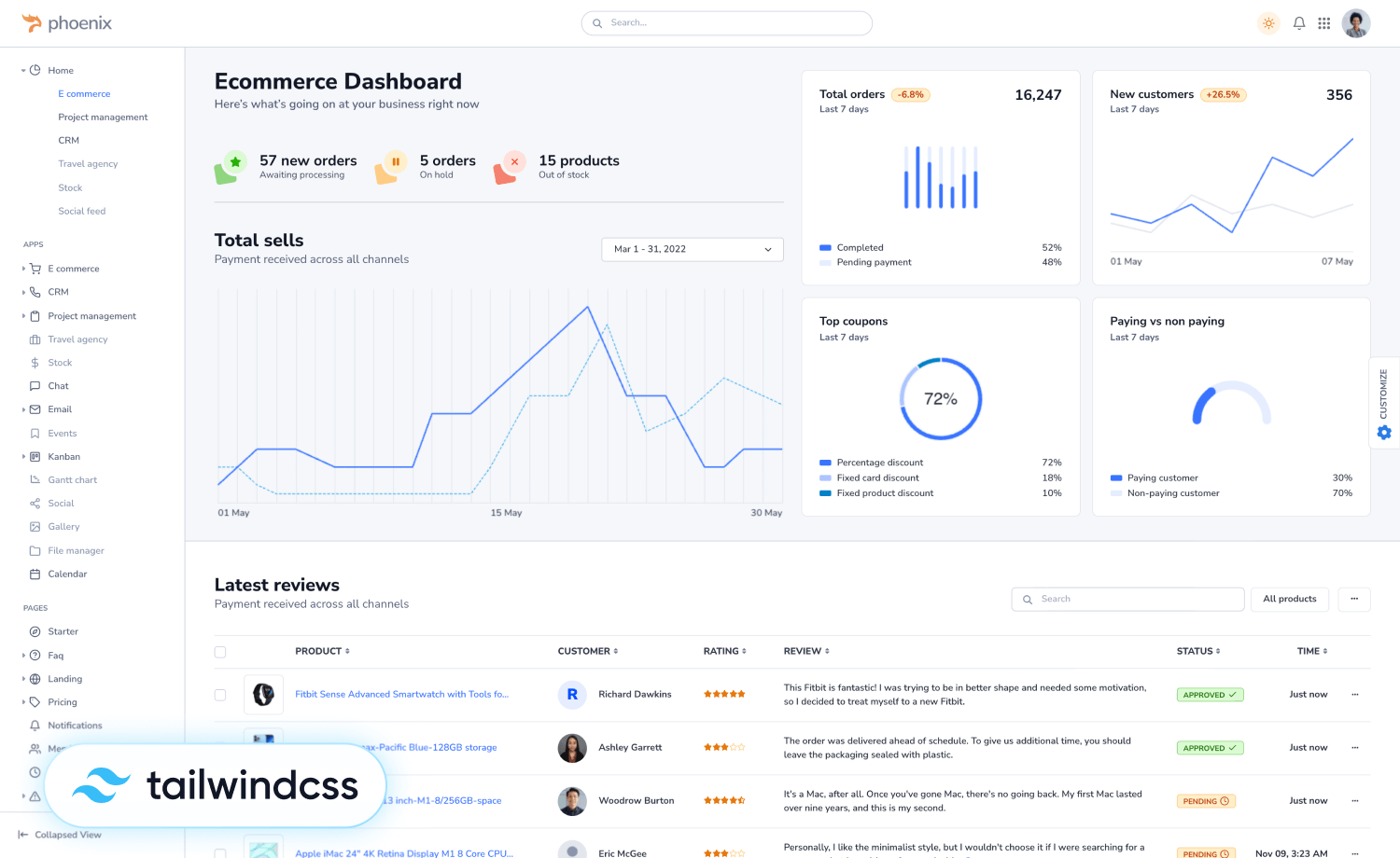
3. Tailwind CSS: A Utility-First Approach
Tailwind CSS takes a different approach to responsive design. It’s a utility-first CSS framework that provides a collection of low-level CSS classes that you can compose to build custom designs.
Tailwind’s focus on reusability and composability makes it a great choice for projects where you want complete control over the look and feel of your website. While it may have a steeper learning curve than Bootstrap or Foundation, Tailwind’s flexibility and performance benefits make it a popular choice among experienced developers.
4. Material UI: Google’s Design Language
Material UI is a React component library that implements Google’s Material Design principles. It offers a wide range of pre-built components that follow Material Design’s clean, modern aesthetic.
Material UI’s components are designed to be responsive out of the box, making it easy to build beautiful and functional websites that adhere to Google’s design language. If you’re a React developer looking for a framework that simplifies the process of building Material Design-compliant websites, Material UI is an excellent choice.
5. Semantic UI: A Focus on Readability
Semantic UI is a framework that prioritizes human-readable HTML and CSS. It uses natural language class names and intuitive structures, making your code easier to understand and maintain. Semantic UI’s components are also designed to be responsive, ensuring that your websites look great on all devices. If you’re a fan of clean, semantic code, Semantic UI might be the framework for you.
Choosing the Right Framework
With so many great responsive web design frameworks available, how do you choose the right one for your project? Here are some factors to consider:
- Project Requirements: Consider the complexity of your project, the design aesthetic you’re aiming for, and any specific features you need.
- Learning Curve: Some frameworks, like Bootstrap, are known for their ease of use, while others, like Tailwind CSS, may have a steeper learning curve.
- Community Support: A large and active community can be a valuable resource when you encounter challenges or need help with your project.
- Performance: If performance is a critical concern, consider frameworks that are known for their speed and efficiency.
Beyond the Frameworks
While frameworks provide a solid foundation for responsive web design, there are a few additional best practices to keep in mind:
- Mobile-First Design: Start by designing for the smallest screen size first, then progressively enhance your design for larger screens.
- Flexible Images: Use CSS or responsive image techniques to ensure that images scale gracefully across different screen sizes.
- Media Queries: Use media queries to apply different styles based on the user’s screen size.
- Testing: Thoroughly test your website on a variety of devices and browsers to ensure a consistent experience for all users.
Embrace the Responsive Revolution!
Responsive web design is no longer optional—it’s essential for creating websites that deliver a great user experience across all devices.
With the most popular web development frameworks at your disposal, building responsive websites has never been easier. Whether you choose Bootstrap, Foundation, Tailwind CSS, Material UI, or another framework, remember that the key is to focus on creating websites that are both beautiful and functional, regardless of the device being used. Embrace the responsive revolution and unlock the full potential of the web!


