It has not been long since website development took a leap from mere news telling to a broader range where daily lives blend with networking. The first text-based websites only had the basic HTML tags, which evolved into today’s versatility of web designs. With the innovation and advancement of technologies like HTML, CSS, & JavaScript, more complex and advanced websites are growing to create user-friendly websites. Along these comes the awareness about content strategies and SEO that influence the outlook of any website, as it is fundamental for a better user experience.
Text-only websites could serve the purpose initially when only slow-loading pages were available on any site. But nowadays, this has changed radically with the need to engage people from all around since most users seemingly do not have the patience to read bulk texts. In most cases, the opinions are directly related to the images and illustrations of a website. Online contents with images get 94% more views than those without images. [ref.]
When we are marching into the metaverse, it is better to show than to tell. And a show must go on with perfect imagery. Since images and photographs do not always express the intended, website design relies greatly on the illustration to showcase everything. In this blog, we’ll try to cover the ongoing illustration trends that will seemingly dominate the year 2022.
Visual Aids
Websites use different visual aids to present the products and services and engage users. Over the years, there have been many changes, and the evolution resulted in significant and powerful imagery. Some of the trendiest visual aids to dominate the year 2022 are enlisted below for your consideration:
1. From Retro Video Games to Today’s Web Illustrations
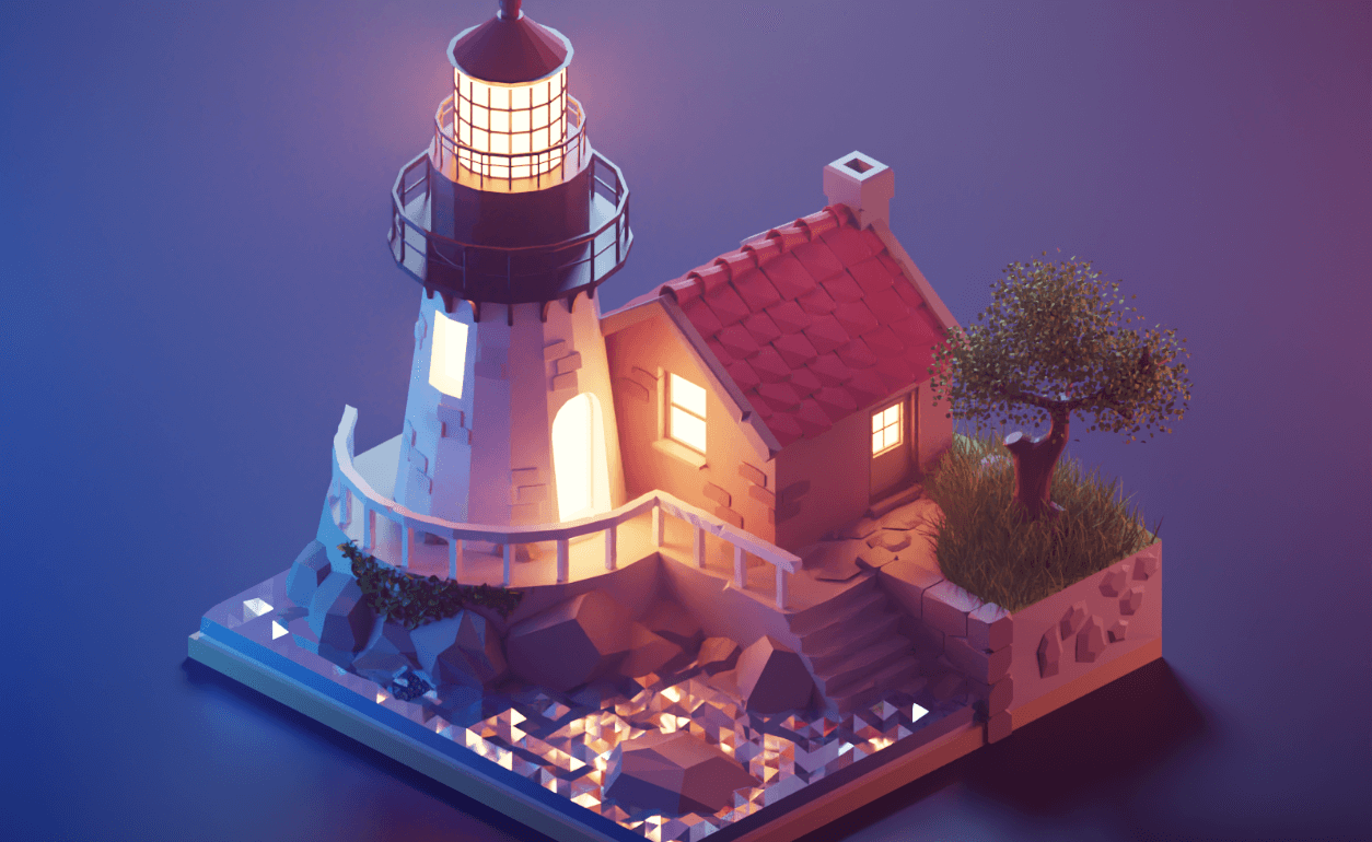
Low Poly: 3D in the illustration is back now, and we can find many different patterns and approaches towards it, one of which is polygon-styled 3D. Low polygon is naturally extended from flat design to use simple, colorful polygons to imitate an object or used as a background. It is a polygon mesh with a relatively small number of polygons. A minimalistic art style using bold & bright geometry to create an image or pattern. When mixed with 3D, this naturally helps the design stand out.
2. Less Traditional, More Trendy
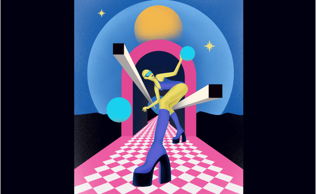
Futurism: 3D futurism visually adds more volume and mass with a range of bold colors & shapes. In this method, objects aren’t considered distinct or separate. A focus on urban scenes and everyday objects in motion gives the feel of futurism, especially if applied along with 3D.
3. Examining Social Prejudices
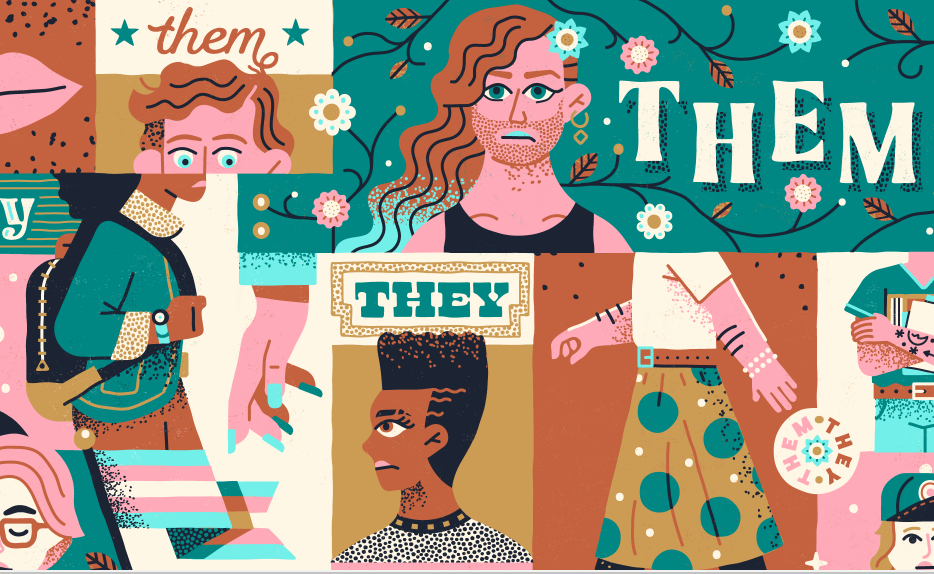
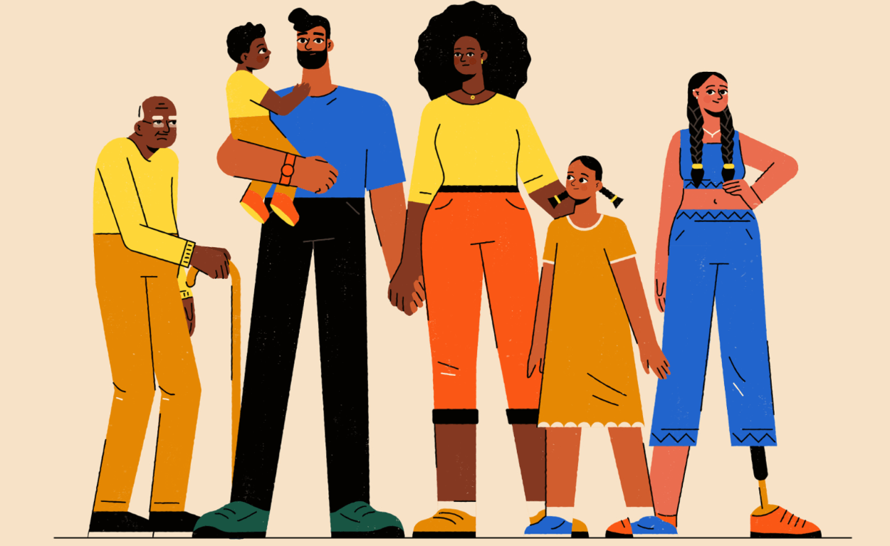
Inclusive Designs: 2022 will see the continued call for inclusivity in designs, which means examining social prejudices, especially inspired by the Black Lives Matter movement. Also, a diversified showcase of human lives and inclusive related visuals necessarily impact brand promotion and representative marketing. The visuals can be icons and illustrations displaying more races, body types, etc.
4. Simplified & Schematized Forms
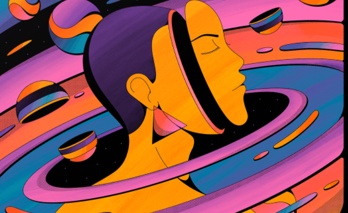
Abstract Illustration: The abstract illustration is one of the hottest trends in web design which is inspired by multiple arts and design movements. These illustrations can help capture ideas express emotions, and invite engaging users. Different websites use different patterns of abstracts, such as:
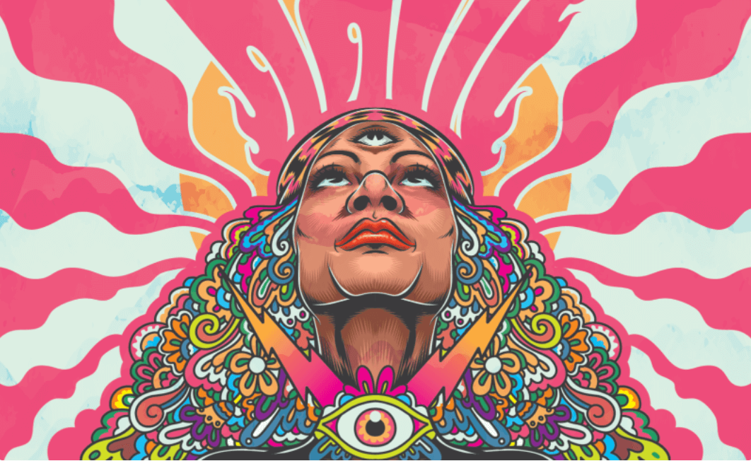
- Liquid State Drive: Psychedelic
This form is recognized for its complex abstractions and colors associated with psychedelic drug uses. Bright and highly contrasting colors with extreme depth of detail add the feel to morphing or inanimate objects.
- Express the Unconscious Consciousness: Surreal
Surrealism is an art form that defies logic and is filled with strange images and bizarre juxtapositions. This depicts bizarre assemblages of the ordinary, visual puns and even primitive or child-like designs.
- Creating Lively Patterns: Geometric
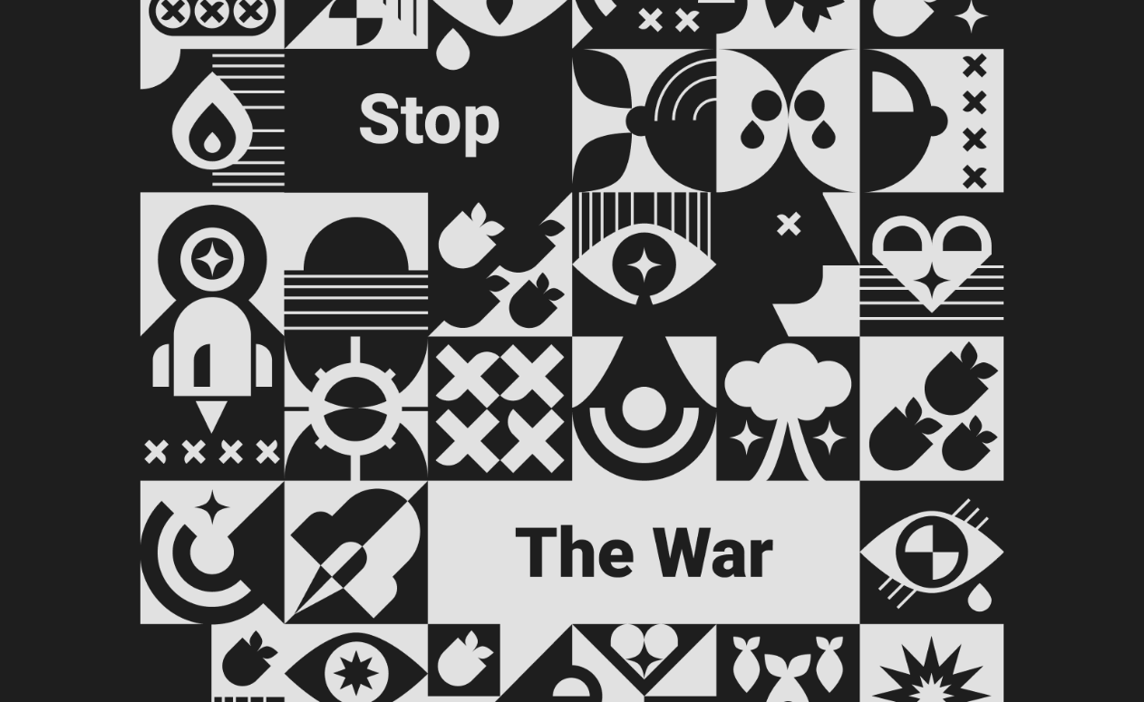
This abstraction is based on using geometric forms placed in non-illusionistic space and combined into a non-objective composition. Geometric illustrations are to see a renaissance in 2022 as it gives artists a lot of flexibility with abstract shapes, lines and angles to be the background of the illustration.
5. Emphasize Usability
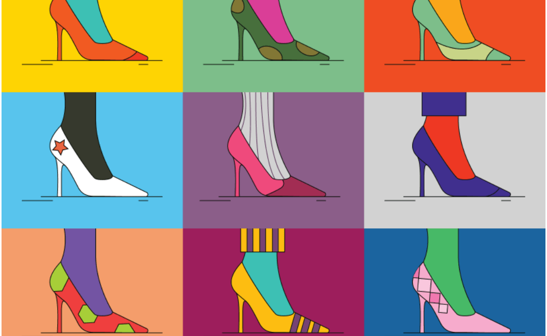
Flat Design Illustration: Flat design is a minimalistic approach emphasizing usability that features clean open space, crisp edges, bright colors & two-dimensional illustrations. Flat-designed illustrations convey messages more quickly as it avoids detailed illustration and ornamental elements.
6. Originality Blended with Uniqueness
Hand Drawn: Hand-drawn illustrations are becoming popular every day as this style adds a cozy feel to images. Also, originality and uniqueness are what every brand looks for to stand out among the crowd, and hand-drawn illustrations avail that.
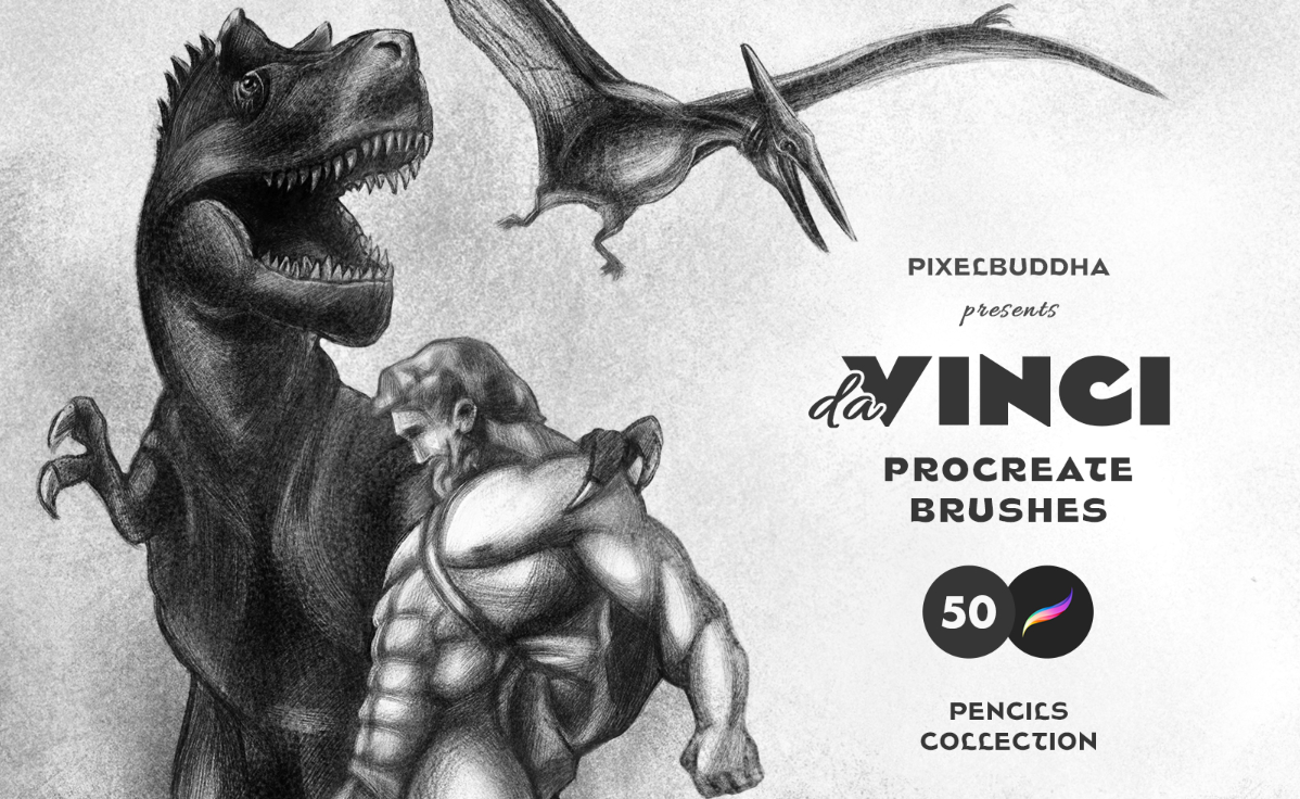
- Pencil & Sketchy
Pencil and sketchy drawing or doodle illustration is one unconventional choice of web design styles. This trend conveys elegance, sophistication and overall boutique-like feelings. It is a style to make your website look more artistic.
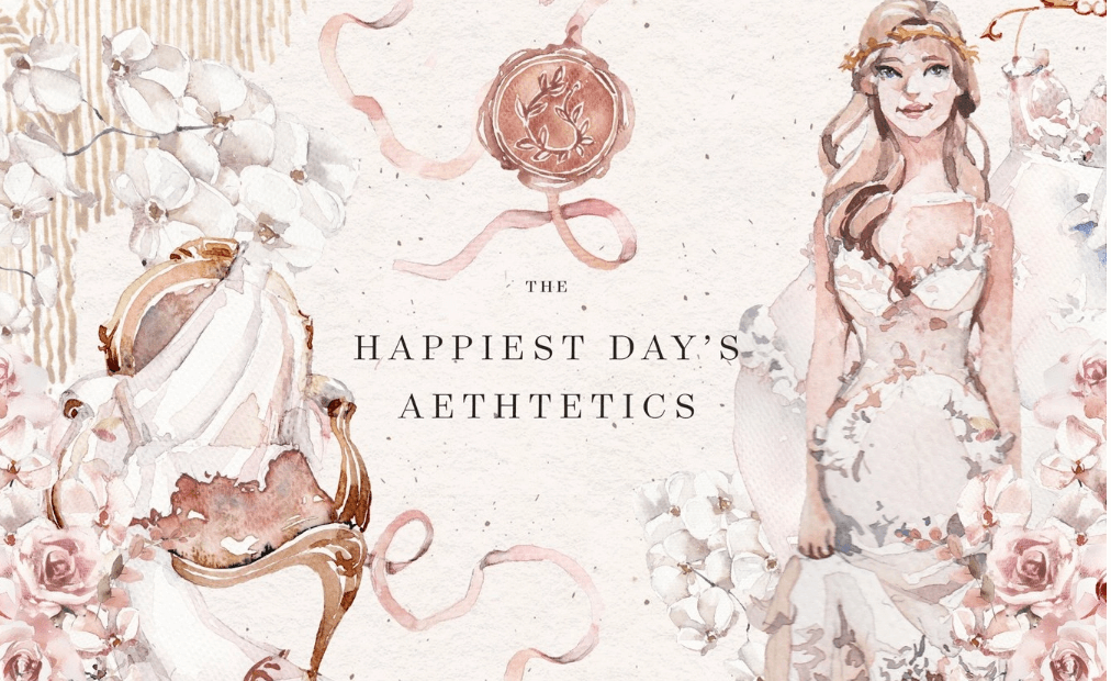
- Water Color
There are many watercolor illustrations online. This style seems to be the most artistic one when discussing web illustration trends. This style showcases creativity, imagination, and incredible art skills, all in a single web illustration.
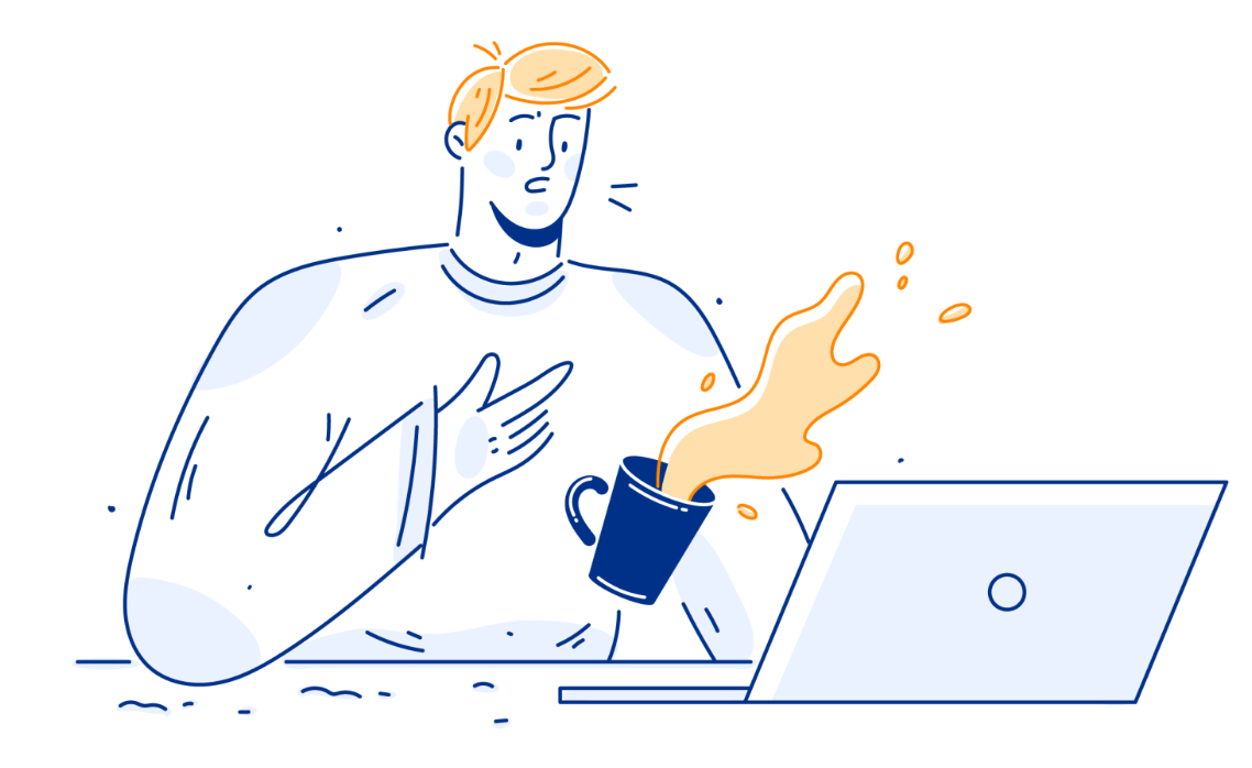
6. Composed Solely of Outlines
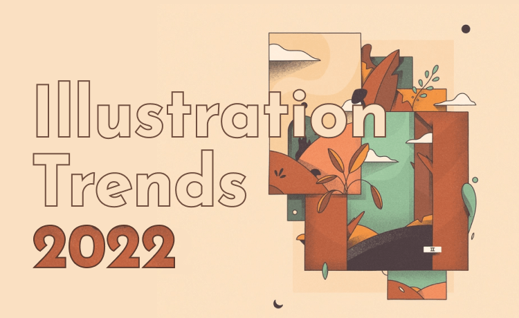
Outlined Illustration: Outlined illustrations are popular when combined with bright colors and presented as simple, minimalistic illustrations. This style reminds childhood, and this trend gets under visitors’ skins. This unique but simple trend instantly helps visitors grasp the idea behind it.
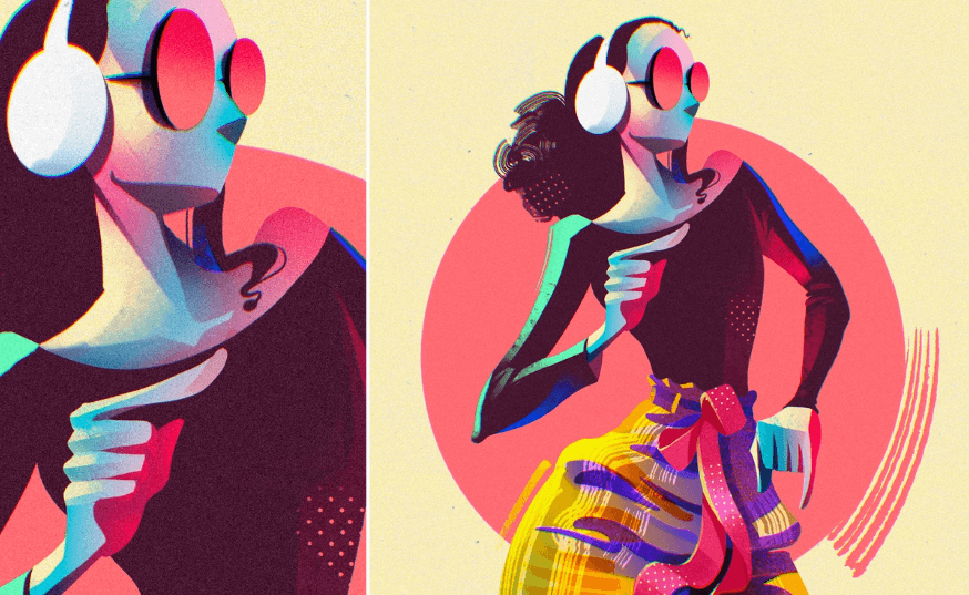
7. Colors More Vivid & Pure
High Saturation: A highly saturated image has more vivid and bright, rich colors than an image that veers towards a scale of grey. While the works have become more polished and interactive, visibility has become more important to designers; they use high saturated images to focus the users’ attention on meaningful content.
8. Of Distinct Lines & Curves
Line Art: In opposition to fancy 3D illustrations and intricate animations, simple and clean aesthetics emerged, amongst which line art stands out with clean lines and no shading, with bold lines contrasting sharply against their background. This trend harnesses minimalism with a strong message, blending texts and images as a whole.

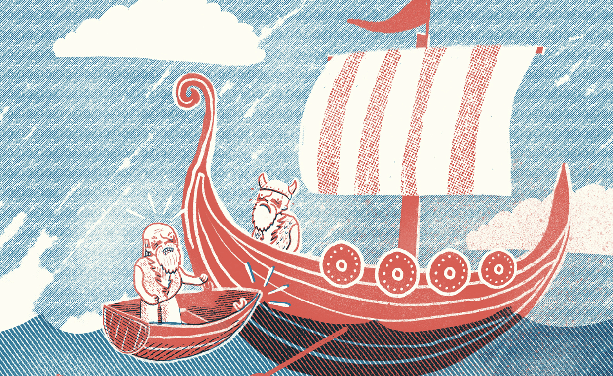
9. Multiplicating Techniques
Print Making: Printmaking originated as a massive art form that has now made its way to web illustrations. This trend adds the feeling of warmth, authenticity and retro while used on web illustrations. It looks traditional if used alone, but when combined with other illustration styles, this can help create innovative and creative collages.
10. Represent How the Object Feels
Texture & Gradients: Textures and gradients come in many various styles in web designs and induce a range of feelings and experiences. Some textures refer to how closely a texture resembles a real-life texture, and some refer to how much a texture stands out against its fellow elements.
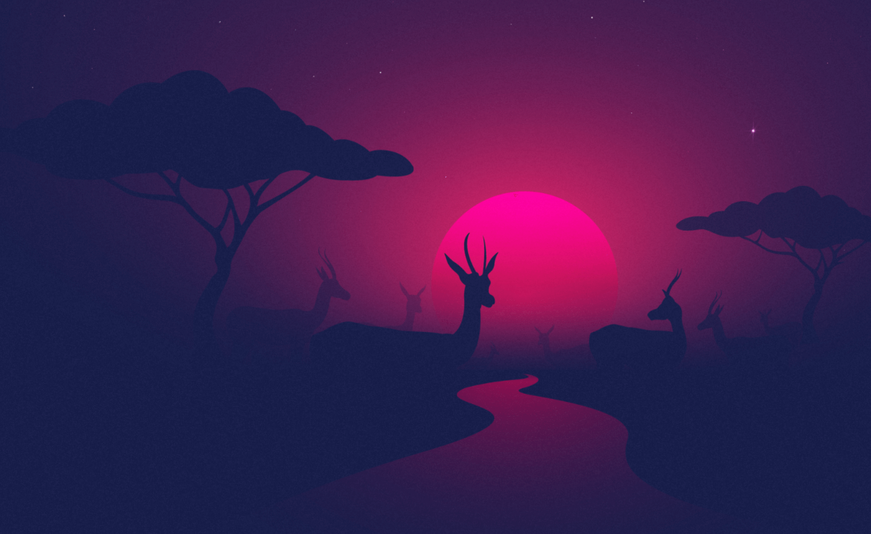
- Atmospheric Gradients
Atmospheric gradients are the smooth color transition inspired by natural atmospheric phenomena, including thunderstorms, sunrises, and moonglow. All colors are necessarily selected to provide an eye-catching naturalistic experience.
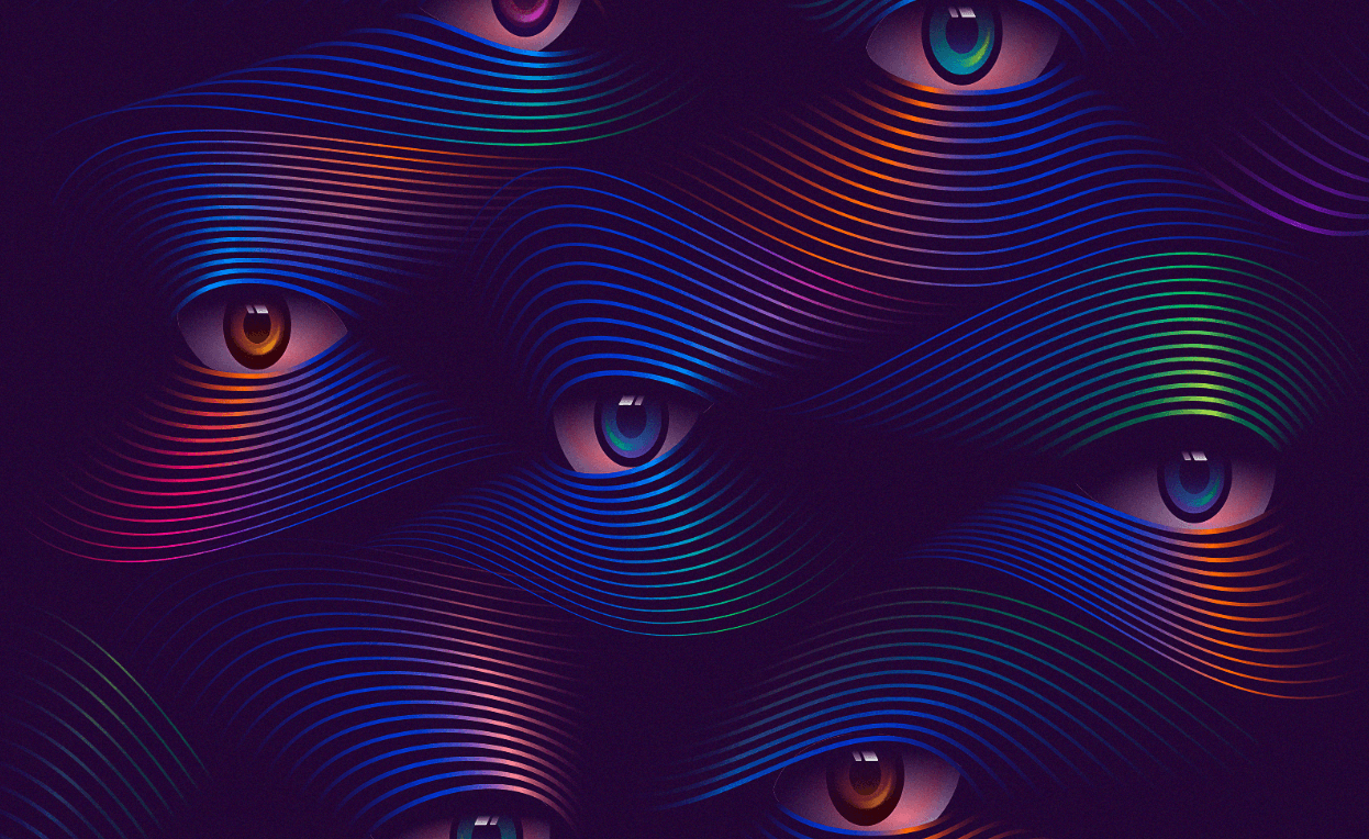
- Odd Gradients
Though gradients are pretty common, the smooth color transitions stand out with an odd shape or design. If got an extraordinary form, this trend still captures the eyes. A smooth gradient on an odd shape can bring out the desired result.
An Honorable Mention
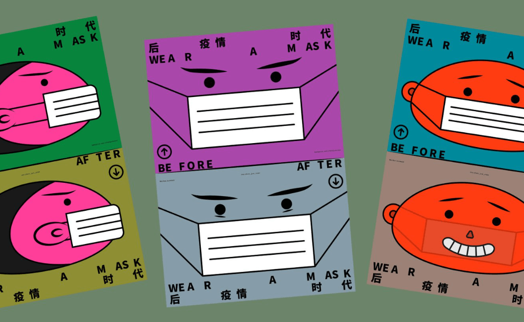
Tweaking: Chen Junxian, a Shenzen-based artist, said, “I like to record life in a ceremonial, concise and powerful way.” He created a distinct illustration style by subtly tweaking the real-life elements and exploring the metamorphosis concept. This illustration style tends to add a ceremonial feeling to the art and can place among trending illustrations. His works provide an intriguing study of human interactions and evoke a relatable sense of curiosity.
Color Palettes
With the advancement of technologies, more and more variations are noticeable in illustration styles. Specifically, when it comes to colors, they vary from person to person. So, in illustrations, colors mean more of what’s intended. Hence, below are the ongoing color trends widely used in web illustration that are dominant this year:
1. Classic Minimalism Combined with Common Colors
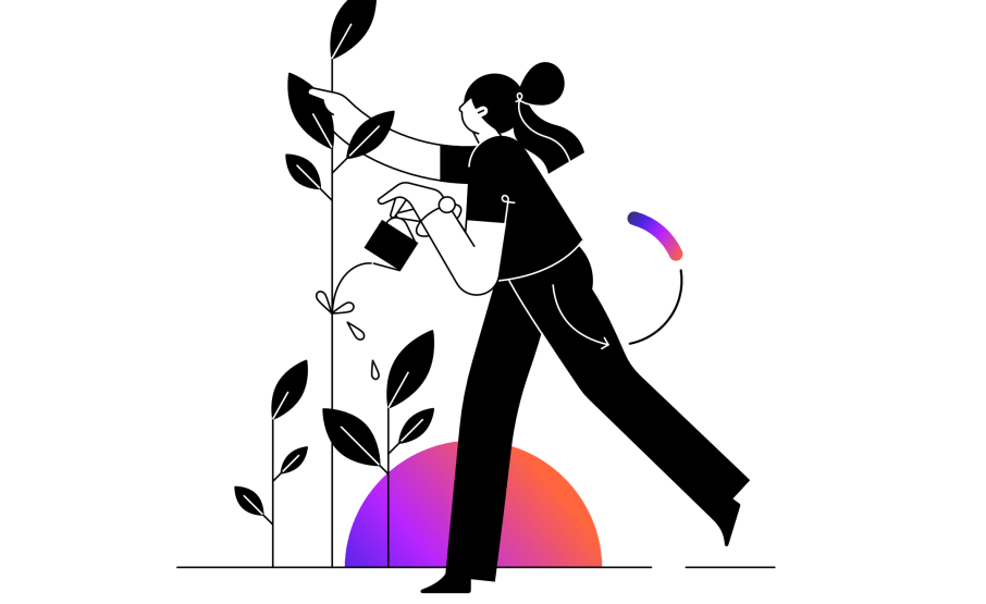
Colorful Minimalism: With the success of material & flat design, minimalist design has become trendier in recent years. Since the basic idea is to say the maximum by saying the minimum. Only necessary elements are included in the design, and so, minimalism can be applied to any design. Colorful minimalism brings playful energy to any project without compromising the serious style, balancing the minimalist and the maximalist to make versatile style applicable across various sectors and designs.
2. The Acceleration of Flat Design
Flat Color Palette: Recent years have seen the rise of flat color in the illustration, a uniform identical tone & hue within unique shapes, textures and details. Usually, it is more likely to be a solid, uninterrupted color achieved by completely uniform brushstrokes, depth and shading. Flat color design in digital product interface design helps keep the user focused on the key contents without interruption.
3. Bringing Out Uniqueness
Bright & Bold Colors: Using the right colors can evoke complete meaning in the audience. Especially in web design, bright and bold colors help grab user attention. Also, since different colors convey different emotions, figuring out the best color to work best while conveying the intended messages is an efficient way towards successful illustration.
4. Some Subdued Hues
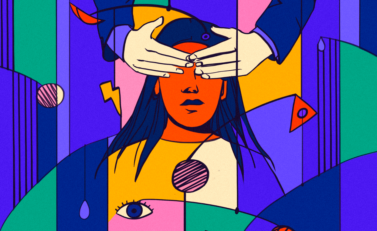
Muted Color Palette: Muted colors are bright colors infused with black, white or other colors to mute the bright hue. Since color often brings loud and confusing signals, using muted color palette can bring a sense of nostalgia, comfort and security. The subdued hues make the design elements look real and cozy. Since subdued colors look more organic and natural and are synonymous with health, these colors have become a bigger consideration for many since the pandemic.
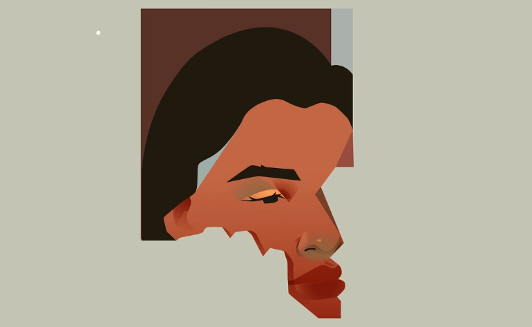
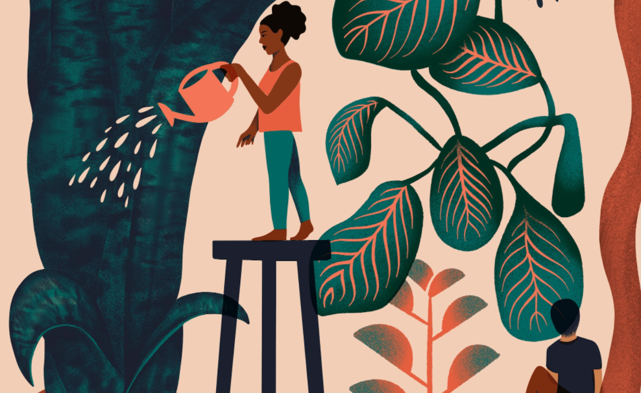
Nature-Inspired Colors: The concept of a natural color palette is a little hazy because nature is home to a wide variety of colors, color schemes and families. Chosen from the many different hues found in nature, unaltered color patterns compose the natural color palettes, which bring out the splendor and beauty of nature no matter how they are used. Nature’s color palettes will be as accurate as possible in reproducing the colors found in nature.
5. Back to Bare Essentials
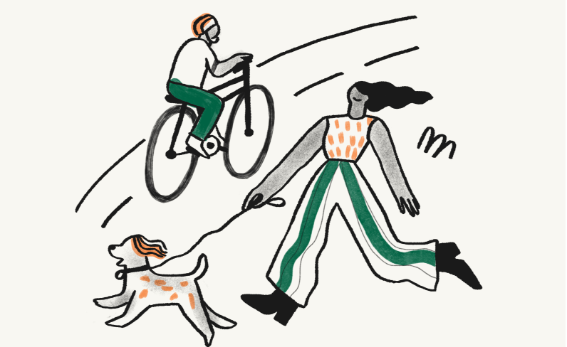
Limited Color Palette: A limited color palette is used for illustrations confined to the bare essentials. Using such palettes help pop the intended colors up from the textures used. Also, using a limited palette helps create unique brand images. The chosen set depends upon the intended effect, the subject matter and the chosen medium.
6. Not to Spoil the Stew
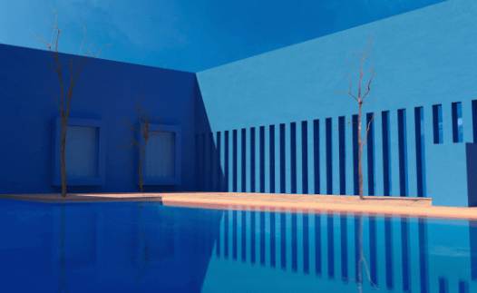
Restricted Color Palette: The margin is thin between a limited and a restricted color palette. While many artists use a limited color palette to establish a brand image or icon, a restricted palette is not limited to some brand colors. In brief, it is how artists choose to creatively operate with very few colors using several tones of the same in the illustration. Reducing colors to basics, the slightest tones can be replaced with bolder essential ones.
7. Evoking Nostalgia
- Retro:
Nostalgia is another on-rise illustration trend that evokes many users’ emotions and drives a bright response. This trend awakens associations with well-known concepts from the 90s, creating a powerful impression using these concepts and memories. Usage of the retro palette, reality elements of the 90s & old-school typefaces create a sense of nostalgia.
- Jeweled Musings:
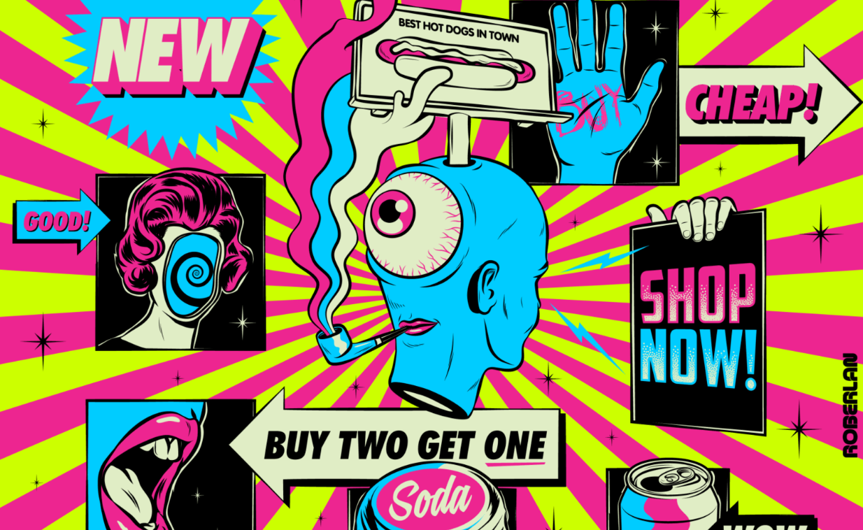
Saturated and vibrant colors dominated fashion two decades before the grunge era introduced a darker palette. After the 1980s, things began to calm down, but the scene was anti-materialistic and praised individualism over materialism. Colors in this era were more muted and subdued. There was a noticeable shift in tone as far as television shows, and other visuals go. As an alternative, the decade of the 1990s is also remembered for its vibrant jewel-toned fashion, featuring rich blues, vivid purples, dark greens, and fiery reds.
8. Feel Welcomed
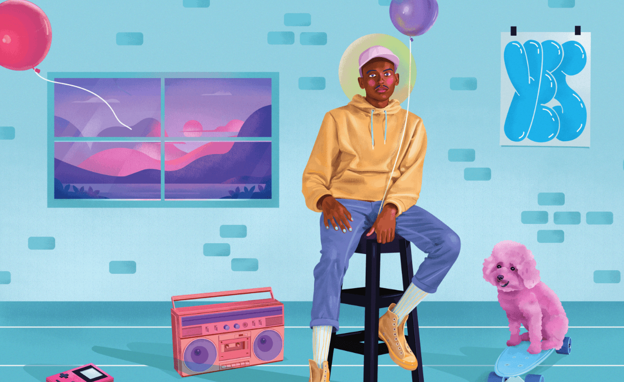
Moody & Warm: Duotones and bold palettes caused the counter-response to the increasing popularity of moody and warm colors in illustration design. Designers welcome this idea since this trend evokes a welcoming feeling and is also pleasant to look at. Since developers are more into creating engaging websites using behavioral designs, they go for warm and moody color palettes to give a welcoming tone to the engaging website they’re creating.
Use Cases
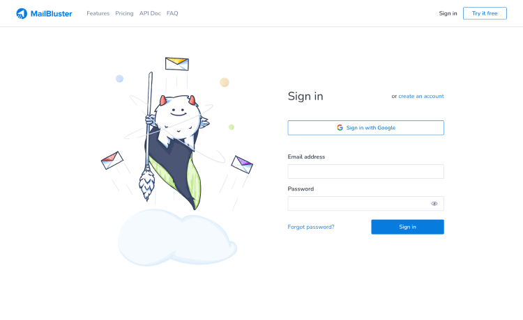
MailBluster
MailBluster is an email marketing tool that embraces some of the aforementioned illustration trends while getting on board with any illustration. Look at how they use hand-drawn illustrations, nature-inspired patterns and soft backgrounds with thick and prominent outlines to express what they want to.
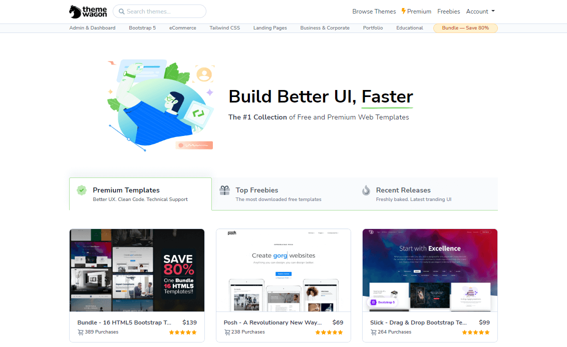
ThemeWagon
ThemeWagon is a renowned platform for free and premium website templates. This site has a minimalist approach to its website design. The website uses a flat design approach blended with gradients of nature-inspired colors and flat colors. though they do not necessarily follow any explicit trend, they blend it all to get what they want.
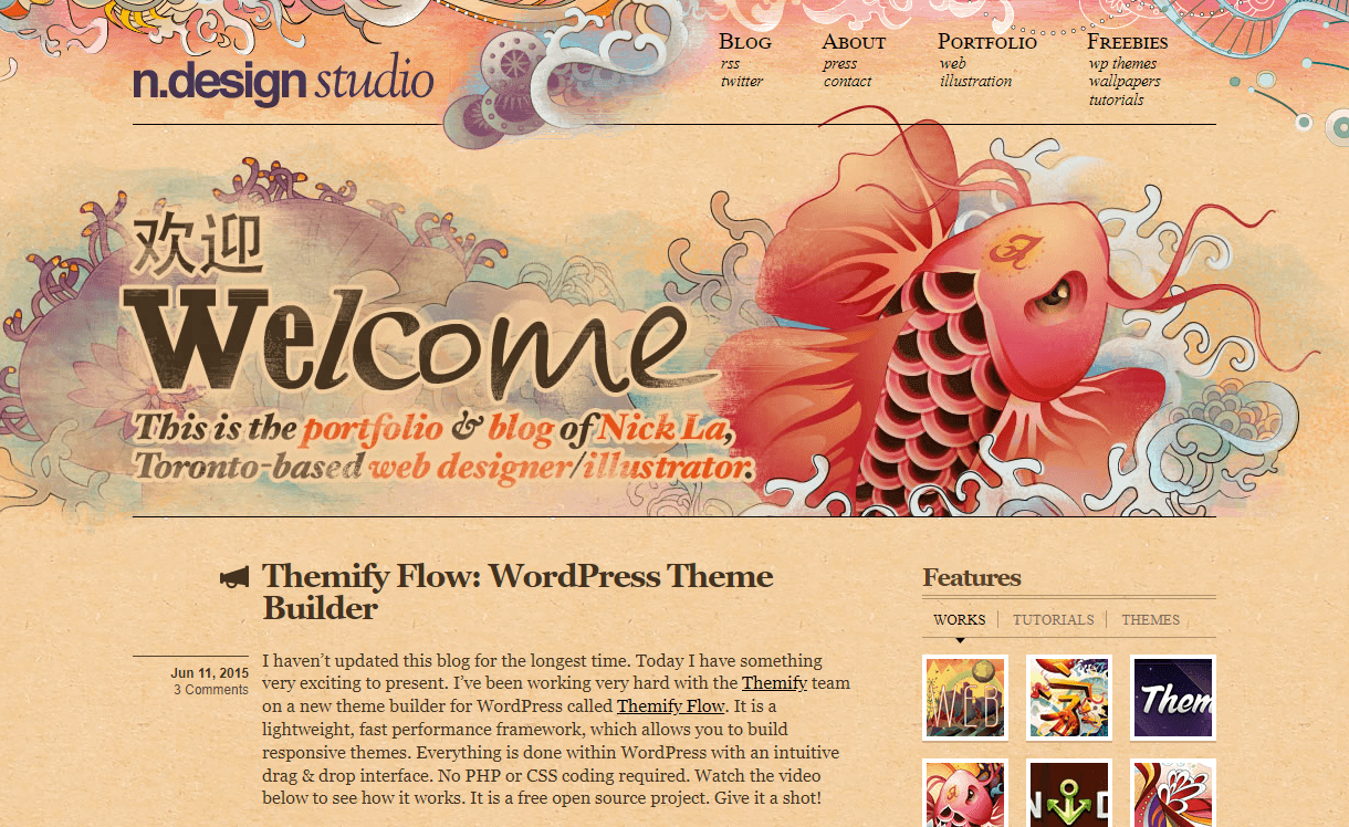
N.Design Studio
This is another example of a personal website. It is a blog and portfolio website of Nick La, a Toronto-based illustrator and web designer. With hand-drawn illustrations, this artist made the website eye-catchy and expressive.
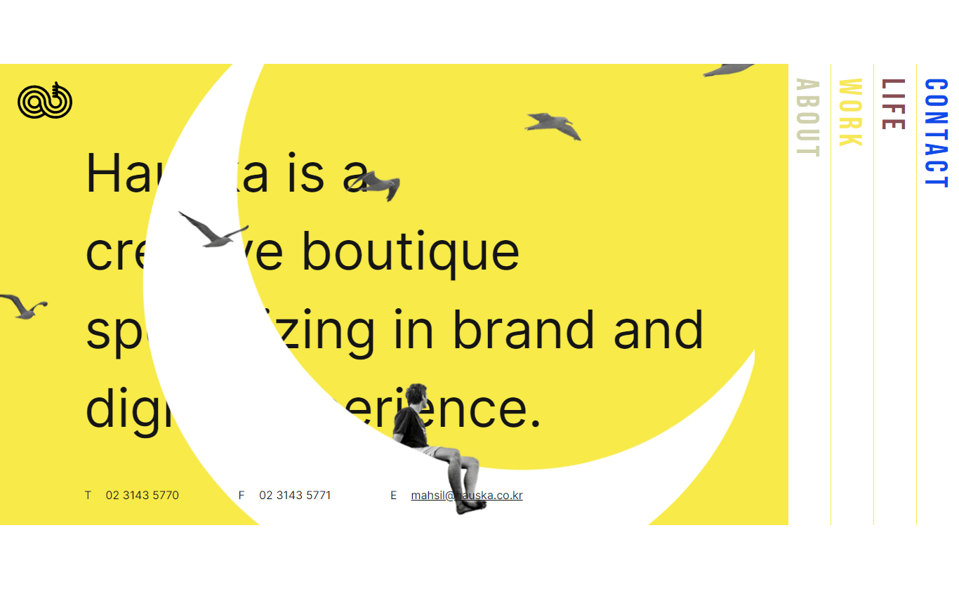
Hauska
Hauska is a creative agency that wants to explore the digital world in different ways. They have incorporated different styles to create their website. For instance, look at how they used a Memphis color palette to blend in with the inherent surreal illustrations.
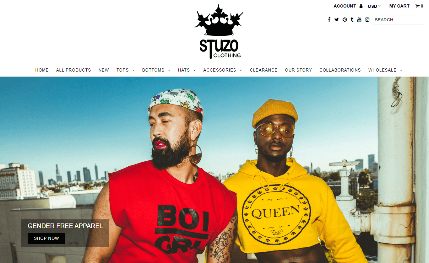
Stuzo Clothing
A clothing brand that specializes in gender-neutral clothing, Stuzo Clothing has a unique brand website. This website comes with inclusive images to show the products off and attract a wider range of customers. The website is a strong example of how inclusive designs are going to dominate web illustration trends.
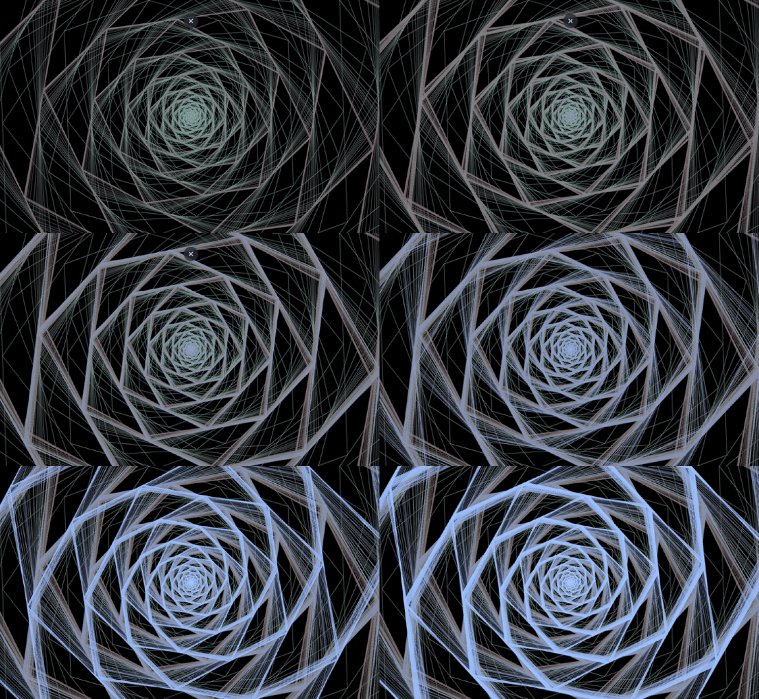
Psilly
Psilly is a website of an online community that conducts psychedelic research, harm-reduction, therapy, and advocacy. This website is a good example of polygon smoothly blended with psychedelia. Among many others, this website stands out thanks to its interactive design.
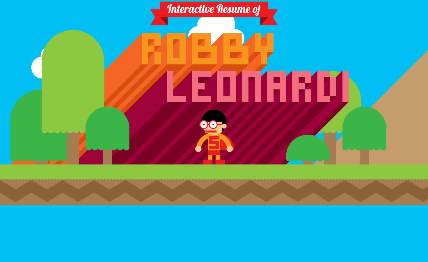
Robby Leonardi
A portfolio website of Robby Leonardi that is completely interactive. Inspired by retro video games, this website has implemented retro illustrations efficiently to stand out among the crowd.
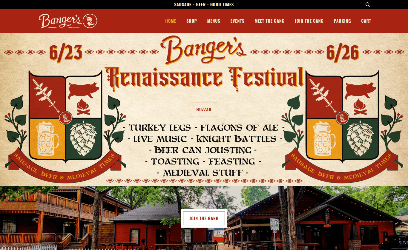
Banger’s
Banger’s selected a muted color palette and blended it with retro style to create an outstanding website that engages potentially rich users. This website is a good example of how you can combine more than one illustration style or color palette and create a modern, eye-catchy design.
“An illustration is a visual editorial – it’s just as nuanced. Everything that goes into it is a call you make: every color, every line weight, every angle.”
Charles M. Blow
The abovementioned are some of the widely accepted illustration trends followed by artists who try to create style and stand out among the crowd. Keeping up with different aspects of web design trends can help you grasp users’ attention at a glance with contemporary inspirations and ideas. If you’re an aspiring artist, let this blog help you ace your next illustration project with all significant trends enlisted in one place so that you don’t have to go back and forth to fulfill the viewers’ requirements of what they need to be more engaged.
