When we think about our favorite brands, our favorite commercials, and the social media pages of companies we follow, we realize we see them as more than “just a brand.”
We see them as a friendly face, and more often than not, as more human than a faceless corporation. Humanizing your brand is incredibly important. Most of all, it’s a way to appeal to your target audience better and connect with them on a deeper level.
Let’s look at some of the ways you can make your brand appear more human with the clever use of web design.
Think About the Character of Your Brand
Start by considering the tone of voice of your overall brand. Are you very serious, or are you a bit more laid back? What is your audience like, and what kind of the point of view and voice would they appreciate? Think of it this way: if your brand were a person, what would they be like? Once you identify this, you can apply your voice to the design of your entire website.
Let’s illustrate this with an example. Each Night is a content site focusing on sleep and mattresses, and they have chosen a more casual and entertaining voice. This is reflected on their pages — they are colorful, vibrant, and eye-catching, and a lot of their images are custom-made to reflect their branding.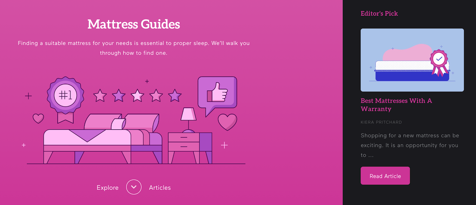
Focus on the Experience
Fostering an incredible user experience is a fantastic way to improve your website’s overall performance. On top of that, it can really highlight your brand’s human side. It may sound a bit off, but take what we’ve just stated into consideration.
If you:
- work hard on ensuring your visitors have a pleasant stay
- optimize your website for them (as opposed to search engines)
- provide plenty of information, intuitive navigation, and fast loading speeds
- cater to the way they want to engage with your website
— how could you be seen as anything but a very human brand, there to facilitate your customer’s enjoyable time online?
Some major brand websites feel foreign and sterile. They have no “soul,” so to speak. On the other hand, there are plenty of smaller websites that go out of their way to help. They do this through their content, their customer service, their layout.
Be more like them and less like a household corporate name that may be popular but has no real identity.
Tell Your Story Through Your About Page
The About page of a brand can be the perfect storytelling vehicle. It allows you to tell your visitors more about your journey, your values, and what you hope to provide for your customers and clients. All of this will naturally bring you closer to your audience. The more they know about you and your motivation, the easier it will be for them to establish a relationship with you.
Try not to make this page too long, and make sure to highlight the main points with your design.
Yellow Leaf Hammocks does this exceptionally well with a succinct yet colorful and meaningful About page. The page details their mission and values in a very digestible way.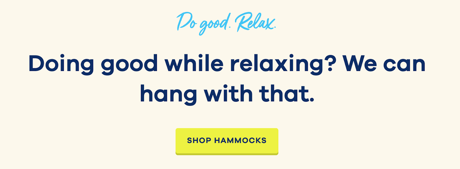
Integrate Your Social Media
Another great way to highlight the personality and human-ness of your brand is to add a social media section to your website.
This can be an Instagram feed, a glimpse into your Twitter feed, or maybe even sharing the posts you are showcasing on LinkedIn. Allowing your visitors to gauge your social media presence and see how others are interacting with you (and how you are interacting with them) will go a long way in making you seem more personable.
A good example of this is Slim Wallet Junkie. They have a Twitter section on some of their pages that serves this purpose well, without being too overpowering or too flashy.
Introduce a Colorful Character
An amazing way to add an entire additional personality to your website is to create a fun character for it. Think of the mascots football clubs use — they are there to unite the fans and establish that all-important connection that makes the fans feel a part of the family.
By creating this kind of personality, you will provide a clear and instant association between the persona and the brand. If you do your work well, it will showcase who you are and what you stand for extremely well.
For instance, Bay Alarm Medical has designed a whimsical character called Grumpy Grandpa, who makes the brand’s website instantly recognizable. He’s there to connect with readers and customers and introduce a bit of comic relief to an otherwise serious topic.
Use Real Images as Opposed to Stock Photos
The images you use on your website are also an amazing opportunity to humanize your brand.
However, if you choose to use stock photos, no matter how great they are, they will still never be able to reflect who you are. Plus, today’s reverse image search tools can detect visually similar images online, making it easy to see when the same photos are used across multiple sites. And, it can hurt your brand’s uniqueness and trust.
Shooting some quality photos of your own will take some time, that’s true. You will also need to edit them a bit and ensure they load fast across different devices. But this is still better than just purchasing a similar image that has also been used by other brands before you.
A great example of this is from Minaal, a travel accessories company. Instead of using stock photos, they have pictures of people using their travel products in different settings. This is likely far more effective at engaging visitors than traditional stock photos.
Final Thoughts
Your ultimate goal when humanizing your brand is to show your visitors what you are made of, what you stand for, and what they can expect from doing business with you. The more you can showcase your personality through the design elements you feature, the easier it will be for them to understand your motives and the force that drives you.
Take our advice, and consider what you can add to your website to make it seem more like a friendly acquaintance than a faceless brand.

