Colors on websites influence how viewers feel about and interact with your products or organizations. While bright colors can lift spirits, soft tones can soothe, creating balance in your web design. So, before deciding on a color palette or scheme, it is essential to carefully consider the latest color trends for web designs, the psychological impact of the colors on your target audience, the emotions you want to evoke, and how the color scheme aligns with your design goal to maximize recognition and connection.
The latest web design trend for 2025 is set to shape our digital spaces, resulting into a fusion of bold and minimalist palettes designed to create immersive, dynamic web experiences. Let’s explore the exciting color trends shaping web design in 2025!
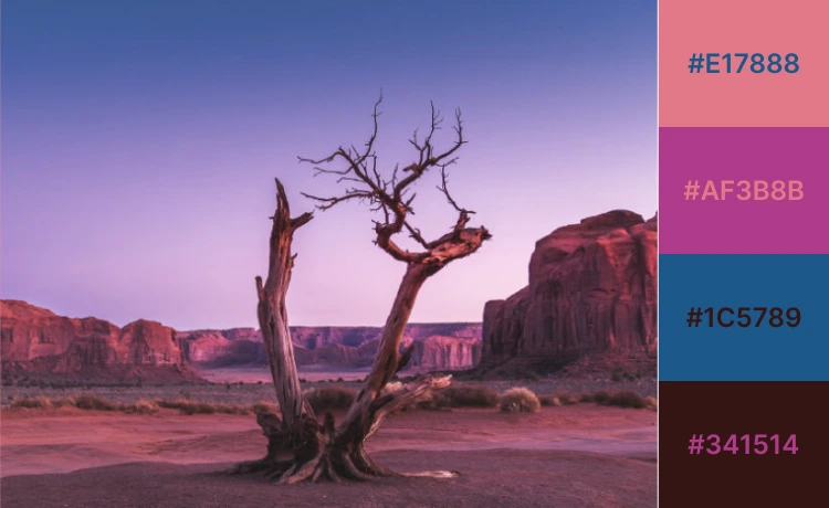
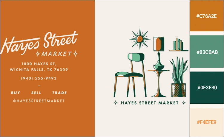
Earthy & Natural Tones
Earthy and natural color schemes convey a sense of warmth, groundedness, and harmony. They include colors like deep brown, muted yellows, red oranges, and green, bringing a natural vibe. In 2025, earthy and natural colors in web design are expected to grow, aligning with the global shifts toward sustainability, mental wellness, and connection to nature.
Why Earthy Tone is Trending
Earthy tones are trending for their versatility, complementing different design styles. They help to create a calming digital experience, reflecting authenticity in a modern way. Likewise, the right mix of earthy tones can enhance the environment for practices such as a mental health private practice, helping to foster a sense of calm and well-being. If you want to create a sustainable and authentic user experience, earthy and natural-toned colors are an excellent choice.
Characteristics:
- Brings comfort and security, which helps retail natural or food-related items.
- Evoke a sense of warmth and coziness with an inviting and comfortable feel.
- It promotes concentration, reducing stress levels and visual distraction, which makes it suitable for workspaces requiring focus.
- Suitable for frequently used areas like CTA buttons, logos, and banner images on the website, conveying reliability and trustworthiness
Example
The café site design uses a soft, earthy palette that conveys reliability and trustworthiness. It tells the story of food and family with a minimal design, where muted brown, orange, and other earthy tones create a sense of comfort and security.
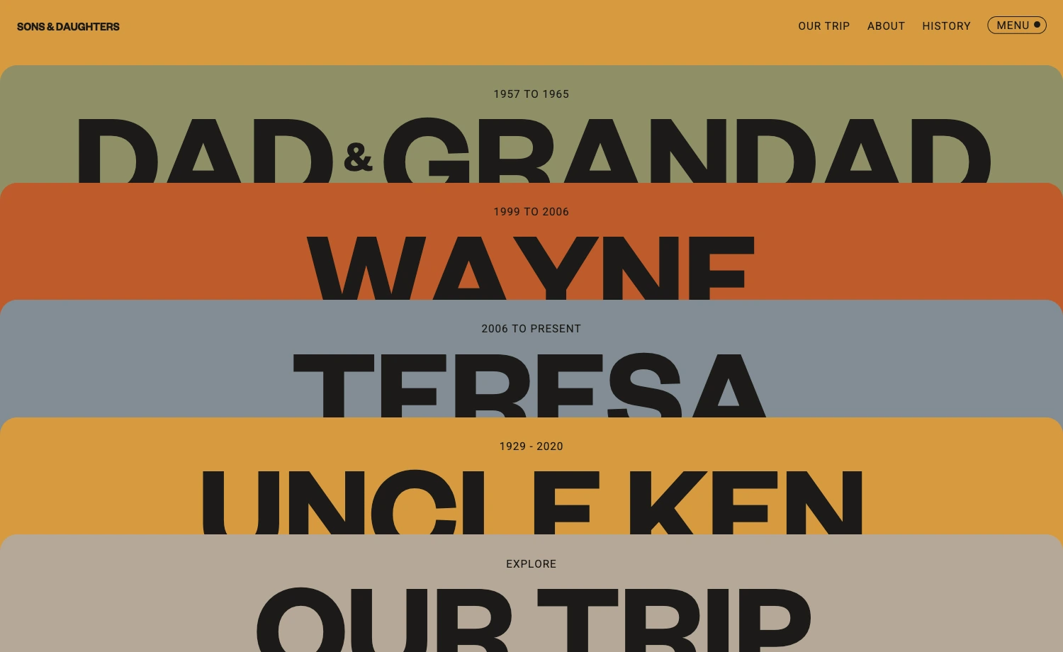
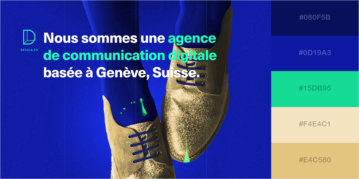
Monochromatic Minimalism
A monochromatic color scheme in web design offers a cohesive style, focusing on simplicity and balance. It lets designers evoke specific emotions by using different shades of a single color and establish harmony without distracting or overwhelming the user. Moreover, a monochrome color palette can achieve visual coherence without boredom.
Why Monochromatic Color is Trending
Although not ideal for all websites, its timelessness allows it to evolve without becoming outdated, making it an enduring choice for modern web designs. It creates a sense of unity that feels both sophisticated and visually appealing. It offers flexibility, ranging from sleek minimalism to big statements, making it a sustainable web design color trend in 2025.
Characteristics:
- Helps get all the attention to the content directly with a clean design
- Maintains harmony across the whole design
- A simple design approach is to use darker tones for areas with less text and lighter tones for areas with more text.
- Simplifies building a specific mood using different shades and tints of one base color, such as blue for trust and professionalism, red for energy, etc.
Example
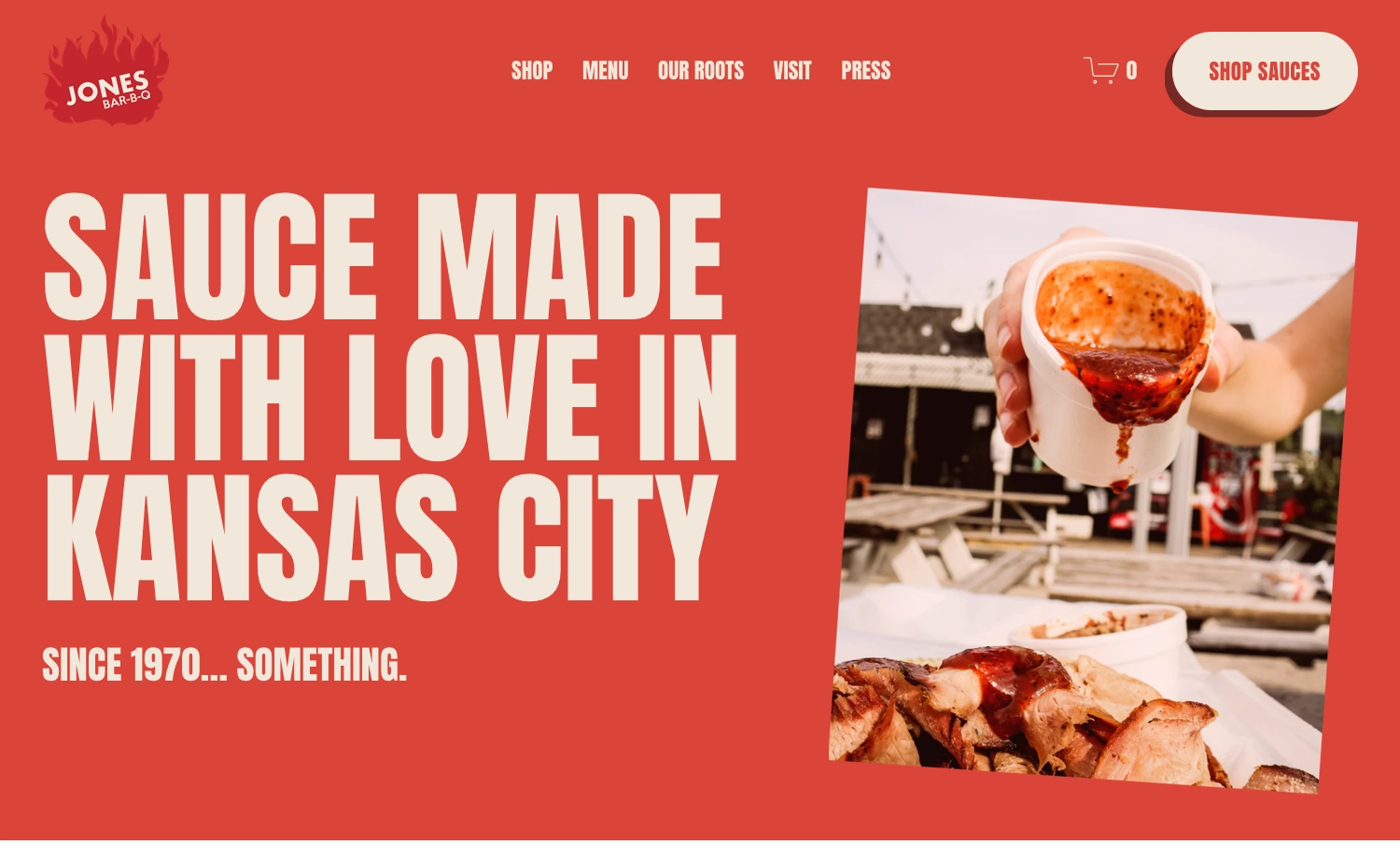
Red invokes a sense of appetite, and the restaurant website Jones Bar-B-Q leverages it the best. The way they use different shades of red appeals to the visitors and makes them feel more welcome to surf the site.
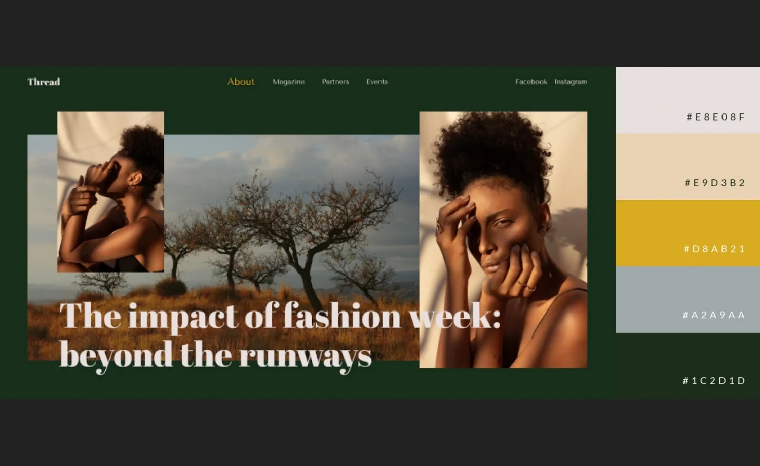
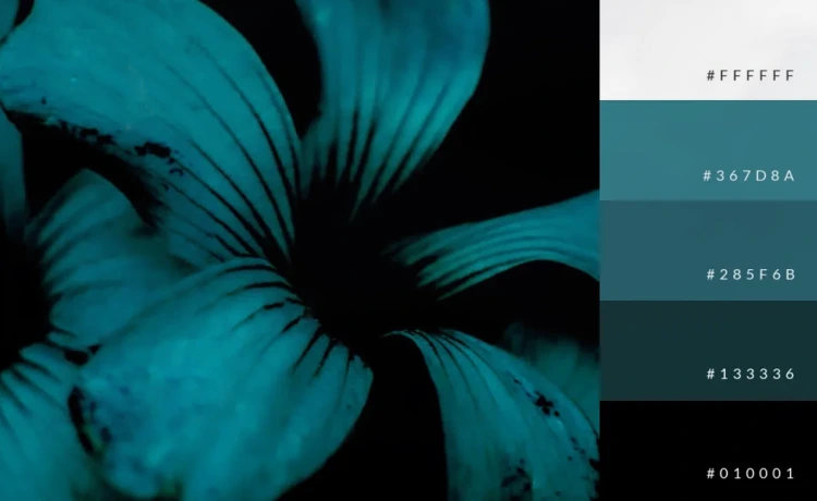
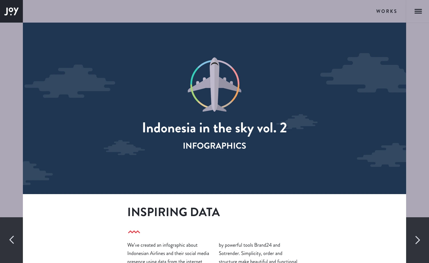
Muted & Moody Color Scheme
A muted and moody color scheme is another one with a versatile foundation if you need a refined and cohesive look on your website, graphic design, infographics, or any other project. It is a significant trend in website design across various contexts in 2025. This pairing can create a soulful and sophisticated palette that offers a modern and editorial feel with thoughtfulness.
Why Muted & Moody Color Schemes are Trending
Muted and moody color schemes offer atmospheric and soft-toned vibes that evoke dreamy and playful experiences with visual storytelling. These colors can also create an inviting yet sophisticated feeling when paired with other soft, neutral, or earth tones. For example, light, pastel blues evoke a sense of relaxation, making people feel calm and safe. But they can express energy and determination when paired with moody colors like navy blue or charcoal.
Characteristics:
- Create a comfortable atmosphere, offering a nostalgic, warm, and inviting space.
- Essential to balance the brightness and darkness contrasts to create a pleasing interplay.
- Trending color for graphics, logo designs, or marketing products on eCommerce websites.
- Suitable for organizations that want to boost imagination, energy, and confidence.
Example
The website uses a soft, muted color scheme in the background, product packaging, and other web elements that evokes energy and an inviting feel. It highlights the brand’s specific aspects, creating reliable and comfortable atmosphere.
Gradient Color Scheme
Gradient color schemes have made a stylish comeback with immersive experiences this year. Designers are embracing soft transitions instead of loud or saturated colors to create strong impressions and elegant visuals. They use smooth color shifts or natural lighting like underwater vibes and sunsets, which build dynamic web experiences without overwhelming the users.
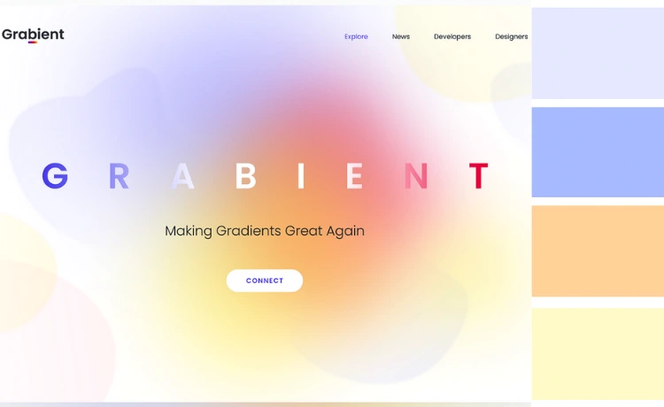
Why the Gradient Color Scheme is Trending
Gradient colors help create depth, emotion, and sophistication with a flow between colors. This year, the multi-dimensional gradients will offer a more dynamic and versatile way to create the perfect fit for trendy aesthetics. It allows designers to make a website more alive and interactive, combining with effects like glassmorphism or blurred backgrounds on web elements.
Characteristics:
- Creates a calm and elegant feel
- Offers multi-toned layered effects blending 2-3 or more colors
- It can enhance interactive effects when applied to background layers or borders.
Example
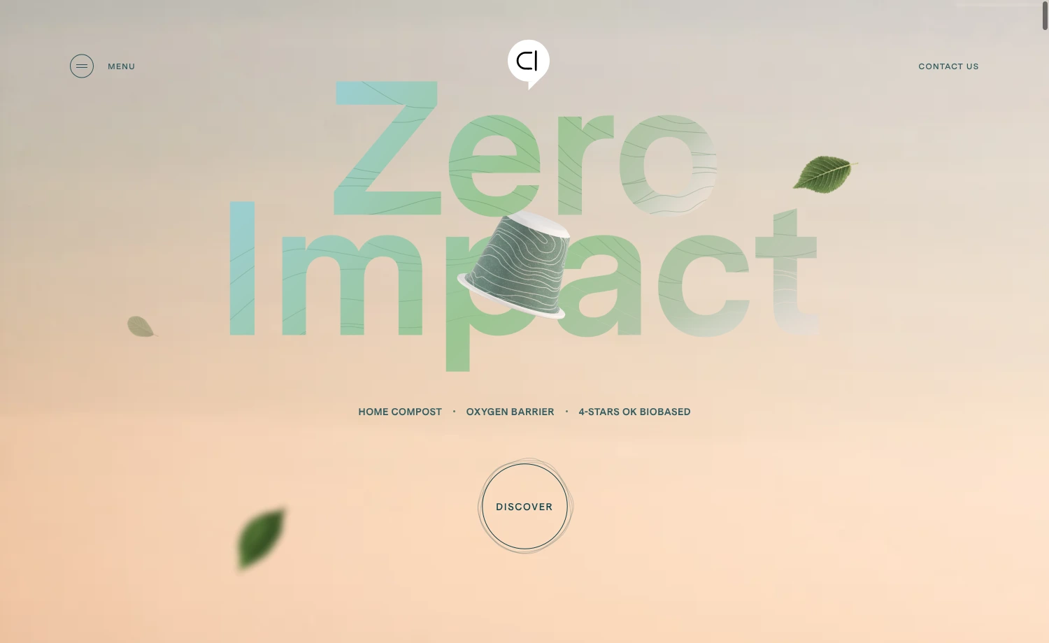
Capsul’in Zero Impact offers a soothing and serene visual impact with its soft gradient. The gradient on the background and texts provides strong, calm impressions.
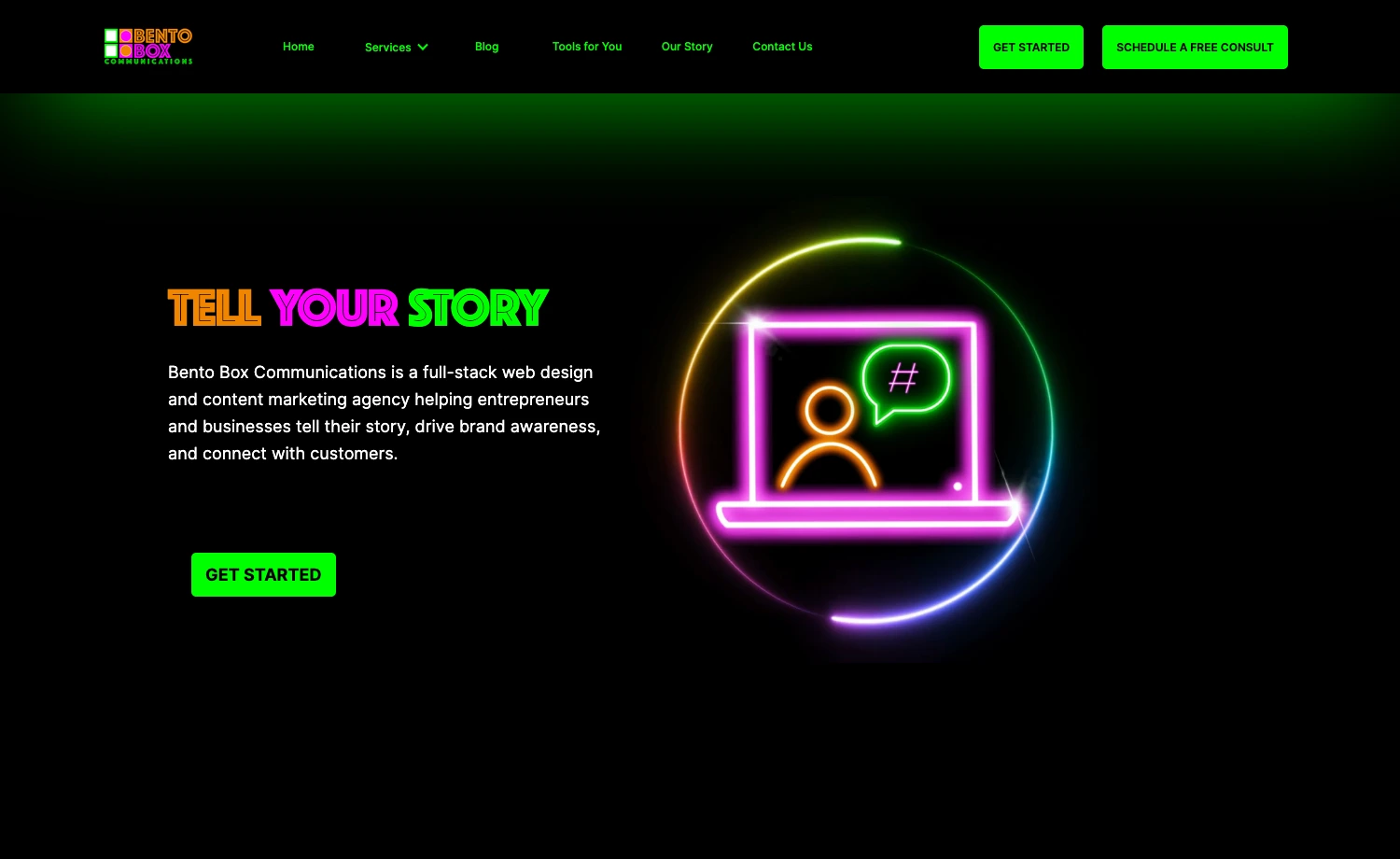
Futuristic Neon
With the rise of AI and tech-driven industries, neon colors like bright purples, greens, electric pinks, etc., will make a statement, particularly in the tech, gaming, and creative industries. They are making a vibrant comeback in web design color trends with an electrifying energy. Besides, using neon colors carefully aligned with your design goal can create strong visual identities, preventing visual fatigue and maintaining balance.
Why Neon Color Schemes are Trending
Neon color schemes create attention-grabbing designs and achieve tranquility for digital products or tech-related websites. They are a great way to captivate attention, creating fun and engaging experiences, especially in a competitive marketplace. Additionally, they allow designers to break away from traditional design styles. It makes websites feel modern, creative, and young.
Characteristics:
- Transform any visual content into dynamic elements.
- Expresses a sense of modernity and excitement.
- Reflects compatibility with dark or muted backgrounds.
- Helps highlight important messages or sections using call-to-action buttons, icons, interactive elements, or the borders
Example
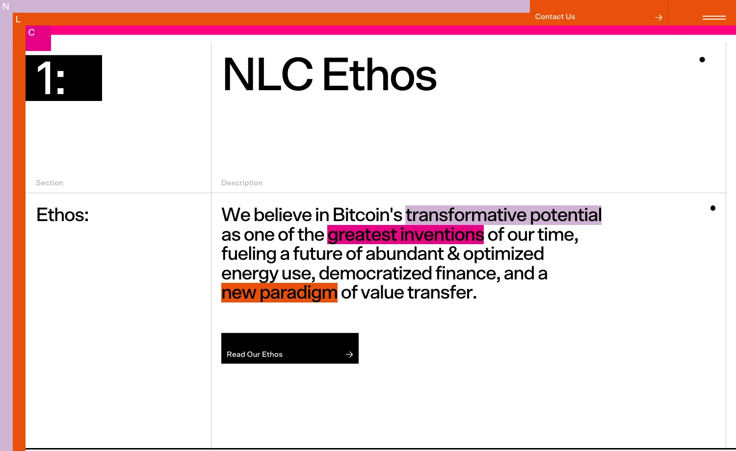
The New Layer Capital is a business website with a minimal design, evoking youth and energy. The vibrant and energetic neon pink and orange with muted color, sets a bold statement about the quality, expressing enthusiasm and confidence. It makes a reliable vibe about the organization that can help grow user connectivity.
The Retro Revival
The retro color schemes are a great way to meet technology with nostalgia. In the future, more AI/VR will be used on websites. These rises of technological advancements encourage blending futuristic interfaces with comforting nostalgic designs and inspiring retro colors. It may also be relevant while adapting cutting-edge web design trends.
Why Retro Color Scheme is Trending
Retro emphasizes a love for nostalgic aesthetics and a creative way to stand out while still feeling emotionally engaging. In website design, retro colors express a straightforward, less tech-centric, and more down-to-earth accent. Moreover, they are like a smile to any design, retreating into a friendly atmosphere.
Characteristics:
- Seems simpler, less tech-centric, and more down-to-earth
- Make an engaging and memorable user experience
- Blends vintage hues with contemporary design elements to create ease with design
- Suitable for entertainment websites like newspapers, home theater websites, etc, as a background or base color for the website.
Example
The newspaper website enhances the brand’s tone and message, creating a vintage outlook. The background has a paper-like appearance, making it more connected with visitors while browsing or reading anything from the site.
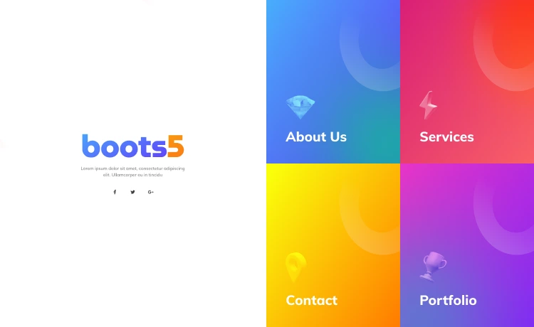
Bright & Bold Colors
Bright and bold colors will significantly influence the 2025 web design color trend. Bold colors express creativity, allowing designers to convey sophistication, warmth, and vibrancy. These colors bring excitement and engagement, helping websites stand out in a crowded online space. They also represent a sense of modernity and dynamism.
Why Bright Bold Colors are Trending
As brands want to stand out more than ever this year, bold colors are becoming powerful tools for making unique and visually striking statements. They leave a strong first impression, creating a memorable and unique digital identity. They also evoke specific emotions, making the interface feel fresh and dynamic. Besides, bold colors help create expressive and high-energy visuals that feel alive, which helps attract young audiences for gaming and technology-based websites.

Characteristics:
- Help users immediately find the most essential parts of a website.
- Trigger an immediate response, urging users to take quick action. For this, they’re commonly used in call-to-action buttons.
- Relevant to cheerful youth sites as they help evoke potential and loyalty, benefiting the entire business.
- Bright pinks, oranges, yellows, or reds can invoke warmth and friendliness, yellow for optimism, and blues for building trust, which benefits industries like lifestyle, wellness, social media, or technical business.
Example
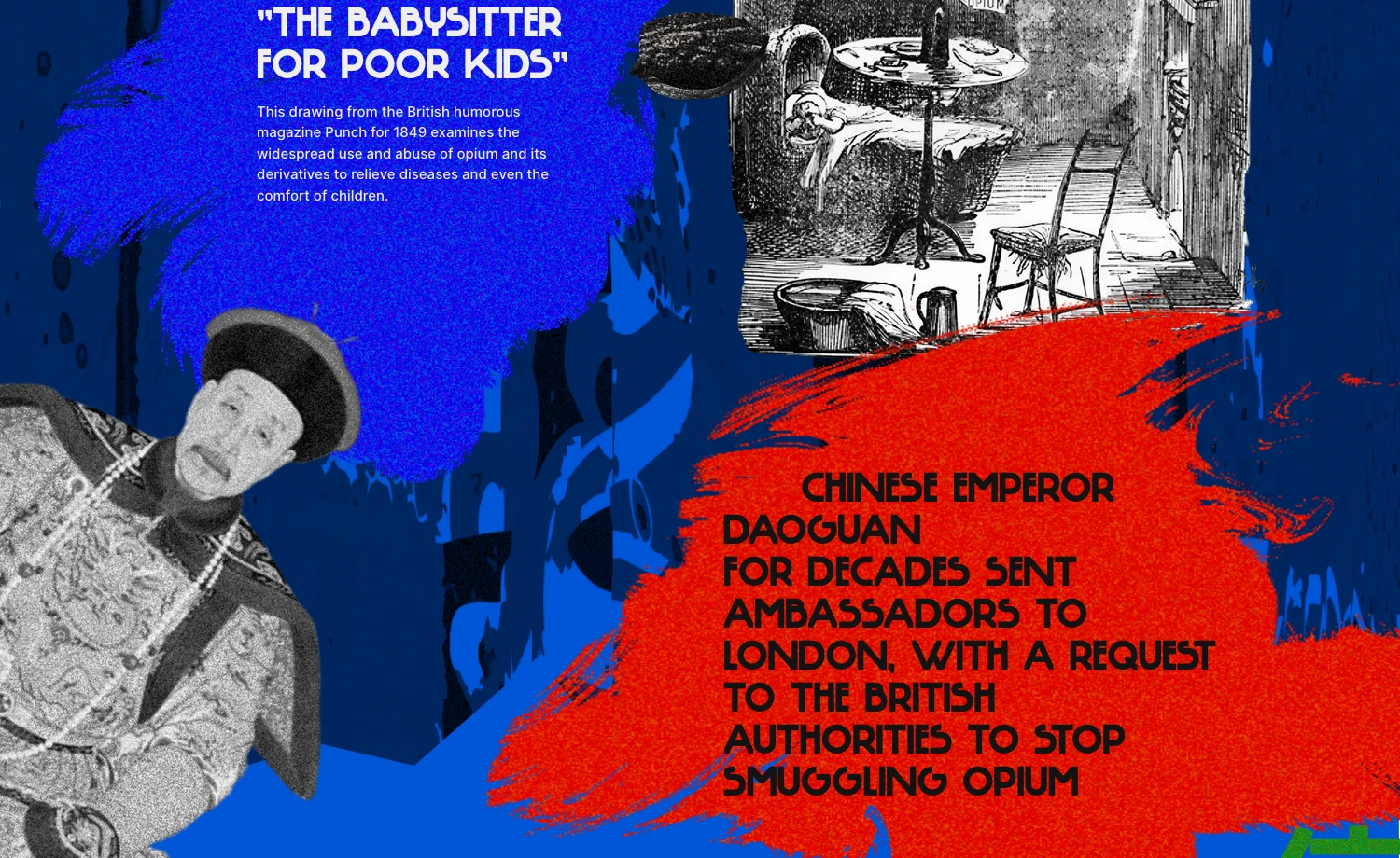
The single-page website about culture and education uses a bold color palette of blue, red, and green to create an emphasized visual storytelling about the previous opium practices and effects. The bold color scheme creates a smooth communication with the visitors, making it easily understandable and enhancing engagement.
Honorary Mention
Pantone Color of the Year 2025: Mocha Mousse
For 2025, Pantone selected Mocha Mousse as the year’s color. It offers a space for warmth, comfort, and elegance with a brown hue and is reminiscent of chocolate and coffee. The color is equally powerful in branding, showing an earthy and luxurious feel to logos and packaging with its versatility.
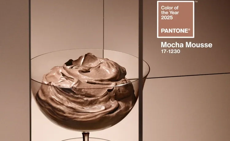
Mocha Mousse is a must-have for any creative color scheme, as you can use it as a main color or a soft accent. It includes the richness and adaptability that holds sophistication, defining the 2025 color trend.
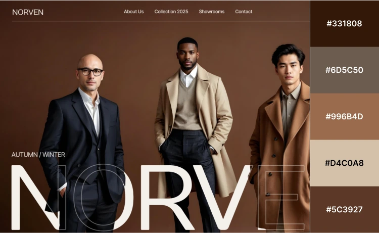
The eCommerce web design for a Men’s clothing and accessories business uses the 2025 Pantone Color Mocha Mousse. The elegant color palette adds luxury to the minimal design with a warm, welcoming vibe. This makes the site more sophisticated, creating a friendly user experience.
In 2025, we are moving away from extremes and leaning into hues that feel purposeful and timeless. It is said that colors can convey a story that words can’t. So, let the colors on your website show the heart of your brand and speak to every visitor.